 响应式布局案例


 本文介绍了一个使用CSS媒体查询实现响应式布局的案例,根据不同屏幕尺寸调整网页元素的样式及布局,确保良好的用户体验。
<!doctype html>
<html>
<head>
<meta charset="utf-8">
<title>Media Queries模块</title>
<style>
@media screen and (min-width:260px){
	.box{
		background:#f60;
		width:400px;
		height:1000px;
	}
}
@media screen and (min-width:600px){
	.box{
		background-color:#60f;
		width:600px;
		height:1000px;
	}
}
@media screen and (min-width:800px){
	.box{
		background:#6f0;
		width:800px;
		height:1000px;
	}
}
</style>
</head>
<body>
<div class="box"></div>
</body>
</html>
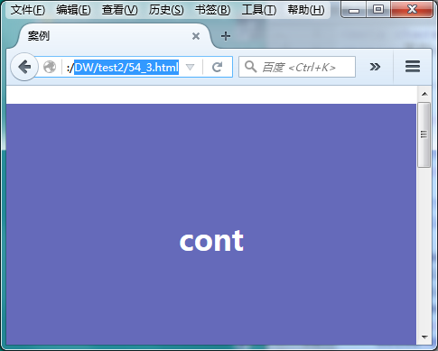
效果图:
<!doctype html>
<html>
<head>
<meta charset="utf-8">
<title>案例</title>
<style>
html{ font-size:62.5%;}
body{
	margin:20px 0;}
.box{
	width:960px;
	margin:0 auto;}
.content{
	width:740px;
	float:left;}
p{
	line-height:600px;
	text-align:center;
	font-size:3rem;
	font-weight:bold;
	margin: 0 0 20px 0;
	color:#fff;}
.cont{
	width:520px;
	float:right;
	background:#656aba;}
.left{
	width:200px;
	float:left;
	background:#ff2dc4;}
.right{
	width:200px;
	float:right;
	background:#41db50;}
@media screen and (min-width:1000px){
	.box{ width:1000px;}
	.content{ width:780px; float:left;}
	.cont{ width:560px; float:right;}
	.left{ width:200px; float:left;}
	.right{ width:200px; float:right;}
}
@media screen and (min-width:640px) and (max-width:999px){
	.box{ width:640px;}
	.content{ width:640px; float:none;}
	p{ line-height:400px;}
	.cont{ width:420px; float:right;}
	.left{ width:200; float:left;}
	.right{
		width:100%;
		float:none;
		clear:both;
		line-height:150px;}
}
@media screen and (max-width:639px){
	.box{ width:100%;}
	.content{ width:100%; float:none;}
	p{ line-height:300px;}
	.cont{ width:100%; float:none;}
	.left{ width:100%; float:none;}
	.right{
		width:100%;
		float:none;
		clear:both;
		line-height:150px;}
}
</style>
</head>
<body>
<div class="box">
	<div class="content">
    	<p class="cont">cont</p>
        <p class="left">left</p>
    </div>
    <p class="right">right</p>
</div>
</body>
</html>
效果图: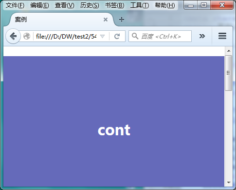
<!doctype html>
<html>
<head>
<meta charset="utf-8">
<title>案例</title>
<style>
body{
	margin:20px 0;}
.box{
	width:960px;
	margin:0 auto;}
.content{
	width:740px;
	float:left;}
p{
	line-height:600px;
	text-align:center;
	font-size:2em;
	font-weight:bold;
	margin: 0 0 20px 0;
	color:#fff;}
.cont{
	width:520px;
	float:right;
	background:#656aba;}
.left{
	width:200px;
	float:left;
	background:#ff2dc4;}
.right{
	width:200px;
	float:right;
	background:#41db50;}
/*大于1000px的时候*/
@media screen and (min-width:1000px){
	.box{ width:1000px;}
	.content{ width:780px; float:left;}
	.cont{ width:560px; float:right;}
	.left{ width:200px; float:left;}
	.right{ width:200px; float:right;}
}
/*最大不超过999像素  最小不小于640px*/
@media screen and (min-width:640px) and (max-width:999px){
	.box{ width:640px;}
	.content{ width:640px; float:none;}
	p{ line-height:400px;}
	.cont{ width:420px; float:right;}
	.left{ width:200; float:left;}
	.right{
		width:100%;
		float:none;
		clear:both;
		line-height:150px;}
}
/*最大不超过639px*/
@media screen and (max-width:639px){
	.box{ width:100%;}
	.content{ width:100%; float:none;}
	p{ line-height:300px;}
	.cont{ width:100%; float:none;}
	.left{ width:100%; float:none;}
	.right{
		width:100%;
		float:none;
		clear:both;
		line-height:150px;}
}
</style>
</head>
<body>
<div class="box">
	<div class="content">
    	<p class="cont">cont</p>
        <p class="left">left</p>
    </div>
    <p class="right">right</p>
</div>
</body>
</html>
效果图:


 扫一扫
扫一扫


 2357
2357

 被折叠的 条评论
为什么被折叠?
被折叠的 条评论
为什么被折叠?
 到【灌水乐园】发言


