


原文作者:typeworkshop.com
原文链接:Black vs. white.
译者:snlchina
注:这是字体设计基础系列文章的第6篇,先拣重要的翻译了。有时间再把全系列的翻完。
Black vs. white. Designing type is nothing more and nothing less than harmonizing black and white shapes. Black can't exist without white, and white can't exist without black. Black, the shape of a letter. White, the space in or in between letters. The amount of white inside a character defines the amount of white in between two characters.
黑与白
字体设计的过程,无非就在于协调黑白空间的形状。黑不能离开白而独立存在,白也是一样。黑空间,是字符的形状。白空间,是字符内部和字符之间的白色空间。字符内部白空间的大小,决定着两个字符之间的白空间的大小。
As it is impossible to create a very black character with a big (white) counter form, a black typeface will always have smaller counters than a light typeface. Hence it follows that there is less space in between the characters (see drawing). A light typeface has much bigger counters. The space in between two letters has to be in proportion. As a consequence there is more white space in between light letters than in between black letters.
如果你要设计一种粗黑字体,那就不可能让它有很大的字怀(counter,字体内部的白空间)。一个粗黑体,其字怀永远要小于一个细线体。所以,粗黑体的字符之间的间距也一定要比细线体的小(如图)。细线体的字怀很大,其字符间距也必须成比例的大。所以,细线体字符之间的白空间一定要比粗黑体的更大。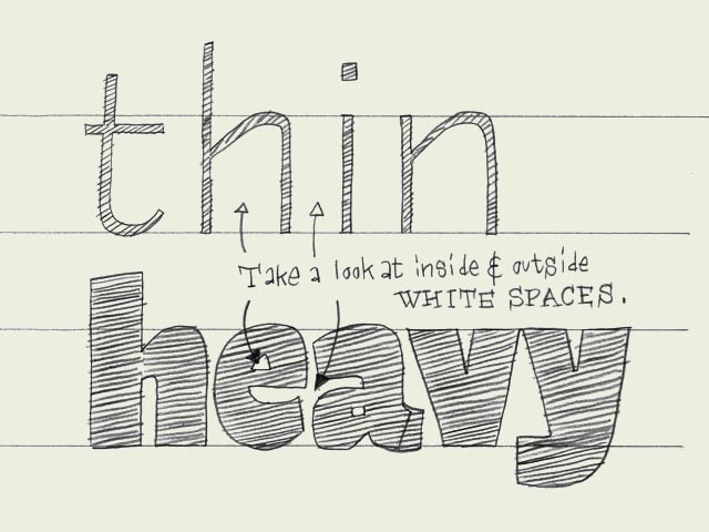
相关文章:


 3767
3767

 被折叠的 条评论
为什么被折叠?
被折叠的 条评论
为什么被折叠?
 到【灌水乐园】发言


