


 这篇博客探讨了如何利用CSS将不同的图像设置为元素的四个角落作为边框,详细阐述了通过父元素和子元素定位来实现这一效果的方法。

父及元素定位方式position: relative;四个角的图片定位为position: absolute;
<div class="box">
    <div class="top-left"></div>
    <div class="top-right"></div>
    <div class="bottom-left"></div>
    <div class="bottom-right"></div>
</div>
<style>
    .box {
        width: 200px;
        height: 200px;
        border: 1px solid black;
        position: relative;
        background-image:url(dialog.png);
        /* 使用边框线 */
        -webkit-border-image:url(border.png) 30 30 round; /* Safari 5 */
        -o-border-image:url(border.png) 30 30 round; /* Opera */
        border-image:url(border.png) 30 30 round;
    }

    .top-left {
        width: 10px;
        height: 10px;
        border-left: 3px solid red;
        border-top: 3px solid red;
        border-radius:0px 0px 20px 0px;
        position: absolute;
        left: -1px;
        top: -1px;
    }

    .top-right {
        width: 10px;
        height: 10px;
        border-right: 3px solid green;
        border-top: 3px solid green;
        border-radius:0px 0px 0px 20px;
        position: absolute;
        right: -1px;
        top: -1px;
    }

    .bottom-left {
        width: 10px;
        height: 10px;
        border-left: 3px solid blue;
        border-bottom: 3px solid blue;
        border-radius:0px 20px 0px 0px;
        position: absolute;
        left: -1px;
        bottom: -1px;
    }

    .bottom-right {
        width: 10px;
        height: 10px;
        border-right: 3px solid yellow;
        border-bottom: 3px solid yellow;
        border-radius:20px 0px 0px 0px;
        position: absolute;
        right: -1px;
        bottom: -1px;
    }
</style>
<html>
<head>
    <meta charset="utf-8"/>
    <title></title>
    <style type="text/css">
        .box {
            width: 400px;
            height: 200px;
            border: 1px solid #E0C987;
            position: relative;
        }

        .top-left, .top-right, .bottom-left, .bottom-right {
            position: absolute;
            width: 10px;
            height: 10px;
            border: 1px solid #fff;
            z-index: 1;
            background: #fff;
        }

        .top-left {
            top: -1px;
            left: -1px;
            border-radius: 0px 0px 10px 0px;
            border-bottom: 1px solid #E0C987;
            border-right: 1px solid #E0C987;
        }

        .top-right {
            top: -1px;
            right: -1px;
            border-radius: 0px 0px 0px 10px;
            border-bottom: 1px solid #E0C987;
            border-left: 1px solid #E0C987;
        }

        .bottom-left {
            left: -1px;
            bottom: -1px;
            border-radius: 0px 10px 0px 0px;
            border-top: 1px solid #E0C987;
            border-right: 1px solid #E0C987;
        }

        .bottom-right {
            right: -1px;
            bottom: -1px;
            border-radius: 10px 0px 0px 0px;
            border-top: 1px solid #E0C987;
            border-left: 1px solid #E0C987;
        }
    </style>
</head>
<body>
    <div class="box">
        <div class="top-left"></div>
        <div class="top-right"></div>
        <div class="bottom-left"></div>
        <div class="bottom-right"></div>
    </div>
</body>
</html>
方法2
div {
  background-image:
    url(top-left.png) top left no-repeat,
    url(to-right.png) top right no-repeat,
    url(bottom-left.png) bottom left no-repeat,
    url(bottom-right.png) bottom right no-repeat;
} 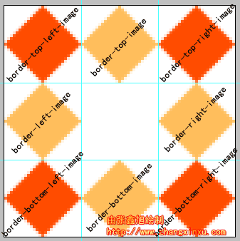
例如:border-image:url(border.png) 30% 40%;
就等同于border-image:url(border.png) 30% 40% stretch stretch;
2个参数的话则第一个参数表水平方向,第二个参数表示垂直方向。
就等同于border-image:url(border.png) 30% 40% round repeat;
表示水平方向round(平铺),垂直方向repeat(重复),至于何为平铺何为重复下面会深入讲解
<!DOCTYPE html>
<html>
<head>
<style>
div
{
border:15px solid transparent;
width:300px;
padding:10px 20px;
}
#round
{
-moz-border-image:url(/i/border.png) 30 30 round; /* Old Firefox */
-webkit-border-image:url(/i/border.png) 30 30 round; /* Safari and Chrome */
-o-border-image:url(/i/border.png) 30 30 round; /* Opera */
border-image:url(/i/border.png) 30 30 round;
}
#stretch
{
-moz-border-image:url(/i/border.png) 30 30 stretch; /* Old Firefox */
-webkit-border-image:url(/i/border.png) 30 30 stretch; /* Safari and Chrome */
-o-border-image:url(/i/border.png) 30 30 stretch; /* Opera */
border-image:url(/i/border.png) 30 30 stretch;
}
</style>
</head>
<body>
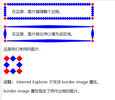
<div id="round">在这里,图片铺满整个边框。</div>
<br>
<div id="stretch">在这里,图片被拉伸以填充该区域。</div>
<p>这是我们使用的图片:</p>
<img src="/i/border.png">
<p><b>注释:</b> Internet Explorer 不支持 border-image 属性。</p>
<p>border-image 属性规定了用作边框的图片。</p>
</body>
</html>


 扫一扫
扫一扫


 843
843

 被折叠的 条评论
为什么被折叠?
被折叠的 条评论
为什么被折叠?
 到【灌水乐园】发言


