


 本文介绍了一篇关于使用HTML和CSS创建动态圣诞树的教程,包括`letter-spacing`属性调整字符间距,`unset`属性重置样式,以及`animation`属性实现动画效果。文章详细展示了代码实现过程,包括星星、树叶、树干、彩球和闪烁效果的制作,适合前端开发者学习。
我的圣诞树写好啦~
第一颗圣诞树
参考链接:https://www.bilibili.com/video/BV1PZ4y1X7sY
展示

代码
HTML:
<!DOCTYPE html>
<html lang="en">
<head>
    <meta charset="UTF-8">
    <meta http-equiv="X-UA-Compatible" content="IE=edge">
    <meta name="viewport" content="width=device-width, initial-scale=1.0">
    <title>圣诞树</title>
    <link rel="stylesheet" href="../css/MerryChristmas.css">
</head>

<body>

    <p class="word">Merry Christmas</p>

    <div class="tree">
        <div class="star">
            <div class="star-in"></div>
        </div>

        <div class="leaf-box">
            <!-- 树叶 -->
            <div class="leaf">
                <div class="edge"></div>
                <div class="edge right"></div>
            </div>
            <div class="leaf">
                <div class="edge"></div>
                <div class="edge right"></div>
            </div>
            <div class="leaf">
                <div class="edge"></div>
                <div class="edge right"></div>
            </div>
            <div class="leaf">
                <div class="edge"></div>
                <div class="edge right"></div>
            </div>
            <div class="leaf">
                <div class="edge"></div>
                <div class="edge right"></div>
            </div>
            <!-- 树干 -->
            <div class="trunk"></div>
            <!-- 彩色的球 -->
            <div class="ball-box">
                <div class="ball b1"></div>
                <div class="ball b2"></div>
                <div class="ball b3"></div>
                <div class="ball b4"></div>
                <div class="ball b5"></div>
                <div class="ball b6"></div>
                <div class="ball b7"></div>
                <div class="ball b8"></div>
                <div class="ball b9"></div>
            </div>
            <!-- 闪烁 -->
            <div class="sparkle">
                <span>◆</span>
                <span>◆</span>
                <span>◆</span>
                <span>◆</span>
                <span>◆</span>
                <span>◆</span>
                <span>◆</span>
                <span>◆</span>
            </div>
            <div class="blink">
                <div></div>
                <div></div>
                <div></div>
                <div></div>
                <div></div>
                <div></div>
            </div>
        </div>
    </div>

</body>
</html>
CSS:
html, body{
    width: 100%;
    height: 100%;
}


*{
    margin: 0;
    padding: 0;
}


body{
    background-color: #000;
}


.word{
    font-size: 22px;
    text-align: center;
    color: gold;
    padding-top: 50px;
    /*  */
    letter-spacing: 5px;
    text-shadow: 2px 4px 9px rgba(255, 255, 255, 0.7);
}


.tree{
    width: 200px;
    height: 300px;
    margin: 80px auto 0 auto;
    position: relative;
    /* border: 1px solid #fff; */
}


.star{
    width: 50px;
    height: 50px;
    position: absolute;
    background-color: #fff;
    border-radius: 50%;
    top: -25px;
    z-index: 1000;
    left: 50%;
    transform: translateX(-50%);
    /*  */
    animation: starLight 1.5s ease infinite alternate;
}


.star-in{
    position: absolute;
    left: 50%;
    top: 50%;
    border-right: 100px solid transparent;
    border-bottom: 70px solid gold;
    border-left: 100px solid transparent;
    transform: translateX(-50%) translateY(-50%) rotate(35deg) scale(0.14);
}


.star-in:before{
    position: absolute;
    left: -65px;
    top: -45px;
    content: '';
    border-right: 30px solid transparent;
    border-bottom: 80px solid gold;
    border-left: 30px solid transparent;
    transform: rotate(-35deg);
}


.star-in:after{
    position: absolute;
    left: -105px;
    top: -3px;
    content: '';
    border-right: 100px solid transparent;
    border-bottom: 70px solid gold;
    border-left: 100px solid transparent;
    transform: rotate(-70deg);
}


@keyframes starLight{
    0%{
        background: radial-gradient(ellipse at center,
        gold 0%,
        rgba(255, 240, 158, 0.5) 42%,
        rgba(255, 242, 173, 0.2) 58%,
        rgba(255, 255, 255, 0.1) 100%
        );
    }
    25%{
        background: radial-gradient(ellipse at center,
        gold 0%,
        rgba(255, 240, 158, 0.5) 40%,
        rgba(255, 242, 173, 0.2) 60%,
        rgba(255, 255, 255, 0.1) 100%
        );
    }
    50%{
        background: radial-gradient(ellipse at center,
        gold 0%,
        rgba(255, 240, 158, 0.5) 38%,
        rgba(255, 242, 173, 0.2) 62%,
        rgba(255, 255, 255, 0.1) 100%
        );
    }
    75%{
        background: radial-gradient(ellipse at center,
        gold 0%,
        rgba(255, 240, 158, 0.5) 36%,
        rgba(255, 242, 173, 0.2) 64%,
        rgba(255, 255, 255, 0.1) 100%
        );
    }
    100%{
        background: radial-gradient(ellipse at center,
        gold 0%,
        rgba(255, 240, 158, 0.5) 34%,
        rgba(255, 242, 173, 0.2) 66%,
        rgba(255, 255, 255, 0.1) 100%
        );
    }
}


.leaf{
    position: absolute;
    left: 50%;
    top: 3%;
    margin-left: -30px;
    background-color: rgb(14, 110, 14);
    width: 60px;
    height: 60px;
    border-radius: 0 10px 35px 10px;
    transform: rotate(45deg);
    box-shadow: 2px 7px 2px rgba(43, 43, 43, 0.2);
}


.edge{
    position: absolute;
    left: 0;
    bottom: 0;
    background-color: rgb(14, 110, 14);
    width: 25px;
    height: 30px;
    border-radius: 0 10px 35px 10px;
    transform: translateY(50%) translateX(0);
}


.edge.right{
    position: absolute;
    /*  */
    left: unset;
    bottom: unset;
    top: 0;
    right: 0;
    background-color: rgb(14, 110, 14);
    width: 25px;
    height: 30px;
    border-radius: 0 10px 35px 10px;
    transform: translateY(0) translateX(50%);
}


.leaf:nth-child(even){
    background-color: #0f880f;
}


.leaf:nth-child(even) .edge{
    background-color: #0f880f;
}


.leaf:nth-child(1){
    z-index: 100;
    transform: rotate(45deg) scale(0.8);
}


.leaf:nth-child(2){
    z-index: 99;
    top: 15%;
    transform: rotate(45deg) scale(1.3);
}


.leaf:nth-child(3){
    z-index: 98;
    top: 28%;
    transform: rotate(45deg) scale(1.6);
}


.leaf:nth-child(4){
    z-index: 97;
    top: 41%;
    transform: rotate(45deg) scale(1.9);
}


.leaf:nth-child(5){
    z-index: 95;
    top: 54%;
    transform: rotate(45deg) scale(2.2);
}


.trunk{
    width: 25px;
    height: 45px;
    border-radius: 0 0 3px 3px;
    position: absolute;
    left: 50%;
    transform: translateX(-50%);
    bottom: 20px;
    z-index: 1;
    box-shadow: 0 0 10px 5px rgb(19, 19, 19);
    background: linear-gradient(0deg, #6d411b 0%, #5a341d 64%);
}


.ball{
    width: 20px;
    height: 20px;
    background-color: #f00;
    box-shadow: -1px -1px 6px inset #600, 1px 1px 8px inset #ffc9c9;
    border-radius: 50%;
    z-index: 101;
    position: absolute;
}


.b1{
    left: 25%;
    top: 30%;
}


.b2{
    left: 35%;
    top: 50%;
}


.b3{
    left: 65%;
    top: 20%;
}


.b4{
    left: 45%;
    top: 22%;
}


.b5{
    left: 40%;
    top: 72%;
}


.b6{
    left: 60%;
    top: 52%;
}


.b7{
    left: 50%;
    top: 62%;
}


.b8{
    left: 80%;
    top: 42%;
}


.b9{
    left: 10%;
    top: 62%;
}


.b4, .b5, .b6{
    background-color: #ececec;
    box-shadow: -1px -1px 6px #615f5f, 1px 1px 8px #fff;
}


.b7, .b8, .b9{
    background: gold;
    box-shadow: -1px -1px 6px inset #3a3101, 1px 1px 8px inset #fff;
}


.sparkle span{
    display: block;
    position: absolute;
    font-size: 20px;
    z-index: 101;
    color: #fff;
    animation: lights 1.5s ease infinite alternate;
}


/* 闪烁动画 */
@keyframes lights{
    0%, 100%{
        transform: scale(1);
    }
    50%{
        transform: scale(1.5);
    }
}


.sparkle span:nth-child(1){
    left: 24%;
    top: 40%;
}


.sparkle span:nth-child(2){
    left: 40%;
    top: 27%;
    font-size: 15px;
}


.sparkle span:nth-child(3){
    left: 50%;
    top: 57%;
    font-size: 12px;
}


.sparkle span:nth-child(4){
    left: 70%;
    top: 67%;
    font-size: 14px;
}


.sparkle span:nth-child(5){
    left: 8%;
    top: 56%;
    font-size: 12px;
}


.sparkle span:nth-child(6){
    left: 70%;
    top: 36%;
    font-size: 14px;
}


.sparkle span:nth-child(7){
    left: 88%;
    top: 20%;
    font-size: 12px;
}


.blink div{
    width: 3px;
    height: 3px;
    border-radius: 50%;
    background-color: #fff;
    z-index: 101;
    position: absolute;
    animation: blink 1.5s ease infinite alternate;
}


@keyframes blink{
    0%{
        box-shadow: 0 0 0 0 #fff;
    }
    25%{
        box-shadow: 0 0 1px 1px #fff;
    }
    50%{
        box-shadow: 0 0 2px 2px #fff;
    }
    75%{
        box-shadow: 0 0 3px 3px #fff;
    }
    100%{
        box-shadow: 0 0 4px 4px #fff;
    }
}


.blink div:nth-child(1){
    transform: scale(0.6);
}


.blink div:nth-child(2){
    left: 88%;
    top: 66%;
    transform: scale(1.2);
}


.blink div:nth-child(3){
    left: 54%;
    top: 43%;
    transform: scale(0.6);
}


.blink div:nth-child(4){
    left: 64%;
    top: 33%;
    transform: scale(0.6);
}


.blink div:nth-child(5){
    left: 34%;
    top: 63%;
    transform: scale(1.4);
}


.blink div:nth-child(6){
    left: 14%;
    top: 73%;
    transform: scale(0.8);
}
学习新知识
1. letter-spacing属性
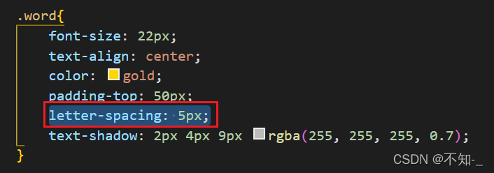
letter-spacing属性是增加(值为正)或减少(值为负)字符间距。
即当应用在英文时,就是增加或减少每个字母之间的间距;应用在中文文字中时就是每个汉字之间的间距。
2. css3 unset属性
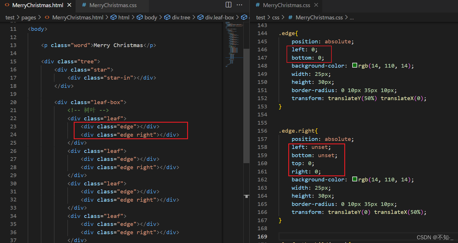
unset 关键字我们可以理解为不设置,其实,它是关键字initial和inherit的组合。
当我们给一个css属性设置了unset的话,可以分为两种情况:
- 如果这个属性本来有从父级继承的值(这个属性默认可以继承,且父级有定义),则将该属性重新设置为继承的值,类似于inherit
- 如果没有继承父级样式,则将该属性重新设置为初始值,类似于initial。
一般left和right在一个样式中只能使用一次,同时使用会出现兼容问题,当浏览器解释代码的时候发现left和right同时存在时,就会放弃解释right。(放弃解释后优先级就派不上用场了,即使优先级最高的!important也不会作用。)
要想解决上述的优先级问题,这里用unset重置就可解决问题。
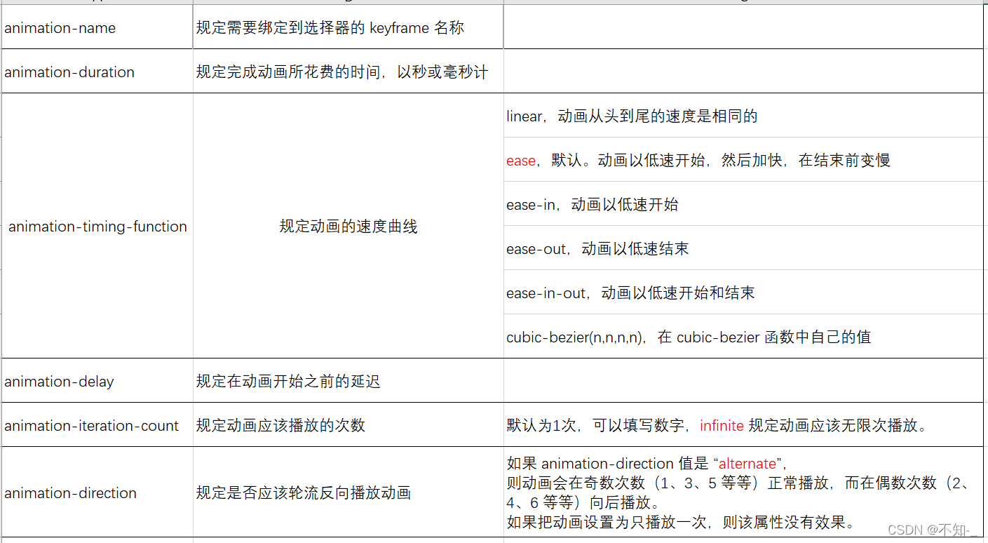
3. animation动画属性
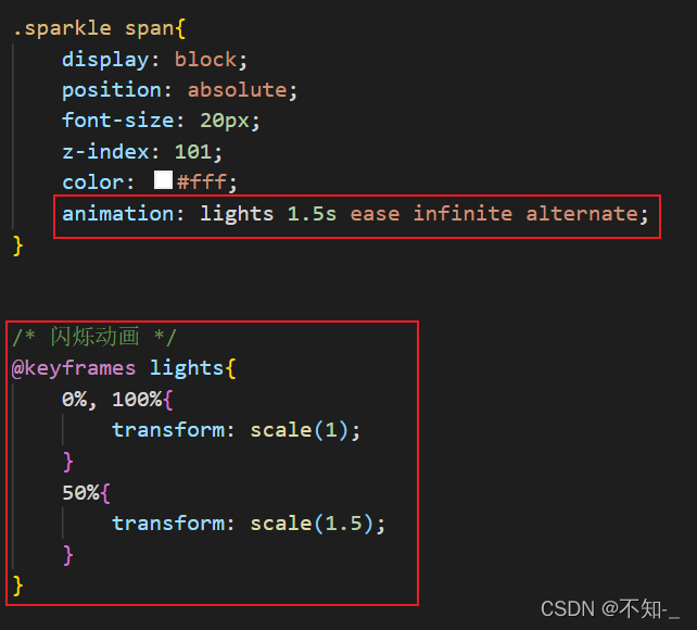
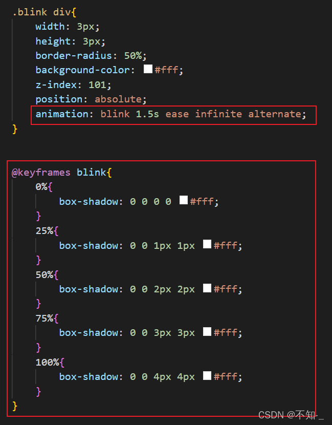
动画就是使元素从一种样式逐渐变化为另一种样式的效果。
创建动画的原理是,将一套 CSS 样式逐渐变化为另一套样式。在动画过程中我们能够多次改变这套 CSS 样式。以百分比来规定改变发生的时间,或者通过关键词 from 和 to,等价于 0% 和 100%。
语法:
animation: name duration timing-function delay iteration-count direction;


 扫一扫
扫一扫


 685
685

 被折叠的 条评论
为什么被折叠?
被折叠的 条评论
为什么被折叠?
 到【灌水乐园】发言


