


 本文介绍了如何利用Flex布局来制作筛子。主要步骤包括在ul元素上设置wrap属性,将li元素改为由div包裹,并调整相关样式。最终通过添加额外的li元素完成筛子的视觉效果。
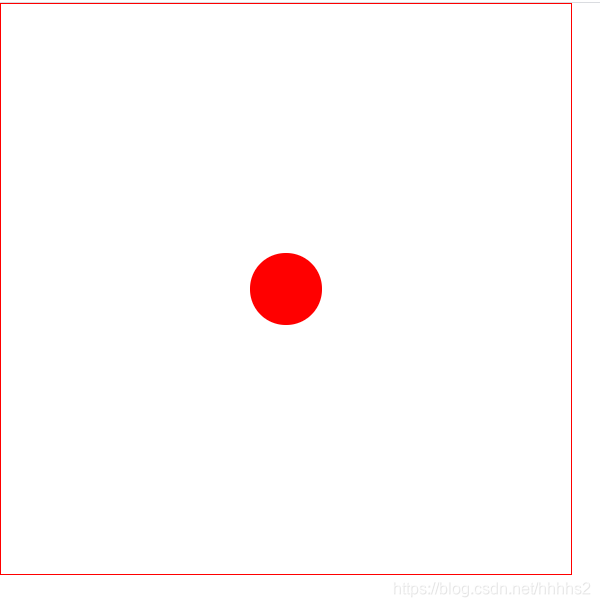
1点 wrap是ul上面的属性
    <div class="box">
 <ul class="wrap">

                <li>1点</li>
                  </ul>
  </ul>
</div>
  ul>li {
        display: block;
        width: 100px;
        height: 100px;
        background: red;
        margin: 10px;
        color: wheat;
        font-size: 22px;
        border-radius: 50%;
    }
  .wrap {
        display: flex;
        flex-direction: fow;
        flex-wrap: wrap;
        /* nowrap不换行 */
        justify-content: space-around;
        align-items: center;

    }
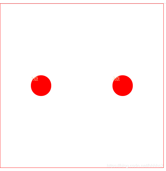
在div里面填加一个li
<div>
                <li>1点</li>
                <li>2点 </li>
</div>
  <li>1点</li>
<li>2点 </li>
 <li>3点</li>
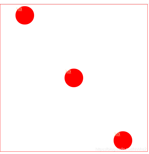
//左上角的圆点
  ul>li:nth-child(1) {
        align-self: flex-start;
        margin: 20px 0;


    }
//右下角的圆点
    ul>li:nth-child(3) {
        align-self: flex-end;
        margin: 0 0 20px 0;

    }
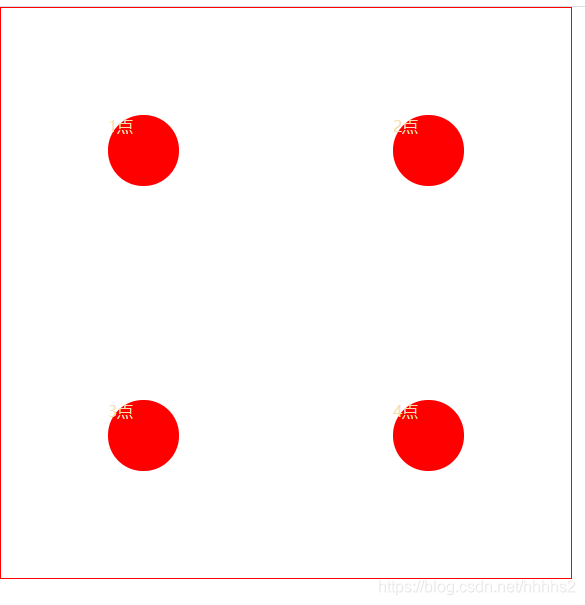
两个div包裹li
<div>
            <li>1点</li>
            <li>2点 </li>
        </div>
        <div>
            <li>3点</li>
            <li>3点</li>
        </div>
吧ul>li 变成ul>div>li 因为添加div了所以需要变换
//第一个盒子的属性
   ul>div:nth-child(1) {
        flex-basis: 100%;
        display: flex;
        justify-content: space-around;
    }
//第二个盒子的属性
    ul>div:nth-child(2) {
        flex-basis: 100%;
        display: flex;
        justify-content: space-around;
    }
//在两个div中间添加个div>li
 <div><li></li></div>
//添加第三个属性
 ul>div:nth-child(3) {
        flex-basis: 100%;
        display: flex;
        justify-content: space-around;
    }
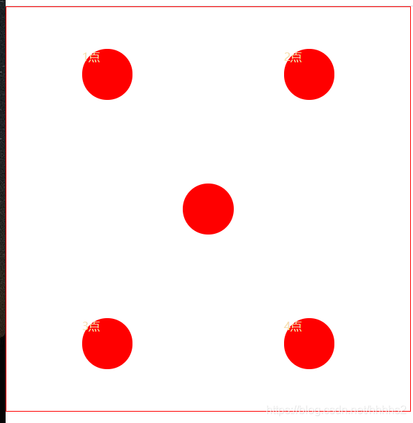
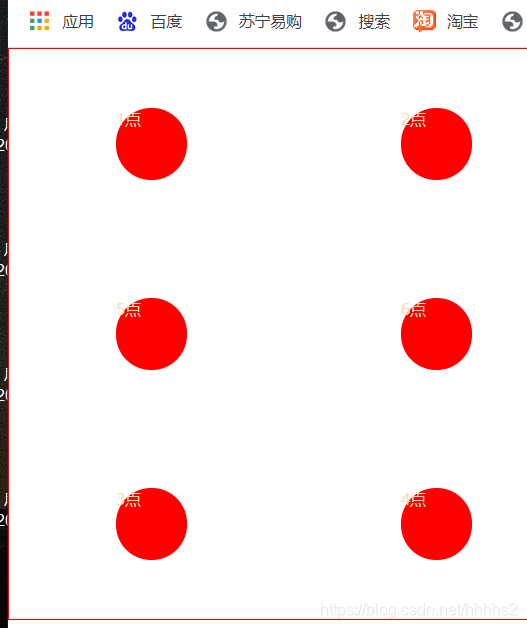
第六点在第五点上面添加一个li即可
 <div>
            <li>1点</li>
            <li>2点 </li>
        </div>
        <div>
            <li>5</li>
            <li>6点 </li>
        </div>
        <div>
            <li>3点</li>
            <li>4点</li>
        </div>
全部代码如下
<!DOCTYPE html>
<html lang="en">

<head>
    <meta charset="UTF-8">
    <meta http-equiv="X-UA-Compatible" content="IE=edge">
    <meta name="viewport" content="width=device-width, initial-scale=1.0">
    <title>Document</title>
</head>

<body>
    <div class="box">
        <ul class="wrap">
            <div>
                <li>1点</li>
                <li>2点 </li>
            </div>
            <div>
                <li>5</li>
                <li>6点 </li>
            </div>
            <div>
                <li>3点</li>
                <li>4点</li>
            </div>
        </ul>
    </div>
</body>
<style>
    * {
        padding: 0;
        margin: 0;
    }

    ul {
        width: 800px;
        height: 800px;
        border: 1px red solid;
        list-style: none;
    }

    ul>div>li {
        display: block;
        width: 100px;
        height: 100px;
        background: red;
        margin: 10px;
        color: wheat;
        font-size: 22px;
        border-radius: 50%;
    }

    /* 第三点左上角的点 */
    /* ul>li:nth-child(1) {
        align-self: flex-start;
        margin: 20px 0;


    }
   /* 第三点右下角的点 */
  /*   ul>li:nth-child(3) {
        align-self: flex-end;
        margin: 0 0 20px 0;

    } */
    ul>div:nth-child(1) {
        flex-basis: 100%;
        display: flex;
        justify-content: space-around;
    }

    ul>div:nth-child(2) {
        flex-basis: 100%;
        display: flex;
        justify-content: space-around;
    }

    ul>div:nth-child(3) {
        flex-basis: 100%;
        display: flex;
        justify-content: space-around;
    }

    .wrap {
        display: flex;
        flex-direction: fow;
        flex-wrap: wrap;
        /* nowrap不换行 */
        justify-content: space-around;
        align-items: center;

    }
</style>

</html>


 扫一扫
扫一扫


 1547
1547

 被折叠的 条评论
为什么被折叠?
被折叠的 条评论
为什么被折叠?
 到【灌水乐园】发言


