


CSS垂直居中
  <div id="box">

    <div id="content"></div>

  </div>
#box为父元素,#content为子元素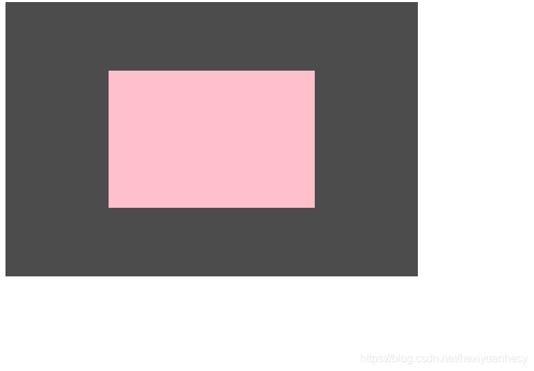
(1)位置+上下左右+margin:auto
父: position:relative
子: position:absolute; 上下左右为 0; margin:0;
  #box{ //父级div position:relative;

    width: 800px;

    height: 600px;

    background: grey;

    position: relative;

  }

  //子div position:absolute 上下左右设置为零,margin为auto
  #content{

    width: 50%;

    height: 50%;

    background:yellow;

    position: absolute;

    top: 0;

    right: 0;

    bottom: 0;

    left: 0;

    margin:auto;

  }
(2)位置+上右一半+margin上右一半=====================================
父: position:relative
子: position:absolute; 上右为 0; 上移右移自身宽高的一半(
1)已知具体宽高则可直接 margin设为负的宽高;
2)未知具体宽高则用 transform: translate(-50%,-50%)
);或者直接在上下左右中 calc() 算出移动距离
注意:calc() 属于表达式了,在css里少用表达式,在渲染的时候会特别慢,影响性能
#box{ //父级div position:relative;

    width: 800px;

    height: 600px;

    background: blue;

    position: relative; //父元素站定脚

  }

#content{ //或者 上左设置为50%,左右margin为宽高的一半

    width: 200px;

    height: 200px;

    background: #FFF;

    position: absolute; //子元素跳出来

    top: 50%; //从中心开始占位

    right: 50%;   //transform:translate(-50%, -50%)

    margin-top: -100px;   //transform:translateX(-50%) translateY(-50%); //上移自己的一半

    margin-right: -100px;  // -webkit-transform:translateX(-50%) translateY(-50%);

  }

直接用calc() 计算方法设置位置
#content{

    width: 200px;

    height: 200px;

    background: #FFF;

    position: absolute; //子元素跳出来

    top: calc(50% - 100px);

    right: calc(50% - 100px);

}
(3)弹性盒子====================================================
父:
display:flex;
justify-content: center;
align-items: center
#box {

  width:800px;

  height:600px;

  background:rgba(0,0,0,0.7);

  display:flex;

  display:-webkit-flex;

  justify-content:center; //内容对齐 居中

  align-items:center; //设置或检索弹性盒子元素在侧轴(纵轴)方向上的对齐方式。

}

#content {

  width:200px;

  height:500px;

  background:pink;

}
(5)table-cell 不常用 ==============================================
注意:父级元必须有固定宽高。
table-cell 作用在文本上,所以得将子元素设置为 inline-block 让其具有文本属性
#box {

  width:600px;

  height:400px;

  background:rgba(0,0,0,0.7);

  display: table-cell;
  vertical-align: middle;
   text-align: center;

}

#content {

  width:50%;

  height:50%;

  background:pink;

  display: inline-block

}
(5)js 代码实现 ==============================================
两列等高,左列固定宽度,右列宽度自适应
<div class="main">

    <div class="left"></div>

    <div class="right"></div>

</div>
(1) 采用弹性盒布局法 flex+右flex1 ================================
<style>

  .main{

    width: 100%;

    height: 600px;

    display: flex;

    }


  .left{

    width: 300px;

    height: 600px;

    border: 3px solid #FF1B79;

    }


.right{

    height: 600px;

    border: 3px solid #02A6E0;

    flex:1;

  }

</style>
(2)左浮动 + 右溢出隐藏 float:left overflow:hidden ================
 .main{

    width: 100%;

    height: 600px;

    }


  .left {

    background: yellow;

    width: 300px;

    float: left;

    height: 100%;

}

.right {

    overflow: hidden;

    background: green;

    height: 100%;

}


 扫一扫
扫一扫


 456
456

 被折叠的 条评论
为什么被折叠?
被折叠的 条评论
为什么被折叠?
 到【灌水乐园】发言


