


 本文主要介绍前端多列布局的实现方法,包括两列、三列、圣杯与双飞翼、均分布局及居中布局。详细阐述了不同布局的特点,如宽度固定或自适应、高度相等,并给出了float、overflow、flex等多种实现方式,还对比了圣杯与双飞翼布局的异同。
文章目录
文章参考
多列布局
两列布局
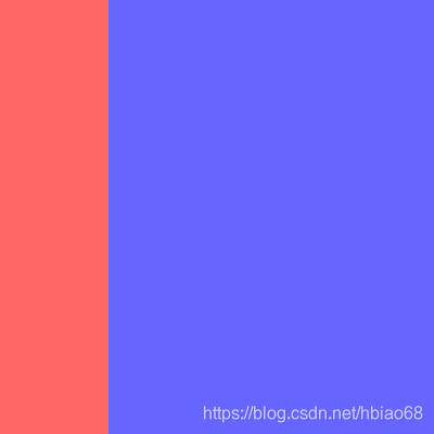
经典的两列布局由左右两列组成,其特点为一列宽度固定、另一列宽度自适应和两列高度固定且相等。以下以左列宽度固定和右列宽度自适应为例,反之同理。
<div class="two-column-layout">
    <div class="left"></div>
    <div class="right"></div>
</div>
float + margin-left/right 方法
左列声明float:left和固定宽度,由于float使节点脱流,右列需声明margin-left为左列宽度,以保证两列不会重叠。
.two-column-layout {
    width: 400px;
    height: 400px;
    .left {
        float: left;
        width: 100px;
        height: 100%;
        background-color: #f66;
    }
    .right {
        margin-left: 100px;
        height: 100%;
        background-color: #66f;
    }
}
overflow + float 方法
左列声明同上,右列声明overflow:hidden使其形成BFC区域与外界隔离。
bfc的区域不会与float的元素区域重叠。 (文字环绕, 列布局)
.two-column-layout {
    width: 400px;
    height: 400px;
    .left {
        float: left;
        width: 100px;
        height: 100%;
        background-color: #f66;
    }
    .right {
        overflow: hidden;
        height: 100%;
        background-color: #66f;
    }
}
flex 方法
使用flex实现会更简洁。左列声明固定宽度,右列声明flex:1自适应宽度
.two-column-layout {
    display: flex;
    width: 400px;
    height: 400px;
    .left {
        width: 100px;
        background-color: #f66;
    }
    .right {
        flex: 1;
        background-color: #66f;
    }
}
三列布局
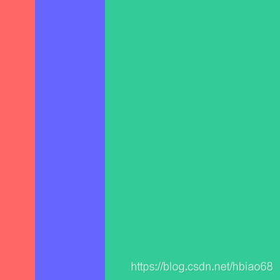
经典的三列布局由左中右三列组成,其特点为连续两列宽度固定、剩余一列宽度自适应和三列高度固定且相等。以下以左中列宽度固定和右列宽度自适应为例,反之同理。整体的实现原理与上述两列布局一致。
<div class="three-column-layout">
    <div class="left"></div>
    <div class="center"></div>
    <div class="right"></div>
</div>
overflow + float 方法
.three-column-layout {
    width: 400px;
    height: 400px;
    .left {
        float: left;
        width: 50px;
        height: 100%;
        background-color: #f66;
    }
    .center {
        float: left;
        width: 100px;
        height: 100%;
        background-color: #66f;
    }
    .right {
        overflow: hidden;
        height: 100%;
        background-color: #3c9;
    }
}
flex 方法
.three-column-layout {
    display: flex;
    width: 400px;
    height: 400px;
    .left {
        width: 50px;
        background-color: #f66;
    }
    .center {
        width: 100px;
        background-color: #66f;
    }
    .right {
        flex: 1;
        background-color: #3c9;
    }
}
圣杯布局 && 双飞翼布局
经典的圣杯布局和双飞翼布局都是由左中右三列组成,其特点为左右两列宽度固定、中间一列宽度自适应和三列高度固定且相等。
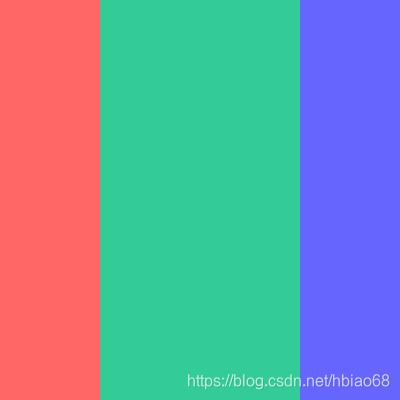
相同点 & 不同点
- 相同
*. 中间列放首位且声明其宽高占满父节点
*. 被挤出的左右列使用float和margin负值将其拉回与中间列处在同一水平线上 - 不同
*. 圣杯布局:父节点声明padding为左右列留出空位,将左右列固定在空位上
*. 双飞翼布局:中间列插入子节点并声明margin为左右列让出空位,将左右列固定在空位上
圣杯布局
主要是通过padding 来预留左右两边的位置,然后使用左右浮动,设置margin为负值,进入到 padding 区域中
<div class="grail-layout-x">
    <div class="left"></div>
    <div class="right"></div>
    <div class="center"></div>
</div>
.grail-layout-x {
    padding: 0 100px;
    width: 400px;
    height: 400px;
    .left {
        float: left;
        margin-left: -100px;
        width: 100px;
        height: 100%;
        background-color: #f66;
    }
    .right {
        float: right;
        margin-right: -100px;
        width: 100px;
        height: 100%;
        background-color: #66f;
    }
    .center {
        height: 100%;
        background-color: #3c9;
    }
}
双飞翼布局
左右两边浮动,中间使用 margin: 0 两边距离 来预留出来
<div class="grail-layout-y">
    <div class="left"></div>
    <div class="right"></div>
    <div class="center">
        <div></div>
    </div>
</div>
.grail-layout-y {
    width: 400px;
    height: 400px;
    .left {
        float: left;
        width: 100px;
        height: 100%;
        background-color: #f66;
    }
    .right {
        float: right;
        width: 100px;
        height: 100%;
        background-color: #66f;
    }
    .center {
        margin: 0 100px;
        height: 100%;
        background-color: #3c9;
    }
}
圣杯布局/双飞翼布局 flex
<div class="grail-layout">
    <div class="left"></div>
    <div class="center"></div>
    <div class="right"></div>
</div>
.grail-layout {
    display: flex;
    width: 400px;
    height: 400px;
    .left {
        width: 100px;
        background-color: #f66;
    }
    .center {
        flex: 1;
        background-color: #3c9;
    }
    .right {
        width: 100px;
        background-color: #66f;
    }
}
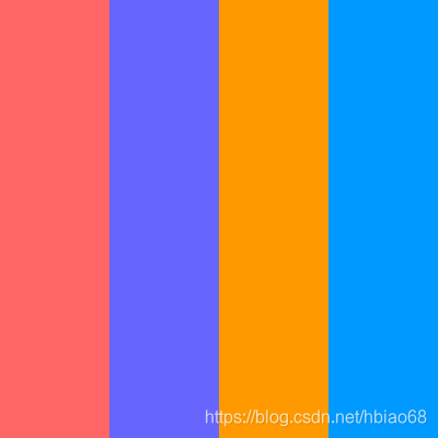
均分布局
经典的均分布局由多列组成,其特点为每列宽度相等和每列高度固定且相等
<div class="average-layout">
    <div class="one"></div>
    <div class="two"></div>
    <div class="three"></div>
    <div class="four"></div>
</div>
.one {
    background-color: #f66;
}
.two {
    background-color: #66f;
}
.three {
    background-color: #f90;
}
.four {
    background-color: #09f;
}
float + width 方法
.average-layout {
    width: 400px;
    height: 400px;
    div {
        float: left;
        width: 25%;
        height: 100%;
    }
}
flex 方法
.average-layout {
    display: flex;
    width: 400px;
    height: 400px;
    div {
        flex: 1;
    }
}
居中布局
居中布局由父容器与若干个子容器组成,子容器在父容器中横向排列或竖向排列且呈水平居中或垂直居中。
此直接上一个目前最简单最高效的居中方式。display:flex与margin:auto的强行组合,
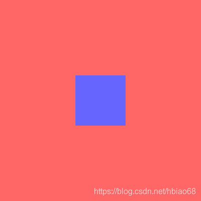
<div class="center-layout">
    <div></div>
</div>
.center-layout {
    display: flex;
    width: 400px;
    height: 400px;
    background-color: #f66;
    div {
        margin: auto;
        width: 100px;
        height: 100px;
        background-color: #66f;
    }
}


 扫一扫
扫一扫


 2980
2980

 被折叠的 条评论
为什么被折叠?
被折叠的 条评论
为什么被折叠?
 到【灌水乐园】发言


