


 本文介绍了使用Python进行数据可视化的方法,包括如何添加图例并调整其位置,以及如何移动坐标轴来改善图表的可读性。
转自:https://blog.youkuaiyun.com/lishangyin88/article/details/80260957
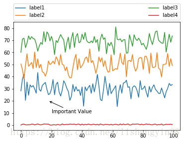
1.图例的添加
- import pandas as pd
- import numpy as np
- import matplotlib.pyplot as plt
- import matplotlib
- %matplotlib inline
- data1=np.random.normal(30,5,100)
- data2=np.random.normal(50,6,100)
- data3=np.random.normal(70,5,100)
- data4=np.random.rand(100)
- plt.plot(data1,label='label1')
- plt.plot(data2,label='label2')
- plt.plot(data3,label='label3')
- plt.plot(data4,label='label4')
- #bbox_to_anchor用于定位标签的位置和大小。前两个数值表示标签左下角的坐标,后两个表示标签的长度和高度
- #ncol表示标签有几列,loc表示位置0表示最合适。mode 表示是水平填充坐标轴区域,
- #borderaxespad一般为默认,表示图利与坐标轴区域的空间。
- plt.legend(bbox_to_anchor=(0,1.02,1,0),ncol=2,loc=0,mode='expand',borderaxespad=0)
- #xy表示指向的位置坐标,xytext表示注释文本框的左下角的坐标。
- plt.annotate('Important Value',xy=(18,20),xytext=(20,10),arrowprops=dict(arrowstyle='->'))
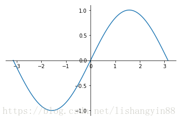
2.坐标轴的移动
- x=np.linspace(-np.pi,np.pi,500,endpoint=True)
- y=np.sin(x)
- plt.plot(x,y)
- ax=plt.gca()
- #spines是指连接坐标轴的线,一共有上下左右四个。top/bottom/right/left
- #上面的和右面的设置成无色
- ax.spines['right'].set_color('none')
- ax.spines['top'].set_color('none')
- #把下面的和左面的线设置成(0,0)
- ax.spines['bottom'].set_position(('data',0))
- ax.spines['left'].set_position(('data',0))
- ax.xaxis.set_ticks_position('bottom')
- #设置刻度间隔是0.5的倍数。这里要注意引入matplotlib.
- ax.yaxis.set_major_locator(matplotlib.ticker.MultipleLocator(0.5))
- ax.ylim=(-1,1)


 1818
1818

 被折叠的 条评论
为什么被折叠?
被折叠的 条评论
为什么被折叠?
 到【灌水乐园】发言


