


 本文详细介绍Echarts中柱状图的配置与使用,包括标签式引入、图表位置调整、X轴与Y轴数据设置、图例导航栏、提示框组件、数据显示优化及事件处理。涵盖从基础设置到高级应用的全面指南。
Echarts图表(主要介绍柱状图)
标签式引入Eharts 如果你把引用echarts的script标签放置head内在IE8-的浏览器中会出现报错,解决的办法就是把标签移动到body内(后)
<script src="http://echarts.baidu.com/dist/echarts.min.js"></script>
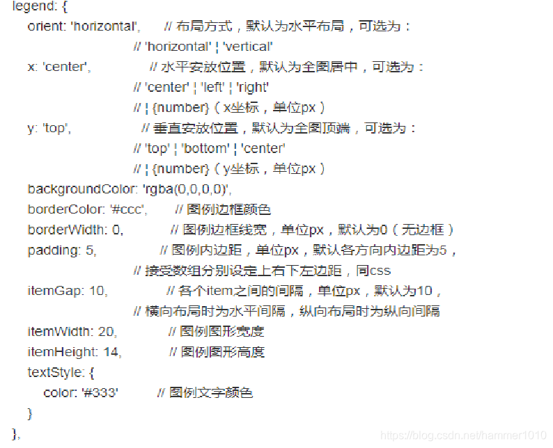
1.legend 标题导航栏
legend

legend: {
       orient: 'vertical',//标题竖着排      图例列表的布局朝向。  'horizontal'如上图横着
       itemGap:18,
       x: 'left',  //左边排布
       top:'20%',  //距离图表上边距
       left:'50%',
       textStyle:{
           color:'white',
       },
       data:bqlx
   },
可参照echarts官方文档
2.整个图表所在区域显示位置
grid
	grid:{ //图形位移
        left: 55,
        right:55,
        top:40,
        bottom:20,
    },


xAxis  X轴显示数据
yAxis  Y轴显示数据
3.xAxis相应设置 X轴
1______xAxis.axisTick ////是否显示刻度线
2______xAxis.axisLabel: {//坐标轴刻度标签的相关设置 …省略号
3______xAxis.axisLabel 文字过多换行


	xAxis:  {
        type: 'category'  //坐标轴类型。正常显示,
    },
    yAxis: {
        type: 'value',
    },
柱状图正常显示  要想图表旋转90   type值对换即可!!!!


2.//省略号。。。
			xAxis: {
                data: ["衬衫11111","羊毛衫111","雪纺衫111","裤子111","高跟鞋11","袜子111"],//x轴中的数据
                nameLocation:'middle',
                axisLabel : {
                    clickable:true,//并给图表添加单击事件  根据返回值判断点击的是哪里
                    interval : 0,
                    formatter : function(params){
                        var newParamsName = "";
                        var paramsNameNumber = params.length;
                        var provideNumber = 3;
//                            var rowNumber = Math.ceil(paramsNameNumber / provideNumber);
                        if (paramsNameNumber > provideNumber) {
                            var tempStr = "";

                            tempStr = params.substring(0, provideNumber);
                            newParamsName = tempStr+"..."


                        } else {
                            newParamsName = params;
                        }
                        return newParamsName
                    }

                }
            },

3.文字过多换行
	axisLabel:{
          formatter:function(val){
            var strs = val.split(''); //字符串数组
            var str = ''
            for (var i = 0, s; s = strs[i++];) { //遍历字符串数组
                str += s;
                if (!(i % 4)) str += '\n';
            }
            return str
          }
        }


axisLine: {  //坐标轴轴线相关设置。
       lineStyle: {
           type: 'solid',
           color: 'white',//坐边线的颜色
           width:'2'//坐标线的宽度
       }
   },

axisTick:{
	show:true,  //是否显示刻度线
     inside:{                  //刻度线显示里面
         show:true    //x轴刻度线里面 显示
     }
   },
4.yAxis.splitLine 区域中的分隔线。
yAxis.splitLine
    splitLine:{
       show: true,
       lineStyle: {
             type: 'dashed', //虚线显示
             color: '#42416f',//坐边线的颜色
             width:'1'//坐标线的宽度
         }
     },
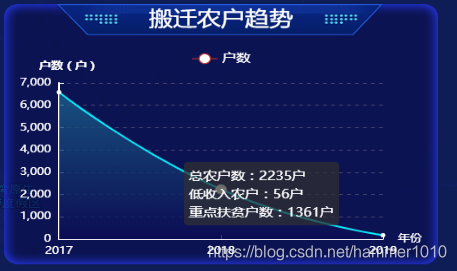
5.tooltip 提示框组件。 (回调)
tooltip
    tooltip: {
        trigger: 'axis', //触发类型。
        formatter:function(params){  //回调函数
            return '各专项拨付进度:'+"<br>"+params[1].name+":"+params[2].data*100 + "%"
        },
        axisPointer: {
            type: 'shadow'  //指示器类型。
        }
      },
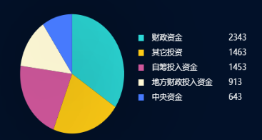
6.series系列列表。
==》echartsLineArea3.clear(); //***清除之前的数据***
每个系列通过 type 决定自己的图表类型
	series[
	    //传入数据在图表中不显示  回调可用
		{
         name:'重点扶贫户数',
          type:'line',
           symbolSize: 0, // symbol的大小设置为0
          itemStyle: {normal: {
              lineStyle:{
                  color: 'rgba(0, 0, 0, 0)', // 线的颜色是透明的
                  width:'0'
              }
          }
          },
          data:zdfphs
      },
	]

	echartsLineArea3.clear();  //***`清除之前的数据`***
    echartsLineArea3.setOption(optionLineArea3);
7.玫瑰图与饼图转换
玫瑰图在series添加一个属性即可
roseType: ‘radius’, 玫瑰图
series:[{
roseType: ‘radius’,
}]

8.echarts图表点击事件________x轴,y轴,图表都可以
echarts bar yAxis xAxis加点击事件
适用于echarts3
只需要在 yAxis或者xAxis里添加triggerEvent:true 既可
	var echartsLineArea2 = echarts.init(document.getElementById('center1'));
    var optionLineArea2 = {...}

	echartsLineArea2.hideLoading();    //隐藏加载动画
    echartsLineArea2.setOption(optionLineArea2);//加载数据图表

    echartsLineArea2.on('click', function (param){
      //y轴点击事件
      if(param.componentType =="yAxis"){
      //适用于echarts3
      //只需要在 yAxis或者xAxis里添加triggerEvent:true 既可
       		 consol.log("y轴点击事件")
        }
	//sever点击事件
	consol.log("sever点击事件")

    });
9.数据柱状图内显示
series.label

	label: {
            normal: {
                show: true,
                position: 'insideRight'
            }
        },
最后来个实例,数据多条可滚动
function fbData1(max,data,val,valjia){

    var echartsLineArea2 = echarts.init(document.getElementById('left1'));

    var optionLineArea2 = {
      tooltip: {
        trigger: 'axis',
        formatter:function(params){
          console.log(params)
            return '各专项拨付进度:'+"<br>"+params[1].name+":"+params[2].data*100 + "%"
        },
        axisPointer: {
            type: 'shadow'
        }
      },

      title: { //标题组件,包含主标题和副标题
        text: '',
        subtext: ''
      },
      grid: { //直角坐标系内绘图网格
        top: 5,//grid 组件离容器上侧的距离
        bottom: 50,//grid 组件离容器下侧的距离
        left: 200,//grid 组件离容器左侧的距离
        right: 50 //grid 组件离容器右侧的距离
      },
      calculable: true,//是否显示手柄
      yAxis: [{
        type: 'category',//坐标轴类型 'category' 类目轴,适用于离散的类目数据,为该类型时必须通过 data 设置类目数据
        data: data,
        axisTick:{
          show:false
        },
        axisLabel: {//坐标轴刻度标签的相关设置
          interval:0,
          margin:200,
          show: false,
          textStyle: {
            align:'left',
            baseline:'middle',
            color: '#e2ecff', //刻度标签文字的颜色
            fontSize:16
          },
          interval: 0 //坐标轴刻度标签的显示间隔,在类目轴中有效
        },
        axisLine: { //x轴  坐标轴轴线相关设置
          show: false,
          lineStyle: {
            type: 'solid',//坐标轴线线的类型
            color: '#19214e', // 坐标轴线线的颜色
            width: '0' //坐标线的宽度
          }
        }
      }],
      xAxis: [{
        name: '',
        type: 'value',
        show: false,
        axisLine: { //x轴  坐标轴轴线相关设置
          show: false,
          lineStyle: {
            type: 'solid',//坐标轴线线的类型
            color: 'white', // 坐标轴线线的颜色
            width: '0' //坐标线的宽度
          }
        },
        axisTick:{
          show:false,
          inside:{
              show:false //x轴刻度线
          }
        },
        splitLine:{
                show: false,
                lineStyle: {
                      type: 'solid',
                      color: '#18214e',//坐边线的颜色
                      width:'0'//坐标线的宽度
                  }
              },
        axisLabel: {//坐标轴刻度标签的相关设置
          show: false,
          textStyle: {
            color: '#e2ecff', //刻度标签文字的颜色
            fontSize:16
          }
        },
      }],

      series: [
         {
          type: 'bar',
          itemStyle: {
              normal: {
                  barBorderRadius:20,
                  color: '#303e8c'
              }
          },
          silent: true,
          barWidth: 20,
          barGap: '-100%', // Make series be overlap
          data: max
        },
        {
          name: '各专项拨付进度',//系列名称,用于tooltip的显示,legend 的图例筛选,在 setOption 更新数据和配置项时用于指定对应的系列
          type: 'bar',
          barWidth: '20',//柱条的宽度
          stack: '总量',//数据堆叠
          itemStyle: { //图形样式
            barBorderRadius:20,
            normal: {
              barBorderRadius:20,
              color: '#457aff'//柱条的颜色
            }
          },
          data: valjia
        },
        //传输图表不显示内容,   用于回调弹框显示
        {
            name:'',
            type:'bar',
             symbolSize: 0, // symbol的大小设置为0
            itemStyle: {normal: {
                lineStyle:{
                    color: 'rgba(0, 0, 0, 0)', // 线的颜色是透明的
                    width:'0'
                }
            }
            },
            data:val
          },
      ]
    };

	//echartsLineArea2.clear(); 清除之前的数据


    echartsLineArea2.hideLoading();    //隐藏加载动画
    echartsLineArea2.setOption(optionLineArea2);//加载数据图表

    //echarts 数据多可滚动
    let chartName = this.echarts.init(document.getElementById('left1'));
      this.autoHeight = val.length * 55 + 20; // .length为柱状图的条数,即数据长度。35为我给每个柱状图的高度,50为柱状图x轴内容的高度(大概的)。
      chartName.getDom().style.height = this.autoHeight + "px";
      chartName.getDom().childNodes[0].style.height = this.autoHeight + "px";
      chartName.getDom().childNodes[0].childNodes[0].setAttribute("height",this.autoHeight);
      chartName.getDom().childNodes[0].childNodes[0].style.height = this.autoHeight + "px";
      chartName.resize();

  }

fbData1(["1.08", "1.08", "1.08", "1.08", "1.08", "1.08", "1.08"],["规模种粮补贴资金", "渔业转型升级资金", "畜牧业转型升级资金", "农业绿色发展示范资金", "省级现代农业园区建设资金", "历史文化村落保护利用资金", "专项扶贫资金"],["0.05", "1.08", "0.23", "0.00", "0.03", "0.00", "0.00"],["0.05", "1.09", "0.23", "0.00", "0.03", "0.00", "0.00"])
效果展示


 5940
5940

 被折叠的 条评论
为什么被折叠?
被折叠的 条评论
为什么被折叠?
 到【灌水乐园】发言


