


 博客介绍了多种CSS图形实现方法,包括使用border - radius实现椭圆,transform实现平行四边形,rotate实现菱形,还有切角效果、梯形标签页等,还提到3D变形内部效应不可逆转,以及简单饼图的实现。
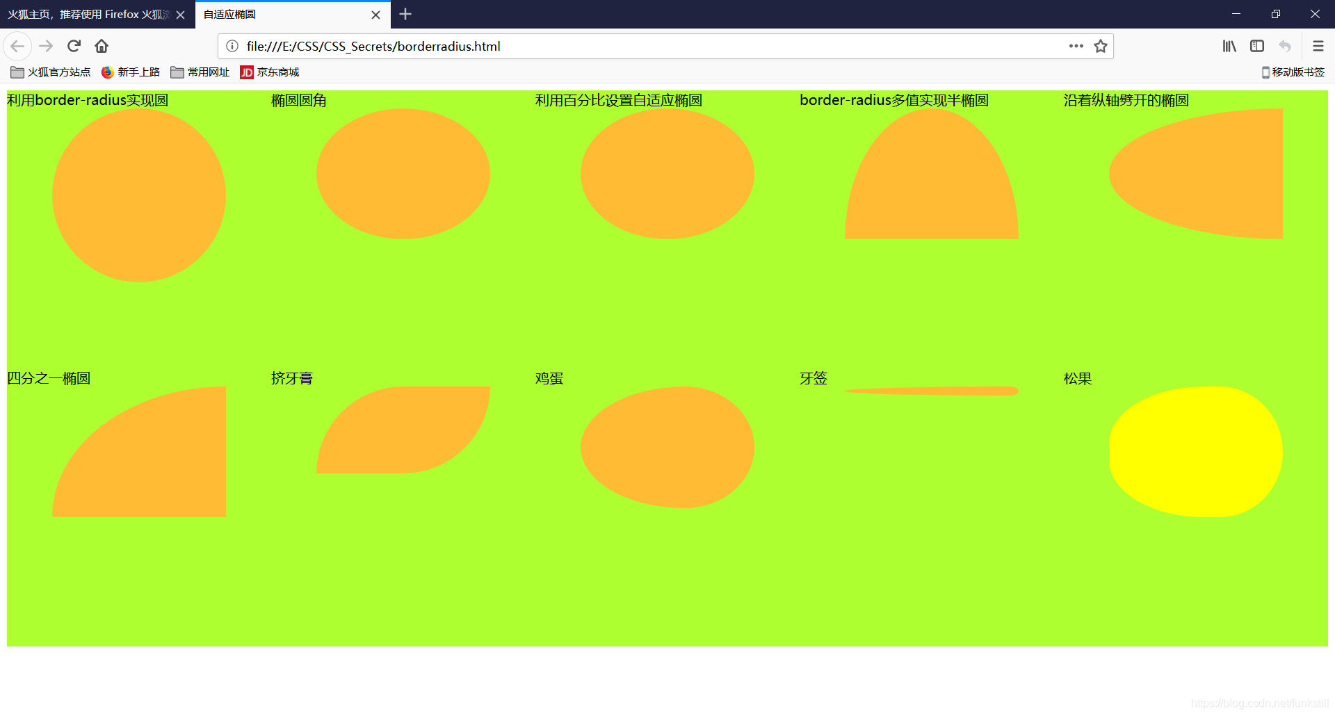
border-radius应用(椭圆等)
<!DOCTYPE html>
<html>
    <head>
        <meta charset="utf-8">
        <title>自适应椭圆</title>
        <style>
            .container {
                width: 20%;
                height: 320px;
                float: left;
                background: greenyellow;
            }
            .test {
                width: 200px;
                height:150px;
                margin: auto;
                top: 0; left: 0; bottom: 0; right: 0;
            }
            /*圆*/
            #image {
                height: 200px;
                background: #fb3;
                border-radius: 100px;
            }
            /*椭圆圆角*/
            #image1 {
                background: #fb3;
                border-radius: 100px / 75px;/*水平直径和垂直直径*/
            }
            /*利用百分比设置自适应椭圆*/
            #image2 {
                background: #fb3;
                border-radius: 50%;
            }
            /*border-radius多值实现半椭圆*/
            #image3 {
                background: #fb3;
                /*如果我们传给它四个值, 这四个值就会被分别从左上角开始
                以顺时针顺序应用到元素的各个拐角。 如果我们提供的值少于
                四个, 则它们会以 CSS 的常规方式重复, 类似于 borderwidth
                的值。 如果只提供了三个值, 则意味着第四个值与第二值相同;
                如果只有两个值, 则意味着第三个值与第一个相同。 */
                border-radius: 50% / 100% 100% 0 0;
            }
            /*沿着纵轴劈开的椭圆*/
            #image4 {
                background: #fb3;
                border-radius: 100% 0 0 100% / 50%;
            }
            /*四分之一椭圆*/
            #image5 {
                background: #fb3;
                border-radius: 100% 0 0 0;
            }
            /*挤牙膏*/
            #image6 {
                height: 100px;
                background: #fb3;
                border-radius: 100px 0 100px 0
            }
            /*鸡蛋*/
            #image7 {
                height: 140px;
                background: #fb3;
                border-radius:60% 40% 40% 60% / 50%
            }
            /*牙签*/
            #image8 {
                height: 10px;
                background: #fb3;
                border-radius: 95% 5% 5% 95% / 50%;
            }
            /*柠檬*/
            #image9 {
                background: yellow;
                height: 140;
                border-radius:60% 40% 40% 60% / 48% 55% 55% 48%;
            }
        </style>
    </head>
    <body>
        <div class="container">利用border-radius实现圆
            <div class="test" id="image"></div>
        </div>
        <div class="container">椭圆圆角
            <div class="test" id="image1"></div>
        </div>
        <div class="container">利用百分比设置自适应椭圆
            <div class="test" id="image2"></div>
        </div>
        <div class="container">border-radius多值实现半椭圆
            <div class="test" id="image3"></div>
        </div>
        <div class="container">沿着纵轴劈开的椭圆
            <div class="test" id="image4"></div>
        </div>
        <div class="container">四分之一椭圆
            <div class="test" id="image5"></div>
        </div>
        <div class="container">挤牙膏
            <div class="test" id="image6"></div>
        </div>
        <div class="container">鸡蛋
            <div class="test" id="image7"></div>
        </div>
        <div class="container">牙签
            <div class="test" id="image8"></div>
        </div>
        <div class="container">松果
            <div class="test" id="image9"></div>
        </div>
    </body>
</html>
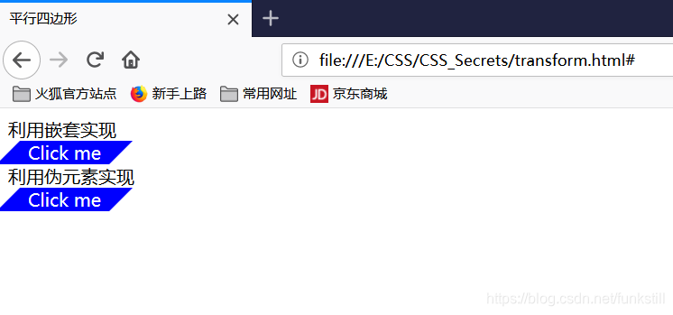
transform(平行四边形)
<!DOCTYPE html>
<html>
    <head>
        <meta charset="utf-8">
        <title>平行四边形</title>
        <style>
            .button1 {
                background: blue;
                width: 100px;
                text-align: center;
                color: white;
                text-decoration: none;

                display: block;
                transform: skewX(-45deg);/*整体倾斜*/
            }
            .button1 > div {
                transform: skewX(45deg);/*将文字扶正*/
            }
            .button2 {
                width: 100px;
                text-align: center;
                text-decoration: none;
                display: block;
                color: white;

                position: relative;
            }
            .button2::before {
                content: '';/*用伪元素说生成矩形,此处一定要有*/
                position: absolute;
                top:0;right:0;bottom: 0;left: 0;
                background: blue;
                z-index: -1;
                transform: skewX(-45deg);
            }
        </style>
    </head>
    <body>
        利用嵌套实现
        <a href="#" class="button1">
            <div>Click me</div>
        </a>
        利用伪元素实现
        <a href="#" class="button2">Click me</a>
    </body>
</html>
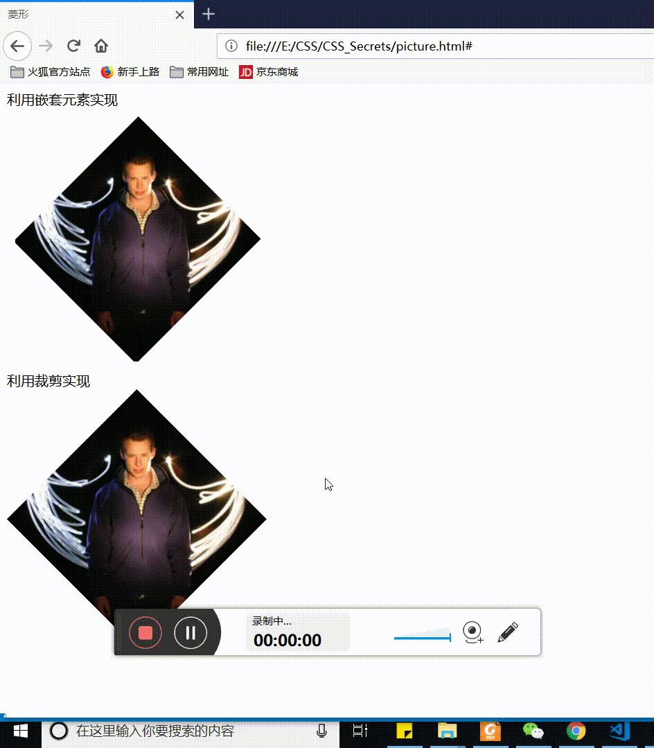
菱形(rotate)
<!DOCTYPE html>
<html>
    <head>
        <meta charset="utf-8">
        <title>菱形</title>
        <style>
            .picture {
                margin: 50px;
                width: 200px;
                transform: rotate(45deg);
                overflow: hidden;
            }
            .picture >img {
                max-width: 100%;
                transform: rotate(-45deg) scale(1.42);/*对图片放大,防止出现八边形*/
            }

            .picture2 {
                clip-path: polygon(50% 0,100% 50%,50% 100%,0 50%);
                transition: 1s clip-path;
            }
            .picture2:hover {
                clip-path: polygon(0 0,100% 0,100% 100%,0 100%);
            }
        </style>
    </head>
    <body>
        利用嵌套元素实现
        <div class="picture">
            <img src="../images/dunstan.jpg" alt="...">
        </div>
        利用裁剪实现<br>
        <img class="picture2" src="../images/dunstan.jpg" alt="...">
    </body>
</html>
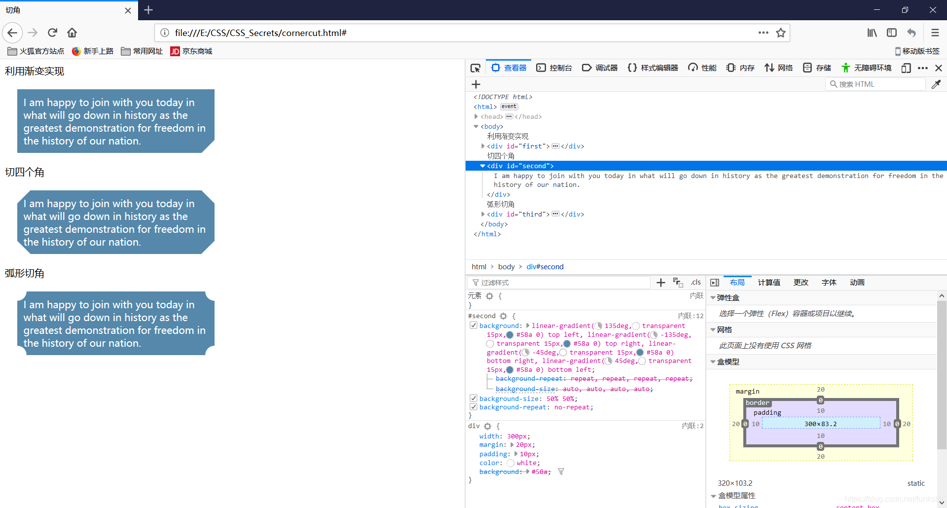
切角效果
<!DOCTYPE html>
<html>
    <head>
        <meta charset="utf-8">
        <title>切角</title>
        <style>
            div {
                width: 300px;
                margin: 20px;
                padding: 10px;
                color: white;
                background: #58a;
            }
            #first {
                background: linear-gradient(-45deg,transparent 15px,#58a 0);
            }
            #second {
                background: linear-gradient(135deg,transparent 15px,#58a 0) top left,
                            linear-gradient(-135deg,transparent 15px,#58a 0) top right,
                            linear-gradient(-45deg,transparent 15px,#58a 0) bottom right,
                            linear-gradient(45deg,transparent 15px,#58a 0) bottom left;
                background-size: 50% 50%;
                background-repeat: no-repeat;
            }
            #third {
                background: radial-gradient(circle at top left,transparent 15px,#58a 0) top left,
                            radial-gradient(circle at top right,transparent 15px,#58a 0) top right,
                            radial-gradient(circle at bottom right,transparent 15px,#58a 0) bottom right,
                            radial-gradient(circle at bottom left,transparent 15px,#58a 0) bottom left;
                background-size: 50% 50%;
                background-repeat: no-repeat;
            }
        </style>
    </head>
    <body>
        利用渐变实现
        <div id="first">
            I am happy to join with you today in what will go down in history as the greatest demonstration for freedom in the history of our nation.
        </div>
        切四个角
        <div id="second">
            I am happy to join with you today in what will go down in history as the greatest demonstration for freedom in the history of our nation.
        </div>
        弧形切角
        <div id="third">
            I am happy to join with you today in what will go down in history as the greatest demonstration for freedom in the history of our nation.
        </div>
    </body>
</html>
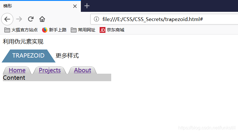
梯形标签页
对元素使用了 3D变形之后, 其内部的变形效应是“不可逆转”的。
<!DOCTYPE html>
<html>
    <head>
        <meta charset="utf-8">
        <title>梯形</title>
        <style>
            div {
                margin: 10px;
            }
            #first {
                position: relative;
                display: inline-block;
                padding: .5em 1em .35em;
                color: white;
            }
            #first::before{
                content: '';
                position: absolute;
                top:0;right: 0;bottom: 0;left: 0;
                z-index: -1;
                background: #58a;
                transform: perspective(.5em) rotateX(5deg);
            }
            nav > a {
                position: relative;
                display: inline-block;
                padding: .3em 1em 0;
            }
            nav > a::before {
                content: '';
                position: absolute;
                top:0;right: 0;bottom: 0;left: 0;
                z-index: -1;
                background: #ccc;
                background-image: linear-gradient(hsla(0,0%,100%,.6),hsla(0,0%,100%,0));
                border: 1px solid rgba(0, 0,0, .4);
                border-bottom: none;
                border-radius: .5em .5em 0 0;
                box-shadow: 0 .15em white inset;
                transform: perspective(.5em) rotateX(5deg);
                transform-origin: bottom;
            }
            #content {
                background: #ccc;
                margin: 0;
                width: 300px;
            }
        </style>
    </head>
    <body>
        利用伪元素实现<br>
        <div id="first">TRAPEZOID</div>
        更多样式<br>
        <nav>
            <a href="#">Home</a>
            <a href="#">Projects</a>
            <a href="#">About</a>
            <div id="content">Content</div>
        </nav>
    </body>
</html>
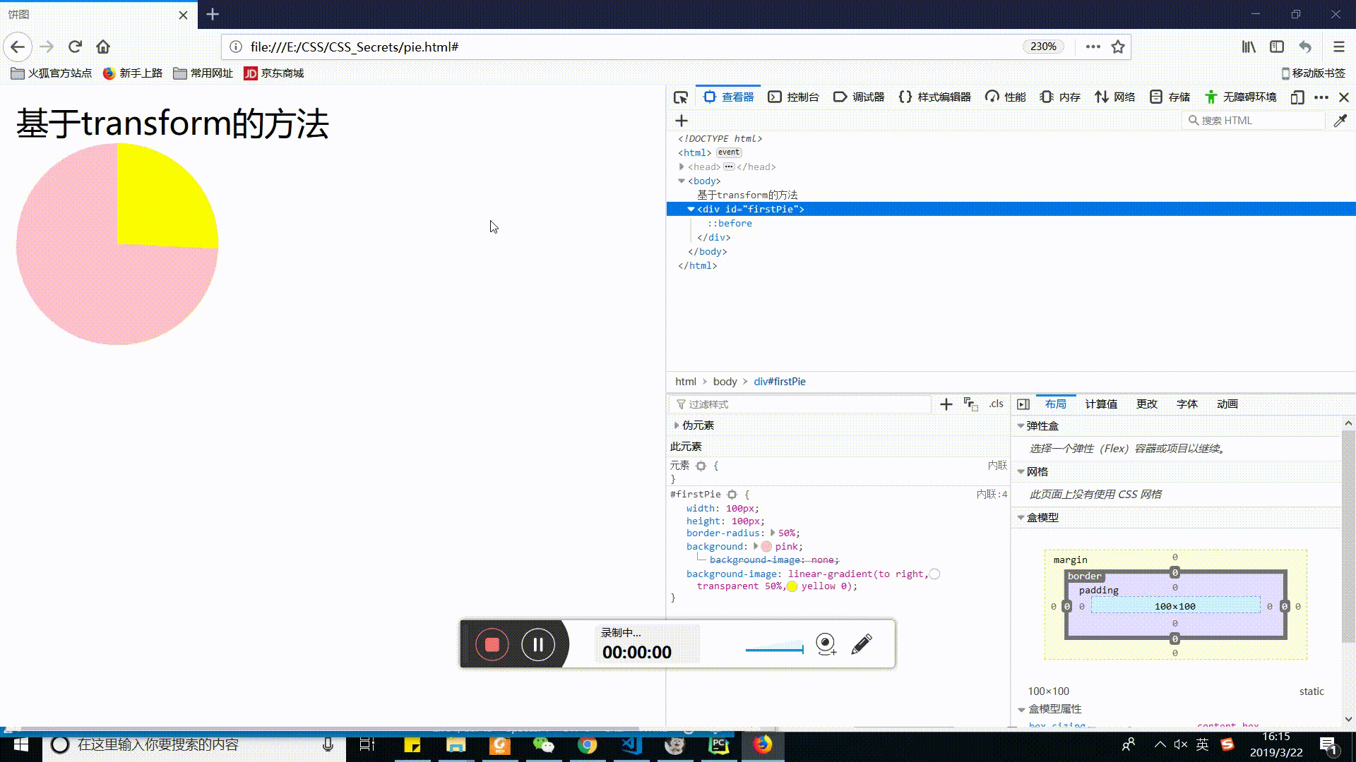
简单的饼图
<!DOCTYPE html>
<html>
    <head>
        <meta charset="utf-8">
        <title>饼图</title>
        <style>
            /*把圆形的左右两部分指定为两种颜色, 然后用伪元素覆盖上去,
            通过旋转来决定露出多大的扇区。*/
            #firstPie {
                width: 100px;height: 100px;
                border-radius: 50%;
                background: pink;
                /*渐变实现右半圆颜色*/
                background-image: linear-gradient(to right,transparent 50%,yellow 0);
            }
            #firstPie::before {
                /*利用伪元素遮盖右边圆*/
                content: '';
                display: block;
                margin-left: 50%;
                height: 100%;
                border-radius: 0 100% 100% 0 / 50%;
                background-color: inherit;/*继承宿主颜色*/
                transform-origin: left;
                animation: spin 3s linear infinite,
                           bg 6s step-end infinite;
            }
            @keyframes spin {
                to {
                    transform: rotate(.5turn);
                }
            }
            @keyframes bg {
                50% {/*当大于50%切换遮盖颜色*/
                    background: yellow;
                }
            }
        </style>
    </head>
    <body>
        基于transform的方法
        <div id="firstPie"></div>
    </body>
</html>


 扫一扫
扫一扫


 3918
3918

 被折叠的 条评论
为什么被折叠?
被折叠的 条评论
为什么被折叠?
 到【灌水乐园】发言


