


 本文介绍如何使用QML实现自定义加载动画,包括创建不同颜色的圆形、设置边框及渐变效果,并通过动画实现圆点旋转,最终形成一个美观且可自定义颜色的加载指示器。
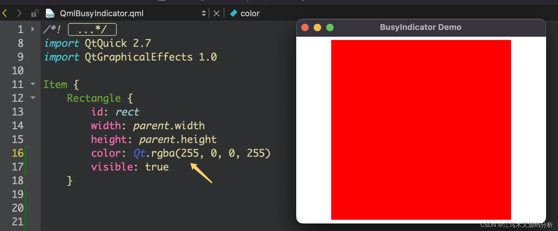
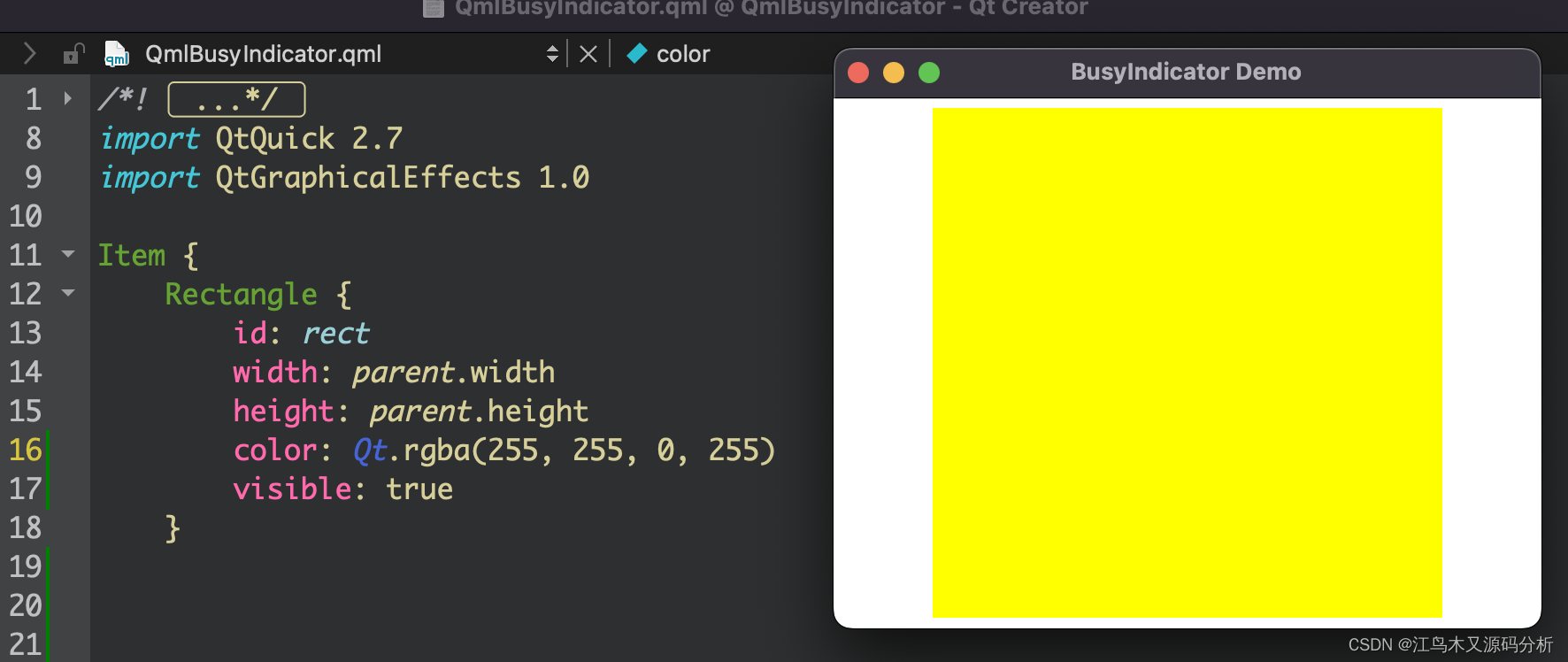
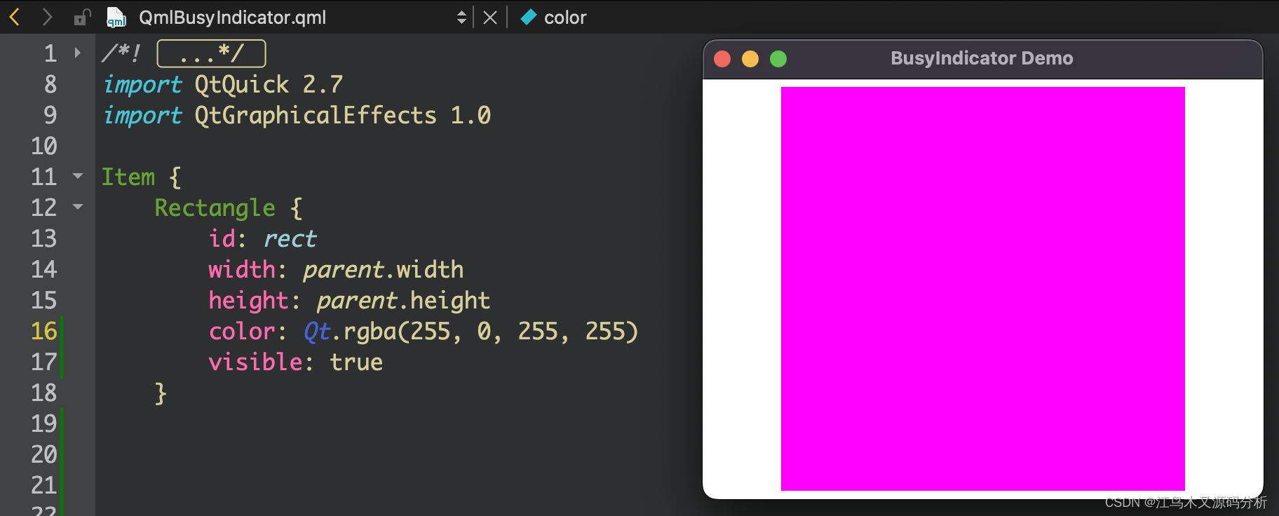
1.创建不同颜色的矩形
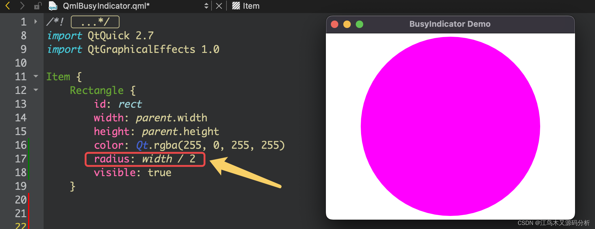
2.将矩形变成圆形
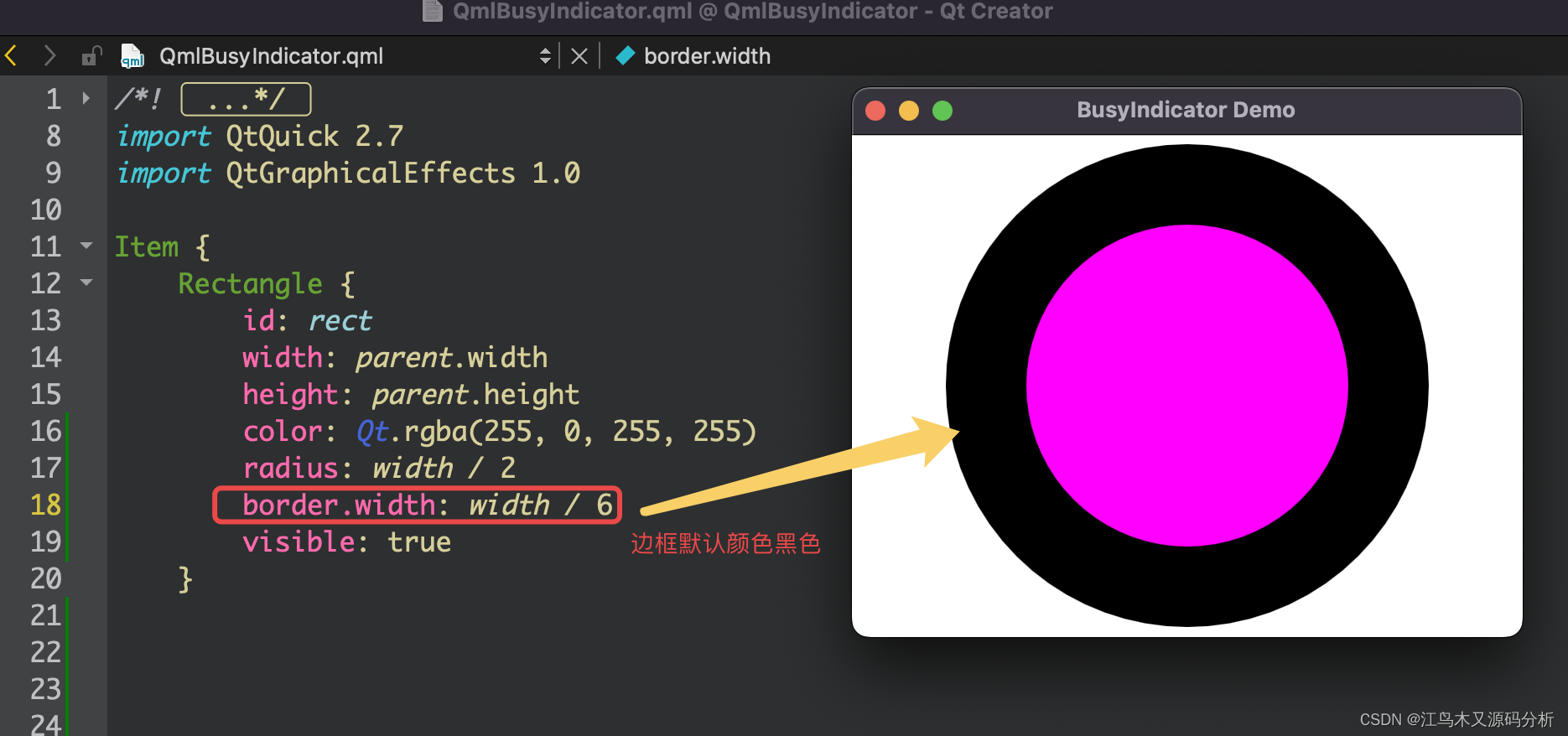
3.通过指定圆形边框的方式实现等待指示器初始形状
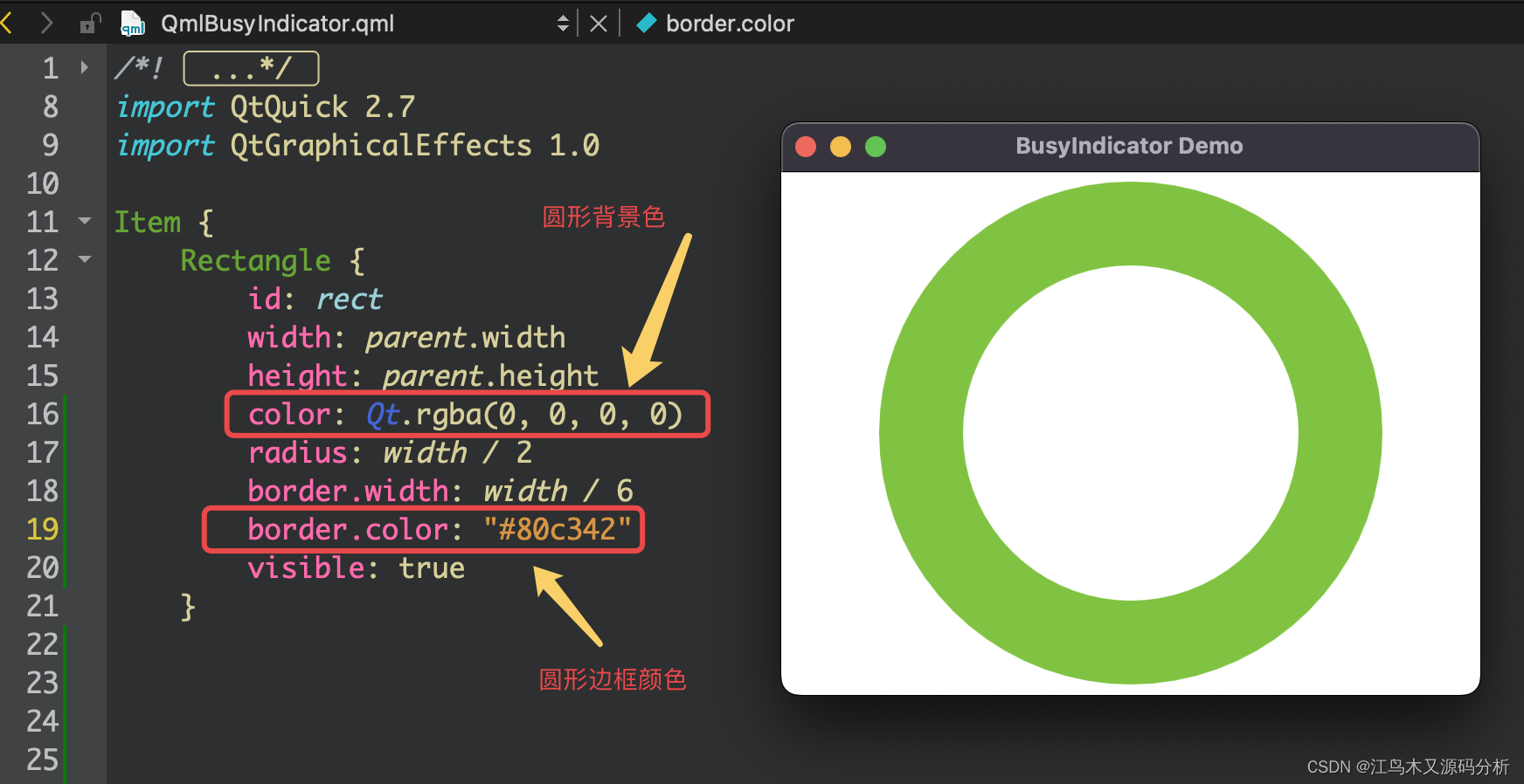
4.去掉背景与改边框颜色
5.添加渐变区域
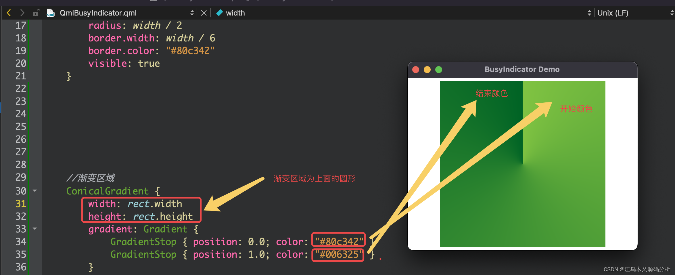
6.指定目标渐变区域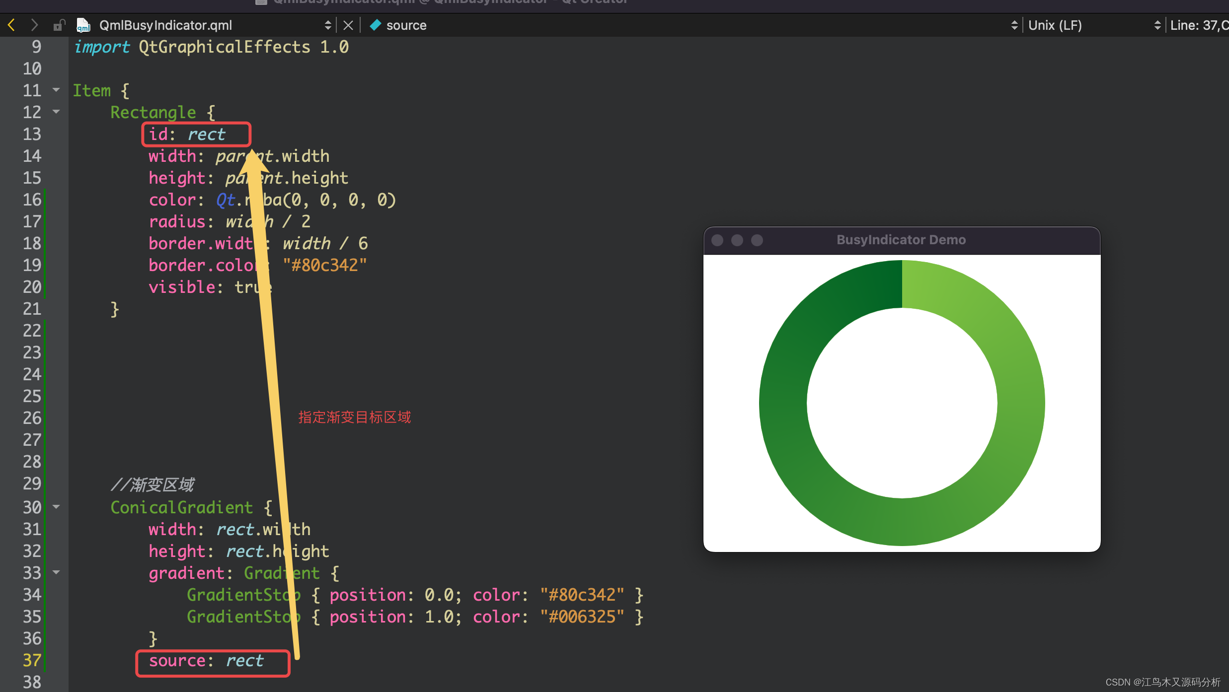
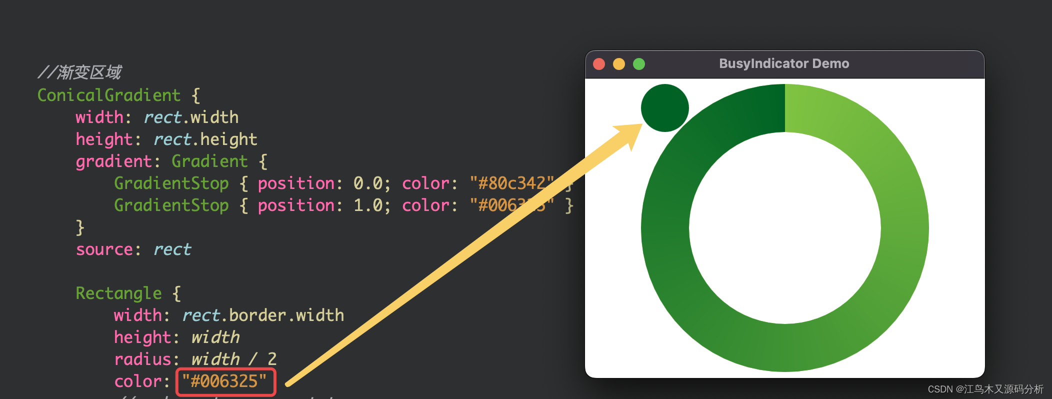
7. 创建一个转动的圆点,并修改颜色
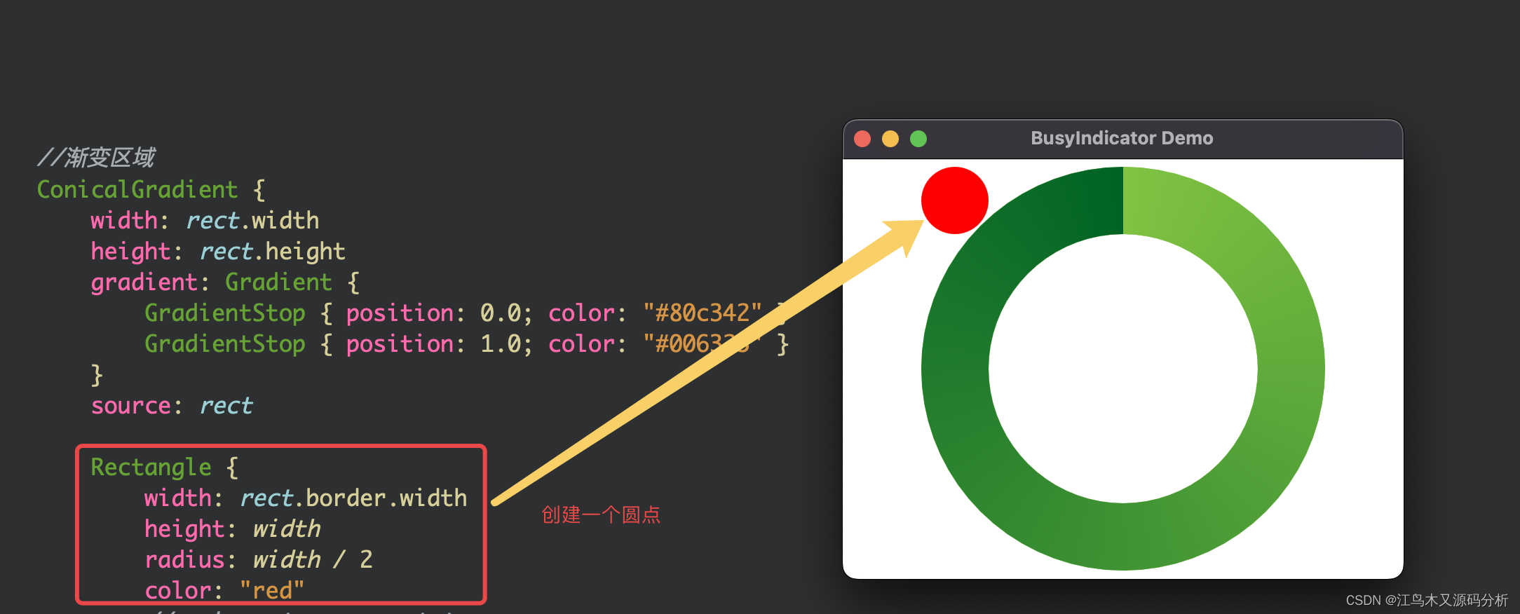
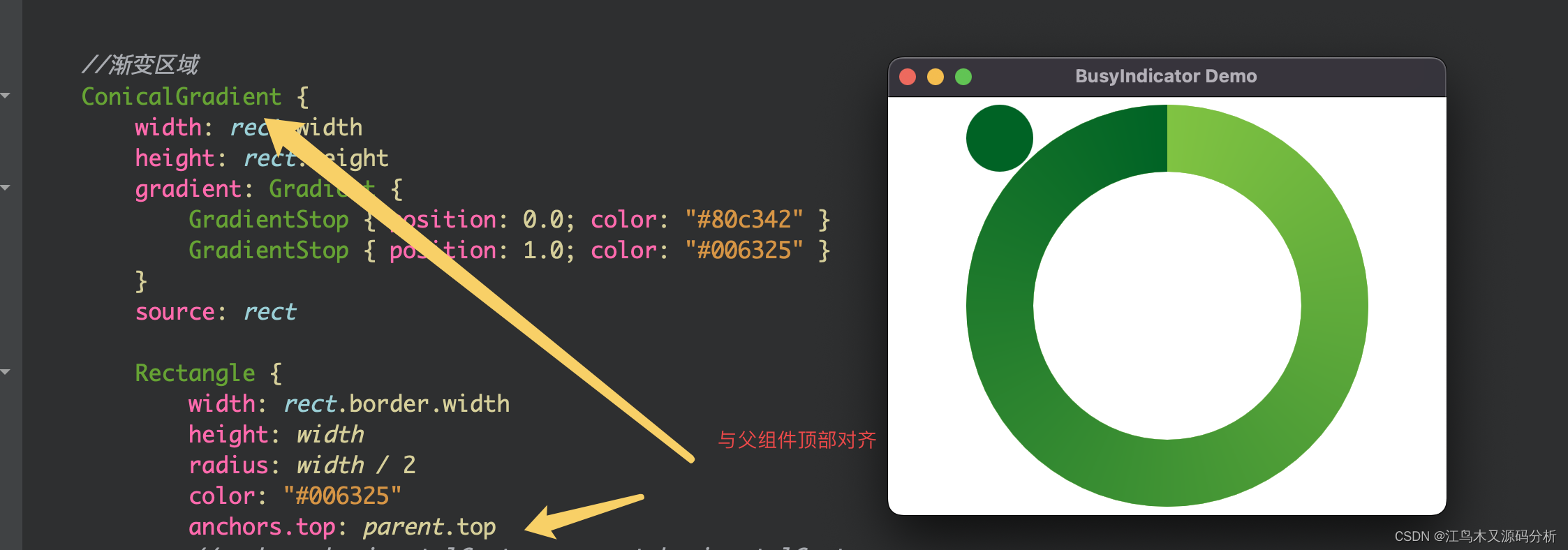
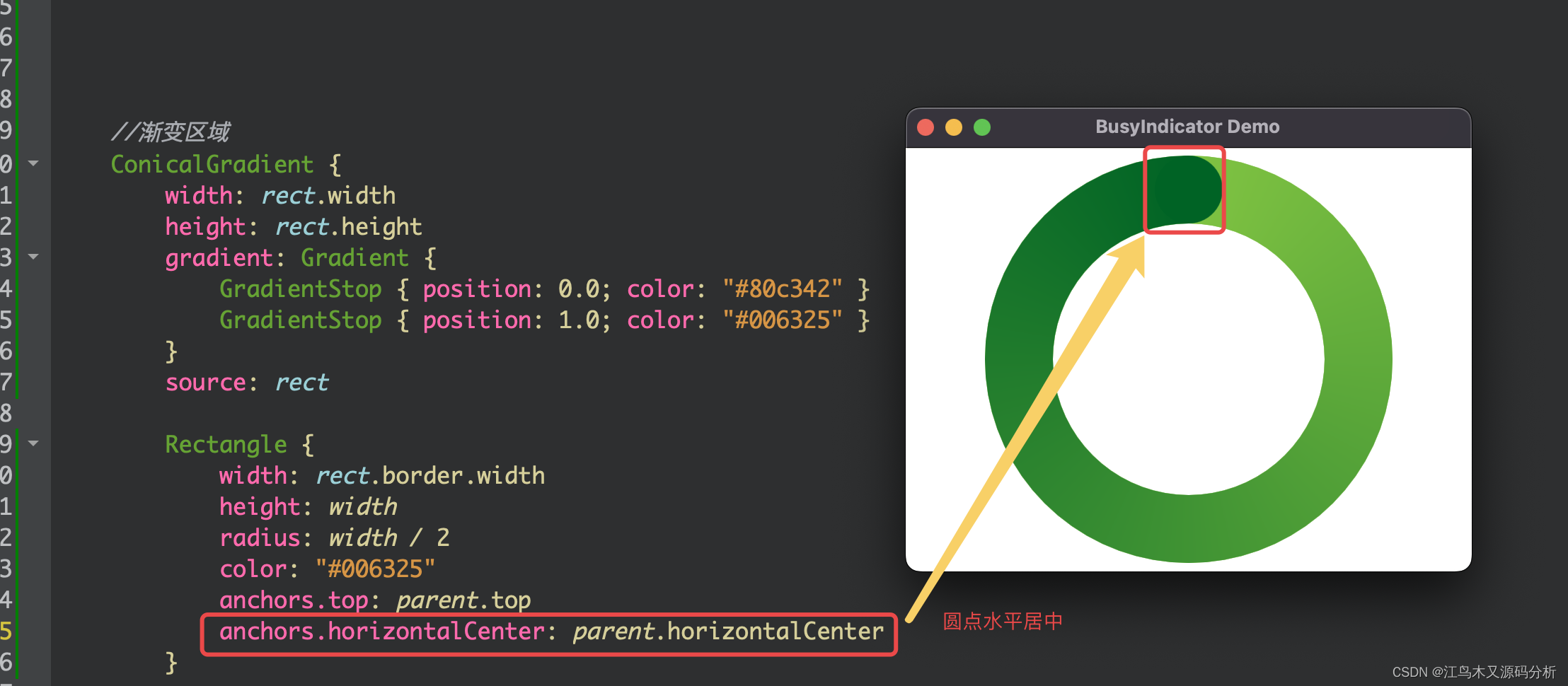
8.调整圆点位置
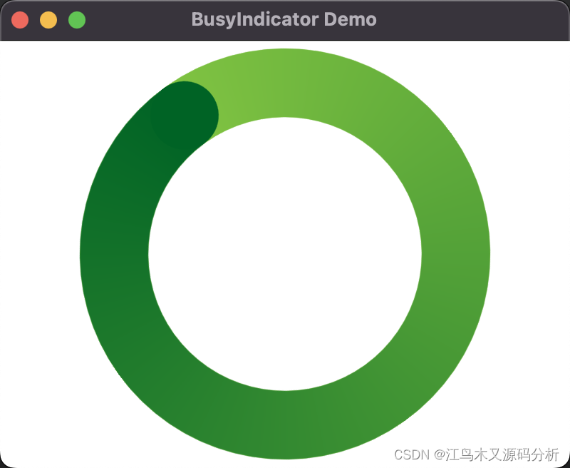
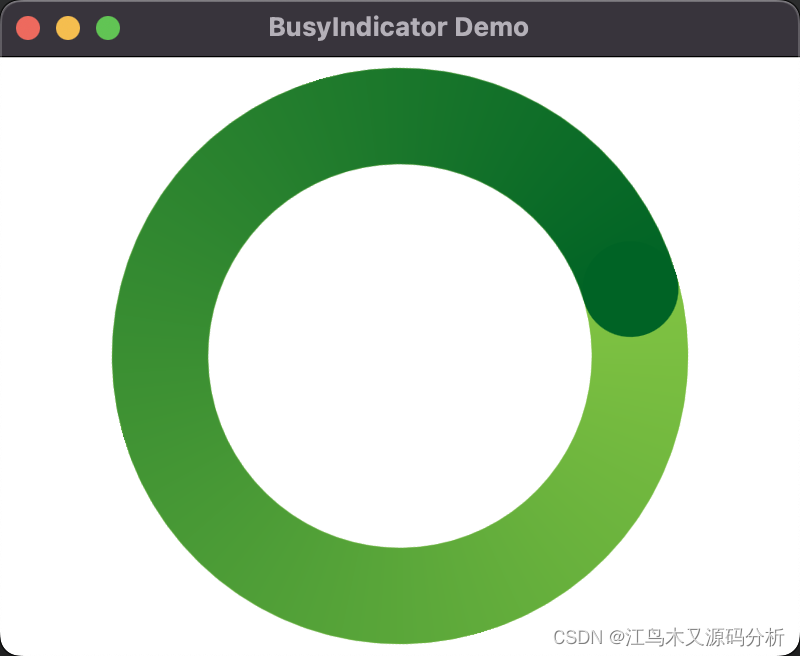
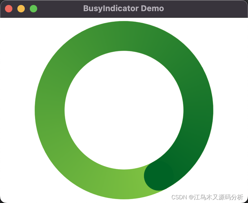
9.添加动画,让渐变循环跑起来
使用封装好的控件
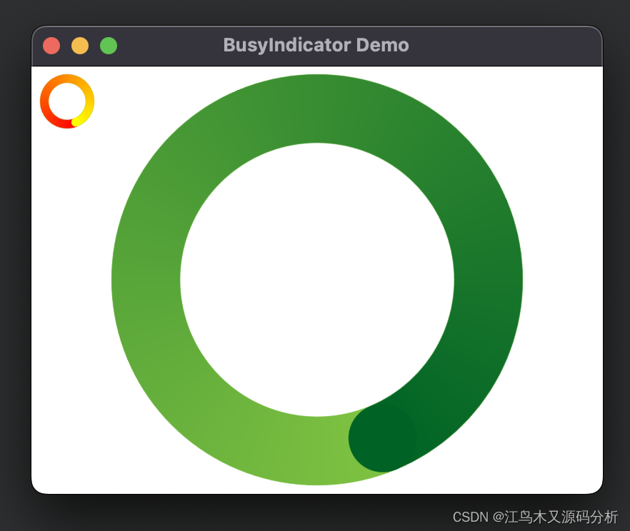
使用示例代码
  BusyIndicator {
        id: busyIndicator
        anchors.centerIn: parent
        implicitWidth: 300
        implicitHeight: 300
        contentItem: QmlBusyIndicator{} //使用默认颜色
    }

    BusyIndicator{
        id:smallIndic
        implicitWidth: 50
        implicitHeight: 50
        contentItem: QmlBusyIndicator{
            //指定颜色
            fromColor: "red"
            toColor: "yellow"
        }
    }
控件完整源码
import QtQuick 2.7
import QtGraphicalEffects 1.0 //ConicalGradient组件所在类
Item {
property string fromColor: "#80c342"
property string toColor: "#006325"
Rectangle {
id: rect //组件ID
width: parent.width //宽
height: parent.height //高
color: Qt.rgba(0, 0, 0, 0) //背景色
radius: width / 2 //圆角大小
border.width: width / 6 //边框宽
border.color: "#80c342" //边框颜色
visible: true //组件可见
}
//渐变区域
ConicalGradient {
width: rect.width //宽
height: rect.height //高
gradient: Gradient {
GradientStop { position: 0.0; color: fromColor }//渐变开始颜色
GradientStop { position: 1.0; color: toColor }//渐变结束颜色
}
source: rect //目标渐变区域
//转动的圆点
Rectangle {
width: rect.border.width //宽
height: width //高
radius: width / 2 //圆角
color: toColor //颜色
anchors.top: parent.top //顶部与父组件对齐
anchors.horizontalCenter: parent.horizontalCenter//在父组件中水平居中
}
//旋转动画
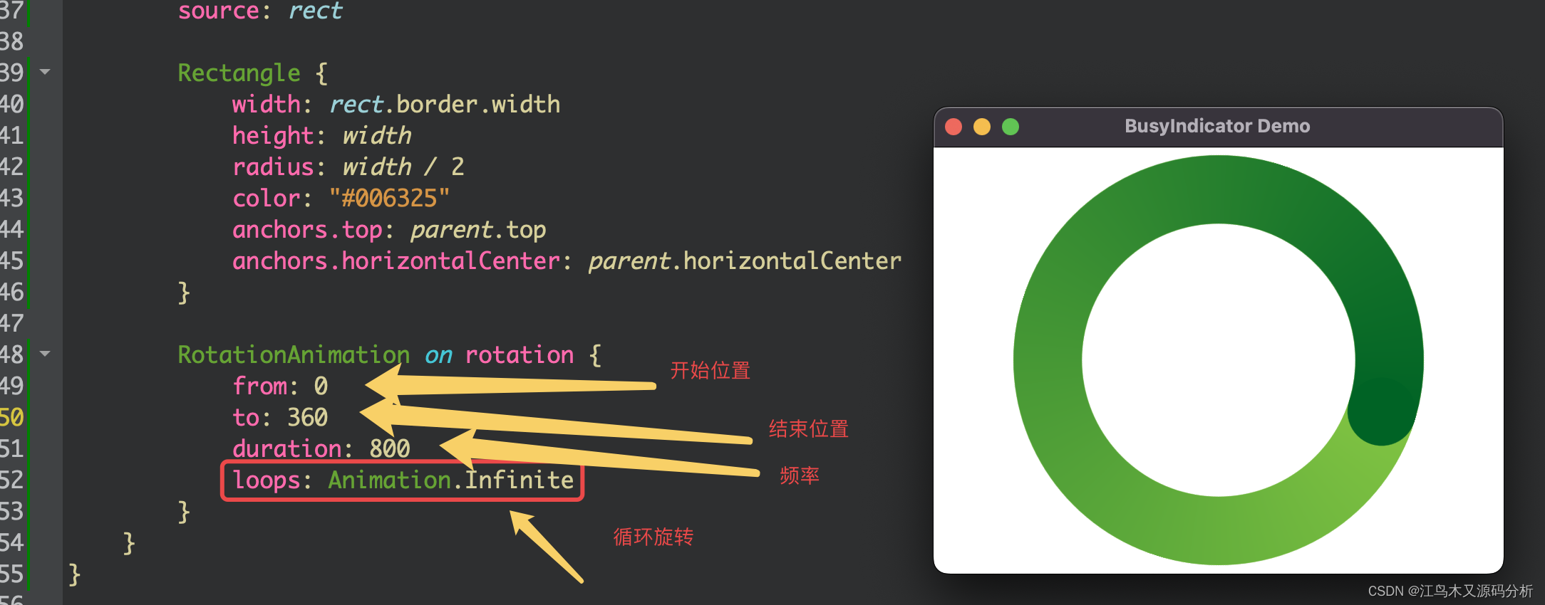
RotationAnimation on rotation {
from: 0 //开始旋转角度
to: 360 //结束旋转角度
duration: 800 //旋转频率
loops: Animation.Infinite //无限循环
}
}
}
修改完善后组件使用示例
完善后源码: QmlBusyIndicator.qml
import QtQuick 2.7
import QtGraphicalEffects 1.0 //ConicalGradient组件所在类

Item {
    property string fromColor :  "#80c342"
    property string toColor : "#006325"
    Rectangle {
        id: rect //组件ID
        width: parent.width //宽
        height: parent.height //高
        color: Qt.rgba(0, 0, 0, 0) //背景色
        radius: width / 2  //圆角大小
        border.width: width / 6 //边框宽
        border.color: fromColor //边框颜色
        visible: true //组件可见
    }

    //渐变区域
    ConicalGradient {
        width: rect.width //宽
        height: rect.height //高
        gradient: Gradient {
            GradientStop { position: 0.0; color: fromColor}//渐变开始颜色
            GradientStop { position: 1.0; color: toColor}//渐变结束颜色
        }
        source: rect //目标渐变区域
        //转动的圆点
        Rectangle {
            width: rect.border.width //宽
            height: width  //高
            radius: width / 2  //圆角
            color: toColor  //颜色
            anchors.top: parent.top //顶部与父组件对齐
            anchors.horizontalCenter: parent.horizontalCenter//在父组件中水平居中
        }

        //旋转动画
        RotationAnimation on rotation {
            from: 0  //开始旋转角度
            to: 360  //结束旋转角度
            duration: 800 //旋转频率
            loops: Animation.Infinite //无限循环
        }
    }
}
RemoteDevBusyIndicator.qml
import QtQuick 2.0
import QtQuick.Controls 2.0

BusyIndicator{
     property int nSize: 100 //大小
     property string from //开始颜色
     property string to //结束颜色
     id: busyIndicator
     anchors.centerIn: parent
     implicitWidth: nSize
     implicitHeight: nSize
     contentItem: QmlBusyIndicator{
          fromColor: from //? fromColor : "#80c342"
          toColor: to //? toColor : "#006325"
     } //使用默认颜色
}
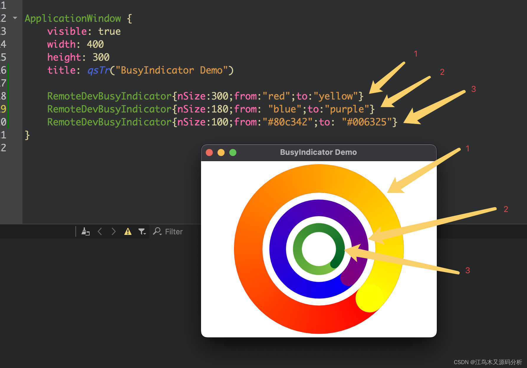
main.qml
import QtQuick 2.7
import QtQuick.Controls 2.0
import QtQuick.Layouts 1.0

ApplicationWindow {
    visible: true
    width: 400
    height: 300
    title: qsTr("BusyIndicator Demo")

    RemoteDevBusyIndicator{nSize:300;from:"red";to:"yellow"}
    RemoteDevBusyIndicator{nSize:180;from: "blue";to:"purple"}
    RemoteDevBusyIndicator{nSize:100;from:"#80c342";to: "#006325"}
}


 扫一扫
扫一扫


 730
730

 被折叠的 条评论
为什么被折叠?
被折叠的 条评论
为什么被折叠?
 到【灌水乐园】发言


