


有时候可能需要用到饼图,但是感觉标签太单调,或者需要美化展示标签怎么办呢~~~~
别着急,我来帮你,
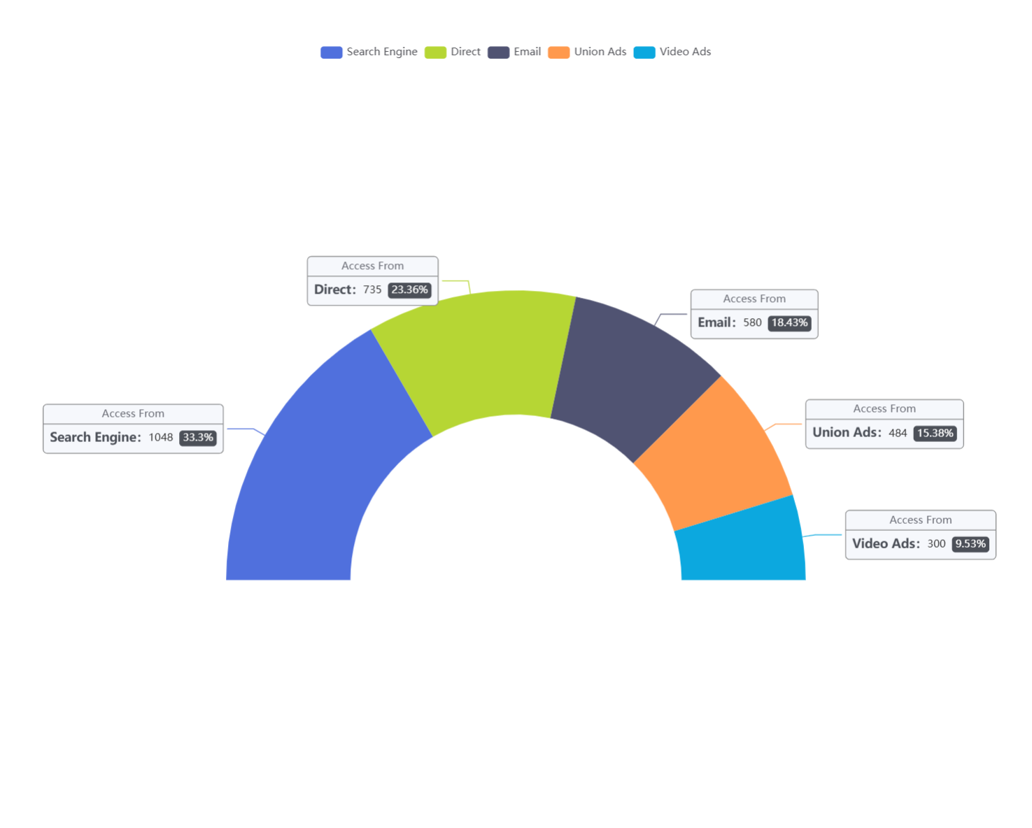
先看结果图-是不是你想要的样子
是你需要 的样子吗,需要的请往下看 嘿嘿~
掉下去了!
代码如下,细细观赏吧!
option = {
  tooltip: {
    trigger: 'item'
  },
  legend: {
    top: '5%',
    left: 'center'
  },
  series: [
    {
      name: 'Access From',
      type: 'pie',
      radius: ['40%', '70%'],
      center: ['50%', '70%'],
      // adjust the start and end angle
      startAngle: 180,
      endAngle: 360,
      data: [
        { value: 1048, name: 'Search Engine' },
        { value: 735, name: 'Direct' },
        { value: 580, name: 'Email' },
        { value: 484, name: 'Union Ads' },
        { value: 300, name: 'Video Ads' }
      ],
        label: {
        formatter: '{a|{a}}{abg|}\n{hr|}\n  {b|{b}:}{c}  {per|{d}%}  ',
        backgroundColor: '#F6F8FC',
        borderColor: '#8C8D8E',
        borderWidth: 1,
        borderRadius: 4,
        rich: {
          a: {
            color: '#6E7079',
            lineHeight: 22,
            align: 'center'
          },
          hr: {
            borderColor: '#8C8D8E',
            width: '100%',
            borderWidth: 1,
            height: 0
          },
          b: {
            color: '#4C5058',
            fontSize: 14,
            fontWeight: 'bold',
            lineHeight: 33
          },
          per: {
            color: '#fff',
            backgroundColor: '#4C5058',
            padding: [3, 4],
            borderRadius: 4
          }
        }
      },
    }
  ]
};
看完了吗?
什么。。你说看不懂?
??
那就让我来给你点化一下,老衲。。咳。小生这就来指点你,----------------------------------------------------------------------------------------------===========================================================================================================--------------------》往哪里看呢,向下看哇!!
        label: {
        formatter: '{a|{a}}{abg|}\n{hr|}\n  {b|{b}:}{c}  {per|{d}%}  ',
        backgroundColor: '#F6F8FC',
        borderColor: '#8C8D8E',
        borderWidth: 1,
        borderRadius: 4,
        rich: {
          a: {
            color: '#6E7079',
            lineHeight: 22,
            align: 'center'
          },
          hr: {
            borderColor: '#8C8D8E',
            width: '100%',
            borderWidth: 1,
            height: 0
          },
          b: {
            color: '#4C5058',
            fontSize: 14,
            fontWeight: 'bold',
            lineHeight: 33
          },
          per: {
            color: '#fff',
            backgroundColor: '#4C5058',
            padding: [3, 4],
            borderRadius: 4
          }
        }
      },
这下看懂了吧~~~
先是格式化,然后加css的边框,然后就是一系列的css样式
别给我说css样式你不知道哇,那你百度吧


 1万+
1万+

 被折叠的 条评论
为什么被折叠?
被折叠的 条评论
为什么被折叠?
 到【灌水乐园】发言


