


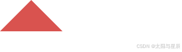
1.实心三角形
四个边框,让三个边框透明,一个边框不透明,width,height都为0。
ps:透明部分占据部分高度(需要去掉)
.border {
    width: 0px;
    height: 0px;
    border-style: solid;
    border-left-width: 50px;
    border-right-width: 50px;
    border-top-width: 0px;
    border-bottom-width: 50px;
    border-left-color: transparent;
    border-right-color: transparent;
    border-bottom-color: #d9534f;
    position: relative;
}

<div class="border"></div>
结果如下:
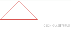
2.空心三角形
.border {
    width: 0px;
    height: 0px;
    border-style: solid;
    border-left-width: 50px;
    border-right-width: 50px;
    border-top-width: 0px;
    border-bottom-width: 50px;
    border-left-color: transparent;
    border-right-color: transparent;
    border-bottom-color: #d9534f;
    position: relative;
}
.border::after {
    content: '';
    border-style: solid;
    border-left-width: 48px;
    border-right-width: 48px;
    border-top-width: 0px;
    border-bottom-width: 48px;
    border-left-color: transparent;
    border-right-color: transparent;
    border-bottom-color: #ffffff;
    position: absolute;
    top: 1px;
    left: -48px;
}
结果如下:
3.扩展:扇形
扇形就是在三角形的基础上增加一个圆角。
.border {
            width: 0px;
            height: 0px;
            border-radius: 100%;
            border-style: solid;
            border-left-width: 50px;
            border-right-width: 50px;
            border-top-width: 0px;
            border-bottom-width: 50px;
            border-left-color: transparent;
            border-right-color: transparent;
            border-bottom-color: #d9534f;
            position: relative;
}
结果如下:


 扫一扫
扫一扫


 1718
1718

 被折叠的 条评论
为什么被折叠?
被折叠的 条评论
为什么被折叠?
 到【灌水乐园】发言


