


 通过降维技术将高维数据转换为二维或三维形式,便于直观理解数据特征与分布。利用主成分分析等算法减少数据维度,揭示不同国家经济和社会发展水平的差异。
摘要: 本文是吴恩达 (Andrew Ng)老师《机器学习》课程,第十五章《降维》中第116课时《目标二: 可视化》的视频原文字幕。为本人在视频学习过程中记录下来并加以修正,使其更加简洁,方便阅读,以便日后查阅使用。现分享给大家。如有错误,欢迎大家批评指正,在此表示诚挚地感谢!同时希望对大家的学习能有所帮助.
————————————————
In the last video, we talked about dimensionality reduction for the purpose of compressing the data. In this vido, let me tell you a second application of dimensionality reduction and that is to visualize the data. For a lot of machine learning applications, it really helps us to develop effective learning algorithms, if we can understand our data better, if there's some way of visualizing the data better. And so, dimensionality reduction offers us another useful tool to do so. Let's start with an example.
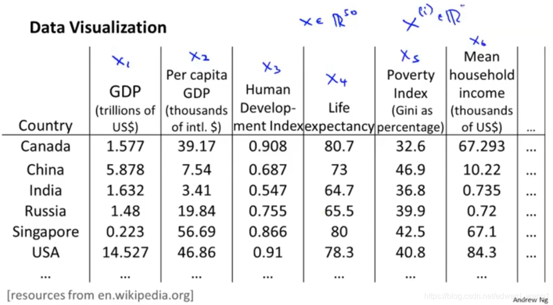
Let's say we've collected a large data set of many statistics facts about different countries around the world. So, maybe the first feature is the country's GDP (Gross Domestic Product). And
is a per capita (per person GDP).
is human development index.
is life expectancy.
(Poverty index) and
(mean household income) etc. And we may have a huge data set like this, maybe 50 features for every country,
. So is there something we can do to try to understand our data better? I've given this huge table of numbers. How do you visualize this data? If you have 50 features, it's very difficult to plot 50-dimensional data. What is a good way to examine this data?
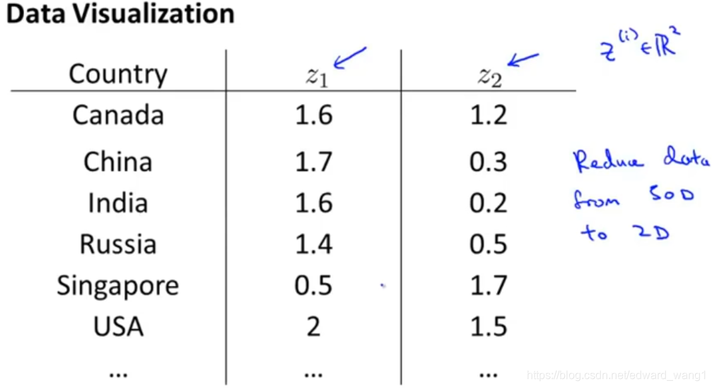
Using dimensionality reduction, what we can do is, instead of having each country represented by this feature vector , let's say we can come up with a different feature representation that is these
vectors,
. If that's the case, if we can have just a pair of numbers,
and
, somehow summarizes my 50 numbers, maybe what we can do is then plot these countries in
and use that to understand these sort of features of different countries. So here what we can do is reduce the data from 50D to 2D. So you can plot this as a two dimensional plot. When you do that, it turns out that if you look at the output of the Dimensionality Reduction Algorithms, it usually doesn't astride a particular meaning to these new features you want
to. It's often up to us to figure out roughly what these features mean.
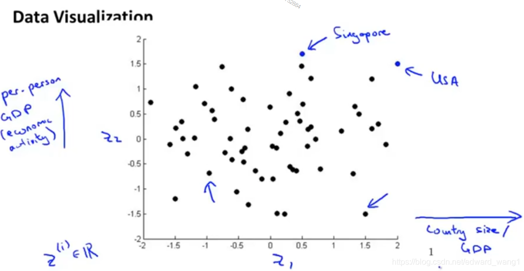
But if you plot those features, here's what you might find. Here, every country is represented by a point . So each of those dots in this figure represents a country. You might find for example that the horizontal axis (
) corresponds roughly to the overall country size, or the overall economic activity of a country or the overall GDP. Where the vertical axis in our data might correspond to the per person GDP, or the per person economic activity. You might find that given the 50 features, these are really the 2 main dimensions of the deviation. So here, you might have a country like the U.S.A, which has a relatively large GDP, and a relatively high per-person GDP as well. Whereas here, you might have a country like Singapore, which actually has a very high per person GDP as well, but because Singapore is a very small country, the overall economic size of Singapore is much more smaller than the US. And over here, you would have countries where individuals are unfortunately. Some are less well off, maybe shorter life expectancy, less health care, less economic activity, as well as smaller countries. Whereas a point like this will correspond to a country that has a substantial amount of economic activity, but individuals tend to be somewhat less well off. So you might find that the axes
and
can help you to most succinctly capture really what are the two main dimensions of the variations amongst different countries. Such as the overall economic activity of the country projected by the size of the country's overall economy as well as the per-person individual well-being measured by per-person GDP, per-person health care, and things like that.
So that's how you can use dimensionality reduction, in order to reduce data from 50 dimensions or whatever, down to two dimensions or maybe down to three dimensions, so that you can plot it and understand you data better. In the next video, we'll start to develop a specific algorithm call PCA, or Principle Component Analysis, which will allow us to do this and also do the early application I talked about of compressing the data.


 被折叠的 条评论
为什么被折叠?
被折叠的 条评论
为什么被折叠?
 到【灌水乐园】发言


