


 本文介绍在微信小程序中如何自定义轮播图小圆点的样式,包括使用官方属性调整颜色,以及通过禁用indicator-dots并用view组件模拟dots实现更灵活的样式控制。
在微信小程序中,轮播图上的小圆点默认样式为黑灰色,这在视觉体验上不是很惊艳眼球,有时达不到我们的需求。所以在这里讲几种改变swiper小圆点默认样式改变的几种方法
1.采用官方提供的swiper属性(indicator-color与indicator-active-color)进行改变,
这里有官方文档的地址:https://developers.weixin.qq.com/miniprogram/dev/component/swiper.html
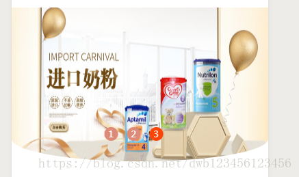
 改变后的样式
代码:
index.wxml
<view class='swiper_box'>
    <swiper class='swipers' autoplay="true" indicator-dots="true" indicator-color="{{indicatorColor}}"
    indicator-active-color="{{indicatorActivecolor}}">
      <block wx:for="{{advimg}}" wx:key>
        <swiper-item>
          <image class="swiper_image" src="{{item.url}}" lazy-load="true" />
        </swiper-item>
      </block>
    </swiper>
  </view>
index.wxss
.swiper_box {
  height: auto;
  position: relative;
}

.swipers {
  height: 450rpx;
}

.swiper_box image {
  width: 100%;
  height: 100%;
  border-radius: 100% 100% 100% 100% /0% 0% 30% 30%;
}
index.js
Page({

  data: {
    advImage: [{
        url: 'https://boweisou.oss-cn-shenzhen.aliyuncs.com/yy/images/5d541883223008b2920f225f81951d8b.jpg'
      },
      {
        url: 'https://boweisou.oss-cn-shenzhen.aliyuncs.com/yy/images/9ed9b64eef643b8d63c429ba63866f7f.jpg'
      },
      {
        url: 'https://boweisou.oss-cn-shenzhen.aliyuncs.com/yy/images/3493a84afa183f39cc5bd8d79a3f6798.jpg'
      }
    ],
    indicatorColor:'white',
    indicatorActivecolor:'red'
  },
  onLoad: function(options) {
    this.setData({
      advimg: this.data.advImage,
    })
  },
  onShow: function() {

  },

  onPullDownRefresh: function() {

  },

  onReachBottom: function() {

  },


  onShareAppMessage: function() {

  }
})
这种方法修改小圆圈的默认样式有很多的局限性,只能修改颜色,
2.禁用掉swiper的indicator-dots属性(即删掉),然后用view组件模拟dots。
此方法改进了方法1的局限性,不仅仅只是简单的修改显示的颜色,比如能改变形状,大小等等

index.wxml
<view class='index_top'>
  <view class='swiper_box'>
    <swiper class='swipers' autoplay="true" current="{{currentSwiper}}" bindchange="swiperChange">
      <block wx:for="{{advimg}}" wx:key>
        <swiper-item>
          <image class="swiper_image" src="{{item.url}}" lazy-load="true" />
        </swiper-item>
      </block>
    </swiper>
    <view class="dots">
      <block wx:for="{{advimg}}" wx:key>
        <view class="dot{{index == currentSwiper ? ' active' : ''}}"></view>
      </block>
    </view>
  </view>
</view>
index.wxss
.swiper_box {
  height: auto;
  position: relative;
}

.swipers {
  height: 450rpx;
}

.swiper_box image {
  width: 100%;
  height: 100%;
  border-radius: 100% 100% 100% 100% /0% 0% 30% 30%;
}

/*用来包裹所有的小圆点  */

.dots {
  width: 210rpx;
  height: 20rpx;
  display: flex;
  flex-direction: row;
  position: absolute;
  left: 50%;
  transform: translateX(-50%);
  bottom: 80rpx;
}

/*未选中时的小圆点样式 */

.dot {
  width: 70rpx;
  height: 10rpx;
  border-radius: 14rpx;
  margin-right: 26rpx;
  background-color: #de8a78;
}

/*选中以后的小圆点样式  */

.active {
  width: 70rpx;
  height: 10rpx;
  background-color: #fc4308;
}
index.js
// pages/goods/index.js
Page({

  data: {
    advImage: [{
        url: 'https://boweisou.oss-cn-shenzhen.aliyuncs.com/yy/images/5d541883223008b2920f225f81951d8b.jpg'
      },
      {
        url: 'https://boweisou.oss-cn-shenzhen.aliyuncs.com/yy/images/9ed9b64eef643b8d63c429ba63866f7f.jpg'
      },
      {
        url: 'https://boweisou.oss-cn-shenzhen.aliyuncs.com/yy/images/3493a84afa183f39cc5bd8d79a3f6798.jpg'
      }
    ],
    currentSwiper: 0,
    indicatorColor:'white',
    indicatorActivecolor:'red'

  },
  onLoad: function(options) {
    this.setData({
      advimg: this.data.advImage,
    })
  },
  onShow: function() {

  },
  swiperChange: function(e) {
    this.setData({
      currentSwiper: e.detail.current
    })
  },
  onPullDownRefresh: function() {

  },
  onReachBottom: function() {

  },
  onShareAppMessage: function() {

  }
})
还有一种情况就是要有数字的

只需要在标注的上加上{{index+1}},然后修改下样式即可


 扫一扫
扫一扫


 3万+
3万+

 被折叠的 条评论
为什么被折叠?
被折叠的 条评论
为什么被折叠?
 到【灌水乐园】发言


