原生html+css+js制作宠物小精灵icon
<!DOCTYPE html>
<html lang="en">
<head>
    <meta charset="UTF-8">
    <title>jigglypuff</title>
    <link rel="stylesheet" href="../css/jigglypuff.css">
</head>
<body>

<div class='pokemon'>
    <div class='normal fairy' id='jigglypuff'>
        <div>
            <div></div>
        </div>
        <div>
            <div></div>
        </div>
        <div>
            <div></div>
        </div>
    </div>
</div>

</body>
</html>
@charset "UTF-8";
*, *:before, *:after {
    box-sizing: border-box; }

html, body {
    min-height: 100%; }

::selection {
    background: none; }

body {
    display: flex;
    align-items: center;
    font-family: -apple-system, BlinkMacSystemFont, "Segoe UI", Roboto, Oxygen-Sans, Ubuntu, Cantarell, "Helvetica Neue", Helvetica, Arial, sans-serif;
    font-size: 18px;
    overflow-x: hidden; }

main {
    display: none; }

.pokemon {
    display: flex;
    flex-flow: row wrap;
    align-items: center;
    align-content: center;
    justify-content: center;
    width: 100vw;
}


.pokemon > div {
    position: relative;
    flex-wrap: wrap;
    align-items: center;
    align-content: center;
    justify-content: center;
    width: calc(100vw / 10);
    height: calc(100vw / 10);
    overflow: hidden;
    background: #f1f1f1;
}

.pokemon > div:before, .pokemon > div:after, .pokemon > div div:before, .pokemon > div div:after {
    content: "";
    display: block; }

#jigglypuff {
    background: #f7d7df; }
#jigglypuff:before {
    position: absolute;
    top: 58.59%;
    left: 41.405%;
    width: 17.19%;
    height: 13.28%;
    background: linear-gradient(to bottom, #8a4041 79.41%, #ee8b9a 79.41%); }
#jigglypuff > div:nth-child(1) {
    position: absolute;
    left: 27.34%;
    width: 52.34%;
    height: 23.44%; }
#jigglypuff > div:nth-child(1):before {
    position: absolute;
    width: 86.57%;
    height: 100%;
    background: #e5c4cc;
    border-radius: 0 0 5% 5% / 0 0 15% 15%; }
#jigglypuff > div:nth-child(1):after {
    position: absolute;
    right: 0;
    width: 13.43%;
    height: 45%;
    background: #e5c4cc;
    border-bottom-right-radius: 50% 25%; }
#jigglypuff > div:nth-child(1) div {
    position: absolute;
    left: 8.21%;
    width: 84.33%;
    height: 70%;
    z-index: 1; }
#jigglypuff > div:nth-child(1) div:before {
    position: absolute;
    width: 83.19%;
    height: 100%;
    background: #f7d7df;
    border-radius: 0 0 5% 5% / 0 0 15% 15%; }
#jigglypuff > div:nth-child(1) div:after {
    position: absolute;
    right: 0;
    width: 16.81%;
    height: 35.71%;
    background: #f7d7df;
    border-bottom-right-radius: 25% 50%; }
#jigglypuff > div:nth-child(2) {
    position: absolute;
    top: 29.69%;
    width: 29.69%;
    height: 30.08%;
    background: white; }
#jigglypuff > div:nth-child(2) div {
    position: absolute;
    top: 10.39%;
    width: 77.63%;
    height: 76.62%;
    background: #017c96; }
#jigglypuff > div:nth-child(2) div:before {
    position: absolute;
    top: 10.17%;
    width: 32.2%;
    height: 30.51%;
    background: white; }
#jigglypuff > div:nth-child(2) div:after {
    position: absolute;
    bottom: 0;
    width: 100%;
    height: 23.73%;
    background: #01a3be; }
#jigglypuff > div:nth-child(3) {
    position: absolute;
    top: 29.69%;
    width: 29.69%;
    height: 30.08%;
    background: white; }
#jigglypuff > div:nth-child(3) div {
    position: absolute;
    top: 10.39%;
    width: 77.63%;
    height: 76.62%;
    background: #017c96; }
#jigglypuff > div:nth-child(3) div:before {
    position: absolute;
    top: 10.17%;
    width: 32.2%;
    height: 30.51%;
    background: white; }
#jigglypuff > div:nth-child(3) div:after {
    position: absolute;
    bottom: 0;
    width: 100%;
    height: 23.73%;
    background: #01a3be; }
#jigglypuff > div:nth-child(2) {
    left: 7.42%; }
#jigglypuff > div:nth-child(3) {
    right: 7.42%; }
#jigglypuff > div:nth-child(2) div {
    left: 14.47%; }
#jigglypuff > div:nth-child(3) div {
    right: 14.47%; }
#jigglypuff > div:nth-child(2) div:before {
    left: 40.68%; }
#jigglypuff > div:nth-child(3) div:before {
    right: 40.68%; }
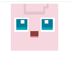


 这篇博客展示了如何使用原生的HTML、CSS和JavaScript来制作宠物小精灵Jigglypuff的图标。通过精细的布局和渐变背景,实现了这个可爱角色的图形效果。主要涉及前端开发中的CSS样式和定位技术。


 扫一扫
扫一扫


 被折叠的 条评论
为什么被折叠?
被折叠的 条评论
为什么被折叠?
 到【灌水乐园】发言


