


 本文介绍如何使用Sass Mixins简化CSS3特性如圆角、阴影、文本阴影、背景渐变的编写,通过实例演示如何创建和使用Mixins,提高前端开发效率。
sass 引入sass
Sass旨在帮助更快地编写CSS。 mixins具有使之成为可能的功能。 存在几种重量级的库,每种情况下都有复杂的公式,但是今天,我将展示如何激发您自己的mixins来补充现有的工作流程。
缩略图:在PhotoDune上手动混合鸡蛋 。
注意: 完整的文档文件可以提前下载,以查看我们将要创建的文件,并了解原始Sass文件的外观。
我已经在前端开发中使用Sass一年多了,mixins是我立即锁定的功能。 无论项目大小,我都能立即减少编写样式表的时间。 但是什么是mixin? 从Sass Language网站:
Mixins是最强大的Sass功能之一。 它们允许重复使用样式(属性或选择器),而不必复制和粘贴样式或将样式移到非语义类中。
换句话说,mixin是代码生成器。 您可以使用@mixin指令在Sass样式表中创建一个mixin,定义应输出CSS规则,并在需要样式声明中包含的任何规则时调用它。 我专门将混合插件用于CSS3功能,例如框阴影,文本阴影和边框半径。 其中许多功能未得到完全支持,需要像-webkit-, -moz-, -ms-, -o-这样的供应商前缀才能正常工作。 我可以每次调用一个单行mixin并让它为我生成合适CSS,而不是每次我都想使用CSS3功能时都编写五个规则。
步骤1:在本地计算机上验证Ruby
前两个步骤要求我们打开Terminal应用程序(在Windows中为Command Prompt)以验证Ruby语言并安装Sass gem。 在以下位置查找终端:
- Mac OS X: 应用程序>实用程序>终端
- Linux: 应用程序>附件>终端
- Windows: 任务栏“开始”按钮>“命令提示符”
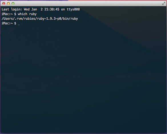
打开终端后,键入以下命令以检查Ruby安装。 不要键入美元符号,它是您的占位符。
$ which ruby 如果未安装Ruby,您应该会看到一些路径信息,例如/usr/local/bin或错误消息。 这是我的OS X终端的输出:
如果您收到错误消息,或者碰巧知道您的计算机上未安装Ruby,那么可以通过以下资源轻松启动并运行这些资源。 安装Ruby的过程不在本文讨论范围之内,并且在下面的站点中有很好的文档说明。
步骤2:安装Sass Gem
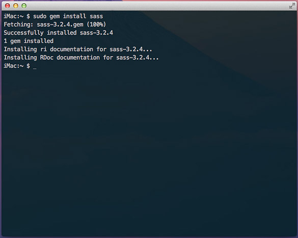
验证或安装了Ruby语言后,Sass就变得很容易了。 在终端中,输入以下命令: $ gem install sass 。 如果您的用户没有正确的权限,则可能需要使用sudo( 超级用户执行 )运行命令,如下所示: $ sudo gem install sass 。 几秒钟后,您将看到类似于以下屏幕的输出。
步骤3:下载并安装LiveReload
虽然你并不需要一个编译器应用程式,例如LiveReload , 指南针或CodeKit编译萨斯到香草CSS,它使各地块是第一次顺畅了很多。 CodeKit仅适用于OS X,LiveReload主要用于OS X,带有Windows Beta。 Compass App可在OS X,Windows和Linux上运行。 在撰写本文时,许可证的价格从10美元到25美元不等,但随着您更深入地进行Sass开发,值得节省时间。
现在将是一个不错的时机,提到Sass具有.sass和.scss两种样式 。 在不赘述的情况下,我坚持使用.scss语法,因为它与原始CSS非常相似,并且可以毫无问题地进行编译。
设置编译器后,您将需要使用HTML和CSS文件设置一个工作目录。 在本教程中,我创建了一个名为Write Your Own Sass Mixins的示例。 下面是我将在整个教程中参考的结构。 如果尚未下载文档文件 ,请这样做,然后将San Sanes和Droid Serif文件添加到/ fonts目录中。 这些字体是我们稍后将在本教程中创建的某些mixin所必需的。
Write Your Own Sass Mixins
index.html
/css (directory)
/fonts (directory)
/scss (directory)
|-- main.scss
由于我选择了LiveReload,因此我们将告诉它监视应该编译到CSS中的更改。 启动LiveReload时,应显示以下屏幕。 将您的工作目录拖到LiveReload窗口的“监视的文件夹”侧栏中。
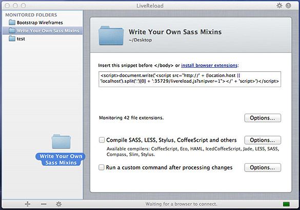
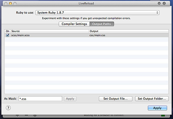
接下来,您将需要选中Compile SASS,LESS,Stylus,CoffeeScript和其他复选框。 单击选项 ,然后选择您的输出路径。
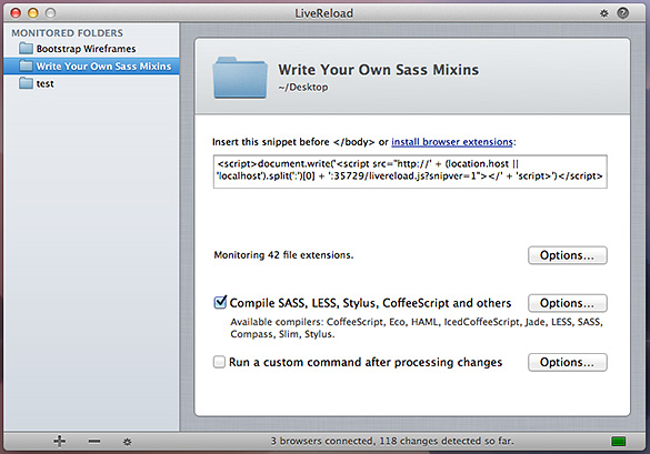
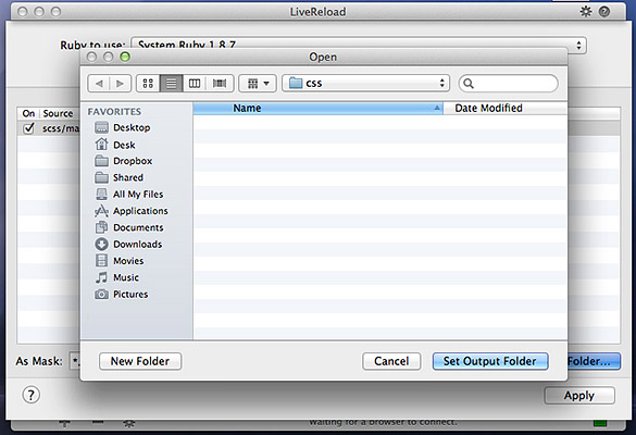
您应该看到一个空白表,其中突出显示了“输出路径”,并在第一行上选中了scss / main.scss。 单击设置输出文件夹...按钮。 默认情况下,应选择CSS文件夹。 单击设置输出文件夹并应用。
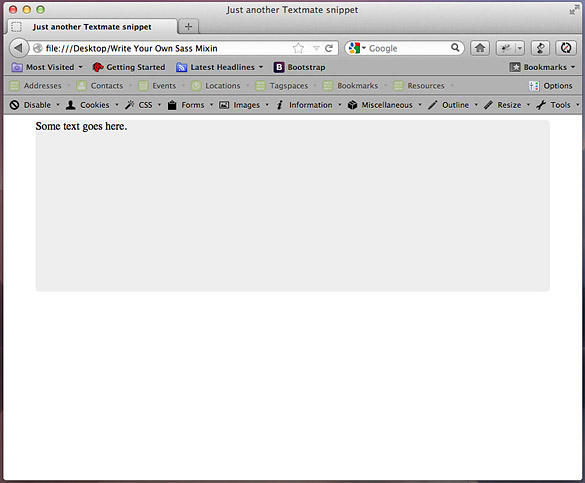
使用此代码更新index.html文件,然后刷新浏览器。 您的索引应类似于以下屏幕。
<!DOCTYPE>
	<html>
		<head>
			<meta http-equiv="Content-type" content="text/html; charset=utf-8">

			<title>Write Your Own Sass Mixins</title>

			<link rel="stylesheet" href="css/main.css" type="text/css" media="screen" title="main" charset="utf-8">
		</head>

		<body>
			<div id="wrapper">
				Some text goes here.
			</div>
		</body>
	</html>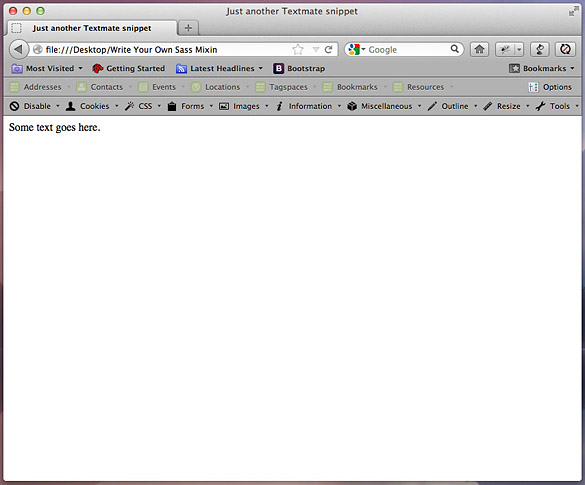
LiveReload提供了适用于Firefox和Chrome的浏览器扩展,但最快的启动和运行方法是将以下Javascript代码段(从LiveReload窗口复制)复制到您的index.html文件中,位于结束body标签上方。 安装完此代码段后,LiveReload将侦听对HTML和Sass文件的更改,并将自动更新浏览器-每隔几分钟便不再需要Command +R。
<script>document.write('<script src="http://' + (location.host || 'localhost').split(':')[0] + ':35729/livereload.js?snipver=1"></' + 'script>')</script>现在我们已经完成了内务处理,我们可以开始创建mixins并让我们的编译器完成艰苦的工作。
步骤4:边界半径-您的第一个实用程序Mixin
如前所述,我在页面布局中使用了许多CSS3功能。 这些领先功能的问题在于它们需要大量的供应商前缀,而我没有太多的耐心。 如果我可以编写一次mixin,而不是每次想要四舍五入时都不要写5行CSS,而是要做很多重复的事情。
在@Sass文件中,通过@mixin(){}声明来标识Mixins 。 每当像LiveReload这样的处理器采用这种语法时,它都会在括号内查找参数,并在花括号内查找类似于CSS的指令。 然后,编译器将解释这些指令,并将纯CSS输出到样式表,在这种情况下为main.css。
打开您的main.scss文件,然后复制以下mixin代码。 单击“保存”时,带有index.html的浏览器窗口应自动重新加载,并且将具有一个带有6px圆角的居中灰色div。
/* Main.scss */
	@mixin border-radius($topLeft, $topRight, $bottomRight, $bottomLeft) {
		-webkit-border-radius: $topLeft $topRight $bottomRight $bottomLeft;
		-moz-border-radius: $topLeft $topRight $bottomRight $bottomLeft;
		-ms-border-radius: $topLeft $topRight $bottomRight $bottomLeft;
		-o-border-radius: $topLeft $topRight $bottomRight $bottomLeft;
		border-radius: $topLeft $topRight $bottomRight $bottomLeft;
	}

	#wrapper {
		@include border-radius(6px, 6px, 6px, 6px);
		width: 750px;
		height: 250px;
		background: #eee;
		margin: 0 auto;
	}
步骤5:扩展边界半径混合
因此,我们的第一个mixin开端良好。 但是边界半径混合有一个弱点:如果应用不透明度小于100%的边界,背景将显示出来。 在许多情况下,这并不是一个很好的设计选择。
幸运的是,我们可以轻松地修复background-clip属性。 如果您不熟悉,CSS-Tricks的Chris Coyier会在该属性上撰写出色的文章。
Sass mixins也可以与其他mixins一起扩展。 这使我们可以分别编写background-clip,并创建第三个mixin来调用它以及上一步中的border-radius规则。 将以下代码添加到main.scss文件中并保存。 刷新浏览器后,您应该会看到一个蓝色背景,以及半透明的浅蓝色半径边框。
/* Main.scss */
	@mixin border-radius($topLeft, $topRight, $bottomRight, $bottomLeft) {
		-webkit-border-radius: $topLeft $topRight $bottomRight $bottomLeft;
		-moz-border-radius: $topLeft $topRight $bottomRight $bottomLeft;
		-ms-border-radius: $topLeft $topRight $bottomRight $bottomLeft;
		-o-border-radius: $topLeft $topRight $bottomRight $bottomLeft;
		border-radius: $topLeft $topRight $bottomRight $bottomLeft;
	}

	@mixin background-clip {
		background-clip: padding-box;
	}

	@mixin combined-radius($topLeft, $topRight, $bottomRight, $bottomLeft) {
		@include background-clip;
		@include border-radius($topLeft, $topRight, $bottomRight, $bottomLeft);
	}

	body {
		background: lightblue;
	}

	#wrapper {
		width: 750px;
		height: 250px;
		background: #eee;
		margin: 0 auto;
		border: 15px solid rgba(255, 255, 255, 0.3);
		@include combined-radius(6px, 6px, 6px, 6px);
	}
尽管我们最初复制了许多行,但是现在我们有了可重用的mixin,可以通过提供border-radius值随时调用它。 并且它将正确渲染。
步骤6:文字阴影
文字阴影是拆分印刷处理和按钮的好方法。 我经常将它们用于选定的导航状态,标签或标签。 它们也是最令人毛骨悚然的项目之一,因为IE9不支持它们,并且没有良好的纯CSS解决方法。
尽管有这个不幸的事实,但我还是包含了其他现代浏览器和IE 10 beta的混合代码。 我还遇到了jQuery脚本,用于IE9或更低版本中的文本阴影渲染 。
对于现代浏览器,text-shadow属性的结构非常类似于box-shadow,具有水平和垂直偏移,模糊和颜色参数。 将以下代码添加到main.scss和index.html文件中,您应该在蓝色文本后面看到一个3px的模糊阴影。
/* Main.scss */

	@mixin text-shadow($horizOffset, $vertOffset, $blur, $color) {
		-webkit-text-shadow: $horizOffset $vertOffset $blur $color;
		-moz-text-shadow: $horizOffset $vertOffset $blur $color;
		-ms-text-shadow: $horizOffset $vertOffset $blur $color; /* IE 10+ */
		-o-text-shadow: $horizOffset $vertOffset $blur $color;
		text-shadow: $horizOffset $vertOffset $blur $color;

		#wrapper,
		#wrapper-text-shadow {
			width: 750px;
			height: 250px;
			background: #eee;
			margin: 0 auto 20px;
			padding: 15px 0 0 15px;
			border: 15px solid rgba(255, 255, 255, 0.3);
			@include combined-radius(6px, 6px, 6px, 6px);
		}

		#wrapper-text-shadow > p {
			font-size: 36px;
			color: blue;
			@include text-shadow(0, 3px, 3px, #333);
		}
	}
Index.html,在div#wrapper结束标记后添加
<div id="wrapper-text-shadow">
		<p>Text shadow test.</p>
</div>步骤7:更多实用工具Mixins
对于最后一步,我为框阴影,背景渐变,@ font-face声明和改进的类型渲染创建了mixin。 这些混合插件已在现代浏览器(Firefox,Chrome,Safari,Opera,IE9)中经过测试,并包含所有特定于供应商的前缀。
我不会详细介绍每一个。 详细的注释包含在main.scss文件中。 Mixins遵循基本格式,可以根据您的需求变化而构建。 如果您有CSS需求,可以编写一个mixin服务。
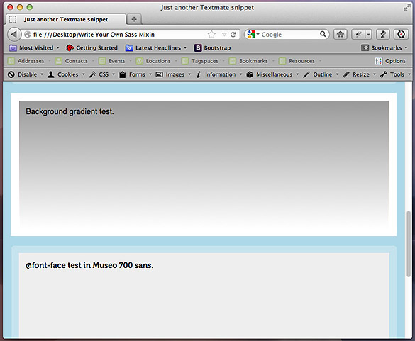
使用以下代码更新index.html和main.scss文件。 刷新后,您应该看到一个浏览器窗口,其中包含许多框,每个框显示一个不同的mixin测试。
<!DOCTYPE>
	<html>
		<head>
			<meta http-equiv="Content-type" content="text/html; charset=utf-8">

			<title>Just another Textmate snippet</title>

			<link rel="stylesheet" href="css/main.css" type="text/css" media="screen" title="main" charset="utf-8">
		</head>

		<body>
			<div id="wrapper">
				Box shadow test.
			</div>

			<div id="wrapper-inset-shadow">
				Inset box shadow test.
			</div>

			<div id="wrapper-text-shadow">
				Text shadow test.
			</div>

			<div id="wrapper-background-gradient">
				Background gradient test.
			</div>

			<div id="wrapper-font-family">
				@font-face test in Museo 700 sans.
			</div>

			<div id="wrapper-improve-legibility">
				<h1>Improve text legibility and kerning test.</h1>
			</div>

			<script>document.write('<script src="http://' + (location.host || 'localhost').split(':')[0] + ':35729/livereload.js?snipver=1"></' + 'script>')</script>
		</body>
	</html>
@mixin border-radius($topLeft, $topRight, $bottomRight, $bottomLeft) {
-webkit-border-radius: $topLeft $topRight $bottomRight $bottomLeft;
-moz-border-radius: $topLeft $topRight $bottomRight $bottomLeft;
-ms-border-radius: $topLeft $topRight $bottomRight $bottomLeft;
-o-border-radius: $topLeft $topRight $bottomRight $bottomLeft;
border-radius: $topLeft $topRight $bottomRight $bottomLeft;
}
@mixin background-clip {
background-clip: padding-box;
}
@mixin combined-radius($topLeft, $topRight, $bottomRight, $bottomLeft) {
@include background-clip;
@include border-radius($topLeft, $topRight, $bottomRight, $bottomLeft);
}
@mixin box-shadow($horizOffset, $vertOffset, $blur, $color) {
/*
Blur is an optional parameter, but helps soften the shadow.
Call the mixin by applying pixel values for $horizOffset,
$vertOffset, and $blur, and a hex value for $color. The
border-collapse rule is included to render shadows properly
in IE9.
*/
-webkit-box-shadow: $horizOffset $vertOffset $blur $color;
-moz-box-shadow: $horizOffset $vertOffset $blur $color;
-ms-box-shadow: $horizOffset $vertOffset $blur $color;
-o-box-shadow: $horizOffset $vertOffset $blur $color;
box-shadow: $horizOffset $vertOffset $blur $color;
border-collapse: separate;
}
@mixin box-shadow-inset($horizOffset, $vertOffset, $blur, $color) {
/*
Same parameters as @mixin box-shadow, but creates an inner shadow
for pressed or recessed effects.
*/
-webkit-box-shadow: $horizOffset $vertOffset $blur $color inset;
-moz-box-shadow: $horizOffset $vertOffset $blur $color inset;
-ms-box-shadow: $horizOffset $vertOffset $blur $color inset;
-o-box-shadow: $horizOffset $vertOffset $blur $color inset;
box-shadow: $horizOffset $vertOffset $blur $color inset;
}
@mixin background-gradient($direction, $first-color, $second-color) {
background: $first-color;
background-image: -webkit-linear-gradient($direction, $first-color, $second-color);
background-image: -moz-linear-gradient($direction, $first-color, $second-color);
background-image: -ms-linear-gradient($direction, $first-color, $second-color);
background-image: -o-linear-gradient($direction, $first-color, $second-color);
background-image: linear-gradient($direction, $first-color, $second-color);
@include background-clip;
}
@mixin typography($font-name, $font-longname) {
/*
Make sure to create a /fonts directory at the same level as your /css directory
to ensure the url strings below work properly. Webfonts will include the short
name to reference in font-family declarations, and the long name needed for
url references. The mixin will need to be invoked with the @include declaration
immediately below to load fonts properly.
*/
@font-face {
font-family: $font-name;
src: url("../fonts/" + $font-longname + ".eot");
src: local('☺'), url("../fonts/" + $font-longname + ".woff") format('woff'),
url("../fonts/" + $font-longname + ".ttf") format('truetype'),
url("../fonts/" + $font-longname + ".svg#webfontjVVPrHqE") format('svg');
font-weight: normal;
font-style: normal;
}
}
@include typography("Museo700", "Museo700-Regular-webfont");
@include typography("DroidSerifRegular", "DroidSerif-Regular-webfont");
@mixin improve-legibility {
/*
The improve-legibility mixin is recommended for headers and smaller amounts of text
due to the more resource-intensive font-rendering. It is not recommended for mobile
devices. For more information, refer to the MDN article ( https://developer.mozilla.org/en-US/docs/CSS/text-rendering ),
or Gigaom ( http://gigaom.com/2010/08/12/optimizelegibility-for-clearer-text-in-your-browser/ ).
Inspect in Chrome or Safari and toggle the text-rendering: optimizeLegibility rule on and off to
see the effect on kerning. It will also activate ligatures on fonts that support extended sets.
*/
text-rendering: optimizeLegibility;
@include text-shadow(0, 0, 1px, transparent);
}
body {
background: lightblue;
font-family: Helvetica, Arial, sans-serif;
font-weight: normal;
}
#wrapper,
#wrapper-inset-shadow,
#wrapper-text-shadow,
#wrapper-background-gradient,
#wrapper-font-family,
#wrapper-improve-legibility {
width: 750px;
height: 250px;
background: #eee;
margin: 0 auto 20px;
padding: 15px 0 0 15px;
border: 15px solid rgba(255, 255, 255, 0.3);
@include combined-radius(6px, 6px, 6px, 6px);
}
#wrapper {
@include box-shadow(0, 3px, 3px, #333);
}
#wrapper-inset-shadow {
@include box-shadow-inset(0, 3px, 3px, #333);
}
#wrapper-text-shadow {
@include text-shadow(0, 3px, 3px, #333);
font-size: 36px;
color: blue;
}
#wrapper-background-gradient {
@include background-gradient(top, #999, #fff);
}
#wrapper-font-family {
font-family: "Museo700", Helvetica, Arial;
}
#wrapper-improve-legibility > h1 {
font-family: "DroidSerifRegular", Georgia, "Times New Roman", serif;
font-weight: normal;
font-size: 48px;
@include improve-legibility;
}
结论
Sass mixins是使用CSS3快速启动和运行的好方法。 无论您是在编写代码,还是从头开始构建整个网站,mixins都可以通过减少键入的行数和检查语法所花费的时间来改善您的工作流程。
由于这些功能是以CSS3为中心的,因此您应该为较旧的浏览器制定备份计划。 对于某些站点,圆角和阴影并不重要,并且可以显示出较低的视觉布局,这是完全可以接受的。 对于其他人,像Modernizr这样的polyfill可以提供特定于功能的类来编写后备CSS规则。
希望您喜欢本教程,感谢您的阅读!
翻译自: https://webdesign.tutsplus.com/tutorials/stir-up-your-own-delicious-sass-mixins--webdesign-10576
sass 引入sass


 扫一扫
扫一扫


 1033
1033

 被折叠的 条评论
为什么被折叠?
被折叠的 条评论
为什么被折叠?
 到【灌水乐园】发言


