


 本文介绍如何使用jQuery Reveal插件创建弹出模态窗口,包括HTML和CSS的基础设置,按钮和模态窗口的创建,以及如何通过CSS3 Media Queries使其适应移动设备。
jquery.reveal
今天,我们将采用Orman的弹出模态窗口 ,并使用HTML和CSS重新创建它。 然后,我们将使用jQuery Reveal插件为其提供全部功能。 我们甚至会更进一步,添加一些CSS3 Media Queries以使其适应移动使用。 让我们开始吧!
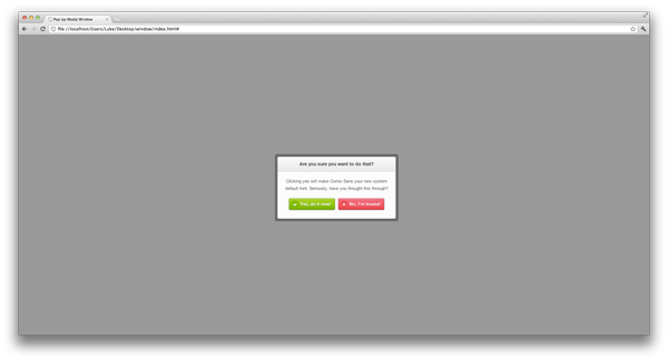
[这是一个简单的小模式窗口,非常适合预览中显示的小确认消息。 不,使用Comic Sans没有任何借口。 奥曼·克拉克
步骤1: HTML5基础
我们将从使用HTML5标记创建空白文档开始。 我们已经链接到样式表和HTML5 Shiv,这将允许HTML5元素在IE中正确呈现。 至关重要的是,我们还链接到了页面底部的最新jQuery库(由Google托管),以优化页面加载。
最后,您可能会注意到我们在脑海中也加入了另一行。 视口元标记。 无论设备的屏幕大小如何,这将使设备能够正确解释我们的页面。 如果您想了解更多有关此的信息,请务必查看此快速提示 !
<!DOCTYPE html>
<html>
<head>

	<!--Meta tags-->
	<meta charset="utf-8">
	<meta name="viewport" content="width=device-width, initial-scale=1, maximum-scale=1">

	<!--Title-->
	<title>Pop Up Modal Window</title>

	<!--Stylesheets-->
	<link rel="stylesheet" href="css/styles.css">

	<!--HTML5 Shiv-->
	<!--[if lt IE 9]>
			<script src="//html5shiv.googlecode.com/svn/trunk/html5.js"></script>
	<![endif]-->

</head>
<body>


	<!--jQuery-->
	<script src="https://ajax.googleapis.com/ajax/libs/jquery/1.7.1/jquery.min.js"></script>

</body>
</html>步骤2:下载Reveal
在开始添加任何标记和样式之前,我们将下载Reveal插件。 转到http://www.zurb.com/playground/reveal-modal-plugin,然后点击页面右侧的“下载Reveal套件”。
解压缩已下载的文件。 您需要将jquery.reveal.js复制到网站的根目录,或者复制到您喜欢的任何文件夹。 我创建了一个名为“ js”的文件夹,通常在其中保存我JavaScript资源。 接下来,我们需要引用我们的脚本,因此请在jQuery脚本之后复制以下内容,以确保路径正确。
<script src="js/jquery.reveal.js"></script>步骤3:建立按钮
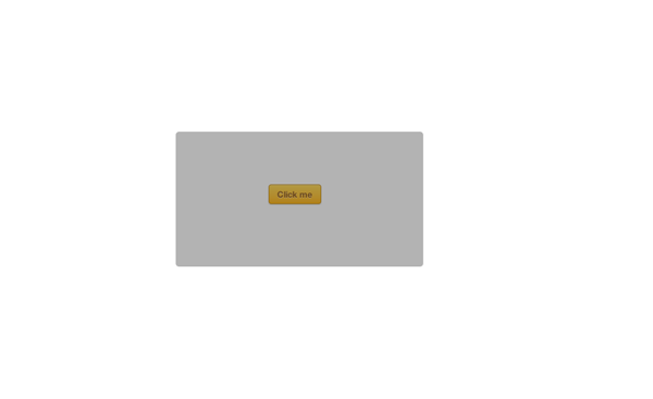
对于本教程,我们将创建一个按钮,单击该按钮可以激活模式。 我继续学习了Orman的Simple Web Buttons免费赠品中的按钮样式。
<body>

	<a href="#" id="button">Click me</a>
在使用某些样式之前,我们将快速添加一个重置项以从浏览器中删除所有不需要的边距等。 我们还为正文添加了一些样式,只是字体系列,背景,并且将字体大小固定为100%。
html, body, div, span, applet, object, iframe,
h1, h2, h3, h4, h5, h6, p, blockquote, pre,
a, abbr, acronym, address, big, cite, code,
del, dfn, em, img, ins, kbd, q, s, samp,
small, strike, strong, sub, sup, tt, var,
b, u, i, center,
dl, dt, dd, ol, ul, li,
fieldset, form, label, legend,
table, caption, tbody, tfoot, thead, tr, th, td,
article, aside, canvas, details, embed,
figure, figcaption, footer, header, hgroup,
menu, nav, output, ruby, section, summary,
time, mark, audio, video {
	margin: 0;
	padding: 0;
	border: 0;
	font: inherit;
	vertical-align: baseline;
}
html {
	font-size: 62.5%;
}
/* HTML5 display-role reset for older browsers */
article, aside, details, figcaption, figure,
footer, header, hgroup, menu, nav, section {
	display: block;
}
body {
	line-height: 1;
	}
ol, ul {
	list-style: none;
}
blockquote, q {
	quotes: none;
}
blockquote:before, blockquote:after,
q:before, q:after {
	content: '';
	content: none;
}
table {
	border-collapse: collapse;
	border-spacing: 0;
}
a {
	text-decoration:none;
}


body {
	font-family:'Helvetica Neue', Helvetica, Arial, sans-serif;
	font-size:100%;

	background:#fff;
}
对于按钮,我们将使用一些渐变,框阴影和边框半径来创建样式。 您需要注意的主要是位置。
首先,我们将按钮绝对定位到主体/浏览器。 将50%应用于左侧和顶部将使其左上角完全位于屏幕中央。 接下来,我们需要减去顶部和左侧的边距。 为了找出我们需要减去它们的东西,我们将看一下我们的高度和宽度。 我们需要将宽度78的一半增加到39,然后减去左边距。 然后,我们取28/2 = 14,然后减去边距顶部。 如果您不确定这里发生了什么,那么在CSS中将项目垂直和水平居中是一个绝妙的技巧。 如果您想了解更多信息,请查看CSS Tricks上的整篇文章 。
完成此操作后,我们还添加了一个可选的悬停效果。
#button {
	width:78px;
	height:28px;

	background-image: -webkit-linear-gradient(top, rgb(254, 218, 113), rgb(254, 186, 72));
	background-image: -moz-linear-gradient(top, rgb(254, 218, 113), rgb(254, 186, 72));
	background-image: -o-linear-gradient(top, rgb(254, 218, 113), rgb(254, 186, 72));
	background-image: -ms-linear-gradient(top, rgb(254, 218, 113), rgb(254, 186, 72));
	background-image: linear-gradient(top, rgb(254, 218, 113), rgb(254, 186, 72));
	filter: progid:DXImageTransform.Microsoft.gradient(GradientType=0,StartColorStr='#feda71', EndColorStr='#feba48');

	border:1px solid #ca9336;

	-webkit-box-shadow:
		inset 0px 1px 0px #fee395,
		      0px 1px 1px rgba(0,0,0,.15);
	-moz-box-shadow:
		inset 0px 1px 0px #fee395,
		      0px 1px 1px rgba(0,0,0,.15);
	box-shadow:
		inset 0px 1px 0px #fee395,
		      0px 1px 1px rgba(0,0,0,.15);

	-webkit-border-radius:4px;
	-moz-border-radius:4px;
	border-radius:4px;

	font-size:13px;
	font-weight:bold;
	text-align:center;
	line-height:28px;

	color:#996633;
	text-shadow:0px 1px 0px rgba(255,255,255,.4);

	position:absolute;
	top:50%;
	left:50%;
	margin-top:-14px;
	margin-left:-39px;
}

#button:hover {
	background-image: -webkit-linear-gradient(top, rgb(254, 194, 82), rgb(254, 205, 97));
	background-image: -moz-linear-gradient(top, rgb(254, 194, 82), rgb(254, 205, 97));
	background-image: -o-linear-gradient(top, rgb(254, 194, 82), rgb(254, 205, 97));
	background-image: -ms-linear-gradient(top, rgb(254, 194, 82), rgb(254, 205, 97));
	background-image: linear-gradient(top, rgb(254, 194, 82), rgb(254, 205, 97));
	filter: progid:DXImageTransform.Microsoft.gradient(GradientType=0,StartColorStr='#fec252', EndColorStr='#fecd61');

	-webkit-box-shadow:
		inset 0px 1px 0px #fed17e,
		      0px 1px 1px rgba(0,0,0,.1);
	-moz-box-shadow:
		inset 0px 1px 0px #fed17e,
		      0px 1px 1px rgba(0,0,0,.1);
	box-shadow:
		inset 0px 1px 0px #fed17e,
		      0px 1px 1px rgba(0,0,0,.1);
}步骤4:创建模态的基础
接下来,我们将添加一些标记,这些标记将创建模态窗口。 我们将从创建一个ID为“ modal”的div开始。 这将是我们的模态窗口的基础。
<body>

<a href="#" id="button">Click me</a>


<div id="modal">

</div>
好,继续这个窗口的样式。 再一次,我们将使用居中方法。 您可能还会看到我们正在使用!important 。 通常不建议使用这种方法来固定CSS样式(这可能会破坏样式表的特殊性,使以后的编辑工作变得很尴尬),但是在这种情况下,我们别无选择,因为需要覆盖插件定义的样式。
我们还增加了visibility:hidden; 要隐藏菜单,请点击我们的按钮以显示该菜单。
#modal {
	width:360px;
	height:189px;
	padding:8px;

	background:rgba(0,0,0,.3);

	-webkit-border-radius:8px;
	-moz-border-radius:8px;
	border-radius:8px;

	position:absolute !important;
	top:50% !important;
	left:50% !important;
	margin-top:-94px !important;
	margin-left:-180px !important;
	z-index:101;
}
我们已经应用了8px的边框半径,这似乎是一个不寻常的值,但是这将确保外角在内部圆角周围适当流动。
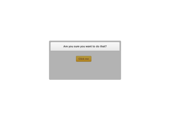
步骤5:模态标题
接下来,我们将添加模型的标题,这将是另一个div,其ID为标题,其中仅包含一些文本。 当然,可以随意使用<h2>或任何您喜欢的东西。
<body>

<a href="#" id="button">Click me</a>


<div id="modal">

	<div id="heading">
		Are you sure you want to do that?
	</div>
之后,我们将添加一些CSS样式,这里只是一些基本的东西,渐变框阴影等。
#heading {
	width:360px;
	height:44px;

	background-image: -webkit-linear-gradient(top, rgb(249, 249, 249), rgb(233, 233, 233));
	background-image: -moz-linear-gradient(top, rgb(249, 249, 249), rgb(233, 233, 233));
	background-image: -o-linear-gradient(top, rgb(249, 249, 249), rgb(233, 233, 233));
	background-image: -ms-linear-gradient(top, rgb(249, 249, 249), rgb(233, 233, 233));
	background-image: linear-gradient(top, rgb(249, 249, 249), rgb(233, 233, 233));
	filter: progid:DXImageTransform.Microsoft.gradient(GradientType=0,StartColorStr='#f9f9f9', EndColorStr='#e9e9e9');

	border-bottom:1px solid #bababa;

	-webkit-box-shadow:
		inset 0px -1px 0px #fff,
		0px 1px 3px rgba(0,0,0,.08);
	-moz-box-shadow:
		inset 0px -1px 0px #fff,
		0px 1px 3px rgba(0,0,0,.08);
	box-shadow:
		inset 0px -1px 0px #fff,
		0px 1px 3px rgba(0,0,0,.08);

	-webkit-border-radius:4px 4px 0px 0px;
	-moz-border-radius:4px 4px 0px 0px;
	border-radius:4px 4px 0px 0px;

	font-size:14px;
	font-weight:bold;
	text-align:center;
	line-height:44px;

	color:#444444;
	text-shadow:0px 1px 0px #fff;
}
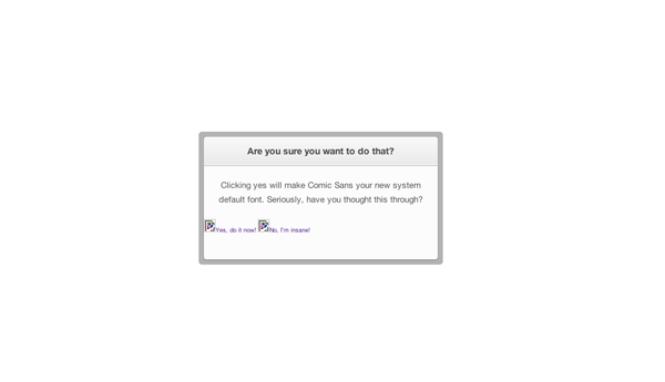
步骤6:模态主要内容
现在,我们将创建包含段落和按钮的部分。
<body>

<a href="#" id="button">Click me</a>


<div id="modal">

	<div id="heading">
		Are you sure you want to do that?
	</div>

	<div id="content">
		<p>Clicking yes will make Comic Sans your new system<br> default font. Seriously, have you thought this through?</p>

		<a href="#" class="button green close"><img src="images/tick.png">Yes, do it now!</a>

		<a href="#" class="button red close"><img src="images/cross.png">No, I’m insane!</a>
	</div>
再次使用一些基本CSS规则,对于该段,我们定义了100%的宽度,并将文本居中对齐,但是请注意,在HTML中,我们使用了换行符。
#content {
	width:360px;
	height:144px;

	background:#fcfcfc;

	-webkit-box-shadow:0px 1px 3px rgba(0,0,0,.25);
	-moz-box-shadow:0px 1px 3px rgba(0,0,0,.25);
	box-shadow:0px 1px 3px rgba(0,0,0,.25);

	-webkit-border-radius:0px 0px 4px 4px;
	-moz-border-radius:0px 0px 4px 4px;
	border-radius:0px 0px 4px 4px;
}

#content p {
	font-size:13px;
	font-weight:normal;
	text-align:center;
	line-height:22px;
	color:#555555;

	width:100%;
	float: left;

	margin:19px 0;
}
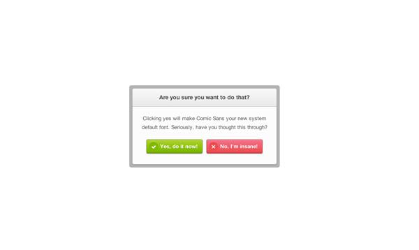
步骤7:这些按钮!
在上一步中,我们为按钮添加了一些标记,但是现在我们将为它们添加一些样式。 您可能已经注意到,我们在这里还使用了两个图像,这些图像用于叉号和刻度线。 我们构造此方法的方式是添加两个类,即button ,定义button所有主要样式,然后添加red和green类,以明显地创建颜色。
我们还将按钮内的图像作为目标,将它们向左浮动并为其指定宽度和高度。
.button {
	width:138px;
	height:33px;

	font-size:13px;
	font-weight:bold;
	line-height:33px;

	color:#fff;
	text-shadow:0px 1px 0px rgba(0,0,0,.2);

	-webkit-border-radius:3px;
	-moz-border-radius:3px;
	border-radius:3px;

	-webkit-box-shadow:
		inset 0px 1px 0px rgba(255,255,255,.5),
		0px 1px 2px rgba(0,0,0,.3);
	-moz-box-shadow:
		inset 0px 1px 0px rgba(255,255,255,.5),
		0px 1px 2px rgba(0,0,0,.3);
	box-shadow:
		inset 0px 1px 0px rgba(255,255,255,.5),
		0px 1px 2px rgba(0,0,0,.3);

	float:left;
}
.button img {
	float:left;
	width:33px;
	height:33px;
}


.button.green {
	background: -webkit-linear-gradient(top,  rgba(170,212,79,1) 0%,rgba(116,185,49,1) 90%,rgba(106,173,45,1) 95%,rgba(96,157,41,1) 100%);
	background: -moz-linear-gradient(top,  rgba(170,212,79,1) 0%,rgba(116,185,49,1) 90%,rgba(106,173,45,1) 95%,rgba(96,157,41,1) 100%);
	background: -o-linear-gradient(top,  rgba(170,212,79,1) 0%,rgba(116,185,49,1) 90%,rgba(106,173,45,1) 95%,rgba(96,157,41,1) 100%);
	background: -ms-linear-gradient(top,  rgba(170,212,79,1) 0%,rgba(116,185,49,1) 90%,rgba(106,173,45,1) 95%,rgba(96,157,41,1) 100%);
	background: linear-gradient(top,  rgba(170,212,79,1) 0%,rgba(116,185,49,1) 90%,rgba(106,173,45,1) 95%,rgba(96,157,41,1) 100%);
	filter: progid:DXImageTransform.Microsoft.gradient( startColorstr='#aad44f', endColorstr='#609d29',GradientType=0 );

	border:1px solid #5b8821;

	margin:0 5px 0 35px;
}
.button.red {
	background: -webkit-linear-gradient(top,  rgba(248,114,136,1) 0%,rgba(243,71,85,1) 90%,rgba(225,65,77,1) 95%,rgba(206,59,70,1) 100%);
	background: -moz-linear-gradient(top,  rgba(248,114,136,1) 0%,rgba(243,71,85,1) 90%,rgba(225,65,77,1) 95%,rgba(206,59,70,1) 100%);
	background: -o-linear-gradient(top,  rgba(248,114,136,1) 0%,rgba(243,71,85,1) 90%,rgba(225,65,77,1) 95%,rgba(206,59,70,1) 100%);
	background: -ms-linear-gradient(top,  rgba(248,114,136,1) 0%,rgba(243,71,85,1) 90%,rgba(225,65,77,1) 95%,rgba(206,59,70,1) 100%);
	background: linear-gradient(top,  rgba(248,114,136,1) 0%,rgba(243,71,85,1) 90%,rgba(225,65,77,1) 95%,rgba(206,59,70,1) 100%);
	filter: progid:DXImageTransform.Microsoft.gradient( startColorstr='#f87288', endColorstr='#ce3b46',GradientType=0 );

	border:1px solid #b0333e;

	margin:0 35px 0 5px;
}
第8步:将其显示出来
现在,我们终于完成了样式的样式设置,将其连接到Reveal插件。 首先,我们需要回到CSS,找到#modal并添加visibility:hidden; 对此。
接下来,我们需要返回到html文档,并将以下内容添加到文档底部,即我们引用Reveal脚本的下方。 在这里,我们将按钮作为单击项,并将模式div作为打开的项。
<script type="text/javascript">
	$(document).ready(function() {
		$('#button').click(function(e) { 		// Button which will activate our modal
			$('#modal').reveal({ 				// The item which will be opened with reveal
				animation: 'fade',              // fade, fadeAndPop, none
				animationspeed: 600,            // how fast animtions are
				closeonbackgroundclick: true,   // if you click background will modal close?
				dismissmodalclass: 'close'    	// the class of a button or element that will close an open modal
			});
		return false;
		});
	});
</script>第9步:覆盖层在哪里?
您可能会认为我们已经完成了,但是请等一下士兵! 我们应该有一个黑色的覆盖层来覆盖模态下的所有内容-整个页面。 要解决此问题,我们需要将一些CSS应用于显示插件(覆盖页面)创建的元素。
.reveal-modal-bg {
	position: fixed;
	height: 100%;
	width: 100%;
	background: #000;
	background: rgba(0,0,0,.4);
	z-index: 100;
	display: none;
	top: 0;
	left: 0;
}
第10步:使其具有移动性
好的,我们现在已经完成了模态,但是我们将添加一些样式以适应较小的设备。 当在不超过767像素的屏幕上查看时,以下媒体查询(在所有其他CSS规则之后添加)将应用样式。 为了使模态能够在不与屏幕重叠的情况下正确查看,我们仅更改了一些宽度,高度和字体大小。
@media only screen and (max-width: 767px) {

	#modal {
		width:284px;
		height:156px;
		padding:8px;

		margin-left:-150px !important;
		margin-top:-78px;
	}
	#heading {
		width:284px;
		height:28px;

		line-height:28px;
		font-size:0.688em;
	}
	#content {
		width:284px;
		height:128px;
   	}
   	#content p {
   		width:284px;
   		font-size:0.688em;
   	}
   	.button img {
		width:23px;
		height:23px;
	}
	.button {
		width:108px;
		height:23px;

		line-height:23px;
		font-size:0.688em;
	}
	.button.green {
		margin:0 4px 0 28px !important;
	}
	.button.red {
		margin:0 28px 0 4px !important;
	}
}
较旧的浏览器
那么,所有这些在旧版浏览器中的表现如何?
好吧,除了现代CSS3技术(例如渐变,边界半径等)之外,该模式还可以像旧版本的Internet Explorer一样工作。 优雅降级的完美示例。
结论
好吧,我们已经做到了! 我们采用了Orman的另一种设计并将其编码,这次使用了一个名为Reveal的免费jQuery插件。
希望您喜欢本教程,感谢您的阅读!
jquery.reveal


 扫一扫
扫一扫


 508
508

 被折叠的 条评论
为什么被折叠?
被折叠的 条评论
为什么被折叠?
 到【灌水乐园】发言


