


 本文详细介绍如何仅使用HTML和CSS3创建一个无JavaScript的切换按钮。通过逐步指导,包括HTML标记、CSS样式和CSS3特性如伪类、组合器及过渡效果的应用,实现一个功能完整且美观的切换滑块。
toggle不能用
您经常会发现使用切换滑块作为复选框的替代品。 今天,我们将使用纯CSS3和HTML创建一个。
第1步:从标记开始
创建一个新HTML文档,并添加一个带有toggle-bg类的span标签。 这将是切换的背景区域。
<!DOCTYPE html>
<!--[if lt IE 7 ]><html class="ie ie6" lang="en"> <![endif]-->
<!--[if IE 7 ]><html class="ie ie7" lang="en"> <![endif]-->
<!--[if IE 8 ]><html class="ie ie8" lang="en"> <![endif]-->
<!--[if (gte IE 9)|!(IE)]><!--><html lang="en"> <!--<![endif]-->
<head>

	<meta charset="utf-8">
	<title></title>
	<meta name="description" content="">
	<meta name="author" content="">

	<!-- Don't Forget the Viewport Metatag http://enva.to/A79s3G -->
	<meta name="viewport" content="width=device-width, initial-scale=1, maximum-scale=1">

	<!-- CSS -->
	<link rel="stylesheet" href="your_stylesheet.css">

</head>
<body>

	<span class="toggle-bg"></span>

</body>
</html>步骤2:语义和功能
为了使切换功能正常运行,我们将使用一些不可见的radio inputs 。 这些只有几个要求:
- 它们必须具有不同的值
- 它们必须具有相同的名称
我将使用on和off作为值,其名称为toggle ,但是您可以根据自己的使用情况进行更改。 例如,也许您会在yes和no之间切换。
将input添加到您先前创建的span 。 您的代码应如下所示:
<span class="toggle-bg">
	<input type="radio" name="toggle" value="off">
	<input type="radio" name="toggle" value="on">
</span>
根据您自己的用法,您可能还希望将其全部放置在表单中。
步骤3:拨动开关
将成为开关本身的小圆圈只是一个span ,稍后我们将对其进行样式设置。 给span一类switch ,并将其插入inputs后面。
这是您的最终HTML标记:
<span class="toggle-bg">
	<input type="radio" name="toggle" value="off">
	<input type="radio" name="toggle" value="on">
	<span class="switch"></span>
</span>
步骤4:设定背景样式
为简单起见,我们将以使该切换工作所需的最低限度开始。 将以下内容添加到您CSS文档中(如果使用嵌入式CSS,则添加到style元素中。)
.toggle-bg{
	background: #222; /* You'll want to see the area being toggled, but feel free to change the color */
	display: block; /* ...So that we can set a height and width */
	float: left; /* ...So that it doesn't take up the full width of the page */
	height: 7px; /* You can change this later if you want */
	position: relative; /* Required to allow the switch to move around */
	width: 26px; /* This can be changed later as well */
}步骤5:看不见的输入
这些inputs必须进行绝对定位,然后略微移位才能正确安装。 然后,我们将其opacity降低为0 。
.toggle-bg input{
	height: 28px;
	left: 0;
	margin: 0; /* Reset the margins and padding */
	opacity: 0; /* Invisible! */
	padding: 0;
	position: absolute;
	top: -10px; /* Shift vertically */
	width: 36px;
	z-index: 2; /* We want the input to be over the span.switch, which we'll give a z-index of 1 */
}步骤6:拨动开关
开关应该是正方形的,因此我们稍后可以使用border-radius将其倒圆为一个完美的圆。 它需要相对定位才能移动,并且由于我们需要给它一个height和width ,因此它将是一个floated在left的block级元素。
.switch{
	background: #ccc;
	display: block;
	float: left;
	height: 14px;
	left: -1px; /* This is the starting point. When adding a border radius, a small bit of the background is shown if we use left: 0;, so -1px is best.*/
	position: relative;
	top: -4px; /* ...To keep it centered vertically */
	width: 14px;
	z-index: 1; /* Remember, it must be below the invisible inputs */
}
步骤7: CSS Hackery!
CSS3添加了新的常规同级组合器,该选择器使用波浪号(~)来选择共享同一父级的元素。 它们在CSS中的出现顺序(在波浪号之前或之后)反映了它们在DOM中出现的顺序。
我们还可以访问新的:checked伪类。 这将使我们能够专门针对已检查的(当前不可见) radio input 。
首先,我们将使用这些选择器重置拨动开关的开始位置。
.toggle-bg input:checked~.switch{ left: -1px; } /* initial toggle position */接下来,我们将告诉浏览器最终的切换位置。
.toggle-bg input~:checked~.switch{ left: 13px; } /* final relative toggle position */ 最后,我们将:checked input放在未选中input和开关的后面,以便可以单击第二个input 。
.toggle-bg input:checked{ z-index: 0; }现在,它应该如下所示:
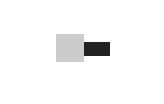
步骤8:到目前为止的故事
这是完整的,未样式化CSS:
.toggle-bg{
	background: #222; /* You'll want to see the area being toggled, but feel free to change the color */
	display: block; /* ...So that we can set a height and width */
	float: left; /* ...So that it doesn't take up the full width of the page */
	height: 7px; /* You can change this later if you want */
	position: relative; /* Required to allow the switch to move around */
	width: 26px; /* This can be changed later as well */
}

.toggle-bg input{
	height: 28px;
	left: 0;
	margin: 0; /* Reset the margins and padding */
	opacity: 0; /* Invisible! */
	padding: 0;
	position: absolute;
	top: -10px; /* Shift vertically */
	width: 36px;
	z-index: 2; /* We want the input to be over the span.switch, which we'll give a z-index of 1 */
}

.switch{
	background: #ccc;
	display: block;
	float: left;
	height: 14px;
	left: -1px; /* This is the starting point. When adding a border radius, a small bit of the background is shown if we use left: 0;, so -1px is best.*/
	position: relative;
	top: -4px; /* ...To keep it centered vertically */
	width: 14px;
	z-index: 1; /* Remember, it must be below the invisible inputs */
}

.toggle-bg input:checked~.switch{ left: -1px; } /* initial toggle position */

.toggle-bg input~:checked~.switch{ left: 13px; } /* final relative toggle position */

.toggle-bg input:checked{ z-index: 0; }
步骤9: Border Radii
现在,您有了一个看起来像傻瓜的方形滑块,因此,我们将这些角弄圆吧! 我们将在类别为toggle-bg的span添加一个8px的border-radius ,并在类别为switch的span添加一个8px的border-radius 。
border-radius: 8px; 注意:与opacity和即将到来的transition ,出于教程的考虑,我在这里不使用任何供应商前缀,但为了与某些旧版浏览器兼容,您将需要它们。
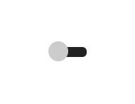
步骤10:转换
应该使用一类switch将Transitions添加到span 。 随意调整设置。 Left:是以下过渡中唯一无法更改的部分。
transition: left .2s ease;步骤11:背景,阴影,渐变...
现在所有功能都已存在,可以根据您的喜好自定义所有内容。 您可以使用类toggle-bg或开关向span添加框阴影和背景渐变。 因为是圆形的,所以径向渐变在开关上看起来会更好。
这是我的设置,但是请根据您的风格和项目进行更改。
为body灰白色背景和边距,以使切换不位于角落:
body{
	background: #f6f8f9;
	margin: 200px;
} 将以下内容添加到.toggle-bg的样式中:
background: linear-gradient(to bottom, #f6f8f9 0%,#e5ebee 50%,#d7dee3 51%,#f5f7f9 100%);
box-shadow: 0 1px 0 #fff, inset 0 0 2px #d7dee3, inset 0 1px 0 #d7dee3, inset 0 1px 5px #d7dee3; 将以下内容添加到.switch的样式中:
background: radial-gradient(ellipse at center, #ffffff 0%,#fefefe 50%,#fdfdfd 51%,#ffffff 100%);
box-shadow: 0 1px 1px #65727b, 0 0 1px #b6bdc2;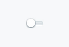
步骤12: iOS切换
对于iOS样式的切换,如果开关的大小与背景大小相同,请为.switch更改以下样式:
height: 30px;
	top: 0;
	width: 30px;
将最终切换位置更改为左41像素:
.toggle-bg input~:checked~.switch{ left: 41px; } 通过更改.toggle-bg input的样式,更改inputs的大小并消除垂直移位:
height: 30px;
top: 0;
width: 70px; 将所有border radii更改为30px而不是8px 。
提示:保持border-radius值等于其修改的元素的height 。
最后,更改.toggle-bg的height和width以适合更改后的元素:
height: 30px;
width: 70px;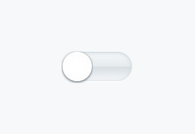
结论
恭喜你! 现在,您可以使用一些很棒的新CSS3创建无JavaScript的切换。 您可能需要更改背景渐变,幸运的是,有一个很棒的在线工具可以帮助您解决此问题。 查看Colorzilla的免费渐变编辑器 。 还有一个名为Gradient的Mac应用程序,其工作原理与此类似。
由于此方法依赖于某些全新CSS3功能,因此不支持较旧的浏览器。 浏览器对:checked伪类的支持包括以下内容:
以下浏览器支持通用兄弟组合器 :
我创建了三个jsFiddles供您自己尝试。 第一个包括最低CSS,您需要有一个可用的切换滑块。 第二个更加漂亮,包括第一个的所有内容以及一些额外的样式和过渡。 最后一个是我所谓的“ iOS样式切换器”,因为就像iOS上的切换器一样,切换器的高度等于切换器背景的高度。
因为这都是CSS,所以可以创建很多变体。 以下是一些入门指南:
注意:在为切换radio inputs创建label ,如果希望能够使用label作为取消选中input的方法,则需要使用JavaScript来显示和隐藏非活动input's label 。 否则,您只能通过按label 检查 (但不能取消选中) input 。
希望本教程对您有所帮助。 谢谢阅读!
toggle不能用


 扫一扫
扫一扫


 227
227

 被折叠的 条评论
为什么被折叠?
被折叠的 条评论
为什么被折叠?
 到【灌水乐园】发言


