


 本文详细介绍了如何使用CSS3的不透明度(opacity)和透明度(transparent)属性来创建丰富的视觉效果。从基本概念到高级应用,包括过渡效果、RGBA颜色以及与圆角和阴影结合的实例,展示了CSS3的强大能力。
css3缩放透明度
在本快速教程中,我们将掌握HTML元素中的不透明度和透明度的概念。 在CSS3之前,我们将使用一组效果,这些效果只能通过使用在Photoshop中创建的多个图像来实现。
注意:以下所有示例均已在Mozilla Firefox,Safari和Chrome上进行了测试。 如果您想在IE或任何其他浏览器中获得类似的信息,请留下评论,我们将很乐意为您提供帮助。
开始之前
在本教程中,我们将使用“渐变背景”,“盒子阴影”和“多图像背景”,这一系列的前两个教程中涉及的主题:
步骤1:不透明度
如果您曾经使用过Photoshop或类似的图形包,您将熟悉不透明度值。 此魔术通过以百分比值(从0%(完全不可见)到100%(完全可见))增加或减小任何图形元素的透明度来起作用。 该百分比是“ Alpha”值,我将在本教程的后面部分解释它的工作方式。
CSS3包含“ opacity”属性,可以在所有现代浏览器中实现,但是它如何工作? 假设您在一个文件夹中有三个Photoshop元素,如下面的屏幕截图所示:图像,一行文本和图片背景上的实心正方形。 图像,文本和黄色正方形位于名为“ Section”的文件夹内。 通过降低该文件夹的不透明度百分比,其中的所有图层将显得更加透明。
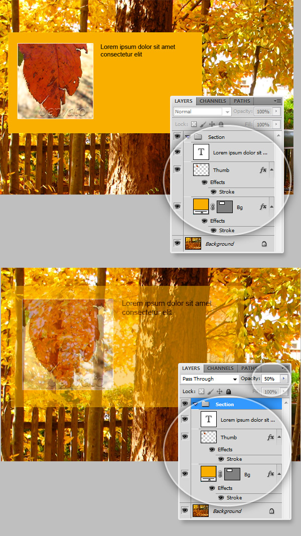
在CSS3中,工作原理几乎相同。 Folder已成为HTML容器元素(一个div,一个段落,一个节等)。因此,更改该元素的“ opacity”属性(就像在Photoshop中一样)将增加或减少其中所有元素的可见性。 以这个HTML标记为例:
<section class="box opaque">
    <img src="images/thumb.jpg" width="180" height="180" alt="Thumb">
    This is a 100% Opaque element, everything inside this tag is fully visible
    </section>

<section class="box translucent60">
    <img src="images/thumb.jpg" width="180" height="180" alt="Thumb">
    This is a 60% Opaque element, you notice that this text is hard to read because Opacity affects the entire element and all the content inside it. </section>
现在,让我们看一下先前标记CSS。
/*Full page image background */
body.image{
	background-image:url(images/bg.jpg);
	background-position:top center;
	background-attachment:fixed;
	background-repeat:no-repeat;
}

/*Opacity Test*/
.opaque{
	opacity: 1;
}

.translucent60{
	opacity: 0.6;
}
如您所见,更改不透明度确实很容易,但是什么时候使用它呢? 一种非常有效的技术是增加:hover伪类的不透明度:
.translucent_on_hover{
	opacity: 0.4;
}

	.translucent_on_hover:hover{
		opacity: 0.9;
}但是,如果您想要真正令人印象深刻的效果,则可以进行一些过渡。
过渡效果
过渡效果会在任何HTML元素样式的两个阶段或实例之间插入中间状态。
为了使事情现在变得简单,让我们看一下过渡效果的基本代码(时间间隔为1秒)。
-webkit-transition: all 1s ease-in-out;
 -moz-transition: all 1s ease-in-out;
 -o-transition: all 1s ease-in-out;
 -ms-transition: all 1s ease-in-out;
 transition: all 1s ease-in-out;
提示:为了确保您不会错过任何各种浏览器前缀,请查看Jeffrey Way最近发布的Prefxr工具 。 摇晃。
您只需要将此CSS规则附加到要使用过渡效果进行动画处理的元素即可,如下所示:
.translucent_transition{
  opacity: 0.4;

  -webkit-transition: all 1s ease-in-out;
  -moz-transition: all 1s ease-in-out;
  -o-transition: all 1s ease-in-out;
  -ms-transition: all 1s ease-in-out;
  transition: all 1s ease-in-out;
  }

  .translucent_transition:hover{
  opacity: 0.9;
  }
“渐进渐出”样式意味着不透明性过渡将在悬停时发生(增加不透明性),并且当光标移到元素外部时将还原(减小不透明性)回到原始值。
观看演示
步骤2:透明度
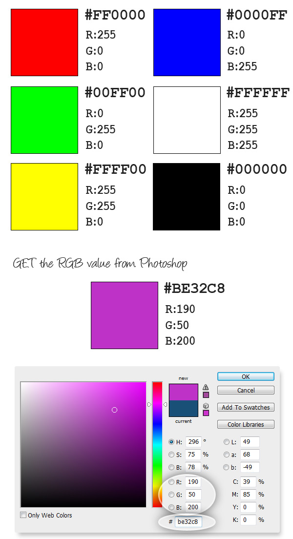
可以通过组合三组值(红色,绿色和蓝色)来创建颜色的每个像素,每个值从0到255。
我们通常在样式表中使用十六进制值作为颜色,例如基本颜色:
- 红色:#FF0000
- 蓝色:#0000FF
- 绿色:#00FF00
- 黑色:#000000
- 白色:#FFFFFF
您可以使用CSS中的RGB值获得相同的颜色,如下所示: rgb(<red>, <green>,<blue>) 。
- 红色:rgb(255,0,0)
- 蓝色:rgb(0,0,255)
- 绿色:rgb(0,255,0)
- 黑色:rgb(0,0,0)
- 白色:rgb(255,255,255)
获取任何颜色的RGB值的一种简单方法是使用Photoshop中的拾色器,如下图所示。
透明在哪里?
在CSS中应用“ opacity”属性时,会影响整个容器及其中的所有内容。 有时这很有用,但是您可能只想使背景透明,而使文本和图像保持100%不透明。 再次出现“ Alpha”值。
CSS3允许我们使用RGB颜色格式,其中包括名为Alpha的第四个值。 这不是一个新概念,PNG图像使用alpha通道将图像上像素的透明度设置为0到1(0%到100%)的值。 这将产生比GIF图像更好的透明度效果,因为它们仅对像素设置可见/不可见值。
以下面的图形为例:
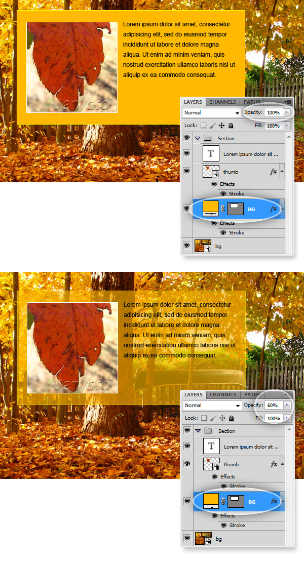
请注意,我只更改了黄色背景层的不透明度。
对于这种效果,有“ RGBA ”(红色,绿色,蓝色,Alpha)颜色值:
rgba(<red>,<green>,<blue>,<alpha>),其中alpha是介于0和1之间的数字,用于设置颜色的不透明度。 如果要使用rgba颜色显示完整的可见背景,可以这样做:
.opaque{
	background-color:rgba(255, 150, 0, 1); /*Alpha = 1 means 100% opaque*/
}
而且,如果您想减少背景的不透明度以使其成为半透明,则就像更改rgba颜色参数的最后一个值一样容易。
.translucent{
	background-color:rgba(255, 150, 0, .6); /*Alpha = .6 means 60% opaque*/
}
由于rgba颜色表现为经典的十六进制颜色,因此可以在“线性渐变”背景上使用它。
.translucent_gradient{
	background-image:-moz-linear-gradient(top, rgba(255, 150, 0, .9), rgba(255, 150, 0, .1));
	background-image: -webkit-gradient(linear, 0% 0%, 0% 100%, from(rgba(255, 150, 0, .9)), to(rgba(255, 150, 0, .1)), color-stop(1,rgba(255, 150, 0, .1)));
}
当然,您可以将其与不透明度样式结合使用以创建漂亮的过渡效果。
.translucent_transition{
	opacity: 0.4;

	-webkit-transition: all 1s ease-in-out;
	-moz-transition: all 1s ease-in-out;
	-o-transition: all 1s ease-in-out;
	-ms-transition: all 1s ease-in-out;
	transition: all 1s ease-in-out;

	background-image:-moz-linear-gradient(top, rgba(255, 150, 0, .9), rgba(255, 150, 0, .1));
	background-image: -webkit-gradient(linear, 0% 0%, 0% 100%, from(rgba(255, 150, 0, .9)), to(rgba(255, 150, 0, .1)), color-stop(1,rgba(255, 150, 0, .1)));
}

	.translucent_transition:hover{
		opacity: 1;
	}
观看演示
第3步:组合多种样式以创建出色的效果
现在,让我们尝试一些更复杂的事情。 我们将使用透明度,悬停不透明度效果以及圆角和阴影来组合多个图像背景,以营造深度感。
让我们从photoshop开始,在教程资源中,您将找到以下图形的PSD:
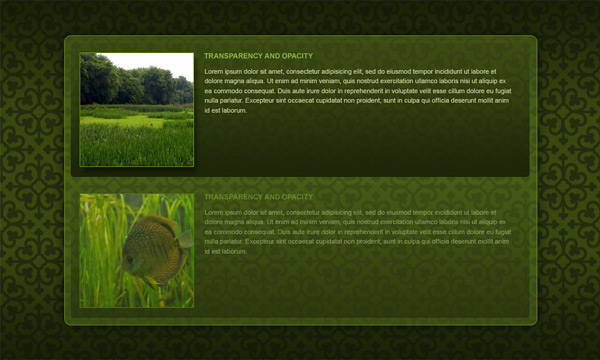
我们将尝试仅使用CSS3样式来获得准确的结果。 这些部分的缩略图将有一些示例图像,还有一个图案背景(欢迎您创建自己的图案背景)。 这次我使用bgpatterns.com创建重复图像。
让我们从HTML标记开始,没有什么太复杂的:
<div class="page">
	<div class="wrapper">
        <section class="container">
            <section class="box">
            	<img src="images/pic1.jpg" />
                <hr /><h2><span>Transparency and Opacity</h2>
                <p>Some text here</p>
            </section>

            <section class="box">
            	<img src="images/pic2.jpg" />
                <hr /><h2><span>Transparency and Opacity</h2>
                <p>Some text here</p>
            </section>
        </section>
    </div>
</div>
现在,有趣的部分是CSS。 首先重置默认样式,设置正文排版并设置包装器部分的样式:
/* Reset */
html, body, div, h1, h2, h3, h4, h5, h6, ul, ol, dl, li, dt, dd, p, blockquote, pre, form, fieldset, table, th, td, img{
    margin: 0;
    padding: 0;
	border:0px;
}

header, section, footer, aside, nav, article, figure {
    display: block;
}
/* End of Reset */

body{
	font-family:Arial, Helvetica, sans-serif;
	color:#333;
}

html{
	height:100%; /* To add a full page body CSS3 gradient you need to set this height to 100% */
}

.wrapper{ margin:0px auto; width:960px; padding:60px 0px 60px 0px;}

.left{ text-align:left;}
然后设置身体背景,基本上是重复的图像(您可以使用任何想要的图像)
/* Body image background */
body{
	height:100%;
	background: url(images/bg.png); /*Image Background*/
}
现在,我们将设置另一个称为“页面”的包装div的样式,该div的宽度和高度与浏览器窗口的宽度和高度基本相同,更重要的是,我们将使用RGBA颜色添加线性渐变背景。
/* Transparent Gradient */
.page{
	width:100%;
	height:100%;
	background: -moz-linear-gradient(top, rgba(15,20,5,0.75) 0%, rgba(15,20,5,0) 50%, rgba(15,20,5,0.75) 100%); /*Transparent Gradient*/
	background: -webkit-gradient(linear, left top, left bottom, from(rgba(15,20,5,0.75)), color-stop(0.5, rgba(15,20,5,0)), to(rgba(15,20,5,0.75)));/*Transparent Gradient*/
}
现在,设置容器部分的样式,即具有半透明背景的圆角框。
/* RGBA transparent background */
.container{
	width:770px;
	padding:15px;
	height:460px;
	margin:0px auto;

	/*Translucent Background*/
	background:rgba(89, 113, 29, 0.5);

	/*Border Radius*/
	border:1px solid #71941D;
	-moz-border-radius: 20px;
	-webkit-border-radius: 20px;
	-khtml-border-radius: 20px;
	border-radius: 20px;

	/*Get rid of Bleed*/
    -moz-background-clip: padding;
    -webkit-background-clip: padding-box;
    background-clip: padding-box;

	/*Box Shadow*/
	box-shadow: 0px 0px 25px rgba(0,0,0,0.75);
	-moz-box-shadow: 0px 0px 25px rgba(0,0,0,0.75);
	-webkit-box-shadow: 0px 0px 25px rgba(0,0,0,0.75);
}
它开始成形。 现在设置内容框的样式。 设置位置,圆角效果,渐变半透明背景,然后将其与悬停效果结合使用,以增加鼠标悬停时的不透明度(为此启用过渡效果)。
.box{
	/*Position*/
	padding:10px;
	margin-bottom:20px;
	min-height:200px;

	/*Translucent Gradient Background*/
	background: -moz-linear-gradient(top, rgba(26,35,8,0), rgba(26,35,8,0.85)); /*Transparent Gradient*/
	background: -webkit-gradient(linear, left top, left bottom, from(rgba(26,35,8,0.15)), to(rgba(26,35,8,0.85)));/*Transparent Gradient*/

	/*Rounded Corners*/
	-moz-border-radius: 5px;
	-webkit-border-radius: 5px;
	-khtml-border-radius: 5px;
	border-radius: 5px;

	/*Fix the bleed*/
	-moz-background-clip: padding;
    -webkit-background-clip: padding-box;
    background-clip: padding-box;

	/*Hide it a little bit until mouse over*/
	opacity: 0.4;

	/*Enable Transition effects*/
	-webkit-transition: all 1s ease-in-out;
	-moz-transition: all 1s ease-in-out;
	-o-transition: all 1s ease-in-out;
	-ms-transition: all 1s ease-in-out;
	transition: all 1s ease-in-out;
}
	.box:hover{
		opacity:1;
	}
现在,为框内HTML元素添加最后的修饰。 您可以尝试在静态模式下将更多的效果添加到元素上并悬停,这一次,当鼠标悬停在“框”部分上时,我将在“ img”标签上显示框阴影:
.box img{
	float:left;
	margin-right:20px;

	border:1px solid #71941D;
}

	.box:hover img{
		box-shadow: 5px 5px 5px rgba(0,0,0,0.50);
		-moz-box-shadow: 5px 5px 5px rgba(0,0,0,0.30);
		-webkit-box-shadow: 5px 5px 5px rgba(0,0,0,0.30);
	}

.box h3{
	font-size:14px;
	font-weight:bold;
	color:#8eb548;
	text-transform:uppercase;
	padding-bottom:20px;
}

.box p{
	color:#c0cf9d;
	font-size:11px;
	line-height:150%;
}就是这样,让我们看看它在浏览器中的外观:
观看演示
结论
将透明胶片和不透明效果与其他CSS3样式结合使用可以做什么。 现在就试试!
翻译自: https://webdesign.tutsplus.com/articles/css3-vs-photoshop-opacity-and-transparency--webdesign-3880
css3缩放透明度


 扫一扫
扫一扫


 1032
1032

 被折叠的 条评论
为什么被折叠?
被折叠的 条评论
为什么被折叠?
 到【灌水乐园】发言


