


 本文介绍了一种使用纯CSS3创建工具提示的方法,无需依赖JavaScript,适用于各种设备,包括移动设备。文章详细解释了如何通过HTML标记和CSS样式实现工具提示的显示、定位和美化,特别关注了对IE7和IE8的支持。
css3禅意花园脚本
啊...工具提示。 它们可以解决您的许多支持问题,或者仅向用户提供一些提示。 如今,有大量使用工具提示的网站和应用程序,但是...有没有更好的方法来实现它们? 我很高兴地说,有一种更好的方法,一种免费的Javascript方法……在大多数情况下都很好。 我们将使用纯CSS3制作一些非常出色的工具提示,然后创建一个移动友好版本,这在这里变得有些朦胧,因为要使其正常工作,我们必须使用一些Dean Edwards IE9.js就是众所周知的Javascript修复程序。
注意:版本8及更高版本完全支持IE。 除移动版本(可点击版本)外,还支持IE7。
视频教程
对于每个想窥探贾斯汀如何用鲜活色彩创建它的人,请查看下面的视频!
书面教程
现在,带有完整编码说明的完整书面逐步指南。 确保也从上方获取源文件下载!
步骤1建立标记
在头上
让我们从创建文档的开头开始,然后插入专门用于本教程的样式表。 在自己的项目中实现时,可以删除tut.css样式表,该样式表仅用于本教程。
我们使用了HTML5文档类型,即!DOCTYPE html,然后将其称为两个样式表。 第一个样式表是透明度版本,但是源文件中还有更多主题可供选择。 第二个是我们讨论的tut.css,仅用于设计本教程的样式,但您可以根据需要随意使用它。
在样式表之后,是我们少于IE9的语句。 我们使用了一个ie.css文件,该文件调用CSSPIE告诉IE 7和8可以使用CSS3功能,因为它们很棒! 然后,我们呼吁Dean Edwards IE9.js进一步告诉IE7&8,我们需要使用高级CSS选择器来使这项工作有效。
<!DOCTYPE html>
    <head>
    <meta charset=utf-8 />
    <title>CSS3 Tooltips - Hover & Clickable</title>
    <link rel="stylesheet" href="styles/themes/tip-transparency.css" />
    <link rel="stylesheet" href="styles/tut.css" />

    <!--[if lt IE 9]>
    <link rel="stylesheet" href="styles/ie.css" media="screen" />
    <script src="http://ie7-js.googlecode.com/svn/version/2.1(beta4)/IE9.js"></script>
    <![endif]-->

    </head>

    <body>

    </body>
    </html>
“用户将能够将鼠标从您的元素移动到工具提示,以便单击链接。”
Websafe工具提示
既然已经创建好头了,那么下一步将是为我们的第一个工具提示创建标记。 在本教程中,我们将使用无序列表,但您可以使用任何东西,因为在CSS中,我们仅使用类名,而不是选择列表本身,从而可以在所需的任何位置简单地插入类。
提示类(即li class =“ tip”)用于将鼠标悬停在上面以显示工具提示的文本或图像。 在其中,我们添加了一个带有哈希的链接,并且哈希是,以便可以访问我们的链接。
提示类之后是tooltipL类(即:strong class =“ tooltipL”),该类用于显示在悬停元素左侧的任何工具提示,在本例中为第一个链接。
甚至可以在工具提示中添加图像和链接。 用户可以将鼠标从悬停元素移动到工具提示,以便单击链接。 该样式功能已在stylehseet中得到了解决,我们将在本教程的后面部分进行讨论。
<ul>
        <li class="tip"><a href="#">Left Tip</a><strong class="tooltipL">Add images in the tooltip. <img class="ref" src="images/profolio.jpg" height="80" width="80" alt="" /><a href="#"> You can even add links!</a></strong></li>
遵循上面的示例将是我们将创建的其余工具提示。 基本上,每个工具提示的所有内容都是相同的。 唯一的区别还是类别。 而不是tooltipL,我们将.tooltipR放在悬停元素右侧,所有.tooltipB放在底部,.tooltipT放在顶部。 每当您想向项目中添加新的工具提示时,您要做的就是根据您希望工具提示显示的位置使用这些类之一。
<li class="tip"><a href="#">Right Tip</a><strong class="tooltipR">Add images in the tooltip. <img class="ref" src="images/profolio.jpg" height="80" width="80" alt="" /><a href="#"> You can even add links!</a></strong></li>

    <li class="tip"><a href="#">Bottom Tip</a><strong class="tooltipB">Add images in the tooltip. <img class="ref" src="images/profolio.jpg" height="80" width="80" alt="" /><a href="#"> You can even add links!</a></strong></li>

    <li class="tip"><a href="#">Top Tip</a><strong class="tooltipT">Add images in the tooltip. <img class="ref" src="images/profolio.jpg" height="80" width="80" alt="" /><a href="#"> You can even add links!</a></strong></li>
    </ul>
移动友好工具提示
这种类型的工具提示与网络安全版本之间的主要区别在于,我们使用了不同的类(即.tipClick),并使其简单地可单击。 在手机上,您无法将鼠标悬停在诸如工具提示之类的地方以使其显示,因此该版本可以解决该问题。 这对于面向行动的内容也非常有用。
<ul>
        <li class="tipClick"><a href="#">Left Tip</a><strong class="tooltipL">Add images in the tooltip. <img class="ref" src="images/profolio.jpg" height="80" width="80" alt="" /><a href="#"> You can even add links!</a></strong></li>

        <li class="tipClick"><a href="#">Right Tip</a><strong class="tooltipR">Add images in the tooltip. <img class="ref" src="images/profolio.jpg" height="80" width="80" alt="" /><a href="#"> You can even add links!</a></strong></li>

        <li class="tipClick"><a href="#">Bottom Tip</a><strong class="tooltipB">Add images in the tooltip. <img class="ref" src="images/profolio.jpg" height="80" width="80" alt="" /><a href="#"> You can even add links!</a></strong></li>

        <li class="tipClick"><a href="#">Top Tip</a><strong class="tooltipT">Add images in the tooltip. <img class="ref" src="images/profolio.jpg" height="80" width="80" alt="" /><a href="#"> You can even add links!</a></strong></li>
    </ul>
这就是HTML标记。 现在让我们看一些CSS来使这个婴儿功能正常!
第2步:使用CSS使其实用并创建样式
在本教程中,我们将使用tip-transparency.css样式,但再次重申,有更多样式可供选择,因此请选择您喜欢的样式。
首先,我们将为主类添加一些样式。
在这里,我们添加了相对位置和内联块显示,以便工具提示与悬停元素保持内联。
.tip, .tipClick{ /* This is any element that has a tooltip attached too it */
        position:relative !important;
        display:inline-block;
    }
接下来,我们要隐藏所有工具提示,直到将其悬停或单击。 为此,我们只需为每个方向选择类别并使用显示:无
.tip > .tooltipL,
    .tip > .tooltipB,
    .tip > .tooltipR,
    .tip > .tooltipT,
    .tipClick > .tooltipL,
    .tipClick > .tooltipB,
    .tipClick > .tooltipR,
    .tipClick > .tooltipT{ /* Used to hide the tooltip */
        display:none;
    }
为了在悬停或单击时显示工具提示,我们将执行与隐藏工具相反的操作,并在为每个方向选择类别后使用display:块。
对于可点击的工具提示,我们将焦点添加到悬停的元素上(即:第一个链接),然后我们将使用加号选择器(即:a:focus + .tooltipL)立即匹配之前的工具提示。
.tip:hover > .tooltipL,
    .tip:hover > .tooltipB,
    .tip:hover > .tooltipR,
    .tip:hover > .tooltipT, /* This shows the tooltip when an elements with the .tip class is hovered over */
    .tipClick > a:focus + .tooltipL,
    .tipClick > a:focus + .tooltipB,
    .tipClick > a:focus + .tooltipR,
    .tipClick > a:focus + .tooltipT{ /* This shows the tooltip once an element with the .tipClick class is clicked */
        display:block;
    }
现在我们有了可行的工具提示,让我们继续进行样式设置。 在大多数情况下,每个工具提示(左,右,顶部或底部)都是相同的,除了一些区别,我将在后面解释。
如您所见,我们希望每个工具提示看起来都一样,因此它们具有85%的不透明度的普通背景。 有一个框阴影可增加一点深度,并带有实心边框以分隔内部内容。
这里有一些重要的事实:min-width:200px(使箭头与悬停元素保持一致),绝对位置,以便我们可以显示工具提示而不影响其周围的任何元素,以及z索引的10,以便工具提示始终位于最上方。
.tooltipL, .tooltipR, .tooltipB, .tooltipT{
        background: #333333; /* old browsers */
        background: rgba(0,0,0,0.85); /* For IE9 */
        background: -moz-linear-gradient(top, rgba(51,51,51,0.85) 0%, rgba(0,0,0,0.85) 100%); /* firefox */
        background: linear-gradient(top, rgba(51,51,51,0.85) 0%, rgba(0,0,0,0.85) 100%); /* future browsers */
        -pie-background: linear-gradient(top, rgba(51,51,51,0.25) 0%, rgba(0,0,0,0.25) 100%); /* pie for less than ie9 */
        background: -webkit-gradient(linear, left top, left bottom, color-stop(0%,rgba(51,51,51,0.85)), color-stop(100%,rgba(0,0,0,0.85))); /* webkit */
        -moz-box-shadow: 0 0 6px 1px #666666;
        -webkit-box-shadow: 0 0 6px 1px #666666;
        box-shadow: 0 0 6px 1px #666666;
        border:solid #FFFFFF;
        color: #E7E7E7;
        min-width:200px;
        padding: 5px;
        position: absolute;
        text-align: center;
        z-index: 10;
    }
因此,由于每个工具提示中的差异是它们相对于悬停元素的位置。 这些值似乎是最好的,不需要更改,但是,如果确实需要更改它们以适合您的项目,那么最好的解决方案是使用javascript使用动态重新定位...但这超出了范围本教程。
通过查看下面CSS代码,您可以看到我们必须重新定位工具提示,以便它们与各自的hover元素内联,而在主要类上使用相对位置将工具提示包含在hover元素内,则它不会定位他们旁边。
.tooltipL{ /* The styling on the tooltip */
    left: -226px;
    margin-top: -28px;
	}

    .tooltipB{ /* The styling on the tooltip */
    top: 30px;
	left: -183px;
	}

    .tooltipR{ /* The styling on the tooltip */
    right: -226px;
    margin-top: -28px;
	}

    .tooltipT{ /* The styling on the tooltip */
    bottom:26px;
    left: -186px;
	}
就快结束了! 现在,我们需要为工具提示创建箭头,该箭头指向悬停元素。 同样,我将在稍后向您介绍一些差异。
因此,在下面的代码中,我们将在每个工具提示之前插入箭头。 在这里重要的是为什么我们可以使用CSS制作箭头的原因是“内容”声明。 我们将添加一个绝对位置,以便我们可以根据需要定位箭头。 放置一个显示:块,高度/宽度为0,以及一个10像素的实线边框,它将作为我们的实际箭头。
.tooltipL:before, .tooltipR:before, .tooltipB:before, .tooltipT:before{
        border-style: solid;
        border-width: 10px;
        height:0px;
        width:0px;
        position:absolute;
        display:block;
        content:"\00a0";
    }
此处的区别是我们希望箭头指向哪个方向,为此,我们在一侧使用纯色背景,而在其余部分使用透明背景。 此外,我们还必须将每个箭头从顶部向下移至右侧,并用工具提示使箭头平齐,以使其看起来像元素上的。
.tooltipL:before{
border-color: transparent transparent transparent #333333; /* Right facing arrow */
top:5px;
right:-20px;
}
.tooltipB:before{
border-color: transparent transparent #333333 transparent; /* Top facing arrow */
right:5px;
top:-20px;
}
.tooltipR:before{
border-color: transparent #333333 transparent transparent; /* Left facing arrow */
top:5px;
left:-20px;
}
.tooltipT:before{
border-color: #333333 transparent transparent transparent; /* Bottom facing arrow */
right:5px;
bottom:-20px;
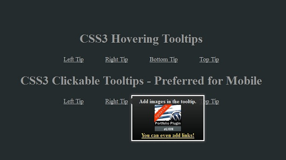
}完成之后,一切都完成了,最终结果应该类似于下图。 如果它看起来不像图像,请返回并检查您的代码...您可能错过了某些内容...可能很小。
为了使您的外观与tut完全一样,我们需要使用tut.css,并且代码应如下所示...
body{background: url(images/maintenance/bg.png) repeat-x #252C2E;}

	a{color:#FFE25F;}

	a:hover{color:#CFE25F;}

	img{border:none;}

	li.tip, li.tipClick {margin-right:30px; margin-left:30px; display:inline;}

	.tip > a, .tipClick > a{font-size:18px;}

	h2{color:#d2d2d2; text-align:center; font-size:36px; position:relative;}

	ul > h2{color:#999;}

	ul{margin: 0 auto;position: relative;text-align: center;top: 130px;width: 960px;}

	li.tip > a, li.tipClick > a{color:#CCC;}

	img.ref{margin:0 auto; display:block;}
全做完了!
恭喜! 现在,您完成了一些非常了不起的工具提示,无需使用javascript即可,只是使IE 7和8发挥作用。 我衷心希望您喜欢本教程,并且能够学习一些有价值的东西。
记住,要有耐心,并不断吸收尽可能多的知识,在您不知不觉中,您将成为您所做的一切的大师!
翻译自: https://webdesign.tutsplus.com/articles/how-to-create-script-free-css3-tooltips--webdesign-3322
css3禅意花园脚本


 扫一扫
扫一扫


 918
918

 被折叠的 条评论
为什么被折叠?
被折叠的 条评论
为什么被折叠?
 到【灌水乐园】发言


