


css滚轮
没有比学习实际项目更好的学习CSS3的方法了,这正是我们要做的。 我将教你如何使用一些初学者到高级CSS技术来创建一个很棒的,分层CSS3轮菜单。 因此,断开您喜欢的文本编辑器或IDE,让我们开始使用CSS3魔术吧!
今天,您将学习如何从可用的多种不同样式和颜色中创建出甘蔗泪滴。 您将在源文件中收到所有变体。 另外,作为一个额外的奖励,我添加了一些可选的Javascript,以便您可以根据悬停的菜单项旋转图像。 源文件甚至带有其自己的文档!
注意:目前,对IE的支持是有限的。 我们将主要通过使用CSS3中可以做的事情来达到这个目的……但是,与所有处于实用性边缘的事物一样,这意味着牺牲了一点稳定性。 不过,我们将在本教程的结尾处解决IE主题!
视频教程
我们今天以两种不同的格式提供本教程:视频和下面的完整书面教程。 按照您喜欢的学习方法(或两者都学习),我们将立即为您服务!
书面教程
下面是逐步编写的教程。 确保也获取完整的可下载源!
步骤1:图层
我们要做的第一件事是创建一些层,这些层将相互重叠并保留在原位,同时使用尽可能少的代码。 重要的是不要让您的代码充满很多膨胀,也不要创建太多
不必要的浮点数或绝对定位的元素,因此我们将尽量保持相对。
代码:
<!-- the layers !-->
<div id="menu-wrap">
<div class="wrap1">
<div class="wrap2">
<div class="wrap3">
<div class="wrap4">
<!-- center image goes here !-->
<div class="completer"></div>
<div class="completer2"></div>
<div class="wrap5">
<div class="nav-holder">

<!-- this space will be used for the menu !-->

</div><!-- nav holder !-->
</div><!-- wrap5 !-->
</div><!-- wrap4 !-->
</div><!-- wrap3 !-->
</div><!-- wrap2 !-->
</div><!-- wrap1 !-->
</div><!-- menu-wrap !-->
如您所见,该代码非常简单。 我们基本上将一层堆叠在另一层之上,这样他们就可以保持自己的位置。
接下来,我们要在轮的中心添加一个图像,或者在这种情况下添加泪滴。 为此,我们只需在wrap4类和completer类之间添加以下代码。 这会将图像锁定在画布的中心。 我们将为此使用一个Rockable图像,因为它们很棒!
<span class="img1"><img class="orbit orbit-frame" src="images/card18.jpg" alt="card08" /></span>现在,我们要为每一层添加一些样式。
#menu-wrap:
这将是滚轮菜单的主要容器。 它还包含影响div id =“ menu-wrap”内部任何内容的所有通用字体和字体大小。
#menu-wrap{
	background:#e7e7e7; /* This isn't needed */
	height:600px; /* This is important and keeps the wheel in place when hovering over elements */
	font-family:sans-serif, Franklin Gothic Medium,Helvetica, Arial; /* If not using Franklin, it will automatically go to the next font in the family */
	font-size:14px; /* Establishes the global font size */
	letter-spacing: 1px !important; /* Effects spacing between letters for all fonts in the wheel */
	}
我们将继续进行操作,并通过使用边距将其放置在车轮的中心,并为其添加一些尺寸和边框来确保正确设置中心图像的样式。
#menu-wrap .orbit{
	height: 210px;
    margin: 32px; /* Pushes the images in the display to the center */
    position: absolute;
	width: 210px;
	}

#menu-wrap .orbit-frame{
	border:2px solid #999; /* Creates a division between the image and wrap5 */
	}
所有包装器:我们希望通过添加通用边框半径,将它们全部置于中心,添加相对位置以使所有内容都包含在内并将其向下压以使其均匀,从而创建适用于所有主包装器的某些样式影响。
.wrap1, .wrap2, .wrap3, .wrap4, .wrap5, .nav-holder{  /* styles all of the wheel containers */
	-moz-border-radius: 220px 0 200px 220px;  /* firefox */
	-webkit-border-radius: 220px 0 200px 220px; /* webkit */
	border-radius: 220px 0 200px 220px;   /* opera */
 	margin:0 auto; /* centers all the wrappers relative to each other */
	position:relative !important;  /* Do not touch unless you know what you are doing */
	top:20px;
	}
.wrap1:
这是您位于其他所有对象之后的最大层。 我们将创建渐变红色背景,并对较旧的浏览器使用纯红色后备。 我们还将使用CSSpie告诉IE可以使用这些样式。 之后,我们要做的就是添加一个宽度和高度,然后就完成了。 您要确保宽度和高度大于所有其他图层,以便显示在它们后面。
.wrap1{
	background: #FF0000; /* old browsers */
	background: -moz-linear-gradient(top, #FF0000 0%, #990000 100%); /* firefox */
	background: -webkit-gradient(linear, left top, left bottom, color-stop(0%,#FF0000), color-stop(100%,#990000)); /* webkit */
	filter: progid:DXImageTransform.Microsoft.gradient( startColorstr='#FF0000', endColorstr='#990000',GradientType=0 ); /* ie */
	background: linear-gradient(top, #FF0000 0%, #990000 100%); /*future CSS3 browsers*/
	-pie-background: linear-gradient(top, #FF0000 0%, #990000 100%); /*IE fix using Pie*/
	height:394px;
	width:394px;
	}
.wrap2:
现在,对于自动换行2,我们将做完全相同的事情,只是将白色的变化用作渐变,并添加外部和内部框阴影以创建轻微的斜角效果以及背景阴影。 然后,我们需要使宽度和高度比主层小40px,以使其均匀美观。
.wrap2{
	background: #FFFFFF; /* old browsers */
	background: -moz-linear-gradient(top, #FFFFFF 0%, #DCBE8F 100%); /* firefox */
	background: -webkit-gradient(linear, left top, left bottom, color-stop(0%,#FFFFFF), color-stop(100%,#DCBE8F)); /* webkit */
	filter: progid:DXImageTransform.Microsoft.gradient( startColorstr='#FFFFFF', endColorstr='#DCBE8F',GradientType=0 ); /* ie */
	background: linear-gradient(top, #FFFFFF 0%, #DCBE8F 100%); /*future CSS3 browsers*/
	-pie-background: linear-gradient(top, #FFFFFF 0%, #DCBE8F 100%); /*IE fix using Pie*/
 	height:354px;
	width:354px;
	-moz-box-shadow: 15px 31px 19px 8px rgba(0, 0, 0, 0.6), 0 -30px 46px -1px rgba(0, 0, 0, 0.65) inset;
	-webkit-box-shadow: 15px 31px 19px 8px rgba(0, 0, 0, 0.6), 0 -30px 46px -1px rgba(0, 0, 0, 0.65) inset;
	box-shadow: 15px 31px 19px 8px rgba(0, 0, 0, 0.6), 0 -30px 46px -1px rgba(0, 0, 0, 0.65) inset;
	}
.wrap3&4:
现在,我们将对所有其他包装使用不同的颜色渐变重复此过程,并使每个图层比最后一个图层小40px。
.wrap3{
	background: #FF0000; /* old browsers */
	background: -moz-linear-gradient(top, #FF0000 0%, #990000 100%); /* firefox */
	background: -webkit-gradient(linear, left top, left bottom, color-stop(0%,#FF0000), color-stop(100%,#990000)); /* webkit */
	filter: progid:DXImageTransform.Microsoft.gradient( startColorstr='#FF0000', endColorstr='#990000',GradientType=0 ); /* ie */
	background: linear-gradient(top, #FF0000 0%, #990000 100%); /*future CSS3 browsers*/
	-pie-background: linear-gradient(top, #FF0000 0%, #990000 100%); /*IE fix using Pie*/
 	height:314px;
	width:314px;
	}

.wrap4{
	border: 2px solid #FF0000;
	background: #990000; /* old browsers */
	background: -moz-linear-gradient(top, #990000 0%, #CC0000 55%, #FF0000 57%); /* firefox */
	background: -webkit-gradient(linear, left top, left bottom, color-stop(0%,#990000), color-stop(55%,#CC0000), color-stop(57%,#FF0000)); /* webkit */
	filter: progid:DXImageTransform.Microsoft.gradient( startColorstr='#990000', endColorstr='#FF0000',GradientType=0 ); /* ie */
	background: linear-gradient(top, #990000 0%, #CC0000 55%, #FF0000 57%); /*future CSS3 browsers*/
	-pie-background: linear-gradient(top, #990000 0%, #CC0000 55%, #FF0000 57%); /*IE fix using Pie*/
	-moz-box-shadow: 1px 1px 7px 2px rgba(0, 0, 0, 0.65), 1px 1px 0 2px rgba(125, 121, 32, 0.32) inset, 5px 5px 9px 6px rgba(221, 252, 116, 0.81) inset;
	-webkit-box-shadow: 1px 1px 7px 2px rgba(0, 0, 0, 0.65), 1px 1px 0 2px rgba(125, 121, 32, 0.32) inset, 5px 5px 9px 6px rgba(221, 252, 116, 0.81) inset;
	box-shadow: 1px 1px 7px 2px rgba(0, 0, 0, 0.65), 1px 1px 0 2px rgba(125, 121, 32, 0.32) inset, 5px 5px 9px 6px rgba(221, 252, 116, 0.81) inset;
 	height:274px;
	width:274px;
	}
.wrap5和.nav持有人:
现在我们可以设置wrap5和nav-holder的样式,将所有菜单项保持在适当的位置;对于candycane样式,我们将其设置为黑色以添加良好的中性对比度,而wrap5将为白色,并将其用作容器中心图片。 我们在这里所做的是切掉背景,以便您可以通过wrap5和nav-holder看到,使其他图层以及中心图像都显示在其后面。 使其透明后,我们将在导航栏上添加黑色边框,并在wrap5上添加白色边框。 导航栏的边框应隐藏在右侧(用于子菜单),隐藏在边框的两倍(对于主菜单),其余部分应牢靠,在不增加图层数量的情况下营造出良好而轻松的效果添加。 传统上,通过这种效果,您最多可以添加5或6个新层,从而节省了大量代码。
这次wrap5的宽度和高度将比其他图层小60px,以使其美观甚至均匀。 顶部再推10像素将有助于对齐图层,内部的框阴影将使我们可以很好地了解wrap5和中心图像之间的距离。
在nav-holder上添加0的顶部将自动使图层与其他图层对齐。 我们还将使用负边距进行进一步的左上对齐,并创建成比例的高度/宽度,使其很好地适合其他图层的顶部。
.wrap5{
	-moz-box-shadow: 9px 9px 5px 0 rgba(0, 0, 0, 0.75) inset, 5px 5px 5px 0 rgba(0, 0, 0, 0.75);
	-webkit-box-shadow: 9px 9px 5px 0 rgba(0, 0, 0, 0.75) inset, 5px 5px 5px 0 rgba(0, 0, 0, 0.75);
	box-shadow: 9px 9px 5px 0 rgba(0, 0, 0, 0.75) inset, 5px 5px 5px 0 rgba(0, 0, 0, 0.75);
    border: 20px solid #FFF;  /* creates the wrap to see the image behind it */
    height: 214px;
    top: 10px;  /* center the element */
    width: 214px;
	}

.nav-holder{
	background: none repeat scroll 0 0 transparent;
    border-color: #121212;  /***  The border declarations are used to create the final wrapper, middle see through and hides the right border to show the submenus */
    border-style: solid hidden solid double;
    border-width: 73px medium 73px 73px;
    height: 252px;
    margin: -92px;  /*  centers the object on relative elements */
    top: 0;
    width: 324px;
	}
“导航持有人的边框应隐藏在右侧(用于子菜单),隐藏在边框上的两倍(对于主菜单),其余部分要牢固,以便在不减少图层数量的情况下创造出很好的效果必须添加。”
好吧,这很容易。 因此,在完成所有这些操作之后,希望您已经学到了一些可以添加到您的技能中的新知识。 但是,到目前为止,这就是您要创建的内容。 如果看起来不是这样,请再次检查代码,看看您是否错过了某些东西……不用担心,这可能是非常小的事情。

完成者:嗯...这看起来不完整吗? 我们需要在几个我称为完成器的层上加满它,以便我们可以隐藏中心图像的一部分,并使导航器支架在其他层周围更远,从而创建一个不错的圆形效果并将其关闭。
做我刚才提到的事情很简单。 我们可以使大多数样式适用于两个完成者,而只需较少的代码。 让我们在一侧添加边框半径以绘制漂亮的曲线,然后使用transform在wrap1和wrap5之间对齐完成器。 添加我们的背景颜色非常重要,否则将不会显示任何内容。 我们必须使该层绝对定位,并将其左右移动并使其顶部完全对齐。
对于这种泪滴样式,.completer1将不显示任何内容。 在其他样式(例如滚轮)上,我们删除了该零件以使其能够显示。
.completer2有更多旋转,我们需要将其向下推一点以使其适合。
.completer, .completer2{ /** absolute elements to hide the border of images **/
	-moz-border-radius: 0 120px 0 113px;  /* firefox */
	-webkit-border-radius: 0 120px 0 113px; /* webkit */
	border-radius: 0 120px 0 113px; /* opera */
    -moz-transform: rotate(-20deg); /* firefox */
	-webkit-transform: rotate(-21deg); /* webkit */
	-o-transform: rotate(-20deg); /* opera */
	-ms-transform: rotate(-20deg); /* ie9 and future versions */
	transform: rotate(-20deg); /* older browsers */
    background-color: #121212;
    background-image: none;
    background-position: 0 0;
    background-repeat: repeat;
    height: 135px;
    position: absolute;
    right: -24px;
    top: -56px;
    width: 130px;
    }

.completer{
	display:none;
    }

.completer2{
	-moz-transform: rotate(110deg); /* firefox */
 	-webkit-transform: rotate(111deg); /* webkit */
	-o-transform: rotate(110deg); /* opera */
	-ms-transform: rotate(110deg); /* ie9 and future versions */
	transform: rotate(110deg); /* older browsers */
    top: 195px;
	}
添加完成者之后,您应该会遇到类似的事情……如果您与此处看到的东西不一样,则只需检查一下代码,看看您错过了什么。

现在,我们可以使用很多层。 它们都包含得很好,并且具有流畅CSS3效果,所以让我们继续前进,让这个婴儿开始工作!
步骤2:导航菜单项和子菜单项
现在,我们想在不同层后面添加看起来像它们的导航链接。 在左侧(双边框)中,我们希望主菜单项;在右侧(开放空间中),我们希望子菜单项在悬停主项后出现。 您会惊讶于这太容易实现了,让我们深入研究。
代码:
当您用鼠标越过滚轮时,有一个悬停块可保持菜单处于活动状态,我们要确保覆盖整个滚轮,因此,为了实现IE兼容性,我们将添加不透明度为0.01的背景,否则将赢得IE甚至不知道该元素在那里。
使用margin-left:76px可以确保您有足够的空间悬停在主菜单和子菜单上,并且可以在不消失的情况下越过滚轮。
ul.menuBuild, ul.menuBuild ul {
  	width: 80px;                 /* sets the size of the menu blocks */
  	background: rgb(0, 0, 0);
	/* RGBa with 0.01 opacity */
	background: rgba(0, 0, 0, 0.01); /* - a bg-color MUST be included for IE to work properly! */
  	padding-left: 0px;           /* stops the usual indent from ul */
  	margin-left: 76px;            /* Opera 7 final's margin and margin-box model cause problems */
	}
现在我们要从每个菜单项或[li]中删除项目符号。 我们还想确保它们相对于nav-holder。
您可以添加边框半径以获得一些额外的样式。 我们将背景设为纯色,然后将菜单项向左移动,以使它们几乎不触及导航支架的边缘。
填充,文本缩进和颜色是额外的样式,菜单功能并非必需。
ul.menuBuild li {
  	list-style-type: none;       /* removes the bullet points */
  	position: relative;
  	-webkit-border-radius: 0px 20px 20px 0px; /* webkit browsers */
  	-moz-border-radius: 0px 20px 20px 0px;  /* firefox */
  	border-radius: 0px 20px 20px 0px; /* opera */
  	background: none repeat scroll 0 0 #464646;
  	height: 14px;
  	left: -177px;
  	padding: 8px;
  	margin: 6px 0 0;
  	width:140px;
  	text-indent:5px;  /* How far the text is from the left edge of the menu */
  	color: #fff; /* sets the default font colour to white */
	}
现在,让我们在子菜单中添加一些渐变,然后将其向右推,然后将第一个子菜单项几乎推到wrap5的边缘。
添加一个盒子阴影将有助于我们创建子菜单项位于其各自图层之下的效果。
ul.menuBuild ul.submenu li{
	background: #f2f2f2; /* old browsers */
	background: -moz-linear-gradient(left, #565656 0%, #666 3%, #FFF 14%); /* firefox */
	background: -webkit-gradient(linear, left top, right top, color-stop(0%,#565656), color-stop(3%,#666), color-stop(14%,#FFF)); /* webkit */
	background: url(bg-image.png) no-repeat, linear-gradient(left, #565656 0%, #666 3%, #FFF 14%); /*future CSS3 browsers*/
    -pie-background: url(bg-image.png) no-repeat, linear-gradient(left, #565656 0%, #666 3%, #FFF 14%); /*PIE*/
	/*filter: progid:DXImageTransform.Microsoft.gradient( startColorstr='#e7e7e7', endColorstr='#FFF',GradientType=1 );*/ /* ie */
	color:#464646;
	position:relative;
	left:296px; /* This is how the menu ends up on the other side of the wheel */
	-webkit-box-shadow: -2px 3px 12px -7px #161616;  /* webkit browsers */
	box-shadow: 16px 0 10px -8px #464646 inset; /* opera */
	-moz-box-shadow: -2px 3px 12px -7px #161616; /* firefox */
	}
在每个子菜单项上添加页边距将使我们产生更多的分离,并赋予每个效果位于不同图层之下的效果。
您还可以为每个项目添加不透明度,以使其在中间项目具有完全不透明度的情况下从顶部变到中间以及从底部变到中间。
ul.menuBuild ul.submenu li.first{
	margin-left: -12px;
	opacity: 0.70;
	}

ul.menuBuild ul.submenu li.second, ul.menuBuild ul.submenu li.third{	margin-left:-12px;
	opacity: 0.85;
	}

ul.menuBuild ul.submenu li.last{
	margin-left:55px;
	opacity: 0.70;
	}
好的,所以您已经添加了子菜单,但是它仍然显示,而没有任何主菜单悬停在上面。 要解决此问题,我们只需在[ul]中不添加任何显示即可。
ul.menuBuild li > ul{          /* using the > selector prevents many lesser browsers (and IE - see below) hiding child ULs */
  	display: none;         /* make child blocks hover without leaving space for them */
  	top: -169px;
  	position: absolute;
    right: -86px;
	color:#565656;
    width: 160px;
	-webkit-border-radius: 0 4px 4px 0; /* webkit */
	-moz-border-radius: 0 4px 4px 0;  /* firefox */
	border-radius: 0 4px 4px 0; /* opera */
	padding:50px;
    height: 24px;
	background: rgb(255, 255, 255);  /* Fallback for web browsers that don't support RGBa */
	background: rgba(255, 255, 255, 0.00);   /* RGBa with 0.01 opacity */
}
所以现在它根本不显示了! 好的,让我们继续进行操作,使其在悬停主项目后显示。 通过使用li:hover> ul,我们可以知道当将主菜单[li]悬停时,我们将通过使用display:block来显示相应子菜单的[ul]。
ul.menuBuild li:hover > ul {    /* one of the most important declarations - the browser must detect hovering over arbitrary elements, the > targets only the child ul, not any child uls of that child ul */
  	display: block;   /* makes the child block visible - one of the most important declarations */
  	position:absolute;
  	left:0;
  	width:400px;
  	height:200px;
	}
每个主菜单项的样式。
出于纯粹的美学考虑,我们可以添加边框半径,框阴影和背景。 必须创建高度,宽度,绝对位置和上边距。
上边距使我们可以将第一个菜单项下推至所需位置,然后我们可以使用较少的下角将其余菜单项下推。
ul.menuBuild li#menu1, ul.menuBuild li#menu2, ul.menuBuild li#menu3, ul.menuBuild li#menu4{
	-webkit-border-radius: 20px 0 0 20px;  /* webkit */
	-moz-border-radius: 20px 0 0 20px;  /* firefox */
	border-radius: 20px 0 0 20px;  /* opera */
	-webkit-box-shadow:-2px 7px 8px -7px #161616;   /* webkit */
	-moz-box-shadow:-2px 7px 8px -7px #161616;  /* firefox */
	box-shadow:-16px 0 8px -7px #222222 inset;  /* opera */
	background: #F0000F; /* old browsers */
	background: -moz-linear-gradient(left, #F0000F 52%, #CC0000 60%, #990000 84%, #FFF 84%, #464646 85%, #363636 92%, #121212 100%); /* firefox */
	background: -webkit-gradient(linear, left top, right top, color-stop(52%,#F0000F), color-stop(60%,#CC0000), color-stop(84%,#990000), color-stop(84%,#FFF), color-stop(85%,#464646), color-stop(92%,#363636), color-stop(100%,#121212)); 		/* webkit */
	filter: progid:DXImageTransform.Microsoft.gradient( startColorstr='#F0000F', endColorstr='#121212',GradientType=1 ); /* ie */
	background: linear-gradient(left, #F0000F 52%, #CC0000 60%, #990000 84%, #FFF 84%, #464646 85%, #363636 92%, #121212 100%); /*future CSS3 browsers*/
	-pie-background: linear-gradient(left, #F0000F 52%, #CC0000 60%, #990000 84%, #FFF 84%, #464646 85%, #363636 92%, #121212 100%); /*IE fix using Pie*/
    height: 18px;
    padding: 8px;
    position: absolute;
	margin-top:100px;
	width:138px;
	}
对于剩下的3个菜单项,我们将为每个菜单项添加一个上边距,以使它们之间的距离均匀,并留有一个边距,以将它们撞到不同的层上。
接下来,我们需要确保将旋转项添加到每个项目中,以便我们可以很好地适应滚轮周围的菜单。
ul.menuBuild li#menu2{
	-webkit-transform:rotate(-10deg); /* webkit */
	-moz-transform:rotate(-10deg);  /* firefox */
	-o-transform:rotate(-10deg); /* opera */
	-ms-transform: rotate(-10deg); /* ie9 and future versions */
	transform: rotate(-10deg); /* older browsers */
    margin-top: 141px;
	margin-left:5px;
	}

ul.menuBuild li#menu3{
	-webkit-transform:rotate(-21deg);  /* webkit */
	-moz-transform:rotate(-21deg); /* firefox */
	-o-transform:rotate(-21deg); /* opera */
	-ms-transform: rotate(-21deg); /* ie9 and future versions */
	transform: rotate(-21deg); /* older browsers */
    margin-top: 181px;
	margin-left:18px;
	}

ul.menuBuild li#menu4{
	-moz-transform: rotate(-32deg); /* firefox */
	-ms-transform: rotate(-32deg); /* ie9 and future versions */
	transform: rotate(-32deg); /* older browsers */
	-webkit-transform: rotate(-32deg); /* webkit */
	-o-transform: rotate(-32deg); /* opera */
    margin-top: 218px;
	margin-left:38px;
	}
照顾完主菜单项后,我们将对子菜单执行相同的操作,除了希望使菜单项上下左右移动而不是使菜单项绕转轮移动。 为此,我们需要通过向每个子菜单添加旋转来补偿主菜单的旋转。
与主菜单相同,我们需要添加一个上边距以使每个菜单之间的间距均匀,并将每个子菜单项向右推,使它们甚至更靠近各自的层。
ul.menuBuild li#menu1 > ul{
	margin-top:0;
	left:20px;
	}

ul.menuBuild li#menu2 > ul{
	-webkit-transform:rotate(10deg); /* webkit */
	-moz-transform:rotate(10deg); /* firefox */
	-o-transform:rotate(10deg); /* opera */
	-ms-transform: rotate(-10deg); /* ie9 and future versions */
	transform: rotate(-10deg); /* older browsers */
	left: 24px;
    margin-top: 6px;
	}

ul.menuBuild li#menu3 > ul{
	-webkit-transform:rotate(21deg); /* webkit */
	-moz-transform:rotate(21deg); /* firefox */
	-o-transform:rotate(21deg); /* opera */
	-ms-transform: rotate(-21deg); /* ie9 and future versions */
	transform: rotate(-21deg); /* older browsers */
	left: 27px;
    margin-top: 16px;
	}

ul.menuBuild li#menu4 > ul{
	-webkit-transform:rotate(32deg); /* webkit */
	-moz-transform:rotate(32deg); /* firefox */
	-o-transform:rotate(32deg); /* opera */
	-ms-transform: rotate(32deg); /* ie9 and future versions */
	transform: rotate(32deg); /* older browsers */
	left: 28px;
    margin-top: 27px;
	}
最后,我们可以添加一些可选的样式,以使字体淡出然后将鼠标悬停时再次变实。 当用户将鼠标悬停在项目上时,它将把每个项目移到前面。
这些样式不是菜单起作用所必需的,但是它们确实增加了一些不错的效果并增加了可用性。
ul.menuBuild ul.submenu li a{
	color:#464646;  /* the color of submenu fonts */
	opacity:0.65;  /* This blends the font in with the background */
	filter:alpha(opacity=65);
	}

ul.menuBuild ul.submenu li a:hover{
	opacity:1.0;   /* and this brings the font opacity back to 100% */
	filter:alpha(opacity=100)
	}

ul.menuBuild li a {  /* for the main menu links */
	color: #FFBE8F;
	display: block;
	width: 100%;
	}

ul.menuBuild li:hover > a {
	color: #fff;
	border-left:double 5px #880000;  /* the indicator for when an item is hovered over */
	} /* do not use display: block; */
如果要进一步设置每个子菜单的样式,可以使用以下代码...
.sub1, .sub2, .sub3, .sub4{
	}
在完成最后一部分之后,您应该具有类似以下内容……如果您的图像看起来不像下面的图像一样,请不要担心,只需返回并检查您的代码即可。
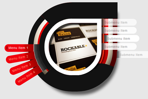
鸣谢:中心图片来自envato资产库。
IE呢?
对于IE,我们可以在单独的样式表中使用CSSPIE。 我不会做太多介绍,因为即使有此修复,IE也无法正确显示。 如果您知道更好的修复方法,请在评论中让我知道。
使用行为,我们可以调用csspie php文件来告诉IE CSS3样式可以使用。 这就是它的工作方式...
ul.menuBuild ul.submenu li, ul.menuBuild ul.submenu li.first, ul.menuBuild ul.submenu li.second, ul.menuBuild ul.submenu li.third, ul.menuBuild ul.submenu li.last, ul.menuBuild li > ul, ul.menuBuild li#menu1, ul.menuBuild li#menu2, ul.menuBuild li#menu3, ul.menuBuild li#menu4, ul.menuBuild li#menu1, ul.menuBuild li#menu2, ul.menuBuild li#menu3, ul.menuBuild li#menu4, ul.menuBuild li#menu2, ul.menuBuild li#menu3, ul.menuBuild li#menu4, ul.menuBuild li#menu2 > ul, ul.menuBuild li#menu3 > ul, ul.menuBuild li#menu4 > ul, .wrap1, .wrap2, .wrap3, .wrap4, .wrap5, .nav-holder, .completer,
.completer2{behavior: url(styles/csspie/PIE.php); } /* CSS3 IE fix - Supports 'border-radius', 'box-shadow', 'border-image', -pie-background', liinear-gradients', 'RGBA' */
其他一些IE修复程序就是这样...
ul.menuBuild ul.submenu li{filter:alpha(opacity=70);} /* IE has too many problems for gradual opacity so we'll just use 70 for all submenus*/

.completer, .completer2{display:none;} /* transform doesn't work properly so we'll just hide the completers */

.nav-holder{ border-bottom-style:none; height:0px;}
大功告成!
所以我希望你们喜欢本教程! 请记住,对CSS3的支持是有限的,并且如果您希望与曾经创建的所有浏览器兼容,那么还有其他方法可以完成相同的任务,例如使用图像和一些javascript。 如果您想要其他菜单样式的教程,如何使用javascript版本或仅如何使用更出色CSS3效果,请在评论中让我知道,我将为您提供一些帮助! 在下面留下您的评论和问题 ;)
要有耐心并不断学习,在您知道它之前,您将成为做什么工作的大师!
翻译自: https://webdesign.tutsplus.com/articles/how-to-create-a-css3-wheel-menu--webdesign-3177
css滚轮
 1440


 扫一扫


 被折叠的 条评论
为什么被折叠?
 到【灌水乐园】发言


