


今天,我们将继续通过使用HTML和CSS将ShutterPress设计从原始PSD转换为功能性网站的教程系列。 到目前为止,我们已经创建了初始站点设计并收集了编码所需的资产 。 现在,我们将实际对其进行编码,以便它可在所有主流浏览器中使用!
简介 :第3天,HTML / CSS转换
今天就是将我们的PSD设计转换为可以正常运行HTML网站的全部内容! 我们将逐步引导您完成标记,直到我们拥有一个在所有主要浏览器上都不错的网站。 我们将从中级的理解水平着手解决这个问题,因此,如果我们过快地跳过了任何基本步骤,请随时在下面的“评论”部分中提出任何具体问题。
特别鸣谢CodeMyConcept ,他亲切地提供了该系列当天的代码和教程!
如果您错过了本系列的前两天,请在这里查看:
好的,现在我们的目标已经明确定义,让我们开始吧!
步骤1基本文件夹结构和布局
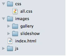
首先,我们从为项目创建基本文件夹结构开始,我们绝对必须保持资产的结构化和组织化。
在这种情况下,一旦HTML和CSS完成,我们将需要一个带有主css文件的“ css”文件夹,一个“ images”文件夹和一个“ js”(Javascript)文件夹,以便我们可以添加滑块,lightbox和手风琴插件。 也是根文件夹中的index.html文件
然后,使用“左”和“右”部分创建布局的基本HTML结构。 我们将使用包装器div来容纳所有内容并将其居中并放置其中的Left和Right容器,并在包装器的顶部和底部使用div来帮助我们处理圆角,同时保持布局的灵活性。
<!DOCTYPE html PUBLIC "-//W3C//DTD XHTML 1.0 Strict//EN" "http://www.w3.org/TR/xhtml1/DTD/xhtml1-strict.dtd">
<html xmlns="http://www.w3.org/1999/xhtml" xml:lang="en" lang="en">
<head>
<title>ShutterPress</title>
<meta http-equiv="Content-Type" content="text/html;charset=utf-8" ></meta>
<link rel="stylesheet" type="text/css" href="css/all.css" media="screen" />
</head>
<body>
<div id="wrapper">
<div id="wrapper-top">
</div> <!-- END WRAPPER TOP -->
<div id="left">
LEFFT MENU HERE
</div> <!-- END LEFT MENU -->
<div id="right">
RIGHT CONTENT HERE
</div> <!-- END RIGHT CONTENT -->
<div id="wrapper-bottom">
</div> <!-- END WRAPPER BOTTOM -->
</div> <!-- END WRAPPER -->
</body>
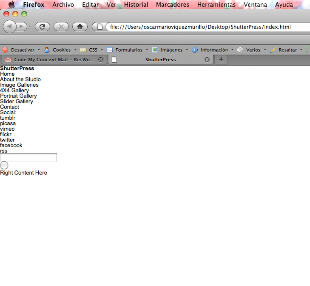
</html>实际上,我们更喜欢在编写任何CSS之前先创建HTML,尽管有些人会同时编写HTML和CSS的一部分,然后继续进行下一部分。 我们发现首先完成整个HTML可以帮助我们提前考虑CSS以及可能需要的其他所有内容,例如Javascript或PHP。 我现在添加的只是我CSS Reset。
步骤2左侧选单HTML
因此,我们从对左侧菜单进行编码开始。 在这里,我们将需要一个h1标签,一个徽标链接以及一个菜单项的无序列表。 我们还需要在子菜单的第三个li标签上嵌套另一个无序列表,并对第二个li标签上的一些虚拟项进行相同的处理,以便稍后我们的javascript手风琴起作用。
我们还需要在链接和子菜单中添加一些“打开的”和“关闭的”类,以便我们可以控制图标和默认打开哪个子菜单,并使用活动类来突出显示当前正在查看的页面。
<h1 class="logo"><a href="#">ShutterPress</a></h1><!-- END LOGO -->
<ul class="menu">
	<li><a href="#">Home</a></li>
	<li>
		<a class="closed" href="#">About the Studio</a>
		<ul class="sub-menu closed">
			<li><a href="#">Item 1</a></li>
			<li><a href="#">Item 2</a></li>
			<li><a href="#">Item 3</a></li>
		</ul> <!-- END SUB MENU -->
	</li>
	<li>
		<a class="opened" href="#">Image Galleries</a>
		<ul class="sub-menu">
			<li><a class="active" href="#">4X4 Gallery</a></li>
			<li><a href="#">Portrait Gallery</a></li>
			<li><a href="subpage.html">Slider Gallery</a></li>
		</ul> <!-- END SUB MENU -->
	</li>
	<li><a href="#">Contact</a></li>
</ul> <!-- END MENU -->
现在,紧随其后的是位于底部的左侧部分中的社交图标和搜索字段。 因此,我们将为底部创建一个容器div,并为该容器内的两个部分分别创建[divs]。
对于“社交”图标,我们需要一个文本跨度和一个图标列表,每个图标都有一个类,以帮助获取正确的图标图像及其相应的悬停状态。
对于“搜索”部分,我们将创建一个表单和一个div,其中包含相应的输入,以帮助浮动它们并添加背景和图标。 这样做比将样式直接应用于输入要好得多,这样可以避免行高和文本缩进的交叉浏览问题。
<div id="left-bottom">
<div class="social">
		<span>Social:</span>
		<ul>
			<li><a class="tumblr" href="#">tumblr</a></li>
			<li><a class="picasa" href="#">picasa</a></li>
			<li><a class="vimeo" href="#">vimeo</a></li>
			<li><a class="flickr" href="#">flickr</a></li>
			<li><a class="twitter" href="#">twitter</a></li>
			<li><a class="facebook" href="#">facebook</a></li>
			<li><a class="rss" href="#">rss</a></li>
		</ul>
	</div> <!-- END SOCIAL -->
	<div class="search">
		<form action="#" method="get">
			<fieldset>
				<div class="left">
					<input type="text" value="" />
				</div>
				<div class="right">
					<input type="submit" value="" />
				</div>
			</fieldset>
		</form>
	</div> <!-- END SEARCH -->
</div> <!-- END LEFT BOTTOM -->
这就是它在我们的浏览器中的外观以及CSS Reset
步骤3正确的内容HTML
现在,我们已经完成了左侧菜单,我们可以开始为缩略图库的“右侧”内容部分编码了。
因此,首先我们在链接内创建一个无序的图像列表,以便我们的灯箱插件可以单击它们,然后创建一个div来包含上一个和下一个按钮。
<ul class="thumbnails">
<li><a href="#"><img src="http://webdesigntutsplus.s3.amazonaws.com/136_ShutterPress/code_phase/images/gallery/thumb1.jpg" alt="thumbnail" width="150" height="121" /></a></li>
<li><a href="#"><img src="http://webdesigntutsplus.s3.amazonaws.com/136_ShutterPress/code_phase/images/gallery/thumb2.jpg" alt="thumbnail" width="150" height="121" /></a></li>
<li><a href="#"><img src="http://webdesigntutsplus.s3.amazonaws.com/136_ShutterPress/code_phase/images/gallery/thumb3.jpg" alt="thumbnail" width="150" height="121" /></a></li>
<li><a href="#"><img src="http://webdesigntutsplus.s3.amazonaws.com/136_ShutterPress/code_phase/images/gallery/thumb4.jpg" alt="thumbnail" width="150" height="121" /></a></li>
<li><a href="#"><img src="http://webdesigntutsplus.s3.amazonaws.com/136_ShutterPress/code_phase/images/gallery/thumb5.jpg" alt="thumbnail" width="150" height="121" /></a></li>
<li><a href="#"><img src="http://webdesigntutsplus.s3.amazonaws.com/136_ShutterPress/code_phase/images/gallery/thumb6.jpg" alt="thumbnail" width="150" height="121" /></a></li>
<li><a href="#"><img src="http://webdesigntutsplus.s3.amazonaws.com/136_ShutterPress/code_phase/images/gallery/thumb7.jpg" alt="thumbnail" width="150" height="121" /></a></li>
<li><a href="#"><img src="http://webdesigntutsplus.s3.amazonaws.com/136_ShutterPress/code_phase/images/gallery/thumb8.jpg" alt="thumbnail" width="150" height="121" /></a></li>
<li><a href="#"><img src="http://webdesigntutsplus.s3.amazonaws.com/136_ShutterPress/code_phase/images/gallery/thumb9.jpg" alt="thumbnail" width="150" height="121" /></a></li>
<li><a href="#"><img src="http://webdesigntutsplus.s3.amazonaws.com/136_ShutterPress/code_phase/images/gallery/thumb10.jpg" alt="thumbnail" width="150" height="121" /></a></li>
<li><a href="#"><img src="http://webdesigntutsplus.s3.amazonaws.com/136_ShutterPress/code_phase/images/gallery/thumb11.jpg" alt="thumbnail" width="150" height="121" /></a></li>
<li><a href="#"><img src="http://webdesigntutsplus.s3.amazonaws.com/136_ShutterPress/code_phase/images/gallery/thumb12.jpg" alt="thumbnail" width="150" height="121" /></a></li>
<li><a href="#"><img src="http://webdesigntutsplus.s3.amazonaws.com/136_ShutterPress/code_phase/images/gallery/thumb13.jpg" alt="thumbnail" width="150" height="121" /></a></li>
<li><a href="#"><img src="http://webdesigntutsplus.s3.amazonaws.com/136_ShutterPress/code_phase/images/gallery/thumb14.jpg" alt="thumbnail" width="150" height="121" /></a></li>
<li><a href="#"><img src="http://webdesigntutsplus.s3.amazonaws.com/136_ShutterPress/code_phase/images/gallery/thumb15.jpg" alt="thumbnail" width="150" height="121"/></a></li>
<li><a href="#"><img src="http://webdesigntutsplus.s3.amazonaws.com/136_ShutterPress/code_phase/images/gallery/thumb16.jpg" alt="thumbnail" width="150" height="121" /></a></li>
</ul> <!-- END THUMBNAILS -->
<div class="navigation">
<a href="#" class="prev">Previous</a>
<a href="#" class="next">Next</a>
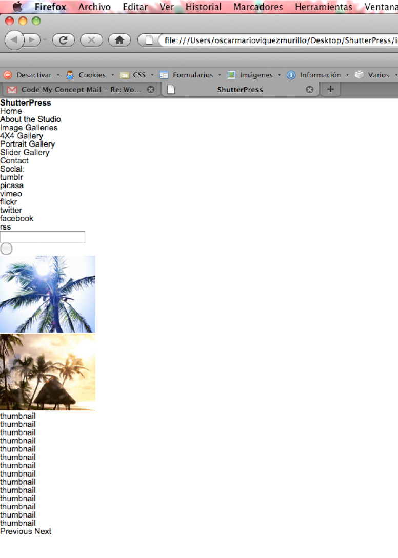
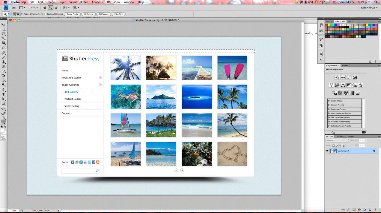
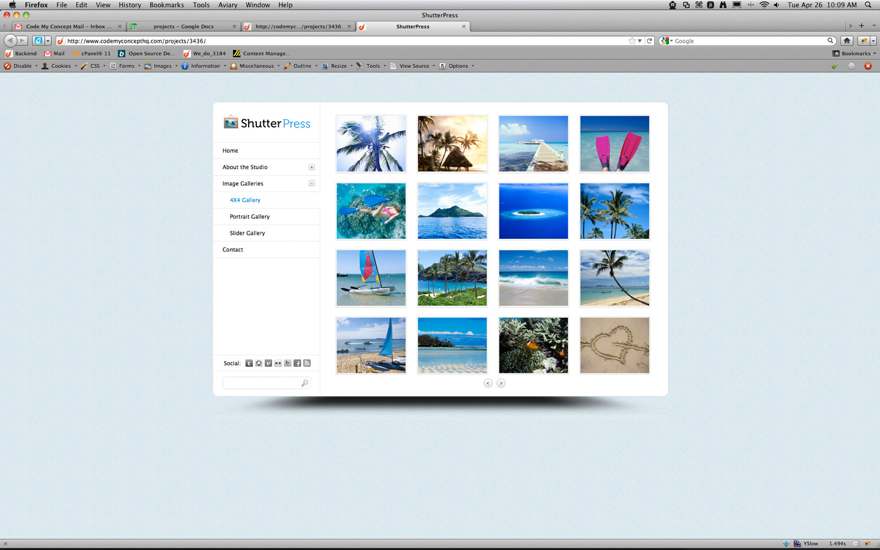
</div> <!-- END NAVIGATION -->此时,我们需要开始对缩略图进行切片,并将其与HTML中的相应名称一起保存,以便显示一些内联图像。
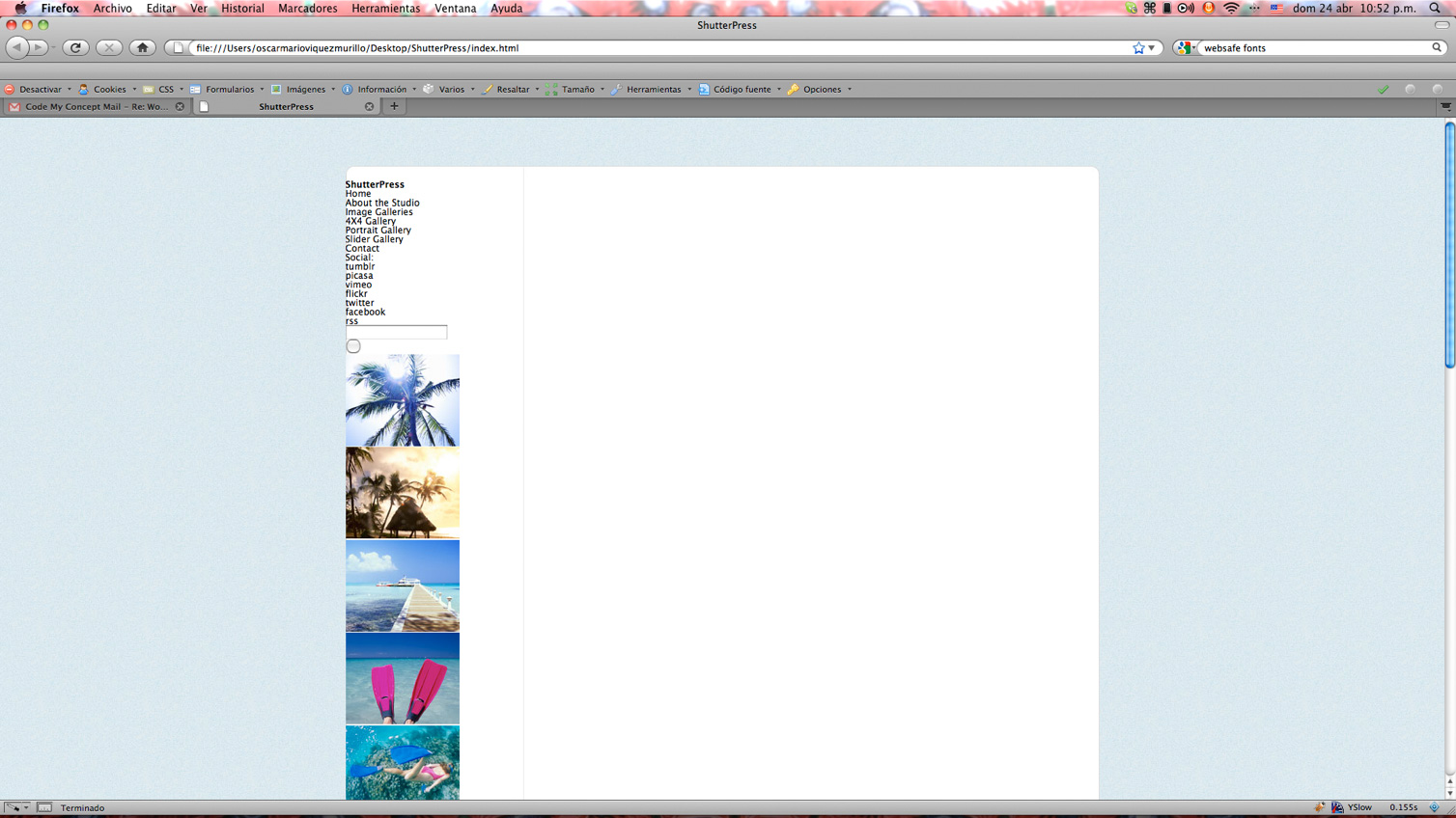
这是我们所有HTML在Firefox中的外观
步骤4 CSS重置和包装
现在为一些样式设置字体,文本和链接颜色以及背景图像的一些常规设置
/*------------------------------*/
/*  GENERAL RESET              */
/*----------------------------*/
html, body, div, span, applet, object, iframe, h1, h2, h3, h4, h5, h6, p, blockquote, pre, a, abbr, acronym, address, big, cite, code, del, dfn,
em, font, img, ins, kbd, q, s, samp, small, strike, strong, sub, sup, tt, var, b, u, i, center, dl, dt, dd, ol, ul, li, fieldset, form, label,
legend, table, caption, tbody, tfoot, thead, tr, th, td, hr, button {
	margin:0;
	padding:0;
	border:0;
	outline:0;
	font-size:100%;
	vertical-align: baseline;
	background:none;
}
ol, ul {list-style:none;}
h1, h2, h3, h4, h5, h6, li {line-height:100%;}
blockquote, q {quotes:none;}
q:before,
q:after {content: '';}
table {border-collapse:collapse; border-spacing:0;}
input,textarea,select{
	font:11px Arial, Helvetica, sans-serif;
	vertical-align:middle;
	padding:0;
	margin:0;
}
input:focus, textarea:focus {
	outline: none;
}

form,fieldset{border-style:none;}

html,
body {
   margin:0;
   padding:0;
   min-height:100%;
}

/*---------------------------------*/
/* GENERAL SETTINGS               */
/*-------------------------------*/
body {
      height:100%;
      font: 12px/12px "Lucida Sans", "Lucida Grande", sans-serif;
      color: #000;
      background: url('../images/bg.jpg') repeat #fff;
}
a {text-decoration:none; color: #000;}
a:hover {text-decoration:none; color: #0285da;}
然后,我们设置包装器样式,以便我们可以构建布局的基础,我们首先通过定义包装器的宽度并以边距为中心进行设置:0 auto;
对于我们先前定义的顶部和底部div,我们设置背景图像和所需的尺寸以创建顶部和底部的圆角,对于包装器,我们设置在Y轴上重复的背景图像,该图像将覆盖左右内容之间的分界线。
对于底部包装的div,我们需要设置一个clear:both; 因为一旦我浮动了我的左右容器,包装器就会崩溃,所以我们需要通过清除浮动来防止这种情况。
/*--------------------------*/
/*     WRAPPER             */
/*------------------------*/
#wrapper-top {
	background:url("../images/content-top.jpg") no-repeat scroll center top #FFFFFF;
	height:18px;
	width:994px;
}

#wrapper {
	width: 994px;
	overflow: hidden;
	margin: 64px auto 0;
	background:url("../images/content-bg.jpg") repeat-y scroll center center #FFFFFF;
}

#wrapper-bottom {
	background:url("../images/content-bottom.jpg") no-repeat scroll center top #FFFFFF;
	height:61px;
	width:994px;
	clear: both;
}
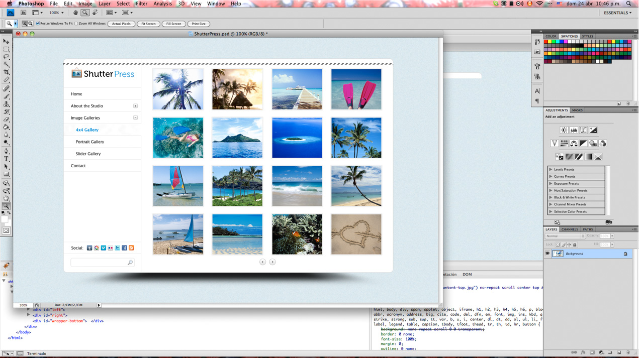
这是我们浏览器中的结果:
步骤5左侧菜单CSS
现在我们已经准备好包装器,可以继续操作内容了:首先,我们设置Right和Left容器的宽度,以便将它们浮动到正确的位置。
/*--------------------------*/
/*     LEFT MENU           */
/*------------------------*/

/* Main Menu */
#left {
	width: 235px;
	float: left;
}


/*------------------------------*/
/*   RIGHT CONTENT             */
/*----------------------------*/

/* Thumbnail Gallery Content*/
#right {
	width: 758px;
	float: right;
}
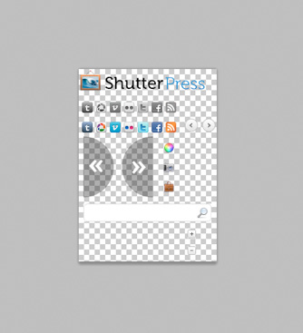
现在,我们通过为设计上的徽标,按钮和图标创建子画面图像来开始设计导航样式。
这种特殊的布局似乎不会增加高度,但是我们仍然希望保持灵活性,以防将来需要在导航中添加更多元素。
因此,我们将Left容器设置为最小高度,以便可以绝对定位左下div,而不必使用巨大的边距将其向下推,这样,即使添加了新元素,布局仍将保持其原始尺寸。
我们还将导航中的链接设置为块显示,以便可以单击整个区域而不仅仅是文本,并使用它们各自的格线添加打开和关闭背景并调整精灵的位置。
具有“已关闭”类的子菜单设置为显示: 因此只显示默认的一个。
/*--------------------------*/
/*     LEFT MENU           */
/*------------------------*/

/* Main Menu */
#left {
	width: 235px;
	float: left;
	min-height: 615px;
	position: relative;
}

#left .logo a {
	background:url("../images/sprite.png") no-repeat scroll 0 0 transparent;
	display:block;
	height:32px;
	margin:8px auto 0;
	text-indent:-999999px;
	width:190px;
}

#left .menu {
	width: 100%;
	border-top: 1px solid #eaeaea;
	margin-top: 30px;
}

#left .menu li a {
	display: block;
	height: 35px;
	line-height: 35px;
	padding-left: 22px;
	border-bottom: 1px solid #eaeaea;
}

#left .menu li a.active {
	color: #0285DA;
	border-right: 1px solid #fff;
}

#left .menu li a.closed {
	background:url("../images/sprite.png") no-repeat scroll 46px -231px transparent;
}

#left .menu li a.opened {
	background:url("../images/sprite.png") no-repeat scroll 46px -257px transparent;
}

#left .menu li .sub-menu li a {
	padding-left: 38px;
}

#left .menu .sub-menu.closed {
	display: none;
}

#left-bottom {
	position: absolute;
	bottom: 0;
	width: 100%;
}
对于底部的社交图标,我们使用相应的小节设置图像,并使用位置设置背景图像,对于悬停状态也是如此。
/* Social */
#left-bottom .social {
	overflow: hidden;
	height: 34px;
	border-top: 1px solid #eaeaea;
	border-bottom: 1px solid #eaeaea;
	padding-left:25px;
}


#left-bottom .social span {
	float: left;
	line-height: 34px;
}

#left-bottom .social ul {
	float:left;
	margin:9px 0 0 10px;
}

#left-bottom .social ul li {
	float: left;
	height: 34px;
}

#left-bottom .social ul li a {
	background:url("../images/sprite.png") no-repeat scroll -5px -50px transparent;
	display:block;
	height:16px;
	width:16px;
	margin: 0 5px 0 0;
	text-indent: -999999px;
}

#left-bottom .social ul li a:hover {
	background-position: -5px -80px;
}

#left-bottom .social ul li a.picasa {
	background-position: -26px -50px;
}

#left-bottom .social ul li a.picasa:hover {
	background-position: -26px -80px;
}

#left-bottom .social ul li a.vimeo {
	background-position: -47px -50px;
}

#left-bottom .social ul li a.vimeo:hover {
	background-position: -47px -80px;
}
对于搜索部分,我们基本上是在浮动输入容器div并将其样式设置为输入而不是输入。
/* Search */
#left-bottom .search {
overflow: hidden;
margin-top: 12px;
}
#left-bottom .search .left {
background:url("../images/sprite.png") no-repeat scroll -5px -203px transparent;
float:left;
height:27px;
margin-left:20px;
padding: 6px 0 0 10px;
width:158px;
}
#left-bottom .search .left input {
border: none;
background: transparent;
width: 100%;
}
#left-bottom .search .right {
background:url("../images/sprite.png") no-repeat scroll -173px -203px transparent;
float:left;
height:27px;
}
#left-bottom .search .right input {
background:none repeat scroll 0 0 transparent;
border:medium none;
cursor:pointer;
height:27px;
width:27px;
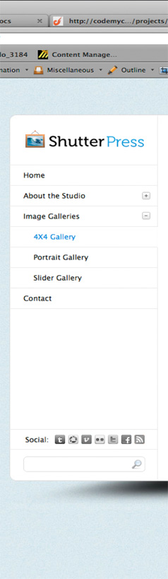
}这就是我们现在在firefox中拥有的
步骤6正确的内容CSS
在这里,我们只是浮动列表项以获得网格显示,我们添加了填充,背景色和边框来为每个缩略图创建框架,还添加了用于分隔的边距。
最后。 我们的按钮的容器div居中,两个链接都处于浮动状态。
/*------------------------------*/
/* RIGHT CONTENT */
/*----------------------------*/
/* Thumbnail Gallery Content*/
#right {
width: 758px;
float: right;
}
#right .thumbnails {
overflow: hidden;
padding:10px 0 0 32px;
}
#right .thumbnails li {
float: left;
margin: 0 21px 18px 0;
}
#right .thumbnails li a {
border: 1px solid #eaeaea;
padding: 2px;
background: #f2f2f2;
display: block;
}
#right .navigation {
margin: -10px auto 0;
overflow: hidden;
width: 50px;
}
#right .navigation a {
background:url("../images/sprite.png") no-repeat scroll 0 0 transparent;
display:block;
float:left;
height:21px;
text-indent:-999999px;
width:21px;
}
#right .navigation .prev {
background-position: -159px -75px;
margin: 0 8px 0 0;
}
#right .navigation .next {
background-position: -186px -75px;
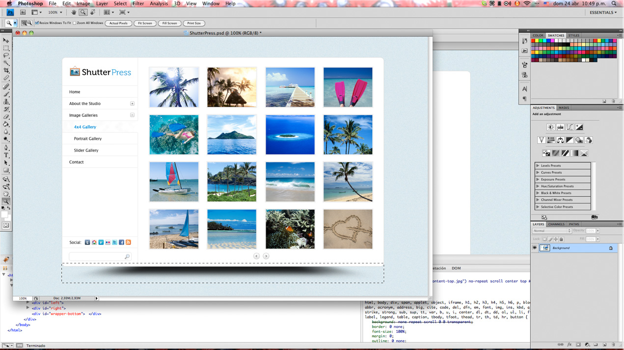
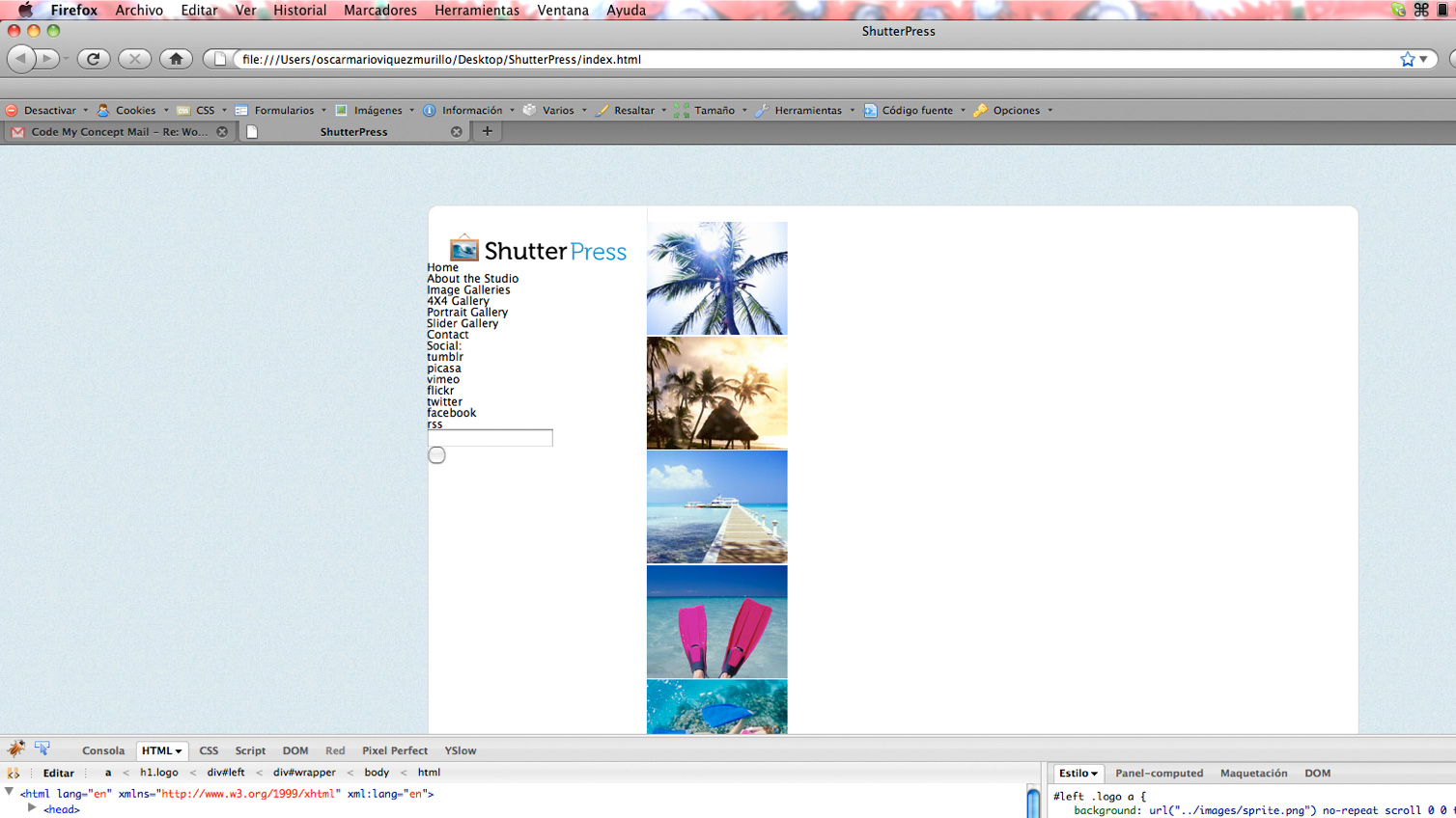
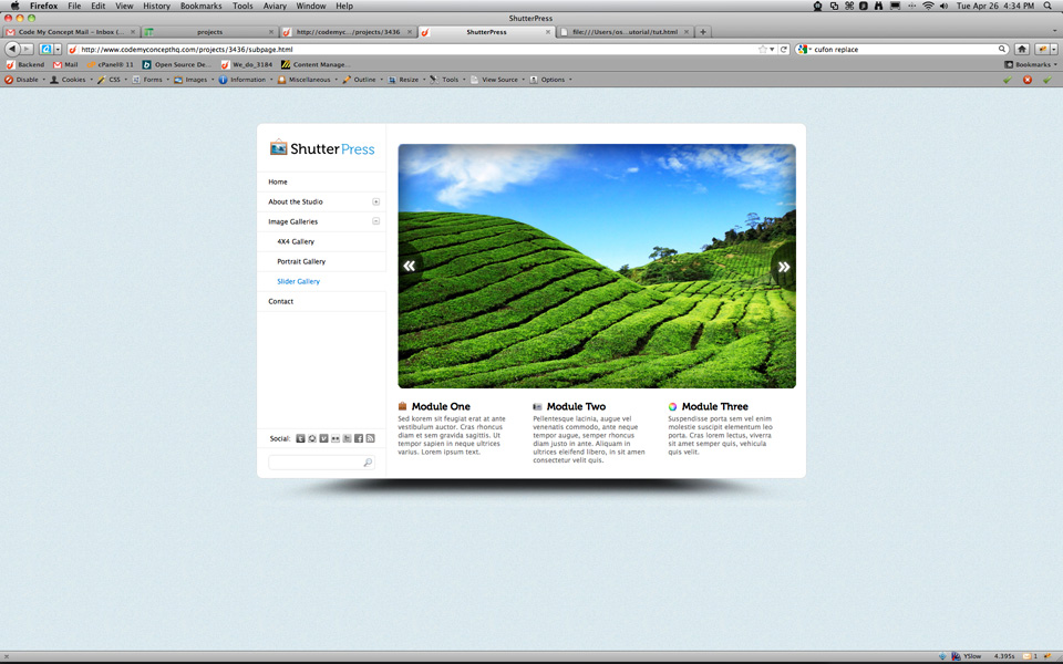
}这是我们在Firefox中完成的第一页!
步骤7第二页HTML
转到子页面,我们要做的是复制index.html并将其命名为subpage.html或inner.html之类的东西,然后我们取出#right容器中的所有内容,并开始构建滑块画廊所需的html。以及下面的3个模块。
我们需要一个div来保存我的幻灯片的整个标记,一个将要作为幻灯片的图像列表,并且我们还将使用3个不同版本的图像,以便稍后可以使用jQuery Cycle插件看到一些操作。
我们还将设置一个空白div,该div将绝对位于图像的顶部,以用作框架,以防万一需要在CMS中实现此布局以获取一些动态内容。 如果发生这种情况,我们可以添加任何图像,而无需事先手工加工圆角和阴影。
最后,对于幻灯片,我们需要创建一个导航div,其中包含用于“上一个”和“下一个”画廊导航的几个链接。
<div id="gallery-holder">
	<ul class="slideshow">
		<li><img src="http://webdesigntutsplus.s3.amazonaws.com/136_ShutterPress/code_phase/images/slideshow/slide1.jpg" alt="slideshow 1" width="719" height="442" /></li>
		<li><img src="http://webdesigntutsplus.s3.amazonaws.com/136_ShutterPress/code_phase/images/slideshow/slide2.jpg" alt="slideshow 2" width="719" height="442" /></li>
		<li><img src="http://webdesigntutsplus.s3.amazonaws.com/136_ShutterPress/code_phase/images/slideshow/slide3.jpg" alt="slideshow 3" width="719" height="442" /></li>
	</ul> <!-- END SLIDESHOW -->
	<div class="slideshow-frame"></div>
	<div class="navigation">
		<a href="#" class="prev">Previous</a>
		<a href="#" class="next">Next</a>
	</div> <!-- END GALLERY NAVIGATION -->
</div> <!-- END GALLERY HOLDER -->
我们的最后一个内容块在自己的容器中设置了3个模块,每个模块本身就是一个div,我将对其进行浮动,因此它们彼此相邻。 里面有标题的h2标签和文本的段落。
<div id="modules-holder">
	<div class="module">
		<h2 class="module-one">Module One</h2>
		<p>Sed korem sit feugiat erat at ante vestibulum auctor. Cras rhoncus diam et sem gravida sagittis. Ut tempor sapien in neque ultrices varius. Lorem ipsum text.</p>
	</div>
	<div class="module">
		<h2 class="module-two">Module Two</h2>
		<p>Pellentesque lacinia, augue vel venenatis commodo, ante neque tempor augue, semper rhoncus diam justo in ante. Aliquam in ultrices eleifend libero, in sit amen consectetur velit quis.</p>
	</div>
	<div class="module">
		<h2 class="module-three">Module Three</h2>
		<p>Suspendisse porta sem vel enim molestie suscipit elementum leo porta. Cras lorem lectus, viverra sit amet semper quis, vehicula quis velit.</p>
	</div>
</div> <!-- END MODULES HOLDER -->步骤8第二页CSS
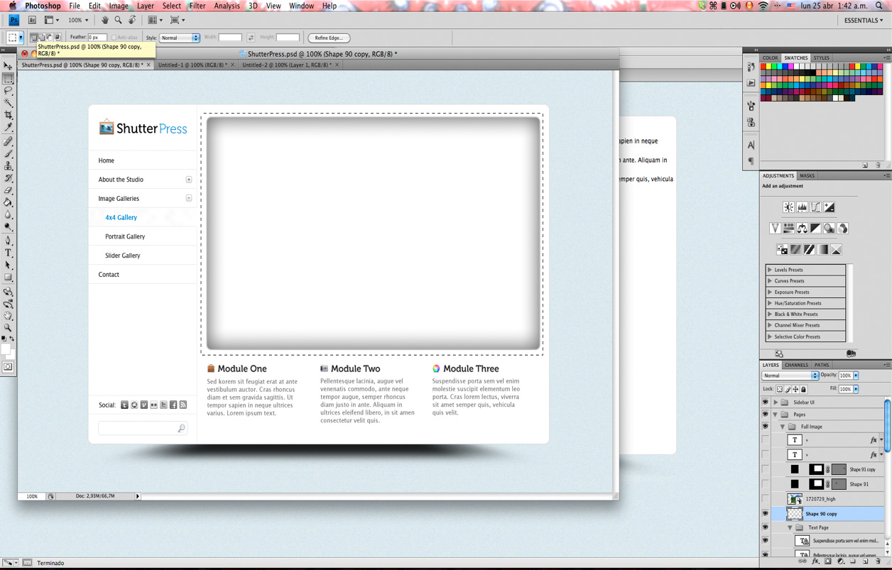
在这种特殊的设计中,获取幻灯片的框架有些棘手,所以我们要做的是:
我们将图层命名为“ Shape 90”,并将填充降至0%。 然后,右键单击名为“ 1720729_high”的图层,选择释放裁剪蒙版,然后隐藏该图层。
回到图层“ Shape 90”并将不透明度设置为50%。 右键单击该图层并进行复制,选择两个“ Shape 90”图层并将其合并。
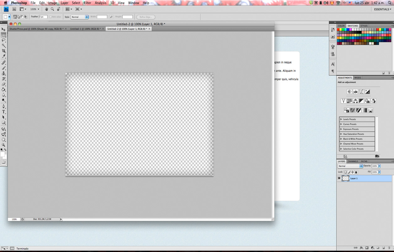
现在,您可以将框架另存为单独的透明.png,只需在角落添加一些白色背景即可覆盖背面的图像。
我们设置模块的尺寸并浮动它们以使其内联; 之后,我们将样式和精灵一起设置为图标的背景图像。
我们将滑块上的列表项设置为以下位置:绝对; 与ul有关,这样它们将折叠起来并看起来像一张图像,这样我们就可以获得布局的真实外观,我们将在整体准备就绪后添加功能。
上一个和下一个按钮的位置也绝对正确,因此我们可以使它们垂直居中。
/* Slideshow Gallery Content*/
#gallery-holder {
	position: relative;
	width: 719px;
	margin:20px auto 0;
	height: 442px;
}

#gallery-holder .slideshow-frame {
	background:url("../images/slideshow-frame.png") no-repeat scroll 0 0 transparent;
	height:442px;
	position:absolute;
	top:0;
	left: 0;
	width:719px;
	z-index: 10;
}

#gallery-holder .slideshow li {
	height:442px;
	position:absolute;
	top:0;
	width:719px
}

#gallery-holder .navigation a {
	height:92px;
	left:0;
	margin-top:-44px;
	position:absolute;
	top:50%;
	width:47px;
	z-index:15;
}

#gallery-holder .navigation a.prev {
	background-position:-6px -103px;
	margin-top:-44px;
}

#gallery-holder .navigation a.next {
	background-position:-65px -103px;
	left:auto;
	right:0;
}

#modules-holder {
	overflow: hidden;
	margin-top: 24px;
	margin-left: 20px;
}

#modules-holder .module {
	float: left;
	width: 204px;
	margin-right: 40px;
}

#modules-holder .module h2 {
	font-size:18px;
	font-weight:normal;
	margin-bottom:5px;
	padding-left:25px;
}

#modules-holder .module h2.module-one {
	background:url("../images/sprite.png") no-repeat scroll -128px -170px transparent;
}

#modules-holder .module h2.module-two {
	background:url("../images/sprite.png") no-repeat scroll -128px -140px transparent;
}

#modules-holder .module h2.module-three {
	background:url("../images/sprite.png") no-repeat scroll -128px -110px transparent;
}

#modules-holder .module p {
	color: #6a6a6a;
	line-height: 15px;
}
完成所有这些之后,我们可以看到模块标题上带有Museo字体,而不是网络安全字体,因此我们需要使用@ font-face进行设置。 因此,我们通过Font Squirrel(http://www.fontsquirrel.com/fontface/generator)来运行字体,并将字体放置在Project根目录中其各自的fonts文件夹中,并使用正确的设置在常规设置中设置CSS字体的路径。
/*---------------------------------*/
/* GENERAL SETTINGS  */
/*-------------------------------*/
body {
      height:100%;
      font: 12px/12px "Lucida Sans", "Lucida Grande", sans-serif;
      color: #000;
      background: url('../images/bg.jpg') repeat #fff;
}
a {text-decoration:none; color: #000;}
a:hover {text-decoration:none; color: #0285da;}


@font-face {
    font-family: 'Museo700';
    src: url('../fonts/museo700-regular-webfont.eot');
    src: url('../fonts/museo700-regular-webfont.eot?#iefix') format('embedded-opentype'),
         url('../fonts/museo700-regular-webfont.woff') format('woff'),
         url('../fonts/museo700-regular-webfont.ttf') format('truetype'),
         url('../fonts/museo700-regular-webfont.svg#Museo700') format('svg');
    font-weight: normal;
    font-style: normal;
}
因此,我们现在需要做的就是将字体系列设置为我们的h2标签,现在第二页已完成。
#modules-holder .module h2 {
	font-family:'Museo700';
	font-size:18px;
	font-weight:normal;
	margin-bottom:5px;
	padding-left:25px;
}
步骤9 jQuery Magic
现在为项目添加一些功能和动画,我们将使用两个插件:幻灯片的jQuery Cycle( http://jquery.malsup.com/cycle/ )和prettyPhoto的灯箱图库( http:// www.no-margin-for-errors.com/projects/prettyphoto-jquery-lightbox-clone/ ),然后为菜单手风琴创建一个自定义函数。
确保下载了prettyPhoto插件并将必要的资源复制到它们各自的文件夹(“ js”文件夹中的javascript,样式表到“ css”文件夹等),可以从Github链接到Cycle插件,并且可以链接到jQuery来自Google API。
我们还将在JS文件夹中创建一个main.js文件,可以在其中放置自定义函数和插件配置。
因此,我们在html文件的标题中引用样式表
<!DOCTYPE html PUBLIC "-//W3C//DTD XHTML 1.0 Strict//EN" "http://www.w3.org/TR/xhtml1/DTD/xhtml1-strict.dtd">
<html xmlns="http://www.w3.org/1999/xhtml" xml:lang="en" lang="en">
<head>
    <title>ShutterPress</title>
	<meta http-equiv="Content-Type" content="text/html;charset=utf-8" ></meta>
	<link rel="stylesheet" type="text/css" href="css/all.css" media="screen" />
	<link rel="stylesheet" type="text/css" href="css/prettyPhoto.css" media="screen" />
</head>
我们还在文档底部恰好在html标记之前引用了javascript文件。
</body>
<script type="text/javascript" src="http://ajax.googleapis.com/ajax/libs/jquery/1.5.2/jquery.min.js"></script>
<script type="text/javascript" src="http://cloud.github.com/downloads/malsup/cycle/jquery.cycle.all.latest.js"></script>
<script type="text/javascript" src="js/jquery.prettyPhoto.js"></script>
<script type="text/javascript" src="js/main.js"></script>
</html>
现在,我们返回到缩略图列表,并设置具有rel属性的链接,以使灯箱画廊正常工作。 我们还有指向占位符500x500图片的链接,因此我们可以在灯箱上显示一些内容
<li><a href="images/500X500.gif" rel="prettyPhoto[gallery]"><img src="images/gallery/thumb1.jpg" alt="thumbnail" width="150" height="121" /></a></li>最后,我们转到main.js文件并开始配置我们的插件。 确保阅读了插件的文档,以便准确了解它们的工作方式以及自定义它们的选项。
对于我们的手风琴,我们需要设置一个click函数,以检查链接是否具有“打开”或“关闭”类。 如果已“关闭”,则它将打开相应的子菜单,然后折叠所有其他子菜单并更改链接的类,以便显示右侧的图标。 如果被单击的对象具有“打开”类,则将其关闭并更改图标。
$(document).ready(function() {

	//prettyPhoto LIGHTBOX
	$("a[rel^='prettyPhoto']").prettyPhoto();


	//MENU ACCORDION
	$('#left .menu li a').click(function(){
		if ( $(this).hasClass('closed') ) {
			$(this).toggleClass('opened closed');
			$(this).parent().siblings().find('.sub-menu').slideUp();
			$(this).parent().siblings().find('a.opened').toggleClass('opened closed');
			$(this).next().slideDown();
			return false;
		} else if ( $(this).hasClass('opened') ){
			$(this).toggleClass('opened closed');
			$(this).next().slideUp();
			return false;
		}
	})


	//SLIDER GALLERY
	$('.slideshow').cycle({
		fx: 'fade',
		next: '#gallery-holder .navigation a.next',
		prev: '#gallery-holder .navigation a.prev'
	});
});
第三天结束 :复习
现在,我们有一个100%完成的项目,其中包含可运行的画廊和子菜单动画。 请享用!
在我们的教程系列的最后一天,我们将引导您完成如何仅使用几次快速编辑就可以创建此模板的自定义变体的方法。 从深色,低俗的风格到现代的金属效果,您都不想错过最后一天!
哦! 我们在本教程的第一天就提到了这一点,但是如果您有兴趣在ThemeForest上提供此模板的WordPress版本,请在评论部分告诉我!
编码积分
本系列此阶段的编码和教程全部由CodeMyConcept提供,CodeMyConcept为设计师提供了广泛的编码服务-从PSD> HTML转换到电子邮件模板和WordPress主题转换。 在CodeMyConcept.com上查看他们的网站!


 扫一扫
扫一扫


 被折叠的 条评论
为什么被折叠?
被折叠的 条评论
为什么被折叠?
 到【灌水乐园】发言


