


 本文介绍了如何使用CSS3实现艺术字体和流行艺术网页背景,包括棋盘、催眠圈和圆点图案等效果。尽管全图像解决方案更简单,但CSS3渐变提供了易于编辑、文件尺寸更小的优点。
网页 html 艺术字体
This article has been superseded by a technique that uses SVG images to achieve the same visual result with less code; this version has been left in place for archival purposes.
本文已被一种使用SVG图像以更少的代码达到相同视觉结果的技术所取代; 此版本已保留用于存档目的。
In previous articles I’ve shown how to make gradient backgrounds with CSS, no images required. I’ve also demonstrated how to make more complex visual effects by using CSS’s multiple backgrounds feature to layer gradients on top of each other.
在先前的文章中,我展示了如何使用CSS制作渐变背景 ,而不需要图像。 我还演示了如何通过使用CSS的多个背景功能使渐变彼此叠加来制作更复杂的视觉效果。
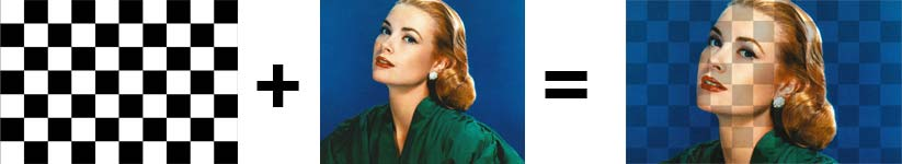
Today, I’m going to take things a step further: if we add images to a background, and if the gradients we add have areas of transparency or opacity, we’ll see portions of the image through the gradient, producing a "pop-art" effect.
今天,我将更进一步:如果将图像添加到背景中,并且如果添加的渐变具有透明或不透明区域,我们将通过渐变看到图像的一部分,从而产生“艺术”效果。
The most important point in writing the style rules is that the image must be added last: remember, in CSS background layers are added in reverse order, so when we specify our image at the end of the background effects, it appears to be on the bottom, with the gradients layered on top.
编写样式规则最重要的一点是必须最后添加图像:请记住,在CSS背景层中以相反的顺序添加图像,因此当我们在背景效果的末尾指定图像时,它似乎位于底部,渐变层位于顶部。
棋盘 (Checkerboard)
For example, to create a checkerboard gradient effect, the CSS would be:
例如,要创建棋盘格渐变效果,CSS将为:
html, body {
	min-height: 100%;
	margin: 0;
}
body {
	background-image:
	linear-gradient(45deg, #000 25%, transparent 25%),
	linear-gradient(-45deg, #000 25%, transparent 25%),
	linear-gradient(45deg, transparent 75%, #000 75%),
	linear-gradient(-45deg, transparent 75%, #000 75%),
	url(grace-kelly.jpg);
	background-size:
		200px 200px, 200px 200px, 200px 200px, 200px 200px, cover;
	background-position:
		0 0, 100px 0, 99px -101px, 0 100px, 0 0;
}
Note that if we add a feature of a different size, we must repeat background-size for all elements. Also note that there is currently a known rendering bug in Safari, Chrome and Firefox that leaves a very faint diagonal mark in some boxes. The slightly-off values in background-position above are an attempt to minimize that, but they may still appear.
请注意,如果我们添加大小不同的功能,则必须为所有元素重复background-size 。 另请注意,目前在Safari,Chrome和Firefox中存在一个已知的渲染错误,该错误在某些框中留下了非常模糊的对角标记。 上面background-position略微偏离的值是试图将其最小化的尝试,但它们可能仍会出现。
催眠圈子 (Hypnotic Circles)
We could also create a repeating radial gradient layered on top of a background image:
我们还可以创建一个重复的径向渐变,层叠在背景图片的上方:
html, body {
	min-height: 100%;
	margin: 0;
}
body {
	background:
		repeating-radial-gradient(rgba(0,0,0,0.3),
		rgba(0,0,0,0.3) 5%, transparent 5%, transparent 10%),
		url(ava-gardner.jpg);
		background-position: -20px 20px, 0 0;
		background-repeat: no-repeat, no-repeat;
		background-size: cover;
}
圆点流行艺术 (Polka Dot Pop Art)
We could also create a repeating radial gradient layered on top of a background image:
我们还可以创建一个重复的径向渐变,层叠在背景图片的上方:
body {
	background:
	radial-gradient(rgba(0, 0, 0, 0) 45%, rgba(0, 0, 0, 0.3) 46%),
	radial-gradient(rgba(0, 0, 0, 0) 45%, rgba(0, 0, 0, 0.3) 46%),
	url(gilda.jpg);
	background-position: 0 0, 80px 80px;
	background-size:160px 160px, 160px 160px, cover;
}
为什么不采用全图像解决方案? (Why Not An All-Image Solution?)
While it may be easier to create gradients like the examples above as alpha-masked PNGs – and certainly easier to add a PNG as a background-image, there are still advantages to CSS3 gradients:
虽然像上面的示例那样创建渐变作为Alpha遮罩的PNG可能会更容易-并且当然可以更容易地将PNG添加为background-image ,但CSS3渐变仍然有一些优势:
"Native" CSS gradients can be edited and changed very easily, whereas modifying a bitmap image means firing up PhotoShop, creating the image, exporting it, uploading the file, and changing the CSS.
可以很容易地编辑和更改“本机” CSS渐变 ,而修改位图图像意味着启动PhotoShop ,创建图像,导出图像,上传文件以及更改CSS。
- Gradients generated by CSS will also tend to be far smaller in file size than PNG solutions. CSS生成的渐变在文件大小上也往往比PNG解决方案小得多。
翻译自: https://thenewcode.com/307/Pop-Art-Web-Page-Backgrounds
网页 html 艺术字体


 扫一扫
扫一扫


 3349
3349

 被折叠的 条评论
为什么被折叠?
被折叠的 条评论
为什么被折叠?
 到【灌水乐园】发言


