


 本文深入介绍了Power BI中的条件格式,这是一种根据预设条件改变数据格式的方法,以增强数据的可理解性。通过实例展示了如何设置数据、创建报告,并应用条件格式,包括颜色标度和图标,以直观展示高、中、低值。最后,探讨了不同场景下条件格式的应用和图标视觉效果的增强作用。
power bi条件格式
In this article, I’m going to explain what conditional formatting in Power BI is. Conditional formatting, as the name suggests, is a way of visualizing data that applies special format rules based on some pre-defined conditions on the values of a selected metric. It is mostly used when the data is presented in a tabular format; however, it can also be used in any charts such as bar charts, line charts, etc.
在本文中,我将解释Power BI中的条件格式是什么。 顾名思义,条件格式是一种可视化数据的方式,该数据基于对选定度量值的某些预定义条件应用特殊格式规则。 它主要用于以表格形式显示数据时使用。 但是,它也可以用于任何图表,例如条形图,折线图等。
Power BI中的条件格式是什么? (What is conditional formatting in Power BI?)
When there is a lot of data expressed in tabular format, it becomes difficult to understand which of the values are higher or lower at first glance. Often, you need to eyeball deeply into the cell values to understand or compare various metrics that are being displayed.
当以表格格式表示的数据很多时,乍一看就很难理解哪个值更高或更低。 通常,您需要深入了解单元格值以了解或比较所显示的各种指标。
For instance, if you consider the figure on the left below, there is just too much data and you need to compare each of the cell values individually in order to understand more about it. However, if you see figure on the right, you can understand just by looking at a single glance, what are the higher values, the middle values and which values are lower. This is known as conditional formatting in Power BI.
例如,如果您考虑下面的左图,那么数据太多了,您需要分别比较每个单元格值以了解更多信息。 但是,如果您看到右侧的图,则只需看一眼就可以了解,什么是较高的值,中间的值以及哪些值较低。 这在Power BI中称为条件格式。

设定资料 (Setting up data)
Let us first try to import some data into the Power BI data model. Once the data is imported, we will investigate how to implement conditional formatting. For the sake of this article, I’m going to import the data from the famous WideWorldImportersDW database that is provided by Microsoft. You can download and install this database on your local easily. Since I have already installed the database, I won’t be covering those steps here. In order to import the data into Power, you can walk along with me in the steps below:
让我们首先尝试将一些数据导入Power BI数据模型。 导入数据后,我们将研究如何实现条件格式。 为了本文的目的,我将从Microsoft提供的著名的WideWorldImportersDW数据库中导入数据。 您可以轻松地在本地下载并安装此数据库。 由于我已经安装了数据库,因此这里不再赘述。 为了将数据导入Power,您可以按照以下步骤与我同行:
- Get Data 获取数据”
Select SQL Server from the dropdown that appears
从出现的下拉菜单中选择“ SQL Server ”
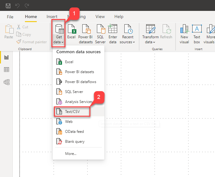
Figure 2 – Get Data in Power BI
图2 –在Power BI中获取数据
In the Connect Server dialog box that appears, provide the server name and the name of the database and click OK
在出现的“连接服务器”对话框中,提供服务器名称和数据库名称,然后单击“ 确定”。
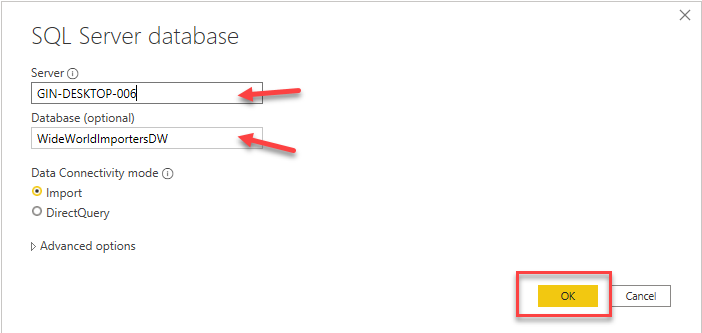
Figure 3 – Server Details
图3 –服务器详细信息
Connect using your credentials as required and click on Connect. In my case, I’m using Windows Authentication mode to connect to the database in SQL Server
根据需要使用您的凭据进行连接 ,然后单击“ 连接” 。 就我而言,我正在使用Windows身份验证模式连接到SQL Server中的数据库
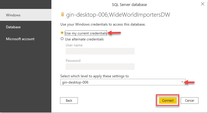
Figure 4 – Authentication
图4 –验证
Once you click on Connect, you’ll see that all the tables from the database are listed in the dialog box. For this article, we will just select three of the tables – Dimensions.City, Dimensions.Date and Fact.Sale. Click Load once done:
单击“连接”后,您将看到对话框中列出了数据库中的所有表。 对于本文,我们将仅选择三个表– Dimensions.City , Dimensions.Date和Fact.Sale 。 单击完成后加载 :
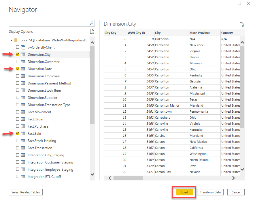
Figure 5 – Selecting Tables
图5 –选择表
All three tables will now be loaded into the Power BI data model and available on the data pane:
现在,所有三个表都将被加载到Power BI数据模型中,并在数据窗格中可用:
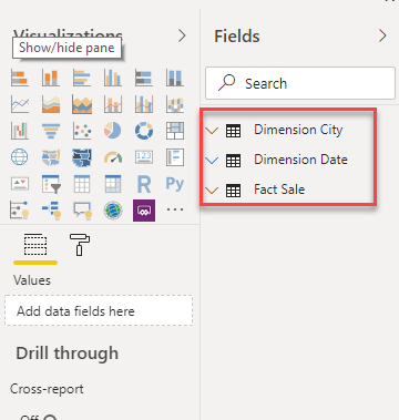
Figure 6 – Data Imported
图6 –导入的数据
在Power BI中生成报告 (Building a report in Power BI)
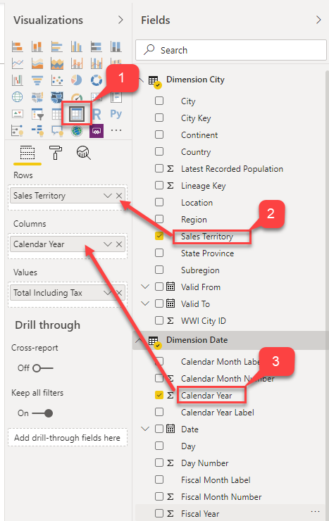
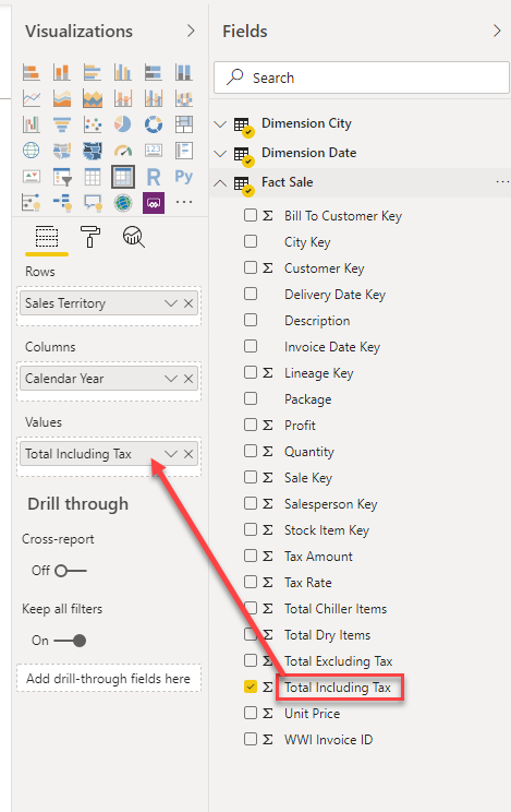
Now, let us quickly build a Power BI report using the Matrix visualization. It will use the data from the tables that we just imported. Click on Matrix on the Visualizations pane and drag and drop the respective fields into the Rows, Columns and Values, as shown in the figures below:
现在,让我们使用Matrix可视化工具快速构建Power BI报告。 它将使用我们刚刚导入的表中的数据。 单击“ 可视化”窗格上的“ 矩阵 ”,然后将相应的字段拖放到“ 行” ,“ 列”和“ 值”中,如下图所示:
Once the fields are in place, you’ll see a similar kind of matrix being created in the Power BI report. This is a simple matrix that displays the sum of Total Including Tax for each of the Sales Territory and by Year. As you can see, it’s not easy to understand the highest and lowest values in the matrix; we need to dive deep into the visual and understand those values.
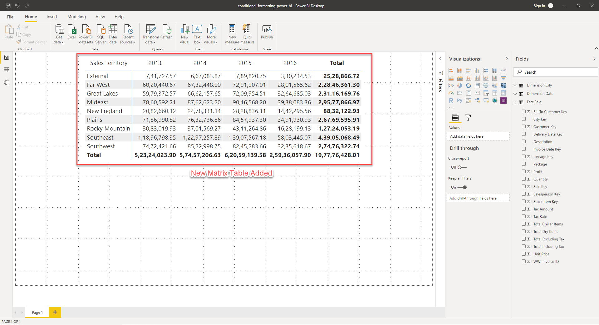
字段到位后,您将在Power BI报表中看到正在创建的类似矩阵。 这是一个简单的矩阵,显示每个销售地区和按年份的总含税总额 。 如您所见,要了解矩阵中的最大值和最小值并不容易。 我们需要深入了解视觉并理解这些价值。
在Power BI中实施条件格式 (Implementing conditional formatting in Power BI)
In order to implement conditional formatting in Power BI, let us go ahead and define the rules for which we would like to visualize. Let us consider that we will change the background color of the cells based on the values each cell holds. For instance, the cell with the lowest value will have a background color of red while the highest will be highlighted in blue. You can follow the steps below to implement the same.
为了在Power BI中实现条件格式设置,让我们继续并定义要可视化的规则。 让我们考虑我们将基于每个单元格所保存的值来更改单元格的背景色。 例如,具有最低值的单元格将具有红色的背景色,而具有最高值的单元格将以蓝色突出显示。 您可以按照以下步骤实施。
- Right-click on the “Total Including Tax” field in the Values section
- 右键单击“ 值”部分中的“ 含税总额 ”字段
Select Conditional Formatting and then click on the Background color
选择条件格式 ,然后单击背景色
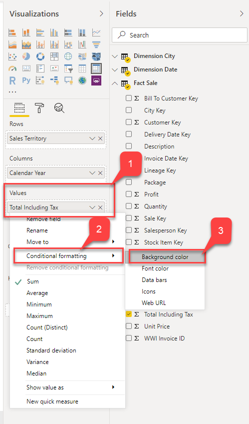
Figure 10 – Conditional Formatting
图10 –条件格式
Alternatively, you can also click on the Format button and turn on the Background Color under Conditional Formatting
或者,您也可以单击“ 格式”按钮,然后在“ 条件格式”下打开“ 背景色 ”
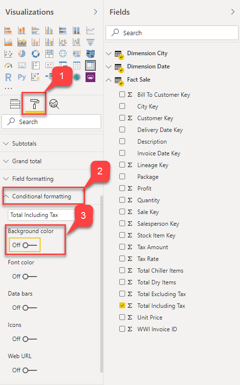
Figure 11 – Conditional Formatting
图11 –条件格式
The Background Color – Formatting dialog box opens
“背景色-格式设置”对话框打开
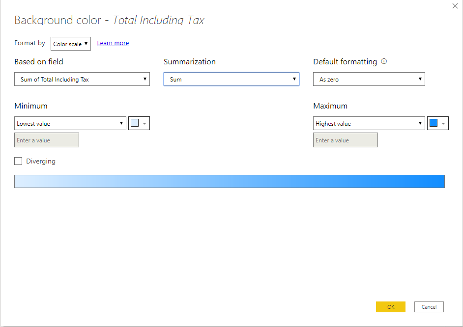
Figure 12 – Background Color
图12 –背景颜色
Let us now select Color Scale as the Format By option and select the colors as discussed earlier. For the Lowest value, we will assign red while the color for the Highest value will be blue. Click OK once done
现在让我们选择“ 色阶”作为“ 格式依据”选项,然后按照前面的讨论选择颜色。 对于最低值,我们将分配红色,而最高值的颜色将为蓝色 。 完成后单击确定
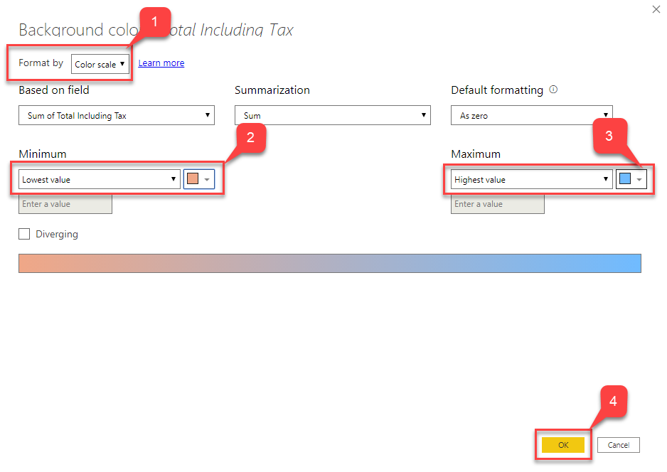
Figure 13 – Defining Color Scale
图13 –定义色阶
You’ll now see that the matrix has been highlighted with the colors as selected in the step above:
现在,您将看到矩阵已用上面步骤中选择的颜色突出显示:
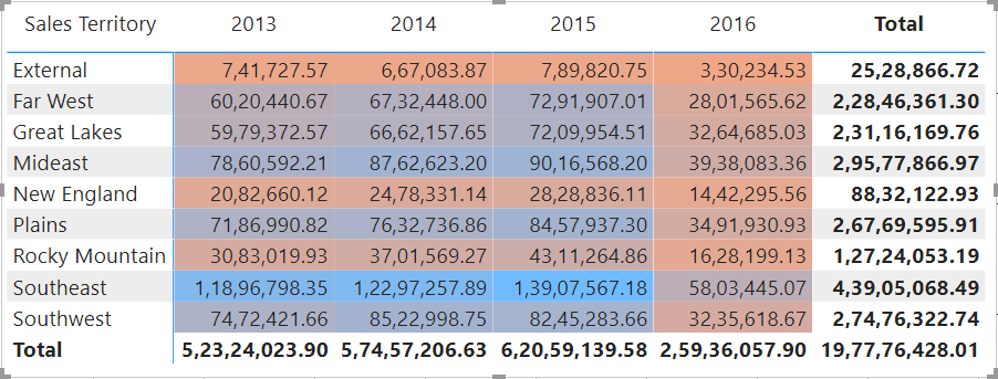
Figure 14 – Conditional Formatting Applied
图14 –应用条件格式
It is now easy to identify which are the lowest and highest values in the entire matrix just by looking at the saturation of the background colors. The highest being “1,39,07,567.18” and the lowest is “3,30,234.52”:
现在,仅通过查看背景色的饱和度即可轻松确定整个矩阵中的最低值和最高值。 最高的是“ 1,39,07,567.18 ”,最低的是“ 3,30,234.52 ”:
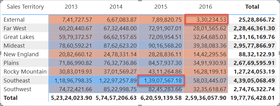
Figure 15 – Highest and Lowest Values
图15 –最高和最低价值
Now that we have seen what conditional formatting in Power BI is all about, let us explore some more different ways of implementing the same. In the steps above, the formatting rule is based on the range of cell values. That means, depending on the value a cell holds, the saturation of the background color changes. However, there might be scenarios where you’d like to visualize the formatting based on a fixed number value and don’t want to change the saturation of the colors. Or you might also want to segregate the measures into categories like High, Average and Low values.
现在,我们已经了解了Power BI中的条件格式是什么,让我们探索实现相同条件的更多不同方法。 在上述步骤中,格式化规则基于单元格值的范围。 这意味着,根据单元格保持的值,背景色的饱和度会发生变化。 但是,在某些情况下,您可能想根据固定的数值可视化格式,并且不想更改颜色的饱和度。 或者,您可能还想将度量分为高 , 平均和低值等类别。
In the steps below, we will try to modify the rules of the conditional formatting from range to fixed values.
在下面的步骤中,我们将尝试将条件格式的规则从范围修改为固定值。
- Right-click on the “Total Including Tax” field in the Values section
- 右键单击“ 值”部分中的“ 含税总额 ”字段
- Conditional Formatting and then click on the 条件格式 ,然后单击Background color 背景色
- Format button and turn on the 格式”按钮,然后在“ Background Color under 条件格式”下打开“ Conditional Formatting 背景色 ”
- The Background Color – Formatting dialog box opens “背景色-格式设置”对话框打开
In the Format By dropdown, select Rules
在格式依据下拉列表中,选择规则
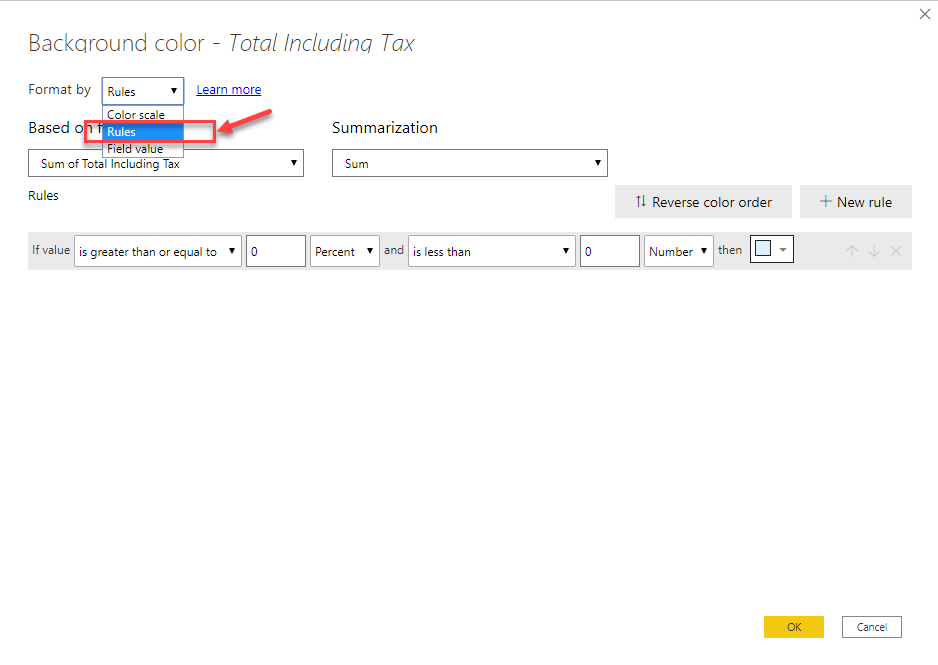
Figure 16 – Selecting Rules
图16 –选择规则
- New Rule button 新建规则”按钮创建尽可能多的规则
Click OK once done
完成后单击确定
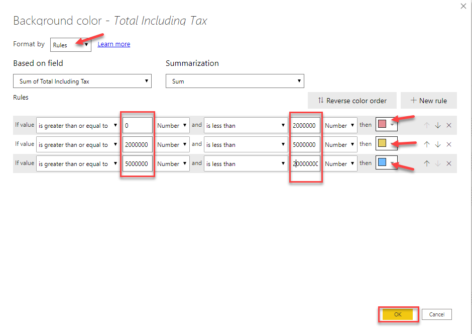
Figure 17 – Defining Colors
图17 –定义颜色
You can see that the formatting for the matrix has been updated. Now we have three different colors that tell us under which category each of the cell values lies
您可以看到矩阵的格式已更新。 现在,我们用三种不同的颜色告诉我们每个单元格值位于哪个类别下
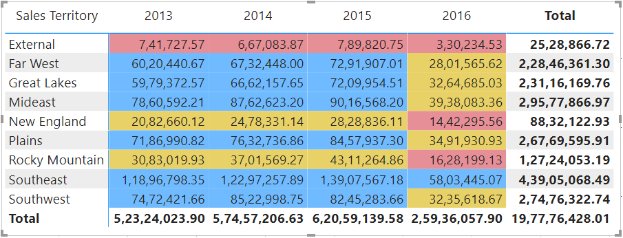
Figure 18 – Rule-Based Conditional Formatting
图18 –基于规则的条件格式
Thus, in the above exercise, we have seen how we can implement conditional formatting in Power BI based on two different ways. The first one was by using the Color Scale and the second was by defining specific Rules for the formatting.
因此,在上面的练习中,我们已经看到了如何基于两种不同的方式在Power BI中实现条件格式。 第一个是通过使用色阶 ,第二个是通过定义格式的特定规则 。
Power BI中带有图标的条件格式 (Conditional formatting with icons in Power BI)
Let us now go one step further and implement some icons just as a visual indicator in the cells. These specific icons are helpful when defining any KPIs, or while comparing metrics based on a criterion. You can follow the steps mentioned below to implement the icons in the cells.
现在让我们更进一步,实现一些图标,作为单元格中的可视指示器。 这些特定图标在定义任何KPI或基于标准比较指标时很有用。 您可以按照下面提到的步骤在单元格中实现图标。
- Right-click on the “Total Including Tax” field in the Values section
- 右键单击“ 值”部分中的“ 含税总额 ”字段
Select Conditional Formatting and then click on Icons
选择条件格式 ,然后单击图标
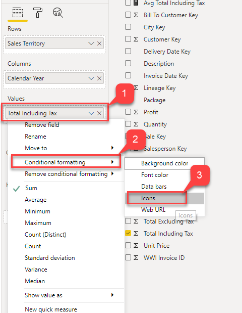
Figure 19 – Selecting Icons
图19 –选择图标
- Icons – Formatting dialog box opens 图标 -格式对话框打开
- Format By option be as 格式依据”选项作为Rules 规则
- Select Icon Layout as Right of Data and Icon Alignment as Middle
- 选择“ 图标布局”作为数据权限,选择“ 图标 对齐”作为中间
Select any option from the dropdown menu for Style and click OK
从样式的下拉菜单中选择任何选项,然后单击确定
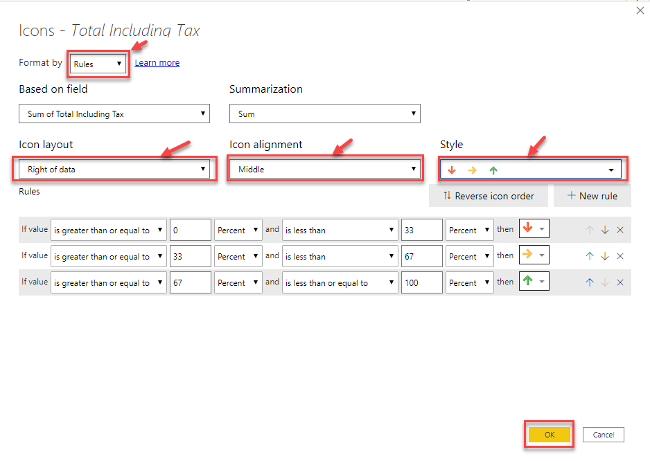
Figure 20 – Defining Rules for Icons
图20 –定义图标规则
Now you can see that the matrix displays additional icons based on the conditions that are defined in the previous step
现在您可以看到矩阵根据上一步中定义的条件显示了其他图标
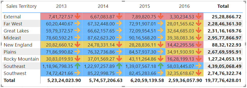
Figure 21 – Conditional Formatting with Icons
图21 –带图标的条件格式
- This is an important feature that helps users to visually understand if the metric has performed well or not 这是一项重要功能,可以帮助用户直观地了解指标是否执行良好
- Again, you can add as many rules as required based on the requirements 同样,您可以根据需求添加任意数量的规则
结论 (Conclusion)
In this article, I have explained what conditional formatting in Power BI is all about and how to implement the same. I have also explained the different ways in how conditional formatting can be applied and in what scenarios. Finally, we have seen how to include some infographic visuals (icons) in the visuals that help increase the readability of the reports to a great extent.
在本文中,我解释了Power BI中的条件格式是什么以及如何实现相同的条件。 我还解释了如何应用条件格式以及在哪种情况下使用不同的方法。 最后,我们已经看到了如何在视觉效果中包含一些图表视觉效果(图标),从而在很大程度上帮助提高报告的可读性。
翻译自: https://www.sqlshack.com/conditional-formatting-in-power-bi-2/
power bi条件格式


 1988
1988

 被折叠的 条评论
为什么被折叠?
被折叠的 条评论
为什么被折叠?
 到【灌水乐园】发言


