


js循环创建按钮
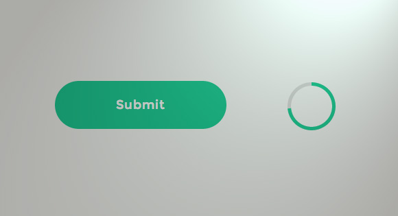
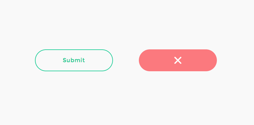
Today we are going to show you how to implement a nifty progress button concept. The concept is the fabulous Submit Button by Colin Garven. Take a look at it first to get an idea of what steps need to be done, and enjoy the animation. The idea behind the button is the following: once clicked, the submit button is transformed into a circle that will show a progress animation using its border. When the progress animation is finished, the button will expand again and show a checkmark to confirm that the submission is complete, as Colin mentions in a comment. We are going to implement this concept and add another state for the case when the submission fails.
今天,我们将向您展示如何实现漂亮的进度按钮概念。 这个概念就是Colin Garven出色的Submit Button 。 首先看一下它,以了解需要执行哪些步骤,然后欣赏动画。 该按钮的含义如下:单击后,提交按钮将转换为一个圆圈,该圆圈将使用其边框显示进度动画。 进度动画完成后,按钮将再次展开并显示一个选中标记,以确认提交已完成,正如Colin在评论中提到的那样。 我们将实现此概念,并为提交失败的情况添加另一个状态。
There are quite some possibilities for creating this button and the effect. When thinking about CSS-only techniques, the most challenging part would be the progress circle. There is a smart technique using the clip property for achieving the effect and Anders Ingemann wrote an excellent and very complete tutorial on it (he uses LESS). But we are going to implement this beauty using an SVG based technique with CSS transitions and some JavaScript. For the progress circle, the checkmark and cross in particular, we’ll make use of the animated line drawing technique explained by Jake Archibald.
创建此按钮和效果有很多可能性。 考虑纯CSS技术时,最具挑战性的部分是进度圈。 有一种使用clip属性来实现效果的聪明技术,Anders Ingemann对此进行了出色而完整的教程(他使用LESS)。 但是我们将使用带有CSS过渡和一些JavaScript的基于SVG的技术来实现这种美感。 对于进度圈,尤其是复选标记和十字,我们将利用Jake Archibald解释的动画线描技术。
Note that animating SVGs can be problematic for some browsers so it might not work everywhere as expected. These kind of techniques are still in their infancy so consider this tutorial as an experimental exercise that might come in handy for future implementations. 😉
请注意,为某些浏览器设置动画SVG可能会出现问题,因此可能无法在所有地方正常使用。 这些技术仍处于起步阶段,因此请将本教程视为实验性练习,可能会在将来的实现中派上用场。 😉
So, let’s get started!
所以,让我们开始吧!
总体规划 (The Master plan)
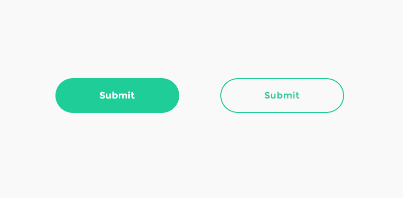
If you have carefully observed Colin’s Dribbble shot, you might have noticed that we’ll need to take care of several states of the button. The interesting part is the transition from one state to another. First, we want to show a simple button with a transparent background and a colored border. When we hover over the button, we want it to get filled with the border color and the text should become white.
如果您仔细观察了Colin的Dribbble镜头,您可能已经注意到我们需要注意按钮的几种状态。 有趣的部分是从一种状态到另一种状态的过渡。 首先,我们要显示一个带有透明背景和彩色边框的简单按钮。 当我们将鼠标悬停在按钮上时,我们希望它被边框颜色填充,并且文本应变为白色。
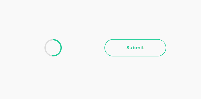
When we click on the button (in order to, for example, submit a form), we want to fade out the text, decrease the button’s width to become a circle, make the border thicker and start a progress animation on the border. We are going to use an SVG circle for this animation, so we need to ensure that the decreased round button is of the same size and sits in the same position as the SVG circle, that we’ll show in that moment. We’ll then draw the circle stroke, simulating the progress of the submission.
当我们单击按钮时(例如,提交表单),我们希望淡出文本,减小按钮的宽度成为一个圆形,使边框变粗并在边框上开始进度动画。 我们将为此动画使用SVG圆,因此我们需要确保减小的圆形按钮与SVG圆具有相同的大小,并且位于相同的位置,这将在那一刻显示。 然后,我们将绘制圆圈笔触,以模拟提交的进度。
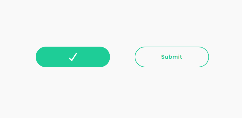
Once the submission is complete, i.e. the stroke is all drawn, we have to make our button expand again and draw the checkmark in case of a successful submission. We’ll also color the button accordingly.
提交完成后,即笔画全部绘制完毕,一旦提交成功,我们必须再次使按钮扩展并绘制选中标记。 我们还将相应地为按钮着色。
For the case of a failed submission, we’ll also want an error state style.
对于提交失败的情况,我们还需要一个错误状态样式。
So, let’s create our markup with all the elements that we need.
因此,让我们使用所需的所有元素来创建标记。
标记 (The Markup)
For our markup we need a main container, a button with a span that contains the text, and the three SVGs:
对于我们的标记,我们需要一个主容器,一个包含文本的跨度的按钮和三个SVG:
<!-- progress button -->
<div id="progress-button" class="progress-button">
	<!-- button with text -->
	<button><span>Submit</span></button>

	<!-- svg circle for progress indication -->
	<svg class="progress-circle" width="70" height="70">
		<path d="m35,2.5c17.955803,0 32.5,14.544199 32.5,32.5c0,17.955803 -14.544197,32.5 -32.5,32.5c-17.955803,0 -32.5,-14.544197 -32.5,-32.5c0,-17.955801 14.544197,-32.5 32.5,-32.5z"/>
	</svg>

	<!-- checkmark to show on success -->
	<svg class="checkmark" width="70" height="70">
		<path d="m31.5,46.5l15.3,-23.2"/>
		<path d="m31.5,46.5l-8.5,-7.1"/>
	</svg>

	<!-- cross to show on error -->
	<svg class="cross" width="70" height="70">
		<path d="m35,35l-9.3,-9.3"/>
		<path d="m35,35l9.3,9.3"/>
		<path d="m35,35l-9.3,9.3"/>
		<path d="m35,35l9.3,-9.3"/>
	</svg>

</div><!-- /progress-button -->
We’ve used Method Draw, an easy-to-use online SVG editor to draw the checkmark and cross previously. The size for all SVGs will be 70×70 because our button has a height of 70 pixels. Since we want the circle to have a stroke thickness of 5 pixel in order to look like in Colin’s concept, we need to set the correct radius when we draw it in the graphics editor so that the whole circle together with its stroke fills the button height of 70 pixels. Note that strokes in SVG are drawn half inset and half outset. For example, a stroke of 2 will increase a circle of radius 10 to a “real” width and height of 20 plus 2 instead of 20 plus 4 (two times the border width), so the formula is 2r + border. So, in our case we know that 2r + 5 = 70, hence our circle needs a radius of 32.5 and we end up with this shape <circle cx="35" cy="35" r="32.5"/>.
我们已经使用了Method Draw (一种易于使用的在线SVG编辑器)来绘制选中标记并事先进行划线。 由于我们的按钮的高度为70像素,因此所有SVG的尺寸均为70×70。 由于我们希望圆的笔触厚度为5像素才能看起来像Colin的概念,因此在图形编辑器中绘制圆时,我们需要设置正确的半径,以便整个圆及其笔触填充按钮的高度70像素。 请注意,SVG中的笔画分别是一半插入和一半插入。 例如,笔划2将使半径为10的圆增加到“真实”宽度和高度,即为20加2而不是20加4(边框宽度的两倍),因此公式为2r + border 。 因此,在我们的例子中,我们知道2r + 5 = 70 ,因此我们的圆需要32.5的半径,最终以<circle cx="35" cy="35" r="32.5"/>这个形状结束。
Unfortunately, we can’t just use this basic shape because the starting point of the “path” will differ in browsers and so we can’t control where the “progress animation” starts. So, we’ll convert this circle shape to a path and use that instead (see above). You can easily do that in Method Draw under Object > Convert to Path.
不幸的是,我们不能仅仅使用这种基本形状,因为“路径”的起点在浏览器中会有所不同,因此我们无法控制“进度动画”的开始位置。 因此,我们将把这个圆形转换为路径并使用它(见上文)。 您可以在“对象”>“转换为路径”下的“方法绘制”中轻松地做到这一点。
For the cross we will use four paths so that we can draw them from a middle point, making it look similar to the checkmark animation.
对于十字,我们将使用四个路径,以便我们可以从中间点绘制它们,使其看起来与选中标记动画相似。
So, now we have all the elements that we need. Let’s think about the action flow and start styling!
因此,现在我们有了所需的所有元素。 让我们考虑一下动作流程并开始样式化!
CSS (The CSS)
First, we need to style our button container. It’s like the outer skin of our button, so let’s make it a bit more like a button and set it’s display to inline-block so that we can use it in the flow:
首先,我们需要设置按钮容器的样式。 就像按钮的外壳一样,让我们使其更像一个按钮,并将其显示设置为inline-block以便我们可以在流程中使用它:
.progress-button {
	position: relative;
	display: inline-block;
	text-align: center;
}
Our button needs some coloring and typographic love. In order to make it look like Colin’s button, we set the right border and choose Montserrat as font:
我们的按钮需要一些颜色和印刷爱。 为了使其看起来像Colin的按钮,我们设置了右边框并选择Montserrat作为字体:
.progress-button button {
	display: block;
	margin: 0 auto;
	padding: 0;
	width: 250px;
	height: 70px;
	border: 2px solid #1ECD97;
	border-radius: 40px;
	background: transparent;
	color: #1ECD97;
	letter-spacing: 1px;
	font-size: 18px;
	font-family: 'Montserrat', sans-serif;
	-webkit-transition: background-color 0.3s, color 0.3s, width 0.3s, border-width 0.3s, border-color 0.3s;
	transition: background-color 0.3s, color 0.3s, width 0.3s, border-width 0.3s, border-color 0.3s;
}
We also need to set a transition for all those properties that we’ll be animating, like the background-color, the width and so on.
我们还需要为所有要设置动画的属性设置过渡,例如背景颜色,宽度等。
On hover, we’ll change the background color and the color:
悬停时,我们将更改背景色和颜色:
.progress-button button:hover {
	background-color: #1ECD97;
	color: #fff;
}
Let’s remove any shiny outlines:
让我们删除所有闪亮的轮廓:
.progress-button button:focus {
	outline: none;
}
All SVGs should be positioned absolutely in the center and we’ll not allow any pointer-events:
所有SVG都应绝对位于中央,我们不允许出现任何指针事件:
.progress-button svg {
	position: absolute;
	top: 0;
	left: 50%;
	-webkit-transform: translateX(-50%);
	transform: translateX(-50%);
	pointer-events: none;
}
The paths should not have any fill as we only want to play with the strokes. We don’t want to show them in any state except their special state, so let’s hide them by making them transparent:
路径不应该有任何填充,因为我们只想玩描边。 我们不希望以特殊状态显示它们,因此我们通过将它们透明化来隐藏它们:
.progress-button svg path {
	opacity: 0;
	fill: none;
}
Our progress ring will be created by setting the stroke of our circle path to 5:
通过将圆路径的笔触设置为5可以创建进度环:
.progress-button svg.progress-circle path {
	stroke: #1ECD97;
	stroke-width: 5;
}
The success/error indicators will have a thinner stroke and they’ll be white. We’ll also set the linecap of the stroke to round, so that they look nicer. These two will have a quick opacity transition:
成功/错误指示器将变细,并且将变为白色。 我们还将笔触的线帽设置为圆形,以使它们看起来更好。 这两个将具有快速的不透明过渡:
.progress-button svg.checkmark path,
.progress-button svg.cross path {
	stroke: #fff;
	stroke-linecap: round;
	stroke-width: 4;
	-webkit-transition: opacity 0.1s;
	transition: opacity 0.1s;
}
So, let’s just recap for a moment and remember our master plan. We need to be able to “style” three additional states (besides the default state) of the button and it’s special elements: the loading state, the success and the error state. So, we will use the classes “loading”, “success” and “error” to indicate them.
因此,让我们回顾一下,记住我们的总体规划。 我们需要能够为按钮的三个附加状态(默认状态之外)“设置样式”,它是特殊的元素:加载状态,成功状态和错误状态。 因此,我们将使用“加载”,“成功”和“错误”类来表示它们。
The button will become a circle and look exactly like the progress circle when we start with the loading process:
当我们开始加载过程时,该按钮将变成一个圆圈,看起来与进度圆圈完全一样:
.loading.progress-button button {
	width: 70px; /* make a circle */
	border-width: 5px;
	border-color: #ddd;
	background-color: transparent;
	color: #fff;
}
Remember that we’ve already set the transition when defining the button styles.
请记住,定义按钮样式时我们已经设置了过渡。
The text should fade out quickly when we start the progress animation…
开始播放进度动画时,文本应快速淡出。
.loading.progress-button span {
	-webkit-transition: opacity 0.15s;
	transition: opacity 0.15s;
}
…by setting the opacity to 0:
…通过将不透明度设置为0:
.loading.progress-button span,
.success.progress-button span,
.error.progress-button span {
	opacity: 0; /* keep it hidden in all states */
}
When we change from the loading to the success or error state, we don’t need the transition, we simply want to keep it hidden.
当我们从加载状态更改为成功或错误状态时,我们不需要过渡,我们只想保持隐藏状态。
When we remove all classes and return to the default state, we want to take a bit more time for the span to appear. So we have to define a different transition duration and delay for the normal state:
当我们删除所有类并返回到默认状态时,我们希望花更多时间显示跨度。 因此,我们必须为正常状态定义不同的过渡持续时间和延迟:
/* Transition for when returning to default state */
.progress-button button span {
	-webkit-transition: opacity 0.3s 0.1s;
	transition: opacity 0.3s 0.1s;
}
When we reach the last state and the submission was either successful or there was an error, we need to redefine the transitions for our button since we don’t need the border color or width to animate:
当我们到达最后一个状态并且提交成功或出现错误时,由于不需要边框颜色或宽度进行动画处理,因此需要重新定义按钮的过渡:
.success.progress-button button,
.error.progress-button button {
	-webkit-transition: background-color 0.3s, width 0.3s, border-width 0.3s;
	transition: background-color 0.3s, width 0.3s, border-width 0.3s;
}
Let set the colors for the final states:
让我们为最终状态设置颜色:
.success.progress-button button {
	border-color: #1ECD97;
	background-color: #1ECD97;
}

.error.progress-button button {
	border-color: #FB797E;
	background-color: #FB797E;
}
When we apply the respective classes, we will show the paths of our SVGs and animate the stroke-dashoffset by setting the following transition:
当我们应用各个类时,我们将显示stroke-dashoffset的路径,并通过设置以下过渡来使stroke-dashoffset动画化:
.loading.progress-button svg.progress-circle path,
.success.progress-button svg.checkmark path,
.error.progress-button svg.cross path {
	opacity: 1;
	-webkit-transition: stroke-dashoffset 0.3s;
	transition: stroke-dashoffset 0.3s;
}
Let’s add some optional easing for the button width animation by defining a the style for this extra class:
让我们通过为这个额外的类定义样式来为按钮宽度动画添加一些可选的缓动:
.elastic.progress-button button {
	-webkit-transition: background-color 0.3s, color 0.3s, width 0.3s cubic-bezier(0.25, 0.25, 0.4, 1), border-width 0.3s, border-color 0.3s;
	-webkit-transition: background-color 0.3s, color 0.3s, width 0.3s cubic-bezier(0.25, 0.25, 0.4, 1.6), border-width 0.3s, border-color 0.3s;
	transition: background-color 0.3s, color 0.3s, width 0.3s cubic-bezier(0.25, 0.25, 0.4, 1.6), border-width 0.3s, border-color 0.3s;
}

.loading.elastic.progress-button button {
	-webkit-transition: background-color 0.3s, color 0.3s, width 0.3s cubic-bezier(0.6, 0, 0.75, 0.75), border-width 0.3s, border-color 0.3s;
	-webkit-transition: background-color 0.3s, color 0.3s, width 0.3s cubic-bezier(0.6, -0.6, 0.75, 0.75), border-width 0.3s, border-color 0.3s;
	transition: background-color 0.3s, color 0.3s, width 0.3s cubic-bezier(0.6, -0.6, 0.75, 0.75), border-width 0.3s, border-color 0.3s;
}
If you’d like to play with some other easing functions, check out Ceaser, the CSS Easing Animation Tool by Matthew Lein.
如果您想使用其他一些缓动功能,请查看Ceaser ,这是Matthew LeinCSS缓动动画工具。
And that’s the style, let’s go on and do the magic!
这就是风格,让我们继续吧!
JavaScript (The JavaScript)
We will start by initializing/caching some elements: button is the HTML button element, progressEl is the SVG element that will have the path that represents the ring shaped progress bar, and the successEl, errorEl are the SVG elements that have the paths for the checkmark and the cross, respectively.
我们将从初始化/缓存一些元素开始: button是HTML button元素, progressEl是SVG元素,它将具有表示环形进度条的路径,而successEl , errorEl是SVG元素,具有用于该进度条的路径。选中标记和叉号。
function UIProgressButton( el, options ) {
	this.el = el;
	this.options = extend( {}, this.options );
	extend( this.options, options );
	this._init();
}

UIProgressButton.prototype._init = function() {
	this.button = this.el.querySelector( 'button' );
	this.progressEl = new SVGEl( this.el.querySelector( 'svg.progress-circle' ) );
	this.successEl = new SVGEl( this.el.querySelector( 'svg.checkmark' ) );
	this.errorEl = new SVGEl( this.el.querySelector( 'svg.cross' ) );
	// init events
	this._initEvents();
	// enable button
	this._enable();
}
We’ll add a function SVGEl that will be used to represent an SVG element and its paths. For each one we will cache the paths and the respective lengths. We initially “undraw” all the paths by manipulating both, the strokeDasharray and the strokeDashoffset values. Later on we will “draw” them back when we want to show the progress path and the checkmark or cross paths. This technique is very well explained in Jake Archibald’s article Animated line drawing in SVG. We basically set the stroke-dasharray to the length of the path and “pull it back” so that we don’t see it anymore by setting the stroke-dashoffset to its length, too. When we want to “draw” the stroke, we will push the offset back to 0, simulating the drawing of the path.
我们将添加一个函数SVGEl ,该函数将用于表示SVG元素及其路径。 对于每一个,我们将缓存路径和相应的长度。 最初,我们通过操作strokeDasharray和strokeDashoffset值来“绘制”所有路径。 稍后,当我们要显示进度路径和选中标记或交叉路径时,我们将它们“拉回”。 杰克·阿奇博尔德(Jake Archibald)的文章SVG中的动画线条画很好地解释了这种技术。 我们基本上将stroke-dasharray设置为路径的长度,然后将其“拉回”,以便也不再通过将stroke-dashoffset设置为其长度来看到它。 当我们要“绘制”笔划时,我们将偏移量推回0,以模拟路径的绘制。
function SVGEl( el ) {
	this.el = el;
	// the path elements
	this.paths = [].slice.call( this.el.querySelectorAll( 'path' ) );
	// we will save both paths and its lengths in arrays
	this.pathsArr = new Array();
	this.lengthsArr = new Array();
	this._init();
}

SVGEl.prototype._init = function() {
	var self = this;
	this.paths.forEach( function( path, i ) {
		self.pathsArr[i] = path;
		path.style.strokeDasharray = self.lengthsArr[i] = path.getTotalLength();
	} );
	// undraw stroke
	this.draw(0);
}

// val in [0,1] : 0 - no stroke is visible, 1 - stroke is visible
SVGEl.prototype.draw = function( val ) {
	for( var i = 0, len = this.pathsArr.length; i < len; ++i ){
		this.pathsArr[ i ].style.strokeDashoffset = this.lengthsArr[ i ] * ( 1 - val );
	}
}
Next, we need to bind the onclick event to the button. The button will initially animate to a rounded shape (by adding the class loading). After this animation ends, either an existing callback function is called (if any was specified in the options) or we simply set the progress to 100% (the speed of this “dummy” animation will be the same as defined for the transition of the stroke-dashoffset in the CSS). The button will also become disabled at this point. (This should actually be the first thing to happen when clicking it, however, if we do so Firefox does not seem to fire the transitionend event.)
接下来,我们需要将onclick事件绑定到按钮。 该按钮最初将设置为圆形动画(通过添加class load )。 动画结束后,要么调用现有的回调函数(如果在选项中指定了回调函数),要么将进度设置为100%(此“虚拟”动画的速度将与为动画的过渡定义的速度相同)。 CSS中的stroke-dashoffset)。 此时,该按钮也将被禁用。 (实际上,这应该是单击它时发生的第一件事,但是,如果这样做,Firefox似乎不会触发transitionend事件。)
UIProgressButton.prototype._initEvents = function() {
	var self = this;
	this.button.addEventListener( 'click', function() { self._submit(); } );
}

UIProgressButton.prototype._submit = function() {
	classie.addClass( this.el, 'loading' );

	var self = this,
		onEndBtnTransitionFn = function( ev ) {
			if( support.transitions ) {
				this.removeEventListener( transEndEventName, onEndBtnTransitionFn );
			}

			this.setAttribute( 'disabled', '' );

			if( typeof self.options.callback === 'function' ) {
				self.options.callback( self );
			}
			else {
				self.setProgress(1);
				self.stop();
			}
		};

	if( support.transitions ) {
		this.button.addEventListener( transEndEventName, onEndBtnTransitionFn );
	}
	else {
		onEndBtnTransitionFn();
	}
}
Once the progress reaches 100% we need to reset the stroke of the progress circle path. Also, we will either show the success checkmark or the error cross paths. After some time (options.statusTime) we “undraw” any status indicator path and enable the button again. Note that, as shown before, we control the transitions via CSS.
进度达到100%后,我们需要重置进度圆路径的笔触。 另外,我们将显示成功复选标记或错误交叉路径。 一段时间(options.statusTime)后,我们“取消绘制”任何状态指示器路径并再次启用该按钮。 请注意,如前所示,我们通过CSS控制过渡。
UIProgressButton.prototype.stop = function( status ) {
	var self = this,
		endLoading = function() {
			self.progressEl.draw(0);

			if( typeof status === 'number' ) {
				var statusClass = status >= 0 ? 'success' : 'error',
					statusEl = status >=0 ? self.successEl : self.errorEl;

				statusEl.draw( 1 );
				// add respective class to the element
				classie.addClass( self.el, statusClass );
				// after options.statusTime remove status and undraw the respective stroke and enable the button
				setTimeout( function() {
					classie.remove( self.el, statusClass );
					statusEl.draw(0);
					self._enable();
				}, self.options.statusTime );
			}
			else {
				self._enable();
			}

			classie.removeClass( self.el, 'loading' );
		};

	// give it a little time (ideally the same like the transition time) so that the last progress increment animation is still visible.
	setTimeout( endLoading, 300 );
}
And the button is done!
按钮完成!
We hope you enjoyed this tutorial and find it useful!
我们希望您喜欢本教程并发现它有用!
翻译自: https://tympanus.net/codrops/2014/04/09/how-to-create-a-circular-progress-button/
js循环创建按钮


 扫一扫
扫一扫


 962
962

 被折叠的 条评论
为什么被折叠?
被折叠的 条评论
为什么被折叠?
 到【灌水乐园】发言


