


 本教程详细讲解如何创建类似Moments App的全屏视频开场动画,涉及CSS动画、视口百分比长度、媒体查询和Flexbox布局等技术。通过HTML5视频和CSS控制,实现视频的旋转和缩放效果,以及全屏播放和关闭动画。同时,介绍了如何处理视频加载、播放控制和关闭行为的JavaScript实现。
android 全屏动画
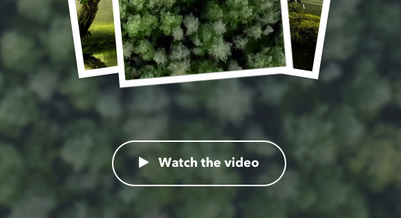
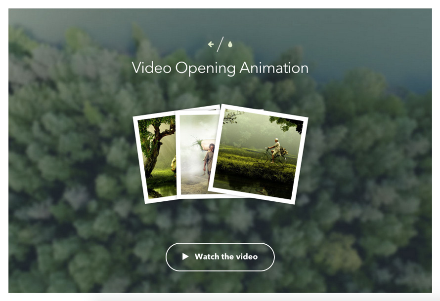
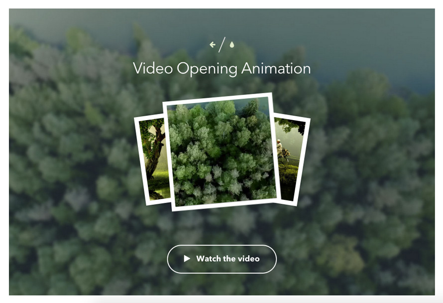
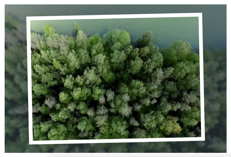
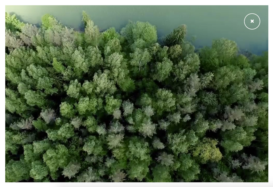
In this in-depth tutorial we want to show you how to create a similar video opening effect to the one seen on momentsapp.com. If you click the “Watch the video” button on the Moments App page, you will see a new image appearing on the photo stack which contains a video. The animation is a slight rotation of the frame and a subtle scaling of the video, which already starts to play. The whole wrapper expands to full screen without any play controls; just the closing cross will be shown. Once the video ends, or, if the user clicks on the closing cross, the video will simply disappear.
在这个深入的教程中,我们想向您展示如何创建与在momentsapp.com上看到的视频类似的视频打开效果。 如果单击Moments App页面上的“观看视频”按钮,您将在包含视频的照片堆栈中看到一个新图像。 动画是帧的轻微旋转和视频的微妙缩放,该视频已经开始播放。 整个包装器无需任何播放控件即可扩展到全屏模式。 仅显示十字叉。 视频结束后,或者,如果用户单击对角线,则视频将消失。
We’ll be using many interesting CSS properties, like CSS animations, viewport-percentage lengths, media queries and the Flexbox layout mode, beside others. We’ll also dive a bit into HTML5 video and some of its attributes and definitions.
我们将使用许多有趣CSS属性,例如CSS动画,视口百分比长度,媒体查询和Flexbox布局模式。 我们还将深入研究HTML5视频及其一些属性和定义。
Note that most of these properties are supported in modern browsers only.
请注意,大多数这些属性仅在现代浏览器中受支持。
The images in the demo are by photographer Herriest and the video is from UnripeContent, a great place to find lots of free footage from various categories.
演示中的图像由摄影师Herriest拍摄,视频来自UnripeContent ,这是一个可以找到许多不同类别免费镜头的好地方。
Let’s get down to business and start by planning the effect, write our markup and the JavaScript. Then we’ll style everything and set up the animations that will give live to the whole effect.
让我们开始做生意,首先计划效果,编写标记和JavaScript。 然后,我们将对所有内容进行样式设置并设置动画,以使整个效果生动起来。
规划,标记和JavaScript (Planning, Markup and JavaScript)
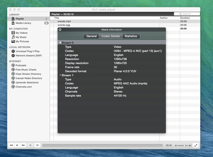
We want to animate a wrapper that contains a video that also gets animated, so we’ll need a nested structure with two wrappers for the video. The only control that we want to have is a close button which will also go into the same wrapper. The video will need to be in MP4 format for minimum support but we’ll add multiple sources for support in various browsers. Read more about this topic in the Wikipedia entry on HTML5 video and Pete LePage’s insightful HTML5 Video article on HTML5 Rocks. We’ve used the handy CloudConvert service for converting our MP4 video into the required file formats (WebM and Ogg).
我们希望对包含视频的包装器进行动画处理,该视频也将被动画化,因此我们需要一个嵌套结构,其中包含两个用于视频的包装器。 我们要拥有的唯一控件是一个关闭按钮,该按钮也将进入同一包装器。 视频必须采用MP4格式才能获得最低支持,但是我们将添加多种来源以支持各种浏览器。 在HTML5视频的Wikipedia条目和HTML5 Rocks上Pete LePage的有见地的HTML5视频文章中了解有关此主题的更多信息。 我们已经使用方便的CloudConvert服务将我们的MP4视频转换为所需的文件格式( WebM和Ogg )。
The poster attribute value allows us to set an image that will be shown before the video loads. With the preload attribute value set to auto, we tell the browser that it’s desirable to download the entire video optimistically, i.e. with the outlook on accomplishment. The sources for the different video file formats are listed inside the video element. When defining a source, we also set the codec; a codec encodes audio and video by turning a set of images into a compressed video stream or a set of audio samples into an audio stream and the other way around. The containers for video/audio stream combinations are the familiar file formats like MP4 (combines H.264 with AAC audio) or WebM (VP8 and Vorbis). These also have an identifying MIME type, like “video/webm”. For an in-depth explanation, check out The ‘Codecs’ and ‘Profiles’ Parameters for “Bucket” Media Types.
海报属性值使我们可以设置将在视频加载之前显示的图像。 将preload属性值设置为auto ,我们告诉浏览器最好乐观地下载整个视频,即具有完成度的前景。 video元素内列出了不同视频文件格式的源。 在定义源时,我们还设置了编解码器; 编解码器通过将一组图像转换为压缩的视频流或将一组音频采样转换为音频流来对音频和视频进行编码,反之亦然。 视频/音频流组合的容器是熟悉的文件格式,例如MP4(将H.264与AAC音频组合)或WebM(VP8和Vorbis)。 它们也具有识别的MIME类型,例如“ video / webm”。 有关详细说明,请查看“ Bucket”媒体类型的“ Codecs”和“ Profiles”参数。
Let’s write the markup:
让我们来编写标记:
<div class="video-wrap">
	<div class="video-inner">
		<video class="video-player" src="media/woods.mp4" poster="media/woods.jpg" preload="auto">
			<source src="media/woods.webm" type='video/webm; codecs="vp8.0, vorbis"'>
			<source src="media/woods.ogg" type='video/ogg; codecs="theora, vorbis"'>
			<source src="media/woods.mp4" type='video/mp4; codecs="avc1.4D401E, mp4a.40.2"'>
			<p>Sorry, but your browser does not support this video format.</p>
		</video>
		<button class="action action--close">
			<i class="fa fa-close"></i>
			<span class="action__label action__label--hidden">Close preview</span>
		</button>
	</div><!-- /video-inner-->
</div><!-- /video-wrap-->

<div class="content">
	<div class="loader">
		<i class="fa fa-spinner fa-pulse"></i>
	</div>
	<button class="action action--hidden action--play">
		<i class="fa fa-play"></i><span class="action__label">Watch the video</span>
	</button>
</div>
We’ll also add a play button that will serve as our trigger for the opening animation and playing the video. As you can see, we are using the Font Awesome icon font here (class fa).
我们还将添加一个播放按钮,该按钮将用作打开动画和播放视频的触发器。 如您所见,我们在这里使用Font Awesome图标字体( fa类)。
When we click on that play button, we will add the class video-wrap–show to the video-wrap division. This will allow us to control the effect on a class-basis by using CSS animations and transitions. Once we click on the closing cross, we will remove that class and add video-wrap–hide instead. Like that, we can define an alternative closing behavior with a different animation.
当我们单击该播放按钮时,我们将把video-wrap-show类添加到video-wrap部门。 这将允许我们通过使用CSS动画和过渡来控制基于类的效果。 一旦单击了十字交叉,我们将删除该类并添加video-wrap-hide 。 这样,我们可以使用其他动画定义替代的关闭行为。
Our aim is to control all the effect using mostly CSS; adding the classes and controlling the playing of the video will be our script’s job.
我们的目标是主要使用CSS来控制所有效果; 添加类并控制视频的播放将是我们脚本的工作。
So let’s sum up what we need to do in order to achieve what we want:
因此,让我们总结一下为了达到我们想要的目标而需要做的事情:
The video will take some time to load, so we’ll need to make sure that we don’t allow opening the video if it’s not ready yet. We can do that by adding the control class video-loaded to the body once the video is loaded. This will allow us to control the visibility of the loader element and the play button.
该视频将需要一些时间来加载,因此我们需要确保如果尚未准备好,则不允许打开该视频。 我们可以通过在视频加载后将已加载视频的控件类添加到主体来实现。 这将使我们能够控制加载器元素和播放按钮的可见性。
When we click on the play button, we want the animation to start. By adding the class video-wrap–show to our video wrapper, we trigger the animation, and we start playing the video a bit later.
当单击播放按钮时,我们希望动画开始。 通过将class video-wrap-show添加到我们的视频包装器中,我们触发了动画,然后稍后开始播放视频。
When the video reaches the end or when we click on the closing cross, we’ll add the class video-wrap–hide to play our alternate closing animation.
当视频到达末尾或单击结束十字时,我们将添加class video-wrap-hide来播放替代的结束动画。
- We pause the video if it hasn’t ended and we set it to the beginning if we open it (again). 如果视频尚未结束,我们会暂停播放,如果再次打开,我们会将其设置为开始播放。
Let’s write the JavaScript, implementing all the control behavior we have defined before:
让我们编写JavaScript,实现我们之前定义的所有控制行为:
;( function() {

	'use strict';

	var bodyEl = document.body,
		videoWrap = document.querySelector('.video-wrap'),
		videoEl = videoWrap.querySelector('video'),
		playCtrl = document.querySelector('.action--play'),
		closeCtrl = document.querySelector('.action--close');

	function init() {
		initEvents();
	}

	function initEvents() {
		playCtrl.addEventListener('click', play);
		closeCtrl.addEventListener('click', hide);
		videoEl.addEventListener('canplaythrough', allowPlay);
		videoEl.addEventListener('ended', hide);
	}

	function allowPlay() {
		classie.add(bodyEl, 'video-loaded');
	}

	function play() {
		videoEl.currentTime = 0;
		classie.remove(videoWrap, 'video-wrap--hide');
		classie.add(videoWrap, 'video-wrap--show');
		setTimeout(function() {videoEl.play();}, 600);
	}

	function hide() {
		classie.remove(videoWrap, 'video-wrap--show');
		classie.add(videoWrap, 'video-wrap--hide');
		videoEl.pause();
	}

	init();

})();
Quite straightforward, right? 🙂 The beauty of having the functionality class-controlled is that we can now define the behavior in an interconnected way in our stylesheet. This has many advantages when it comes to managing an effect. But it’s a matter of preference and requirements; if you have many complex interactions going on, you might be better off defining most or all the behavior (animations, transitions or visibility) in your JavaScript. But we want to dive into CSS today and explore some exciting properties that will hopefully help you with some other challenges during your development work.
很简单,对吧? class对功能进行类控制的好处在于,我们现在可以在样式表中以相互关联的方式定义行为。 在管理效果方面,这具有许多优势。 但这是喜好和要求的问题; 如果您正在进行许多复杂的交互,那么最好在JavaScript中定义大多数或所有行为(动画,过渡或可见性)。 但是我们今天想深入探讨CSS,并探索一些令人兴奋的特性,这些特性有望在开发工作中帮助您解决其他挑战。
The effect from the Moments App website is great for examining and utilizing some exciting techniques, so let’s dive into the CSS!
Moments App网站的效果非常适合检查和利用一些令人兴奋的技术,所以让我们深入CSS!
CSS (The CSS)
Let’s bring everything to life with our style definitions. We’ll focus on the styles that are important for the effect only, but you can check out the resting styles for the page in the style.css file that is located in the css folder.
让我们通过样式定义将所有内容变为现实。 我们将只关注仅对效果重要的样式,但是您可以在css文件夹中的style.css文件中查看页面的静止样式。
Let’s start by setting the box-sizing to border-box for all elements. This box model is the preferred choice among developers because it has the advantage of allowing to define sizes including borders and paddings:
首先,将所有元素的框大小设置为border-box 。 此框模型是开发人员首选的选择,因为它具有允许定义包括边框和填充的大小的优点:
*,
*:after,
*:before {
	-webkit-box-sizing: border-box;
	box-sizing: border-box;
}
Let’s define the body and link styles:
让我们定义主体和链接样式:
body {
	font-family: 'Avenir Next', 'Helvetica Neue', 'Lato', 'Segoe UI', Helvetica, Arial, sans-serif;
	color: #fff;
	background: #333 url(../media/woods.jpg) no-repeat center center;
	background-size: cover;
	-webkit-font-smoothing: antialiased;
	-moz-osx-font-smoothing: grayscale;
}

a {
	text-decoration: none;
	color: #d9ecc9;
	outline: none;
}

a:hover,
a:focus {
	color: #fff;
}
You don’t need to set the font-smoothing properties, but we choose to do so here as it makes the fonts crisp on Mac and prevents some jiggling in Firefox.
您不需要设置字体平滑属性,但我们选择在此处进行设置,因为这会使Mac上的字体清晰,并防止Firefox中出现一些抖动。
Next, we need to set the styles for our main page container that wraps everything. Using viewport-percentage lengths, we set its dimensions to span over the whole viewport and hide any overflow. How do we want the elements inside of the container to be laid out? Since we are using a fixed 100% height, we want the elements to be spread in one column, which is centered on the screen. What a pain this would be without the fantastic Flexbox layout mode 🙂 Let’s make extensive use of it and define exactly what we want:
接下来,我们需要为包装所有内容的主页容器设置样式。 使用视口百分比长度,我们将其尺寸设置为跨整个视口并隐藏任何溢出。 我们要如何布置容器内部的元素? 由于我们使用的是固定的100%高度,因此我们希望元素分布在屏幕中央的一列中。 如果没有出色的Flexbox布局模式,这将是多么痛苦🙂让我们对其进行广泛使用并确切定义我们想要的:
.container {
	width: 100vw;
	height: 100vh;
	border: 20px solid #fff;
	position: relative;
	overflow: hidden;
	display: -webkit-flex;
	display: flex;
	-webkit-flex-direction: column;
	flex-direction: column;
	-webkit-justify-content: space-around;
	justify-content: space-around;
	-webkit-align-items: center;
	align-items: center;
}
We set the display to flex and the flex-direction property to column. Justifying the content with space-around and aligning the items using center will give us the elastic layout we want. Try resizing your browser window to see how the elements will be laid out depending on how much space is available.
我们将显示设置为flex ,并将flex-direction属性设置为column 。 用空格左右对齐内容并使用center对齐项目将为我们提供所需的弹性布局。 尝试调整浏览器窗口的大小,以查看如何根据可用空间来布局元素。
Let’s take care of that main video wrapper. Now, before we start styling away, let’s reflect on some possible scenarios and what we need to consider so that things don’t break. We need to cover every possible case (or at least the most important ones, leaving out devices like tiny watches). Considering the case of a smartphone or small device, we want to avoid too much fanciness and we have to consider native behavior (which might just throw our entire effect overboard, like it is the case for iOS).
让我们来照顾一下主要的视频包装器。 现在,在开始进行样式设计之前,让我们思考一下一些可能的情况以及我们需要考虑的事情,以免发生问题。 我们需要涵盖所有可能的情况(或至少是最重要的情况,而忽略诸如小手表之类的设备)。 考虑到智能手机或小型设备的情况,我们要避免过于幻想,而必须考虑本机行为(这可能会使我们的整个效果落伍,就像iOS一样)。
So we want our effect to only animate entirely for larger screens and we don’t want to do anything too elaborate for tiny screens (we just want to show the video wrapper). We make use of media queries of which we will have two: one for defining the whole effect for screens bigger than 25em, and one for defining some styles differently according to the aspect ratio of the screen. Our reference aspect ratio is the video itself: with a size of 1280 × 720, we have an aspect ratio of 1280/720, or 16/9. Since we want to make sure that the video covers the whole screen, we need to distinguish between the “vertical” and the “horizontal” case. One will use the width of the video to cover the screen and one will take the height. But more on that later.
因此,我们只希望为大屏幕完全制作动画效果,而对于小屏幕则不想做得太复杂(我们只想显示视频包装器)。 我们利用媒体查询,其中有两种:一种用于定义大于25em的屏幕的整体效果,另一种用于根据屏幕的纵横比不同地定义某些样式。 我们的参考宽高比是视频本身:尺寸为1280×720,我们的宽高比为1280/720或16/9。 由于我们要确保视频覆盖整个屏幕,因此我们需要区分“垂直”和“水平”情况。 一个将使用视频的宽度来覆盖屏幕,另一个将使用其高度。 但是稍后会更多。
The “default” styles without the main animation effect will be defined first, and then we’ll add everything else we need to our media queries.
首先定义没有主要动画效果的“默认”样式,然后将其他所有需要添加的内容添加到媒体查询中。
The main wrapper will be a fixed element that will take up all the width and height available. We’ll use flexbox to center the inner container, so let’s define the necessary properties:
主包装器将是一个固定元件,它将占用所有可用的宽度和高度。 我们将使用flexbox将内部容器居中,因此让我们定义必要的属性:
.video-wrap {
	position: fixed;
	z-index: 1000;
	top: 0;
	left: 0;
	width: 100%;
	height: 100%;
	pointer-events: none;
	display: -webkit-flex;
	display: flex;
	-webkit-align-items: center;
	align-items: center;
}
We set the z-index value of the element very high so that it’s on top of everything else, but we don’t want it to be clickable when the inner parts are hidden. Using pointer-events: none will make the wrapper “untouchable” and invisible to interaction but be careful when using this, support is limited. You can achieve a similar behavior by using visibility, though. If you are interested in how that works, check out this short post of our Fullscreen Overlay Effects.
我们将元素的z-index值设置得很高,以使其位于其他所有元素之上,但是我们不希望在隐藏内部部件时单击它。 使用指针事件:没有哪个会使包装“不可触摸”且对于交互不可见,但是使用此事件时要小心,支持有限。 但是,您可以通过使用可见性来实现类似的行为。 如果您对它的工作方式感兴趣,请查看我们的全屏叠加效果的这篇简短文章。
When we show the video, we will set the pointer-events to auto:
展示视频时,我们将指针事件设置为auto :
.video-wrap--show {
	pointer-events: auto;
}
While the main video wrapper serves as a layout container, the video-inner division and the video itself are our crucial main players. Let’s set the base styles for the video-inner div:
虽然主视频包装器用作布局容器,但视频内部部门和视频本身是我们至关重要的主要参与者。 让我们为video-inner div设置基本样式:
.video-inner {
	position: relative;
	overflow: hidden;
	width: 100%;
	height: 100%;
	margin: 0 auto;
	opacity: 0;
	background: black;
}
Here we set the width and height to 100% because no expansion or fancy effect will happen for the base case of small devices.
在这里,我们将宽度和高度设置为100%,因为在小型设备的基本情况下不会发生扩展或幻想效果。
.video-wrap--show .video-inner {
	opacity: 1;
}
Adding our “show” class will simply trigger the visibility of the inner division.
添加我们的“ show”类将仅触发内部分区的可见性。
The video element itself will be positioned absolutely and centered by setting the top to 50% and a transform to “pull” it back up half of its own height:
通过将顶部设置为50%,然后将其“拉”回其自身高度的一半,可以将视频元素本身定位在绝对中心位置:
.video-player {
position: absolute;
top: 50%;
width: 100%;
-webkit-transform: translate3d(0,-50%,0);
transform: translate3d(0,-50%,0);
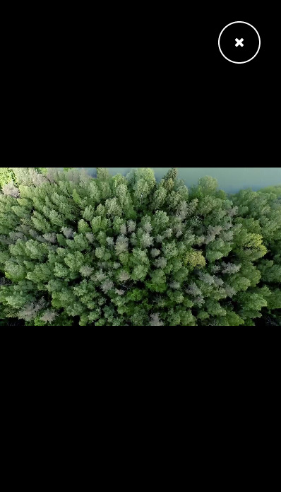
}These are the base styles that will allow to show the main video wrapper and to look like this for small screens:
这些是基本样式,它们可以显示主要的视频包装,并在小屏幕上看起来像这样:
Remember, the styles for the main effect will be defined in two media queries later on.
请记住,稍后将在两个媒体查询中定义主要效果的样式。
Let’s style the loader and action buttons (play and close). The loader and play button will be placed in a division with the class content which needs relative positioning. Why? We want the loader to be positioned absolutely in the same place of the play button so that we can switch both with a transition:
让我们设置加载器和操作按钮(播放和关闭)的样式。 加载程序和播放按钮将与需要相对定位的课程内容放在一个分区中。 为什么? 我们希望将加载程序绝对定位在播放按钮的同一位置,以便我们可以通过过渡切换两者:
.content {
	position: relative;
}

/* Loader */
.loader {
	font-size: 2.5em;
	position: absolute;
	top: 50%;
	left: 50%;
	-webkit-transform: translate3d(-50%,-50%,0);
	transform: translate3d(-50%,-50%,0);
}

.video-loaded .loader {
	opacity: 0;
	pointer-events: none;
	-webkit-transition: opacity 0.3s;
	transition: opacity 0.3s;
}
The buttons that are actions will get the class action and we will define some common styles:
作为动作的按钮将获得类动作,我们将定义一些常见的样式:
.action {
	font-family: 'Avenir Next', 'Helvetica Neue', 'Lato', 'Segoe UI', Helvetica, Arial, sans-serif;
	font-size: 1.15em;
	font-weight: bold;
	position: relative;
	overflow: hidden;
	margin: 0;
	padding: 1em 2em;
	color: #fff;
	border: 2px solid;
	border-radius: 40px;
	background: none;
	-webkit-flex: none;
	flex: none;
}

.action:focus {
	outline: none;
}
Setting the flex property value to none will make sure that our button doesn’t get squeezed when things get tight.
将flex属性值设置为none可以确保当事情变紧时我们的按钮不会被挤压。
We remove the outline on focus. (Note: Yes, it’s an absolute sin to do this but I consider it an absolute no-brainer that you should provide an appropriate focus style for maintaining good accessibility but when creating demos for Codrops, I want the UI to be impeccable for the sake of being able to concentrate solely on the effect in question; in my opinion, the :focus style breaks this by changing the style on click in a permanent way.)
我们将重点放在轮廓上。 (注意:是的,这样做绝对是罪过,但我认为应该提供适当的焦点样式以保持良好的可访问性绝对是理所当然的,但是当为Codrops创建演示时,我希望UI是无可挑剔的能够完全专注于所讨论的效果;在我看来,:focus样式通过永久更改点击样式来打破这一点。)
The action label or text will be set to inline and when we don’t want to show the label but keep it screen reader accessible, we can hide it by setting its position to absolute and the top value to 200%. Note that we need to set the parent’s overflow value to hidden for this to work.
动作标签或文本将设置为内联,并且当我们不想显示标签但要让屏幕阅读器可访问时,可以通过将其位置设置为绝对值并将上限值设置为200%来隐藏它。 请注意,我们需要将父级的溢出值设置为隐藏,才能正常工作。
.action__label {
	display: inline-block;
	margin: 0 0 0 0.75em;
}

.action__label--hidden {
	position: absolute;
	top: 200%;
}
The play button will be invisible initially, and then, when the video is loaded and we add the video-loaded class to the body, we show it:
播放按钮最初将是不可见的,然后,在加载视频并将视频加载的类添加到主体后,我们将其显示:
.action--play {
	display: block;
	margin: 1em auto;
	opacity: 0;
	pointer-events: none;
	-webkit-transition: opacity 0.3s 0.1s;
	transition: opacity 0.3s 0.1s;
}

.video-loaded .action--play {
	opacity: 1;
	pointer-events: auto;
}
The closing button which is placed in our inner video wrapper, will be shown using a transition on its opacity and scale transform. This transition will have a delay when we open the video wrapper, but none when we close it:
放置在我们内部视频包装中的关闭按钮将通过其不透明度和比例转换的过渡来显示。 当我们打开视频包装器时,此过渡会有一个延迟,但是当我们关闭它时没有延迟:
.action--close {
	line-height: 1;
	position: absolute;
	z-index: 1000;
	top: 30px;
	right: 30px;
	width: 60px;
	height: 60px;
	padding: 0;
	opacity: 0;
	-webkit-transition: -webkit-transform 0.3s, opacity 0.3s;
	transition: transform 0.3s, opacity 0.3s;
	-webkit-transform: scale3d(0.7,0.7,1);
	transform: scale3d(0.7,0.7,1);
}

.video-wrap--show .action--close {
	opacity: 1;
	-webkit-transition-delay: 1.2s;
	transition-delay: 1.2s;
	-webkit-transform: scale3d(1,1,1);
	transform: scale3d(1,1,1);
}
Now we are getting to the heart of our styles.
现在,我们进入样式的核心。
For screens that are at least 25em in width, we want the expanding animation to take effect. So first we need to set the inner video wrapper to the right size. For the “vertical” case we will use the viewport width as a base measure to size our inner container. We do that so that we have a similar size to the decorative polaroid images which also have a dynamic width and height depending on the aspect ratio.
对于宽度至少为25em的屏幕,我们希望展开的动画生效。 因此,首先我们需要将内部视频包装器设置为正确的尺寸。 对于“垂直”情况,我们将视口宽度用作确定内部容器大小的基本度量。 我们这样做是为了使我们拥有与装饰性宝丽来图像相似的大小,该装饰性宝丽来图像还具有取决于宽高比的动态宽度和高度。
Once we set the main wrapper’s class to video-wrap–show, we play the animation showVideo-1. When we close it, we will use the animation hideVideo. We’ll have a more detailed look at the animations later on.
将主包装的类设置为video-wrap-show之后,我们将播放动画showVideo-1 。 当我们关闭它时,我们将使用动画hideVideo 。 稍后,我们将对动画进行更详细的介绍。
The inner video wrapper will be slightly rotated and scaled down initially. You could also set these properties in the 0% keyframe but you can save yourself the repetition and just define the initial state in the class declaration.
最初,内部视频包装器将稍微旋转并按比例缩小。 您也可以在0%关键帧中设置这些属性,但是可以避免重复,而只需在类声明中定义初始状态即可。
The video element will take up all the viewport height for this default “vertical case” (in the next media query we will switch that) and let the width be defined automatically. It will also be transformed; first, to be centered with the “translate -50%” technique, then scaled and rotated in the opposite direction to compensate the rotation of the parent slightly. We don’t want to rotate it too much, as we don’t want any edges to show here. Make sure to play around with these transforms to see how you can achieve other interesting effects.
video元素将占据此默认“垂直案例”的所有视口高度(在下一个媒体查询中,我们将对其进行切换),并自动定义宽度。 它也会被改变; 首先,以“平移-50%”技术为中心,然后缩放并沿相反方向旋转以稍微补偿父级的旋转。 我们不想旋转太多,因为我们不想在这里显示任何边缘。 确保尝试这些转换,以了解如何实现其他有趣的效果。
When we show the main wrapper, we will change the video element’s transform (we’ll still keep it centered, though) and make sure that it’s also in that state when we close it. When we hide everything, we simply want to fade out the wrapper without animating it back. When closing things and making them disappear always think of the fastest elegant way to do it; remember that the user has decided to get rid of whatever is being closed, so making it easy and more fast can be desirable in cases like these.
当显示主包装时,我们将更改视频元素的变换(尽管仍然将其居中),并确保在关闭它时也处于该状态。 当我们隐藏所有内容时,我们只想淡出包装器而不对其进行动画处理。 当关闭事物并使它们消失时,总是想到最快的优雅方法。 请记住,用户已决定摆脱任何关闭的东西,因此在此类情况下,使其变得轻松快捷是理想的。
@media screen and (min-width: 25em) {
	.video-inner {
		width: 30vw;
		height: 30vw;
		border: 20px solid #fff;
		-webkit-transform: scale3d(0.1,0.1,1) rotate3d(0,0,1,-5deg);
		transform: scale3d(0.1,0.1,1) rotate3d(0,0,1,-5deg);
	}
	.video-wrap--show .video-inner {
		opacity: 0;
		-webkit-animation: showVideo-1 1.25s forwards;
		animation: showVideo-1 1.25s forwards;
	}
	.video-wrap--hide .video-inner {
		-webkit-animation: hideVideo 1.25s forwards;
		animation: hideVideo 1.25s forwards;
	}
	.video-player {
		left: 50%;
		width: auto;
		height: 100vh;
		-webkit-transition: -webkit-transform 1s;
		transition: transform 1s;
		-webkit-transform: translate3d(-50%,-50%,0) scale3d(0.7,0.7,1) rotate3d(0,0,1,5deg);
		transform: translate3d(-50%,-50%,0) scale3d(0.7,0.7,1) rotate3d(0,0,1,5deg);
	}
	.video-wrap--show .video-player,
	.video-wrap--hide .video-player {
		-webkit-transform: translate3d(-50%,-50%,0) scale3d(1,1,1);
		transform: translate3d(-50%,-50%,0) scale3d(1,1,1);
	}
}
The second media query is for the “horizontal” case, i.e. the case that we know will make the video cover the whole screen by setting the width to the full viewport width. We take the values of the video’s width and height to define the minimum aspect ratio, which is the same as 16/9.
第二个媒体查询针对“水平”情况,即我们知道的情况是,通过将宽度设置为整个视口宽度,使视频覆盖整个屏幕。 我们采用视频的宽度和高度的值来定义最小纵横比,该纵横比与16/9相同。
We size our inner wrapper to 30vh initially, and the video itself will take up all the width of the screen while leaving the height to auto.
最初,我们将内部包装的大小调整为30vh ,视频本身将占据屏幕的所有宽度,而高度保持为auto 。
@media screen and (min-width: 25em) and (min-aspect-ratio: 1280/720) {
	.video-inner {
		width: 30vh;
		height: 30vh;
	}
	.video-wrap--show .video-inner {
		-webkit-animation: showVideo-2 1.25s forwards;
		animation: showVideo-2 1.25s forwards;
	}
	.video-player {
		width: 100vw;
		height: auto;
	}
}
Just a side note on formatting the CSS: you might have noticed that we don’t use a new line between rules in media queries; this turns out to be really useful because you know that you are inside of a media query when editing your styles. Not a big amazing thing, but sometimes it can speed things up and ease locating something.
只是关于格式化CSS的一个旁注:您可能已经注意到,我们在媒体查询的规则之间没有使用新的界线; 事实证明这非常有用,因为您在编辑样式时就知道自己在媒体查询中。 这并不是一件令人惊奇的大事,但有时它可以加快速度并简化查找位置。
Let’s define the animations!
让我们定义动画!
You might wonder why we are using the WebKit prefix for transitions and animations. Animations still need the prefix for Safari (8), iOS Safari (8.4) and Android (40) in order to work and transitions for some older Android browsers.
您可能想知道为什么我们将WebKit前缀用于过渡和动画。 动画仍然需要Safari(8),iOS Safari(8.4)和Android(40)的前缀,才能在某些较旧的Android浏览器上正常工作和转换。
The first animation is for expanding the inner video wrapper for the vertical case where we take the viewport width as base measure. You don’t need to distinguish these two cases for the inner wrapper if you have a fixed initial size. But since we want a dynamic size depending on the ratio (and because we want to show you how to abuse the relative viewport units) we define two different opening animations.
第一个动画是针对垂直情况扩展内部视频包装,在垂直情况下,我们将视口宽度作为基本度量。 如果初始大小固定,则无需区分内部包装的这两种情况。 但是,由于我们希望根据比例获得动态大小(并且因为我们想向您展示如何滥用相对视口单位),因此我们定义了两个不同的打开动画。
Considering the initial state of the inner wrapper, we now animate its dimensions to half of the viewport width and set the opacity to 1. We scale it up a bit but keep the rotation value. Then we animate to fullscreen, using 100vw for the width and 100vh for the height. The transforms will be “unset”:
考虑到内部包装的初始状态,我们现在将其尺寸设置为视口宽度的一半的动画,并将不透明度设置为1。我们将其放大一点,但保留旋转值。 然后,我们将动画设置为全屏动画,宽度为100vw,高度为100vh。 转换将是“未设置”的:
@-webkit-keyframes showVideo-1 {
	50% {
		width: 50vw;
		height: 50vw;
		opacity: 1;
		-webkit-transform: scale3d(0.5,0.5,1) rotate3d(0,0,1,-5deg);
		transform: scale3d(0.5,0.5,1) rotate3d(0,0,1,-5deg);
	}
	100% {
		width: 100vw;
		height: 100vh;
		opacity: 1;
		-webkit-transform: scale3d(1,1,1) rotate3d(0,0,1,0deg);
		transform: scale3d(1,1,1) rotate3d(0,0,1,0deg);
	}
}

@keyframes showVideo-1 {
	50% {
		width: 50vw;
		height: 50vw;
		opacity: 1;
		-webkit-transform: scale3d(0.5,0.5,1) rotate3d(0,0,1,-5deg);
		transform: scale3d(0.5,0.5,1) rotate3d(0,0,1,-5deg);
	}
	100% {
		width: 100vw;
		height: 100vh;
		opacity: 1;
		-webkit-transform: scale3d(1,1,1) rotate3d(0,0,1,0deg);
		transform: scale3d(1,1,1) rotate3d(0,0,1,0deg);
	}
}
The other animation is exactly the same, we just use the viewport height as base measure and so we need to set the 50% keyframe width and height to 50vh.
其他动画是完全相同的,我们只是将视口高度用作基本度量,因此我们需要将50%关键帧的宽度和高度设置为50vh。
@-webkit-keyframes showVideo-2 {
	50% {
		width: 50vh;
		height: 50vh;
		opacity: 1;
		-webkit-transform: scale3d(0.5,0.5,1) rotate3d(0,0,1,-5deg);
		transform: scale3d(0.5,0.5,1) rotate3d(0,0,1,-5deg);
	}
	100% {
		width: 100vw;
		height: 100vh;
		opacity: 1;
		-webkit-transform: scale3d(1,1,1) rotate3d(0,0,1,0deg);
		transform: scale3d(1,1,1) rotate3d(0,0,1,0deg);
	}
}

@keyframes showVideo-2 {
	50% {
		width: 50vh;
		height: 50vh;
		opacity: 1;
		-webkit-transform: scale3d(0.5,0.5,1) rotate3d(0,0,1,-5deg);
		transform: scale3d(0.5,0.5,1) rotate3d(0,0,1,-5deg);
	}
	100% {
		width: 100vw;
		height: 100vh;
		opacity: 1;
		-webkit-transform: scale3d(1,1,1) rotate3d(0,0,1,0deg);
		transform: scale3d(1,1,1) rotate3d(0,0,1,0deg);
	}
}
Notice, how we add the actual reset transform with the scale3d and the rotate3d. You could as well simply write one of the transform types but this is a troublemaker for browsers like FF. It’s a good idea to thoroughly test each case if you’d like to simplify it.
注意,我们如何将实际的重置变换与scale3d和rotation3d相加。 您也可以简单地编写一种转换类型,但这对于FF之类的浏览器来说是一个麻烦。 如果您想简化每个案例,最好对它进行彻底测试。
Last, but not least, we define the animation for hiding the whole thing. Remember that we’ve already taken care of hiding the video element itself in the first media query. For the video wrapper animation we set the first and last keyframe to be the same except for the opacity. Like that we are simply fading out the video wrapper.
最后但并非最不重要的一点是,我们定义了用于隐藏整个事物的动画。 请记住,我们已经在第一个媒体查询中隐藏了视频元素本身。 对于视频包装动画,我们将第一个和最后一个关键帧设置为相同,除了不透明度。 这样,我们只是在淡化视频包装器。
@-webkit-keyframes hideVideo {
	0% {
		width: 100vw;
		height: 100vh;
		opacity: 1;
		-webkit-transform: scale3d(1,1,1) rotate3d(0,0,1,0deg);
		transform: scale3d(1,1,1) rotate3d(0,0,1,0deg);
	}
	100% {
		width: 100vw;
		height: 100vh;
		opacity: 0;
		-webkit-transform: scale3d(1,1,1) rotate3d(0,0,1,0deg);
		transform: scale3d(1,1,1) rotate3d(0,0,1,0deg);
	}
}

@keyframes hideVideo {
	0% {
		width: 100vw;
		height: 100vh;
		opacity: 1;
		-webkit-transform: scale3d(1,1,1) rotate3d(0,0,1,0deg);
		transform: scale3d(1,1,1) rotate3d(0,0,1,0deg);
	}
	100% {
		width: 100vw;
		height: 100vh;
		opacity: 0;
		-webkit-transform: scale3d(1,1,1) rotate3d(0,0,1,0deg);
		transform: scale3d(1,1,1) rotate3d(0,0,1,0deg);
	}
}
This syntax looks like we could simplify it, right? It should be possible to define the 0% and 100% keyframe in one definition and then set the different properties in single keyframes, but this does not seem to work well in IE, unfortunately. Also, placing the animations into the media query definitions will bring you into hell’s kitchen in IE10 and IE11: they simply won’t work. Read more about this problem in this article by Karen Menezes: IE bug: keyframe animations inside a media query block.
这种语法看起来我们可以简化它,对吧? 应该可以在一个定义中定义0%和100%关键帧,然后在单个关键帧中设置不同的属性,但是不幸的是,这似乎在IE中效果不佳。 另外,将动画放入媒体查询定义中会使您进入IE10和IE11的地狱厨房:它们根本无法工作。 Karen Menezes在本文中了解有关此问题的更多信息: IE错误:媒体查询块内的关键帧动画。
These are all the styles for the effect. Make sure to play around with the transforms and the animations. For example, you could set a nice timing function or rotate differently, or even rotate in perspective; there are many possibilities—imagination is all you need 🙂
这些都是效果的样式。 确保玩转变换和动画。 例如,您可以设置一个不错的计时功能,或者进行不同的旋转,甚至旋转透视图。 有很多可能—想象就是您所需要的🙂
We hope you enjoyed this tutorial and find it useful! Thank you for reading!
我们希望您喜欢本教程并发现它有用! 感谢您的阅读!
翻译自: https://tympanus.net/codrops/2015/09/17/how-to-create-a-fullscreen-video-opening-animation/
android 全屏动画


 扫一扫
扫一扫


 被折叠的 条评论
为什么被折叠?
被折叠的 条评论
为什么被折叠?
 到【灌水乐园】发言


