


 本文介绍如何创建一个响应式的弹性幻灯片,具有缩略图预览功能。滑动会自动适应周围容器,可通过缩略图导航或自动播放功能浏览。文章详细解释了HTML、CSS和JavaScript的实现过程。

tga缩略图预览
Today we want to show you how to create a simple elastic slideshow with a thumbnail preview. The slideshow will adjust automatically to its surrounding container and we can navigate through the slides by using the thumbnail previewer or the autoplay slideshow option.
今天,我们想向您展示如何使用缩略图预览创建简单的弹性幻灯片。 幻灯片将自动适应其周围的容器,我们可以使用缩略图预览器或自动播放幻灯片选项浏览幻灯片。
To make this slideshow responsive, we will use a mixture of JavaScript and CSS techniques.
为了使幻灯片显示响应,我们将结合使用JavaScript和CSS技术。
The fabulous photography used in the demo is by Bartek Lurka and it is licensed under the Attribution-NonCommercial-NoDerivs 3.0 Unported License.
该演示中使用的精彩照片是由Bartek Lurka拍摄的,并根据Attribution-NonCommercial-NoDerivs 3.0 Unported License授权。
So, let’s do it!
所以,让我们开始吧!
标记 (The Markup)
We will create two unordered lists, one for the main slider and one for the thumbnail navigation beneath the large image. The “large slider” list elements will contain the image and a title with an h2 and h3 element:
我们将创建两个无序列表,一个用于主滑块,一个用于在大图像下方的缩略图导航。 “大滑块”列表元素将包含图像以及带有h2和h3元素的标题:
<div id="ei-slider" class="ei-slider">
<ul class="ei-slider-large">
<li>
<img src="images/large/1.jpg" alt="image01" />
<div class="ei-title">
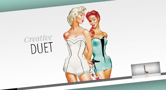
<h2>Creative</h2>
<h3>Geek</h3>
</div>
</li>
<li>...</li>
</ul>
<ul class="ei-slider-thumbs">
<li class="ei-slider-element">Current</li>
<li>
<a href="#">Slide 1</a>
<img src="images/thumbs/1.jpg" alt="thumb01" />
</li>
<li>...</li>
</ul>
</div>
The list for the thumbnail preview navigation will contain an absolute element (the first list element with the class ei-slider-element and the thumbnail list elements which consist of an anchor and an image (the thumbnail).
缩略图预览导航的列表将包含一个绝对元素(具有ei-slider-element类的第一个列表元素和由锚点和图像(缩略图)组成的缩略图列表元素。
Now, let’s add the style.
现在,让我们添加样式。
CSS (The CSS)
First, we will define the style for the main wrapper. We will have the slider inside of a wrapper which will be 100% in width in order to stretch over the whole window. Now, the slider itself will also have a width of 100%, making it use all the space there is in width. But we will also define a maximum width, so that the images in our slider don’t get stretched too much when dealing with a big screen:
首先,我们将定义主包装的样式。 我们将在包装纸内部放置一个滑块,该滑块的宽度为100%,以便在整个窗口上伸展。 现在,滑块本身也将具有100%的宽度,使其使用宽度中的所有空间。 但是我们还将定义一个最大宽度,以便在处理大屏幕时,滑块中的图像不会被拉伸得太大:
.ei-slider{
	position: relative;
	width: 100%;
	max-width: 1920px;
	height: 400px;
	margin: 0 auto;
}
While the images are loading, we will add a loading element which will have the following style:
在加载图像时,我们将添加具有以下样式的loading元素:
.ei-slider-loading{
	width: 100%;
	height: 100%;
	position: absolute;
	top: 0px;
	left: 0px;
	z-index:999;
	background: rgba(0,0,0,0.9);
	color: #fff;
	text-align: center;
	line-height: 400px;
}
The unordered list will occupy all the space we defined and will not show any overflow:
无序列表将占据我们定义的所有空间,并且不会显示任何溢出:
.ei-slider-large{
	height: 100%;
	width: 100%;
	position:relative;
	overflow: hidden;
}
The list elements that will hold the images will be of absolute position. Depending from where we navigate we will slide them from the left or from the right:
将保存图像的列表元素将处于绝对位置。 根据我们导航的位置,我们将其从左侧或右侧滑动:
.ei-slider-large li{
	position: absolute;
	top: 0px;
	left: 0px;
	overflow: hidden;
	height: 100%;
	width: 100%;
}
The width of the image will be set in our JavaScript but we also want to define it if we don’t have JS enabled:
图片的宽度将在我们JavaScript中设置,但如果我们未启用JS,我们也想对其进行定义:
.ei-slider-large li img{
	width: 100%;
}
The title holder will be positioned in the middle of the list element with a right margin to fit the picture in our example (and not to overlap the face in the photography):
标题持有者将以右边距定位在列表元素的中间,以适合我们示例中的图片(并且不与摄影中的脸部重叠):
.ei-title{
	position: absolute;
	right: 50%;
	margin-right: 13%;
	top: 30%;
}
The style for the headings is the following:
标题的样式如下:
.ei-title h2, .ei-title h3{
	text-align: right;
}
.ei-title h2{
	font-size: 40px;
	line-height: 50px;
	font-family: 'Playfair Display', serif;
	font-style: italic;
	color: #b5b5b5;
}
.ei-title h3{
	font-size: 70px;
	line-height: 70px;
	font-family: 'Open Sans Condensed', sans-serif;
	text-transform: uppercase;
	color: #000;
}
The navigation list will have a small height of 13 pixels. We will set a default width for the thumbnails in the initialisation of our plugin. From that width we will set a max-width to the unordered list. This will make it elastic when we resize the window, but not occupy all the width there is.
导航列表的高度为13像素。 我们将在初始化插件时为缩略图设置默认宽度。 从该宽度,我们将为无序列表设置最大宽度。 当我们调整窗口大小时,这将使其具有弹性,但不会占据所有宽度。
.ei-slider-thumbs{
	height: 13px;
	margin: 0 auto;
	position: relative;
}
The list elements of the navigation list will be of relative position:
导航列表的列表元素将处于相对位置:
.ei-slider-thumbs li{
	position: relative;
	float: left;
	height: 100%;
}
The special slider element that indicates the current image will be positioned absolutely on top of the current thumbnail element:
指示当前图像的特殊滑块元素将绝对位于当前缩略图元素的顶部:
.ei-slider-thumbs li.ei-slider-element{
	top: 0px;
	left: 0px;
	position: absolute;
	height: 100%;
	z-index: 10;
	text-indent: -9000px;
	background: rgba(0,0,0,0.9);
}
The link elements will have a white box shadow to show a tiny separation and some darker shadow to appear under them. We’ll also add a transition to the element so that we can change the background-color smoothly on hover:
链接元素将具有一个白框阴影以显示微小的分隔,并在其下面显示一些较暗的阴影。 我们还将向元素添加过渡,以便我们可以在悬停时平滑地更改背景颜色:
.ei-slider-thumbs li a{
	display: block;
	text-indent: -9000px;
	background: #666;
	width: 100%;
	height: 100%;
	cursor: pointer;
	box-shadow:
        0px 1px 1px 0px rgba(0,0,0,0.3),
        0px 1px 0px 1px rgba(255,255,255,0.5);
    transition: background 0.2s ease;
}
.ei-slider-thumbs li a:hover{
	background-color: #f0f0f0;
}
The image will be positioned absolutely and we will add a transition and a box reflection to it. Adding a max-width to it will make sure that the thumb will adjust to the size of the list element when the window gets smaller than the width of the unordered list itself:
图像将绝对定位,我们将为其添加过渡和框反射。 向其添加最大宽度将确保当窗口变得小于无序列表本身的宽度时,滑块将调整为列表元素的大小:
.ei-slider-thumbs li img{
	position: absolute;
	bottom: 50px;
	opacity: 0;
	z-index: 999;
	max-width: 100%;
    transition: all 0.4s ease;
	-webkit-box-reflect:
        below 0px -webkit-gradient(
            linear,
            left top,
            left bottom,
            from(transparent),
            color-stop(50%, transparent),
            to(rgba(255,255,255,0.3))
            );
}
On hover, we will animate the opacity and the bottom value so that it appears to be sliding in from the top:
悬停时,我们将对不透明度和底部值进行动画处理,以使其看起来从顶部开始滑入:
.ei-slider-thumbs li:hover img{
	opacity: 1;
	bottom: 13px;
}
Last but not least, we want to make sure that from a certain width on, the slider title will not cover the best parts of our image. So, we will make it appear at the bottom of the image with a semi-transparent white background:
最后但并非最不重要的一点是,我们要确保从一定宽度开始,滑块标题将不会覆盖图像的最佳部分。 因此,我们将其以半透明的白色背景显示在图像的底部:
@media screen and (max-width: 830px) {
	.ei-title{
		position: absolute;
		right: 0px;
		margin-right: 0px;
		width: 100%;
		text-align: center;
		top: auto;
		bottom: 10px;
		background: rgba(255,255,255,0.9);
		padding: 5px 0;
	}
	.ei-title h2, .ei-title h3{
		text-align: center;
	}
	.ei-title h2{
		font-size: 20px;
		line-height: 24px;
	}
	.ei-title h3{
		font-size: 30px;
		line-height: 40px;
	}
}
For the case that we don’t have JavaScript enabled we will add this piece of CSS to ensure that our slides are shown. We will hide the thumbnail navigation:
对于未启用JavaScript的情况,我们将添加此CSS,以确保显示幻灯片。 我们将隐藏缩略图导航:
.ei-slider{
	height: auto;
}
.ei-slider-thumbs{
	display: none;
}
.ei-slider-large li{
	position: relative;
}
And that’s all the style! Let’s take a look at the JavaScript.
这就是所有样式! 让我们看一下JavaScript。
JavaScript (The JavaScript)
Since we are creating a plugin, let’s first look at the definition of the options:
由于我们正在创建插件,因此我们首先来看一下选项的定义:
$.Slideshow.defaults 		= {
	// animation types:
	// "sides" : new slides will slide in from left / right
	// "center": new slides will appear in the center
	animation			: 'sides', // sides || center
	// if true the slider will automatically
	// slide, and it will only stop if the user
	// clicks on a thumb
	autoplay			: false,
	// interval for the slideshow
	slideshow_interval	: 3000,
	// speed for the sliding animation
	speed			: 800,
	// easing for the sliding animation
	easing			: '',
	// percentage of speed for the titles animation.
	// Speed will be speed * titlesFactor
	titlesFactor		: 0.60,
	// titles animation speed
	titlespeed			: 800,
	// titles animation easing
	titleeasing			: '',
	// maximum width for the thumbs in pixels
	thumbMaxWidth		: 150
};
In the _init funtion we will start by setting the opacity of the title elements and the images to 0. We will also preload the images and once they are loaded we will set their size and position according to the slider width and height. Then we configure the thumbnails navigation by setting the width of the unordered list and the list items.
在_init函数中,我们将从将标题元素和图像的不透明度设置为0开始。我们还将预加载图像,一旦加载图像,我们将根据滑块的宽度和高度设置其大小和位置。 然后,我们通过设置无序列表和列表项的宽度来配置缩略图导航。
We will then show the first slide and if we set autoplay in our options to true, then we’ll start the slideshow. The we initialize the events which are the events for resizing the window and for clicking the thumbnails:
然后,我们将显示第一张幻灯片,如果将选项中的自动播放设置为true,则将开始幻灯片演示。 我们初始化事件,这些事件是用于调整窗口大小和单击缩略图的事件:
_init : function( options ) {
this.options = $.extend( true, {}, $.Slideshow.defaults, options );
// set the opacity of the title elements and the image items
this.$imgItems.css( 'opacity', 0 );
this.$imgItems.find('div.ei-title > *').css( 'opacity', 0 );
// index of current visible slider
this.current = 0;
var _self = this;
// preload images
// add loading status
this.$loading = $('
').prependTo( _self.$el );
$.when( this._preloadImages() ).done( function() {
// hide loading status
_self.$loading.hide();
// calculate size and position for each image
_self._setImagesSize();
// configure thumbs container
_self._initThumbs();
// show first
_self.$imgItems.eq( _self.current ).css({
'opacity' : 1,
'z-index' : 10
}).show().find('div.ei-title > *').css( 'opacity', 1 );
// if autoplay is true
if( _self.options.autoplay ) {
_self._startSlideshow();
}
// initialize the events
_self._initEvents();
});
},
And here are the single functions we just talked about:
这是我们刚才谈到的单个功能:
_preloadImages : function() {
// preloads all the large images
var _self = this,
loaded = 0;
return $.Deferred(
function(dfd) {
_self.$images.each( function( i ) {
$('
![]() ').load( function() {
if( ++loaded === _self.itemsCount ) {
dfd.resolve();
}
}).attr( 'src', $(this).attr('src') );
});
}
).promise();
},
_setImagesSize : function() {
// save ei-slider's width
this.elWidth = this.$el.width();
var _self = this;
this.$images.each( function( i ) {
var $img = $(this);
imgDim = _self._getImageDim( $img.attr('src') );
$img.css({
width : imgDim.width,
height : imgDim.height,
marginLeft : imgDim.left,
marginTop : imgDim.top
});
});
},
_getImageDim : function( src ) {
var $img = new Image();
$img.src = src;
var c_w = this.elWidth,
c_h = this.$el.height(),
r_w = c_h / c_w,
i_w = $img.width,
i_h = $img.height,
r_i = i_h / i_w,
new_w, new_h, new_left, new_top;
if( r_w > r_i ) {
new_h = c_h;
new_w = c_h / r_i;
}
else {
new_h = c_w * r_i;
new_w = c_w;
}
return {
width : new_w,
height : new_h,
left : ( c_w - new_w ) / 2,
top : ( c_h - new_h ) / 2
};
},
_initThumbs : function() {
// set the max-width of the slider elements to the one set in the plugin's options
// also, the width of each slider element will be 100% / total number of elements
this.$sliderElems.css({
'max-width' : this.options.thumbMaxWidth + 'px',
'width' : 100 / this.itemsCount + '%'
});
// set the max-width of the slider and show it
this.$sliderthumbs.css( 'max-width', this.options.thumbMaxWidth * this.itemsCount + 'px' ).show();
},
_startSlideshow : function() {
var _self = this;
this.slideshow = setTimeout( function() {
var pos;
( _self.current === _self.itemsCount - 1 ) ? pos = 0 : pos = _self.current + 1;
_self._slideTo( pos );
if( _self.options.autoplay ) {
_self._startSlideshow();
}
}, this.options.slideshow_interval);
},
').load( function() {
if( ++loaded === _self.itemsCount ) {
dfd.resolve();
}
}).attr( 'src', $(this).attr('src') );
});
}
).promise();
},
_setImagesSize : function() {
// save ei-slider's width
this.elWidth = this.$el.width();
var _self = this;
this.$images.each( function( i ) {
var $img = $(this);
imgDim = _self._getImageDim( $img.attr('src') );
$img.css({
width : imgDim.width,
height : imgDim.height,
marginLeft : imgDim.left,
marginTop : imgDim.top
});
});
},
_getImageDim : function( src ) {
var $img = new Image();
$img.src = src;
var c_w = this.elWidth,
c_h = this.$el.height(),
r_w = c_h / c_w,
i_w = $img.width,
i_h = $img.height,
r_i = i_h / i_w,
new_w, new_h, new_left, new_top;
if( r_w > r_i ) {
new_h = c_h;
new_w = c_h / r_i;
}
else {
new_h = c_w * r_i;
new_w = c_w;
}
return {
width : new_w,
height : new_h,
left : ( c_w - new_w ) / 2,
top : ( c_h - new_h ) / 2
};
},
_initThumbs : function() {
// set the max-width of the slider elements to the one set in the plugin's options
// also, the width of each slider element will be 100% / total number of elements
this.$sliderElems.css({
'max-width' : this.options.thumbMaxWidth + 'px',
'width' : 100 / this.itemsCount + '%'
});
// set the max-width of the slider and show it
this.$sliderthumbs.css( 'max-width', this.options.thumbMaxWidth * this.itemsCount + 'px' ).show();
},
_startSlideshow : function() {
var _self = this;
this.slideshow = setTimeout( function() {
var pos;
( _self.current === _self.itemsCount - 1 ) ? pos = 0 : pos = _self.current + 1;
_self._slideTo( pos );
if( _self.options.autoplay ) {
_self._startSlideshow();
}
}, this.options.slideshow_interval);
},
The _slideTo function will take care of the transition between the slides. Depending on what we’ve set in our options, we’ll either make the new slide appear from the side or simply make it fade in without sliding it. We’ll also take care of the title and its heading elements which we will slightly slide from the sides by setting their right margins. The thumbnail slider element will have to move to the new corresponding thumbnail position.
_slideTo函数将处理幻灯片之间的过渡。 根据我们在选项中设置的内容,我们要么使新幻灯片从侧面显示,要么简单地使其淡入而不滑动。 我们还将处理标题及其标题元素,我们将通过设置其右边距从侧面略微滑动。 缩略图滑块元素将必须移动到新的相应缩略图位置。
_slideTo			: function( pos ) {

	// return if clicking the same element or if currently animating
	if( pos === this.current || this.isAnimating )
		return false;

	this.isAnimating	= true;

	var $currentSlide	= this.$imgItems.eq( this.current ),
		$nextSlide		= this.$imgItems.eq( pos ),
		_self			= this,

		preCSS			= {zIndex	: 10},
		animCSS			= {opacity	: 1};

	// new slide will slide in from left or right side
	if( this.options.animation === 'sides' ) {

		preCSS.left		= ( pos > this.current ) ? -1 * this.elWidth : this.elWidth;
		animCSS.left	= 0;

	}

	// titles animation
	$nextSlide.find('div.ei-title > h2')
			  .css( 'margin-right', 50 + 'px' )
			  .stop()
			  .delay( this.options.speed * this.options.titlesFactor )
			  .animate({ marginRight : 0 + 'px', opacity : 1 }, this.options.titlespeed, this.options.titleeasing )
			  .end()
			  .find('div.ei-title > h3')
			  .css( 'margin-right', -50 + 'px' )
			  .stop()
			  .delay( this.options.speed * this.options.titlesFactor )
			  .animate({ marginRight : 0 + 'px', opacity : 1 }, this.options.titlespeed, this.options.titleeasing )

	$.when(

		// fade out current titles
		$currentSlide.css( 'z-index' , 1 ).find('div.ei-title > *').stop().fadeOut( this.options.speed / 2, function() {
			// reset style
			$(this).show().css( 'opacity', 0 );
		}),

		// animate next slide in
		$nextSlide.css( preCSS ).stop().animate( animCSS, this.options.speed, this.options.easing ),

		// "sliding div" moves to new position
		this.$sliderElem.stop().animate({
			left	: this.$thumbs.eq( pos ).position().left
		}, this.options.speed )

	).done( function() {

		// reset values
			$currentSlide.css( 'opacity' , 0 ).find('div.ei-title > *').css( 'opacity', 0 );
			$nextSlide.css( 'z-index', 1 );
			_self.current	= pos;
			_self.isAnimating		= false;

		});

},
The _initEvents function will recalculate the sizes of the images when we resize the window and reposition the thumbnail slider element. When clicking on a thumbnail we will show the regarding slide:
当我们调整窗口大小并重新定位缩略图滑块元素时, _initEvents函数将重新计算图像的大小。 单击缩略图时,我们将显示相关幻灯片:
_initEvents			: function() {

	var _self	= this;

	// window resize
	$(window).on( 'smartresize.eislideshow', function( event ) {

		// resize the images
		_self._setImagesSize();

		// reset position of thumbs sliding div
		_self.$sliderElem.css( 'left', _self.$thumbs.eq( _self.current ).position().left );

	});

	// click the thumbs
	this.$thumbs.on( 'click.eislideshow', function( event ) {

		if( _self.options.autoplay ) {

			clearTimeout( _self.slideshow );
			_self.options.autoplay	= false;

		}

		var $thumb	= $(this),
			idx		= $thumb.index() - 1; // exclude sliding div

		_self._slideTo( idx );

		return false;

	});

}
And that’s it! I hope you enjoyed this tutorial and find it useful!
就是这样! 我希望您喜欢本教程并发现它有用!
翻译自: https://tympanus.net/codrops/2011/11/21/elastic-image-slideshow-with-thumbnail-preview/
tga缩略图预览


 扫一扫
扫一扫


 2503
2503

 被折叠的 条评论
为什么被折叠?
被折叠的 条评论
为什么被折叠?
 到【灌水乐园】发言


