


 本文介绍了Chrome对position:sticky的支持回归,重点讲述了这种粘性定位在导航跟随、层次滚动效果和交互布局中的应用,包括Safari的前缀需求以及实现层次滚动的HTML结构和CSS技巧。
            <div >Chrome杀了个回马枪</a><a href="javascript:">position:sticky简介</a><a href="javascript:" class="title-nav-li" title="富有层次的滚动交互">富有层次的滚动交互</a><a href="javascript:" >你可能不知道的position:sticky</a><a href="javascript:" class="title-nav-li" title="层次滚动实现原理">层次滚动实现原理</a><a >男人这辈子最重要的是什么?</a></div></div>
            <article><p class="link">by <a href="https://www.zhangxinxu.com/">zhangxinxu</a> from <a href="https://www.zhangxinxu.com/wordpress/?p=8244">https://www.zhangxinxu.com/wordpress/?p=8244</a><br>
本文可全文转载,个人网站无需授权,只要保留原作者、出处以及文中链接即可,任何网站均可摘要聚合,商用请联系授权。
一、Chrome杀了个回马枪
position:sticky早有耳闻也有所了解,后来,Chrome放弃了对其支持,我也就不关心这个声明了,今天偶然发现,卧槽,Chrome什么时候杀了个回马枪,居然又支持了。眼瞅着,各个浏览器纷纷立了山头,要必要关心关心position:sticky了,不要被人留下厚此薄彼的口舌。
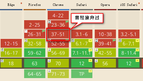
Safari目前还需要-webkit-私有前缀。
二、position:sticky简介
单词sticky的中文意思是“粘性的”,position:sticky表现也符合这个粘性的表现。基本上,可以看出是position:relative和position:fixed的结合体——当元素在屏幕内,表现为relative,就要滚出显示器屏幕的时候,表现为fixed。例如,可以滚动下面这个框框感受下交互表现:
其中导航元素设置了如下CSS:
nav {
    position: -webkit-sticky;
    position: sticky;
    top: 0;
}
于是,正如大家看到,随着页面的滚动,当导航距离上边缘0距离的时候,黏在了上边缘,表现如同position:fixed。
//zxx: position:sticky要想生效,top属性或则left属性(看滚动方向)是必须要有明确的计算值的,否则fixed的表现不会出现。
这就是position:sticky最基本的表现,特别适合导航的跟随定位效果。
很多人以为position:sticky就上面这点效果,就好像以为就是个平常的史莱姆一样,实际上,position:sticky可以实现性价比极高,甚至还有点小酷的交互布局效果。嘿嘿,这可是皇帝的夜壶——不是人人都能看到的哟。
三、富有层次的滚动交互
滚动下面这个嵌入页面的滚动条,我们可以看到新闻标题依次推上去,网友评论也会在恰当的时间从背后钻出来。
如果上面页面显示不出来,可以狠狠地点击这里:position:sticky实现的富有层次的滚动交互demo
GIF录屏效果如下:
四、你可能不知道的position:sticky
position:sticky有个非常重要的特性,那就是sticky元素效果完全受制于父级元素们。
这和position:fixed定位有着根本性的不同,fixed元素直抵页面根元素,其他父元素对其left/top定位无法限制。
根据我简单的测试,发现了sticky元素以下一些特性表现:
- 父级元素不能有任何
overflow:visible以外的overflow设置,否则没有粘滞效果。因为改变了滚动容器(即使没有出现滚动条)。因此,如果你的position:sticky无效,看看是不是某一个祖先元素设置了overflow:hidden,移除之即可。 2019-05-22新增
父级元素设置和粘性定位元素等高的固定的height高度值,或者高度计算值和粘性定位元素高度一样,也没有粘滞效果。我专门写了篇文章深入讲解了粘性效果无效的原因,可以点击这里查看。- 同一个父容器中的sticky元素,如果定位值相等,则会重叠;如果属于不同父元素,且这些父元素正好紧密相连,则会鸠占鹊巢,挤开原来的元素,形成依次占位的效果。至于原因需要理解粘性定位的计算规则,同样点击这里查看。
- sticky定位,不仅可以设置
top,基于滚动容器上边缘定位;还可以设置bottom,也就是相对底部粘滞。如果是水平滚动,也可以设置left和right值。
下面,我们再看看看富有层次的滚动效果的实现原理。
五、层次滚动实现原理
首先,HTML结构如下(结构很重要):
<article>
<section>
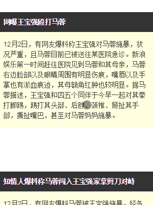
<h4>网曝王宝强殴打马蓉</h4>
<content>
<p>12月2日,有网友爆料称...</p>
</content>
<footer>网友评论:...</footer>
</section>
<section>
<h4>知情人爆料称马蓉闯入王宝强家拿剪刀对峙</h4>
<content>
<p>...</p>
</content>
<footer>网友评论:...</footer>
</section>
...
</article>
其中,标题<h4>和底部<footer>设置了sticky定位,如下:
article h4,
h4 {
    position: sticky;
    top: 0;
    z-index: 1;
}
content {
    position: relative;
}
footer {
    position: sticky;
    bottom: 50vh;
    z-index: -1;
}
由于每一段短新闻都在section标签中,属于不同的父元素,因此,滚动的时候,后面的新闻标题才能把前面已经sticky定位的新闻标题推开,这是sticky定位天然的特性,无需任何JavaScript的帮助。
如果,我们这里的HTML结构做调整,标题都是平级的,如下:
<article>
    <section>
        <h4>网曝王宝强殴打马蓉</h4>
        <content>
            <p>12月2日,有网友爆料称...</p>
        </content>
        <footer>网友评论:...</footer>
        <!-- 下一个短新闻 -->
        <h4>知情人爆料称马蓉闯入王宝强家拿剪刀对峙</h4>
        <content>
            <p>...</p>
        </content>
        <footer>网友评论:...</footer>
    </section>
    ...
</article>
则最终效果是所有sticky定位的新闻标题都会重叠在一起,这并不是我们想要的效果。所以,记住了,position:sticky布局的时候,使用合适的HTML结构很重要。
效果中,网友评论从后面钻出来的效果又是如何实现的呢?
两个关键点:
- 定位用的
bottom,效果和top正好是对立的。设置top粘滞的元素随着往下滚动,是先滚动后固定;而设置bottom粘滞的元素则是先固定,后滚动; z-index:-1让网友评论footer元素藏在了content的后面,于是才有了“犹抱琵琶半遮面”的效果。
position:sticky polyfill
CSS `position: sticky`声明的Polyfill地址:https://github.com/wilddeer/stickyfill
可以兼容到IE9及其以上浏览器。


 扫一扫
扫一扫


 2115
2115

 被折叠的 条评论
为什么被折叠?
被折叠的 条评论
为什么被折叠?
 到【灌水乐园】发言


