


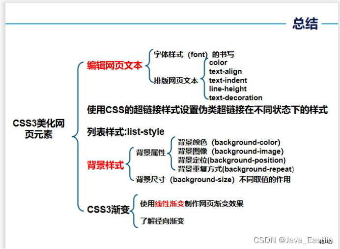
 本文详细介绍了如何使用CSS来美化网页元素,包括文本高亮、行高设置、背景透明、字体加粗、颜色设定、文本对齐、装饰效果、垂直对齐、文本阴影、超链接样式、列表样式、背景颜色、背景图像、背景尺寸和线性渐变等。通过实例展示了如何通过CSS实现特定样式的定制,如突出显示文本、设置字体类型、风格、大小和粗细,以及调整文本颜色和链接样式等。
#CSS美化网页元素
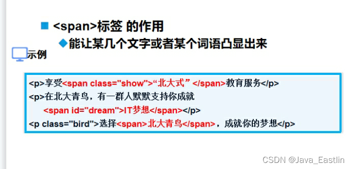
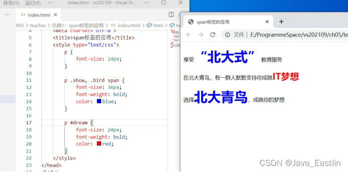
在某一段文本中突出显示某几个字,以粗体、红色、大字号显示,通常使用(<span> )标签
在CSS中,设置文本行高使用(line-height)属性
在CSS中设置背景颜色为透明的值为(transparent)
设置文本字体加粗的属性是什么?
去掉列表项前标记符号的CSS属性是什么?
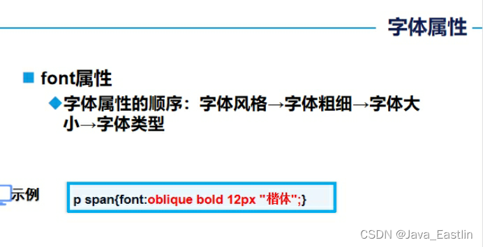
描述使用font属性设置字体类型、风格、大小、粗细的样式顺序
1<span>标签
1属性表
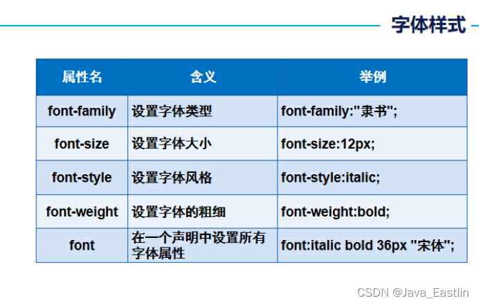
1font-family
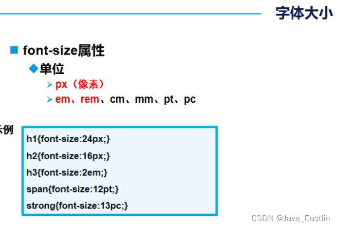
2font-size
3font-style
4font-weight
5font属性顺序sty-w-s-f
2文本属性表
1color

2缩进
3文本装饰
4文本阴影-参数
3超链接相关表
1list-style
2background-color
3背景图像属性
4图像
1背景属性
5背景尺寸 apcc
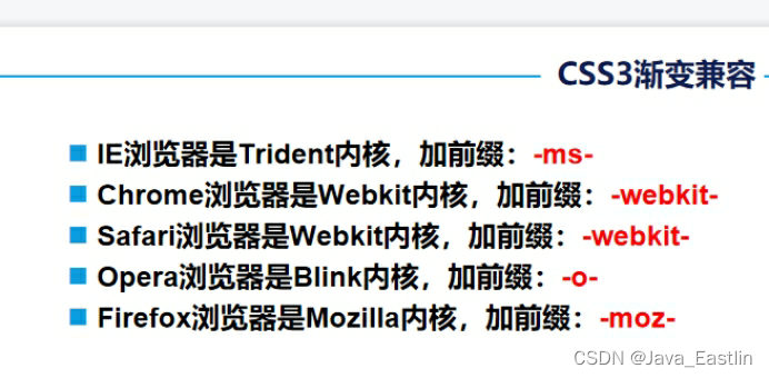
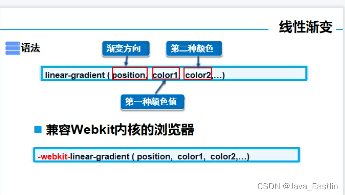
6颜色线性渐变
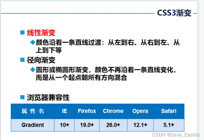
1参数列表解释
总结
1<span>标签的应用-定制特定样式部分
<head lang="en">
<meta charset="UTF-8">
<title>span标签的应用</title>
<style type="text/css">
p {
font-size: 14px;
}
p .show, .bird span {
font-size: 36px;
font-weight: bold;
color: blue;
}
p #dream {
font-size: 24px;
font-weight: bold;
color: red;
}
</style>
</head>
<body>
<p>享受<span class="show">“北大式”</span>教育服务</p>
<p>在北大青鸟,有一群人默默支持你成就<span id="dream">IT梦想</span></p>
<p class="bird">选择<span>北大青鸟</span>,成就你的梦想</p>
</body>
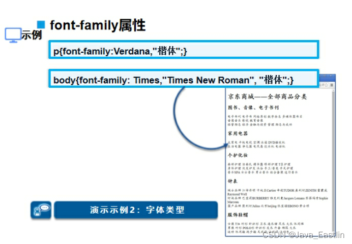
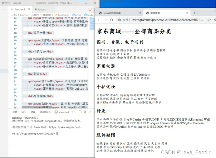
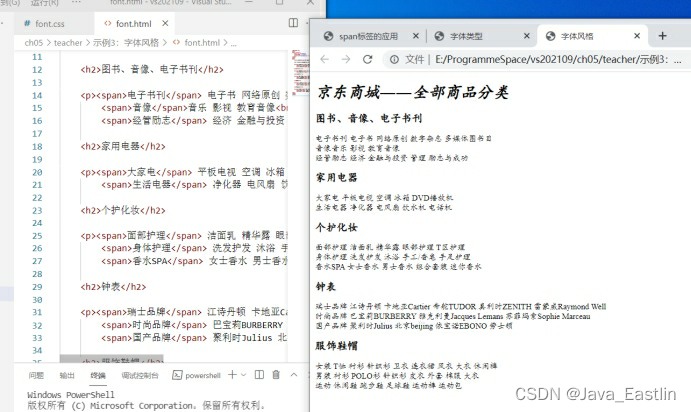
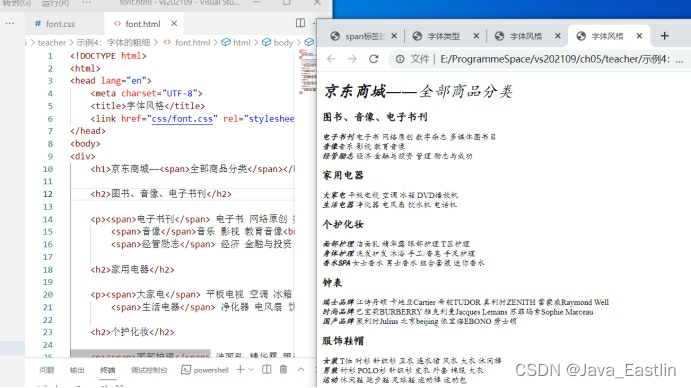
2字体类型font-family
body{font-family: Times,"Times New Roman", "楷体";}
<head lang="en">
<meta charset="UTF-8">
<title>字体类型</title>
<link href="css/font.css" rel="stylesheet" type="text/css"/>
</head>
<body>
<div>
<h1>京东商城――全部商品分类</h1>
<h2>图书、音像、电子书刊</h2>
<p><span>电子书刊</span> 电子书 网络原创 数字杂志 多媒体图书目<br/>
<span>音像</span>音乐 影视 教育音像<br/>
<span>经管励志</span> 经济 金融与投资 管理 励志与成功</p>
<h2>家用电器</h2>
<p><span>大家电</span> 平板电视 空调 冰箱 DVD播放机<br/>
<span>生活电器</span> 净化器 电风扇 饮水机 电话机</p>
<h2>个护化妆</h2>
<p><span>面部护理</span> 洁面乳 精华露 眼部护理 T区护理<br/>
<span>身体护理</span> 洗发护发 沐浴 手工/香皂 手足护理<br/>
<span>香水SPA</span> 女士香水 男士香水 组合套装 迷你香水</p>
<h2>钟表</h2>
<p><span>瑞士品牌</span> 江诗丹顿 卡地亚Cartier 帝舵TUDOR 真利时ZENITH 雷蒙威Raymond Well<br/>
<span>时尚品牌</span> 巴宝莉BURBERRY 雅克利曼Jacques Lemans 苏菲玛索Sophie Marceau<br/>
<span>国产品牌</span> 聚利时Julius 北京beijing 依宝诺EBONO 劳士顿</p>
<h2>服饰鞋帽</h2>
<p><span>女装</span> T恤 衬衫 针织衫 卫衣 连衣裙 风衣 大衣 休闲裤<br/>
<span>男装</span> 衬衫 POLO衫 针织衫 皮衣 外套 棉服 大衣<br/>
<span>运动</span> 休闲鞋 跑步鞋 足球鞋 运动裤 运动包</p>
</div>
</body>
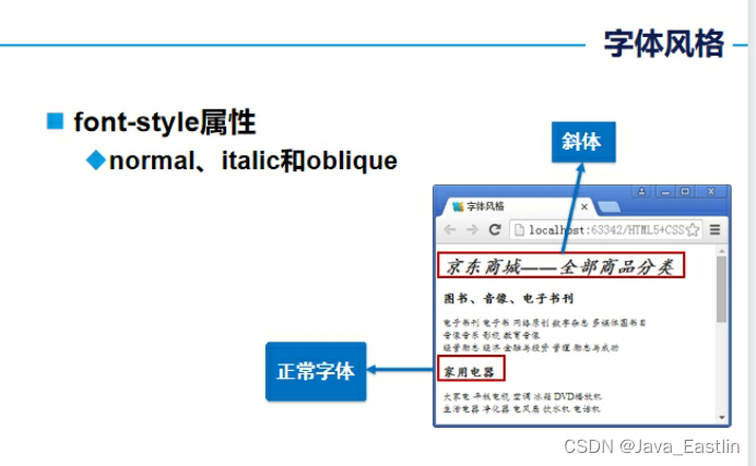
3字体风格font-style
body{font-family: Times,"Times New Roman", "楷体";}
h1{font-size:24px; font-style:italic;}
h1 span{font-style:oblique;}
h2{font-size:16px; font-style:normal;}
p{font-size:12px;}
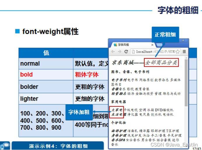
4字体的粗细font-weight
body{font-family: Times,"Times New Roman", "楷体";}
h1{font-size:24px; font-style:italic;}
h1 span{font-style:oblique; font-weight:normal;}
h2{font-size:16px; font-style:normal;}
p{font-size:12px;}
p span{font-weight:bold;}
p span{font:oblique bold 12px "楷体";}
5文本颜色color:#...
h1{color:rgba(0,0,255,0.5); font-size:24px; }
h3{font:12px normal;}
p{font-size:12px;}
p span{color:#F00;}
<head lang="en">
<meta charset="UTF-8">
<title>总裁致辞页面</title>
<link href="css/common.css" rel="stylesheet" type="text/css" />
</head>
<body>
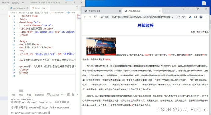
<h1>总裁致辞</h1>
<h3>来源:来自北大青鸟</h3>
<hr/>
<p><img src="image/icon.jpg" alt="高管团队" width="176" height="108" />目前北大青鸟IT教育全体系员工<span>10000</span>余名、授权培训中心<span>180</span>余家、合作院校<span>500</span>余所、覆盖全国<span>90</span>余座城市,市场占有率达到<span>39.8%</span>。</p>
<p>作为IT职业教育的先行者,北大青鸟IT教育创新的职业教育理念和业务经营模式得到了社会的广泛认可:国家人力资源和社会保障部与北大青鸟IT教育实施课程联合认证制度;公司两度入选中华人民共和国商务部评选的“中国连锁经营百强企业”,是迄今为止教育培训领域唯一上榜品牌。公司连续两年荣获 “中国服务业十大优秀特许品牌”称号,并获得中国特许经营协会颁发的中国连锁经营百强和中国特许经营年度大奖;获得新浪颁发的“中国教育杰出贡献奖”和“中国十大品牌教育集团”称号;并赢得 “中国IT公众认知企业金奖”、“本土最具知名度认证奖”、“最佳就业认同奖”、“质量放心用户满意双优品牌”、“最佳实用课程奖”等数十个奖项。人民日报、光明日报、经济日报、解放日报、中国青年报、中国计算机报等几十家权威媒体对公司进行了多方面的报道。</p>
<p>2000年,北大青鸟IT教育创造性地将特许经营模式引入到IT职业教育领域,在全国建立“北大青鸟APTECH计算机授权培训中心”。所有中心实行统一经营管理、严格保证教学质量,受到社会和业界的高度认可。发展速度之快、经营规模之大、学员人数之多,在全国众多IT职业培训机构中一枝独秀。成立至今,北大青鸟IT教育先后培养<span>45</span>万名学员进入IT行业。</p>
</body>

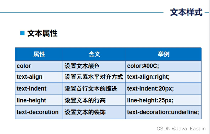
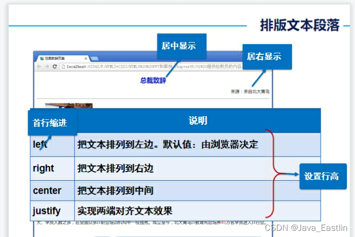
6排版文本段落text-align:LRC
text-decoration:blink //定义闪烁的文本,
IE、Chrome 或 Safari 不支持 "blink" 属性值。
text-indent:2em 段前缩进2字符
2em相对单位
text的意思是文本,indent在计算机英语中意思是缩进,至于后面的2em意思就是2个相对单位
em又是什么单位?
em这个单位的意思就是文字的高度,1em就是1个文字的高度,2em就是两个文字高度,所以我们写的“text-indent:2em;”的意思就是,文本缩进2个文字的高度,因为汉字是方块字,高度和宽度是一样的,所以缩进2个文字的高度,就等于缩进两个文字的宽度,最后的效果就是缩进了两个文字。
【说明一点】
对于"text-indent:2em;"属性,只能加在块状元素上面,内联元素是不起作用的。
h1{color:#091CC4; font-size:24px; text-align:center; text-decoration:blink;}
h3{text-align:right; font:12px normal;}
p{font-size:12px; text-align:left; line-height:28px; text-indent:2em;}
p span{color:#F00;}
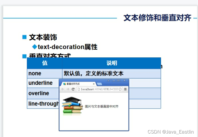
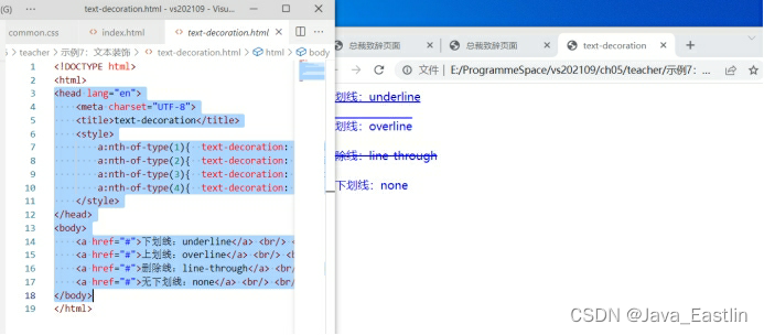
7文本装饰
text-decoration:
underline下overline上none无line-through删除线
<head lang="en">
<meta charset="UTF-8">
<title>text-decoration</title>
<style>
a:nth-of-type(1){ text-decoration: underline; }
a:nth-of-type(2){ text-decoration: overline; }
a:nth-of-type(3){ text-decoration: line-through; }
a:nth-of-type(4){ text-decoration: none; }
</style>
</head>
<body>
<a href="#">下划线:underline</a> <br/> <br/>
<a href="#">上划线:overline</a> <br/> <br/>
<a href="#">删除线:line-through</a> <br/> <br/>
<a href="#">无下划线:none</a> <br/> <br/>
</body>
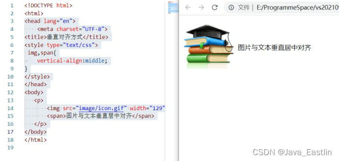
8垂直对齐方式
vertical-align:middle;
<head lang="en">
<meta charset="UTF-8">
<title>垂直对齐方式</title>
<style type="text/css">
img,span{
vertical-align:middle;
}
</style>
</head>
<body>
<p>
<img src="image/icon.gif" width="129" height="121" />
<span>图片与文本垂直居中对齐</span>
</p>
</body>
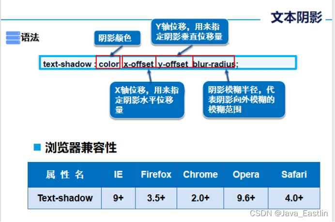
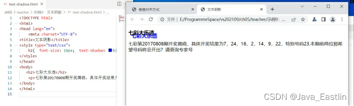
9文本阴影
text-shadow: c,x,y,r
<head lang="en">
<meta charset="UTF-8">
<title>文本阴影</title>
<style type="text/css">
h2{ font-size: 18px; text-shadow: blue 10px 10px 2px; }
</style>
</head>
<body>
<h2>七彩大乐透</h2>
<p>七彩第20170808期开奖揭晓,具体开奖结果为7,24,16,2,14,9,22,特别号码23.本期前两位那希望号码将会开出?请查询专家号</p>
</body>
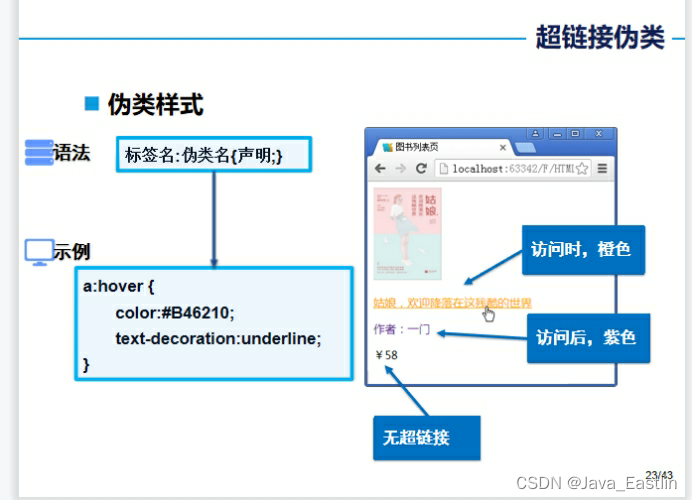
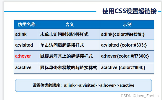
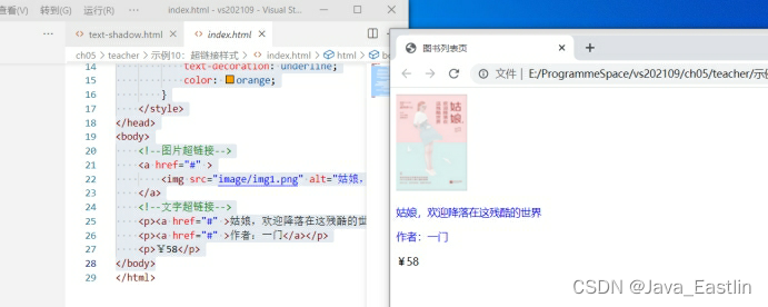
10超链接样式
a:hover{...}
<head lang="en">
<meta charset="UTF-8">
<title>图书列表页</title>
<style>
p{
font-size: 14px;
}
a{
text-decoration: none;
}
a:hover{
text-decoration: underline;
color: orange;
}
</style>
</head>
<body>
<!--图片超链接-->
<a href="#" >
<img src="image/img1.png" alt="姑娘,欢迎降落在这残酷的世界" title="姑娘,欢迎降落在这残酷的世界" />
</a>
<!--文字超链接-->
<p><a href="#" >姑娘,欢迎降落在这残酷的世界</a></p>
<p><a href="#" >作者:一门</a></p>
<p>¥58</p>
</body>
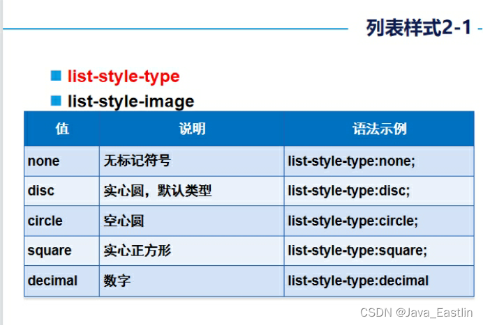
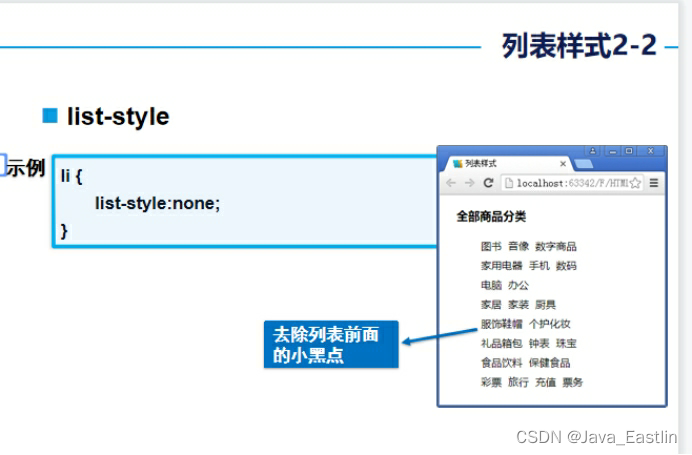
11列表样式ul li{...}
.title {
font-size: 18px;
font-weight: bold;
text-indent: 1em;
line-height: 35px;
}
ul li {
height: 30px;
line-height: 25px;
text-indent: 1em;
list-style: none;
}
a {
font-size: 14px;
text-decoration: none;
color: #000;
}
a:hover {
color: #F60;
text-decoration: underline;
}
<head lang="en">
<meta charset="UTF-8">
<title>列表样式</title>
<link href="css/background.css" rel="stylesheet" type="text/css"/>
</head>
<body>
<h2 class="title">全部商品分类</h2>
<ul>
<li><a href="#">图书</a> <a href="#">音像</a> <a href="#">数字商品</a></li>
<li><a href="#">家用电器</a> <a href="#">手机</a> <a href="#">数码</a></li>
<li><a href="#">电脑</a> <a href="#">办公</a></li>
<li><a href="#">家居</a> <a href="#">家装</a> <a href="#">厨具</a></li>
<li><a href="#">服饰鞋帽</a> <a href="#">个护化妆</a></li>
<li><a href="#">礼品箱包</a> <a href="#">钟表</a> <a href="#">珠宝</a></li>
<li><a href="#">食品饮料</a> <a href="#">保健食品</a></li>
<li><a href="#">彩票</a> <a href="#">旅行</a> <a href="#">充值</a> <a href="#">票务</a>
</li>
</ul>
</body>

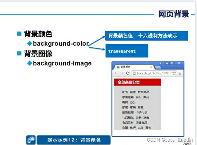
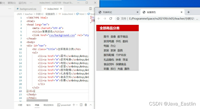
12背景颜色bg-color
#nav {
width:230px;
background-color:#D7D7D7;
}
.title {
background-color:#C00;
font-size:18px;
font-weight:bold;
color:#FFF;
text-indent:1em;
line-height:35px;
}
#nav ul li {
height:25px;
line-height:25px;
list-style: none;
}
a {
font-size:14px;
text-decoration:none;
color:#000;
}
a:hover {
color:#F60;
text-decoration:underline;
}
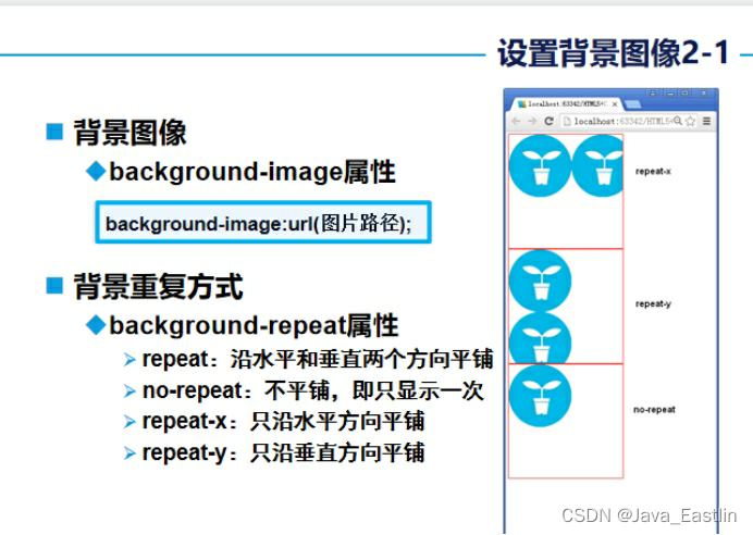
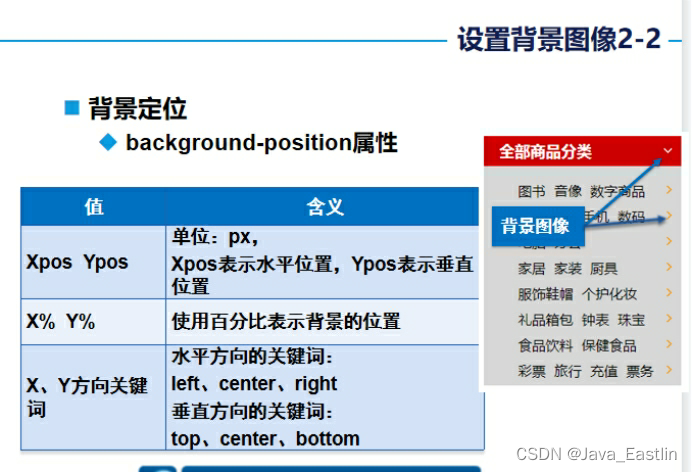
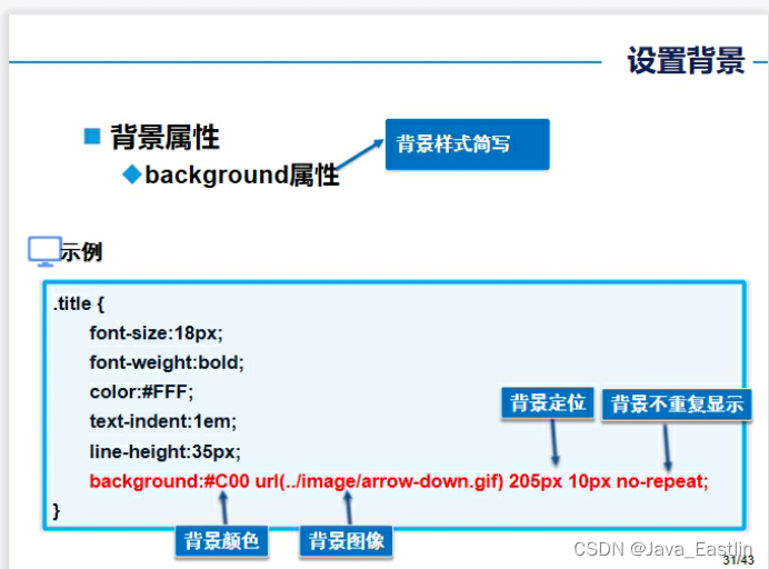
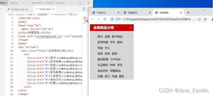
14背景图像bg-img
位置等等no-repeat,rp,rp-x,rp-y
bg:color url w h positon
#nav {
width:230px;
background-color:#D7D7D7;
}
.title {
/*background-color:#C00;*/
font-size:18px;
font-weight:bold;
color:#FFF;
text-indent:1em;
line-height:35px;
/*background-image:url(../image/arrow-down.gif);
background-repeat:no-repeat;
background-position:205px 10px;*/
background:#C00 url(../image/arrow-down.gif) 205px 10px no-repeat;
}
#nav ul li {
height:30px;
line-height:25px;
list-style: none;
background-image:url(../image/arrow-right.gif);
background-repeat:no-repeat;
background-position:170px 2px;
}
a {
font-size:14px;
text-decoration:none;
color:#000;
}
a:hover {
color:#F60;
text-decoration:underline;
}
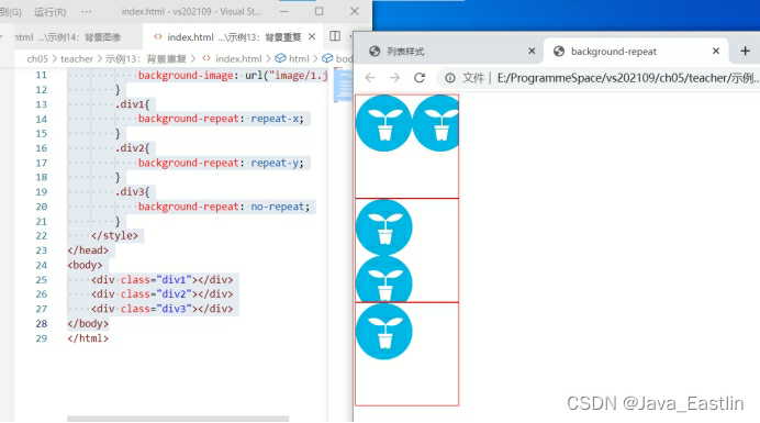
13背景重复repeat
<head lang="en">
<meta charset="UTF-8">
<title> background-repeat</title>
<style>
div{
width: 400px;
height: 400px;
border: 1px solid red;
background-image: url("image/1.jpg");
}
.div1{
background-repeat: repeat-x;
}
.div2{
background-repeat: repeat-y;
}
.div3{
background-repeat: no-repeat;
}
</style>
</head>
<body>
<div class="div1"></div>
<div class="div2"></div>
<div class="div3"></div>
</body>
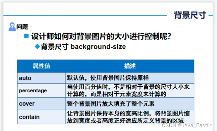
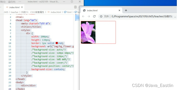
15CSS3背景属性
bg-size-a\p\c\c
<head lang="en">
<meta charset="UTF-8">
<title></title>
<style>
div {
width: 200px;
height: 130px;
border: 1px solid red;
background: url("img/bg_flower.gif") no-repeat;
/*background-size: auto;*/
/*background-size: 120px 60px;*/
/*background-size: 120px;*/
/*background-size: 50% 80%;*/
/*background-size: cover;*/
/*background-position: center;*/
background-size: contain;
}
</style>
</head>
<body>
<div></div>
</body>
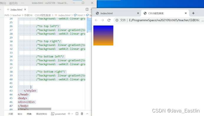
16CSS3线性渐变
bg:linear-gradient(to top||bottom, orange, blue);
目前可以不需要内核前缀
background: -webkit-linear-gradient(to top, orange, blue); /*-webkit-*/
此行可删!
<head lang="en">
<meta charset="UTF-8">
<title>CSS3线性渐变</title>
<style>
div {
width: 100px;
height: 100px;
/*to top*/
background: linear-gradient(to top, orange, blue);
background: -webkit-linear-gradient(to top, orange, blue); /*-webkit-*/
/*to bottom*/
/*background: linear-gradient(to bottom, orange, blue);*/
/*background: -webkit-linear-gradient(to bottom, orange, blue);*/
/*to left*/
/*background: linear-gradient(to left, orange, blue);*/
/*background: -webkit-linear-gradient(to left, orange, blue);*/
/*to right*/
/*background: linear-gradient(to right, orange, blue);*/
/*background: -webkit-linear-gradient(to right, orange, blue);*/
/*to top left*/
/*background: linear-gradient(to top left, orange, blue);*/
/*background: -webkit-linear-gradient(to top left, orange, blue);*/
/*to top right*/
/*background: linear-gradient(to top right, orange, blue);*/
/*background: -webkit-linear-gradient(to top right, orange, blue);*/
/*to bottom left*/
/*background: linear-gradient(to bottom left, orange, blue);*/
/*background: -webkit-linear-gradient(to bottom left, orange, blue);*/
/*to bottom right*/
/*background: linear-gradient(to bottom right, orange, blue);*/
/*background: -webkit-linear-gradient(to bottom right, orange, blue);*/
}
</style>
</head>
<body>
<div></div>
</body>


 扫一扫
扫一扫


 1558
1558


 到【灌水乐园】发言


