


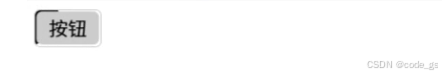
先看效果图
<!DOCTYPE html>
<html lang="en">
<head>
  <meta charset="UTF-8">
  <meta name="viewport" content="width=device-width, initial-scale=1.0">
  <title>Document</title>
  <style>
    .btn {
      width: 55px;
      height: 30px;
      line-height: 30px;
      text-align: center;
      border: 1px solid #ccc;
      border-radius: 5px;
      position: relative;
      overflow: hidden;
    }
    .btn::before {
      content: "";
      display: block;
      width: 200%;
      height: 200%;
      position: absolute;
      left: 50%;
      top: 50%;
      z-index: -2;
      background-color: #000;
      transform-origin: 0% 0%;
      animation: line 2s linear infinite;
    }
    .btn::after {
      content: "";
      display: block;
      width: 95%;
      height: 95%;
      position: absolute;
      left: 50%;
      top: 50%;
      border-radius: 5px;
      transform: translate(-50%, -50%);
      z-index: -1;
      background-color: #ccc;
    }
    @keyframes line {
      0% {
        transform: rotate(0deg);
      }
      100% {
        transform: rotate(360deg);
      }
    }
  </style>
</head>
<body>
  <div class="btn">
    按钮
  </div>
</body>
</html>


 扫一扫
扫一扫


 632
632

 被折叠的 条评论
为什么被折叠?
被折叠的 条评论
为什么被折叠?
 到【灌水乐园】发言


