


 本文介绍了一个移动端页面采用REM布局的设计方案,包括HTML结构、LESS样式及JavaScript实现自适应的方法,并提供了设计稿PSD文件和完整源码下载。
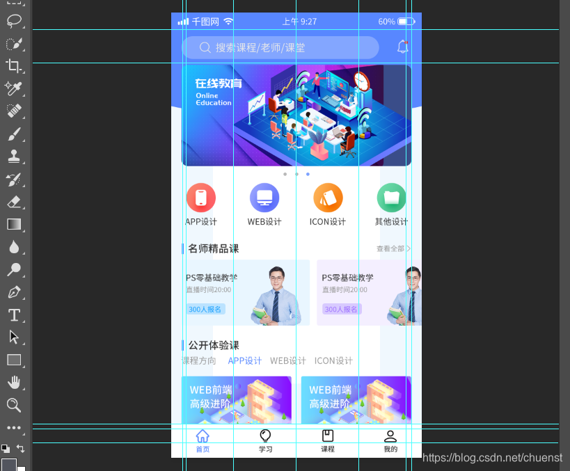
页面效果

设计稿psd文件
下载链接:https://download.youkuaiyun.com/download/chuenst/14503793
核心代码
html部分
<header>
        <div class="search-box">
            <div class="search">
                <img src="./images/搜索.png" alt="">
                <span>搜索课程/老师/课堂</span>
            </div>
            <div class="search-right">
                <img src="./images/通知.png" alt="">
            </div>
        </div>
    </header>
    <div class="banner">
        <img src="./images/矢量智能对象.png" alt="">
    </div>

    <div class="list">
        <div class="diannav">
            <div></div>
            <div></div>
            <div class="dianing"></div>
        </div>
        <div>
            <img src="./images/界面设置面.png" alt="">
            <br>
            <span>APP设计</span>
        </div>
        <div>
            <img src="./images/web.png" alt=""><br>
            <span>WEB设计</span>
        </div>
        <div>
            <img src="./images/图标167.png" alt="">
            <br>
            <span>ICON设计</span>
        </div>
        <div>
            <img src="./images/矩形4.png" alt="">
            <br>
            <span>其他设计</span>
        </div>
    </div>
    <div class="fine">
        <div class="fine-left">
            <span></span> 名师精品课
        </div>
        <div class="fine-right">
            查看全部>
        </div>
    </div>
    <div class="fine-bottom">
        <div class="fbleft">
            <img src="./images/300人报名.png" alt="">
        </div>
        <div>
            <img src="./images/300报名.png" alt="">
        </div>
    </div>
    <div class="epic">
        <div class="epic-left">
            <span></span> 公开体验课
        </div>
    </div>
    <div class="epic-bottom">
        <div>课程方向</div>
        <div style="color: #5887ff;">APP设计</div>
        <div>WEB设计</div>
        <div>ICON设计</div>
    </div>
    <div class="epic-img">
        <div><img src="./images/WEB前端高级进阶.png" alt=""></div>
        <div><img src="./images/WEB前端高级进阶.png" alt=""></div>
    </div>

    </div>
    <footer>
        <div>
            <img src="./images/主页.png" alt=""><br>
            <span>首页</span>
        </div>
        <div>
            <img src="./images/学习(2).png" alt=""><br>
            <span>学习</span>
        </div>
        <div>
            <img src="./images/形状1.png" alt=""><br>
            <span>课程</span>
        </div>
        <div>
            <img src="./images/圆角矩形1.png" alt=""><br>
            <span>我的</span>
        </div>
    </footer>
less部分
* {
    margin: 0;
    padding: 0;
}
body {
    margin: 0 auto;
    font-family: -apple-system, Helvetica, sans-serif;
    color: #666;
    background-color: #F6F6F6;
    box-sizing: border-box;
    padding-bottom: 200rem/54;
}
header {
    width: 1080rem /54;
    height: 370rem /54;
    padding: 0 40rem /54;
    margin: 0 auto;
    box-sizing: border-box;
    background: url(../images/椭圆2.png) no-repeat;
    background-size: 100% 100%;
    overflow: hidden;
    .search-box {
        width: 100%;
        height: 100rem /54;
        margin-top: 70rem/54;
        line-height: 100rem /54;
        position: relative;
        .search {
            margin-right: 140rem/54;
            height: 100rem /54;
            background-color: #83a6ff;
            border-radius: 50px;
            padding-left: 75rem /54;
            img {
                width: 50rem /54;
                height: 50rem /54;
                vertical-align: middle;
            }
            span {
                font-size: 45rem /54;
                color: rgb(232, 232,232);
            }
        }
        .search-right {
            position: absolute;
            right: 0px;
            top: 10rem /54;
            img {
                width: 60rem /54;
                height: 66rem /54;
            }
        }
    }
}

.banner {
    width: 1000rem /54;
    height: 430rem /54;
    margin: -180rem /54 auto;
    img {
        width: 1000rem /54;
        height: 430rem /54;
    }
}
.diannav{
    width: 1080rem /54;
    display: flex;
    justify-content: center;
    position: absolute;
    left: -50%;
    margin-left: 540rem /54;
    top: -30rem /54;
    div{
        width: 16rem /54;
        height: 16rem /54;
        border-radius: 8rem /54;
        margin: 0 20rem /54;
        background-color: #999;
    }
    .dianing{
        background-color: #5887ff;
    }
}
.list {
    width: 1080rem /54;
    height: 220rem /54;
    margin: 0 auto;
    margin-top: 230rem /54;
    display: flex;
    justify-content: space-around;
    align-items: center;
    text-align: center;
    font-size: 37rem /54;
    position: relative;
    img {
        width: 132rem /54;
    }
}
.fine {
    width: 1000rem /54;
    height: 60rem /54;
    margin: 0 auto;
    margin-top: 50rem /54;
    line-height: 60rem /54;
    box-sizing: border-box;
    .fine-left {
        float: left;
        font-size: 42rem /54;
        overflow: hidden;
        font-weight: 900;
        span {
            display: inline-block;
            width: 10rem /54;
            height: 50rem /54;
            background-color: #5887ff;
            position: relative;
            top: 10rem/54;
        }
    }
    .fine-right {
        float: right;
        font-size: 30rem /54;
    }
}
.fine-bottom {
    width: 1000rem/54;
    height: 290rem /54;
    margin: 0 auto;
    margin-top: 30rem /54;
    display: flex;
    justify-content: flex-start;
    div img {
        height: 280rem /54;
    }
    .fbleft img{
        margin-right: 30rem /54;
    }
}
.epic {
    width: 1000rem /54;
    height: 60rem /54;
    margin: 0 auto;
    margin-top: 50rem /54;
    line-height: 60rem /54;
    box-sizing: border-box;
    .epic-left {
        float: left;
        font-weight: 900;
        font-size: 42rem /54;
        span {
            display: inline-block;
            width: 10rem /54;
            height: 50rem /54;
            background-color: #5887ff;
            position: relative;
            top: 10rem/54;
        }
    }
}
.epic-bottom {
    width: 1000rem /54;
    height: 60rem /54;
    margin: 10rem/54 auto;
    font-size: 34rem /54;
    display: flex;
    justify-content: flex-start;
    align-items: center;
    box-sizing: border-box;
    div {
        margin-right: 50rem /54;
    }
}
.epic-img {
    width: 1000rem /54;
    height: 210rem /54;
    margin: 0 auto;
    margin-top: 30rem /54;
    display: flex;
    justify-content: space-between;
    img {
        width: 480rem /54;
    }
}
footer {
    width: 1080rem /54;
    height: 130rem /54;
    position: fixed;
    background-color: #fff;
    right: 0;
    left: 0;
    bottom: 0;
    z-index: 99;
    margin: 0 auto;
    display: flex;
    justify-content: space-around;
    align-items: center;
    font-size: 28rem /54;
    img {
        width: 60rem /54;
        height: 60rem /54;
    }
}
js部分
		set_fontsize()
        function set_fontsize() {
            let htm = document.documentElement
            let view_width = htm.clientWidth
            if (view_width >= 320 && view_width <= 1080) {
                htm.style.fontSize = view_width / 20 + 'px'
            } else {
                htm.style.fontSize = 54 + 'px'
            }
        }
        window.addEventListener('resize', function () {
            set_fontsize()
        })
源码下载
下载地址:https://download.youkuaiyun.com/download/chuenst/14503787


 扫一扫
扫一扫


 916
916

 被折叠的 条评论
为什么被折叠?
被折叠的 条评论
为什么被折叠?
 到【灌水乐园】发言


