一、引言
穿梭框(Transfer)是前端开发中常用的组件,用于在两个列表之间移动数据项。虽然 Element UI 提供了基础的 el-transfer 组件,但在实际项目中我们往往需要更丰富的功能和更灵活的定制。本文将详细讲解如何基于 Vue2 和 Element UI 封装一个功能强大的穿梭框组件,并分析其特点、优势及使用方法。
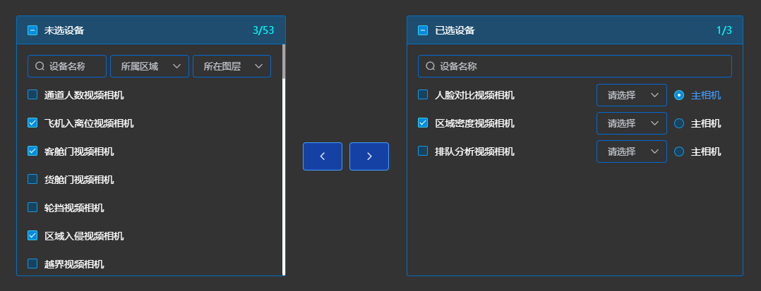
二、先上效果图
三、组件封装详解
想跳过步骤直接使用的,可以直接划到底部看 使用指南 和 完整组件代码.
1. 基础结构搭建
首先我们来看组件的基础模板结构:
<template>
<div class="transfer">
<!-- 左框 -->
<div class="transfer_left" :style="{ width: props.leftWidth }">
<!-- 左侧内容 -->
</div>
<!-- 按钮 -->
<div class="transfer_center">
<el-button @click="leftClick"></el-button>
<el-button @click="rightClick"></el-button>
</div>
<!-- 右框 -->
<div class="transfer_right" :style="{ width: props.rightWidth }">
<!-- 右侧内容 -->
</div>
</div>
</template>
这个结构创建了一个包含左右两个面板和中间操作按钮的基础布局。通过 props.leftWidth
和 props.rightWidth
可以动态设置两侧面板的宽度。
2. 数据管理
组件的数据管理是核心功能:
data() {
return {
allCheck_left: false, // 左侧全选状态
allCheck_right: false, // 右侧全选状态
checked_left: [], // 左侧已选数据
checked_right: [], // 右侧已选数据
leftList: [], // 左侧总数据列表
rightList: [], // 右侧总数据列表
left_search: "", // 左侧搜索词
right_search: "" // 右侧搜索词
};
}
组件通过 data
属性管理所有状态,包括选择状态、数据列表和搜索条件。
这里比较核心的是左右两侧的数据解耦,毕竟我就是为了解决这个问题才封装的这个组件,在element-ui 的 el-transfer 中因左右框共用一套数据的原因,不能在一侧框单独添加检索条件,数据解耦完美的解决了这个问题。
3. 属性配置
组件提供了丰富的配置选项:
props: {
props: {
type: Object,
default() {
return {
label: "name", // 显示文本内容字段
key: "id", // 唯一标识字段
disabled: "disabled", // 多选框禁用字段
leftWidth: "300px", // 左侧宽度
rightWidth: "300px", // 右侧宽度
};
},
},
// 源数据
data: {
type: Array,
default() {
return [];
},
},
// 已选数据
value: {
type: Array,
default() {
return [];
},
},
// 是否可搜索
filterable: {
type: Boolean,
default() {
return false;
},
},
// 搜索框提示文字
filterPlaceholder: {
type: String,
default() {
return "请输入关键字";
},
},
// 两侧标题
titles: {
type: Array,
default() {
return ["未选数据", "已选数据"];
},
},
// 自定义搜索条件
search: {
type: Object,
default() {
return {
left: [],
right: [],
};
},
},
}
这些属性使得组件可以高度定制化,适应各种业务场景。
为减少学习成本,这里封装的和 el-transfer 相同的属性保持了对齐。
有额外定制需求,也可以在这里继续添加定制化属性。
4. 核心功能实现
数据移动功能
// 将右边选中的数据移动到左边
leftClick() {
let arr = [];
this.rightList = this.rightList.filter((item) => {
if (this.checked_right.includes(item[this.props.key])) {
this.leftList.push(item);
arr.push(item);
return false;
} else {
return true;
}
});
this.$emit(
"change",
this.rightList.map((item) => item[this.props.key]),
"left",
this.checked_right
);
this.checked_right = [];
}
// 将左边选中的数据移动到右边
rightClick() {
let arr = [];
this.leftList = this.leftList.filter((item) => {
if (this.checked_left.includes(item[this.props.key])) {
this.rightList.push(item);
arr.push(item);
return false;
} else {
return true;
}
});
this.$emit(
"change",
this.rightList.map((item) => item[this.props.key]),
"right",
this.checked_left
);
this.checked_left = [];
}
这两个方法实现了数据在左右面板之间的移动,并在移动后触发 change
事件通知父组件。
搜索过滤功能
computed: {
// 左边要显示的数据列表
leftList_bak() {
let arr = this.leftList.filter((item) =>
item[this.props.label].includes(this.left_search)
);
let array = [arr];
if (this.search.left && this.search.left.length) {
array.push(...this.search.left);
}
return this.findIntersectionById(...array);
},
// 右边要显示的数据列表
rightList_bak() {
let arr = this.rightList.filter((item) =>
item[this.props.label].includes(this.right_search)
);
let array = [arr];
if (this.search.right && this.search.right.length) {
array.push(...this.search.left);
}
return this.findIntersectionById(...array);
}
},
methods: {
// 求查询交集
findIntersectionById(...arrays) {
// 使用第一个数组作为初始累积值
return arrays.reduce((acc, currentArray) => {
const currentIds = new Set(currentArray.map((item) => item.id));
return acc.filter((item) => currentIds.has(item.id));
}, arrays[0] || []); // 确保初始值为第一个数组或空数组
},
}
这些计算属性实现了基于搜索条件的数据过滤,支持文本搜索和自定义搜索条件的组合。
这里的 left_search 和 right_search 是封装自带的 filterable 的名称过滤功能的过滤结果,this.search.left 和 this.search.right 是分别是左右两侧增加的搜索条件的过滤结果,这里调用 findIntersectionById 方法求最后过滤的交集得到最终查询结果。
5. 文本溢出处理
<template>
<el-checkbox
v-for="(item, index) in rightList_bak"
:key="item[props.key]"
:label="item[props.key]"
:disabled="item[props.disabled]"
>
<el-tooltip v-if="item.isOverflow" :content="item[props.label]" placement="top">
<span :ref="'text_right' + index" class="check_text">{{item[props.label]}}</span>
</el-tooltip>
<span :ref="'text_right' + index" class="check_text" v-else>{{item[props.label]}}</span>
<slot name="right" :option="item"></slot>
</el-checkbox>
</template>
methods: {
checkOverflowLeft() {
this.leftList_bak.forEach((item, index) => {
const el = this.$refs["text_left" + index][0];
if (el) this.$set(item, "isOverflow", el.scrollWidth > el.clientWidth);
});
},
checkOverflowRight() {
this.rightList_bak.forEach((item, index) => {
const el = this.$refs["text_right" + index][0];
if (el) this.$set(item, "isOverflow", el.scrollWidth > el.clientWidth);
});
}
}
这些方法通过判断 el.scrollWidth 是否大于 el.clientWidth 检测文本是否溢出,通过控制 isOverflow 属性来控制 toolTip 的显隐,如果溢出则显示 tooltip 提示完整内容。
6. 数量展示
<span>{{ chechCount_left }}/{{ checkTotal_left }}</span>
computed: {
checkTotal_left() {
return this.leftList.length;
},
checkTotal_right() {
return this.rightList.length;
},
// 未选设备-已选数量
chechCount_left() {
return this.checked_left.length;
},
// 已选设备-已选数量
chechCount_right() {
return this.checked_right.length;
},
}
7. 全选/半选状态判断
watch: {
checked_left(val) {
if (val.length && val.length == this.leftList_bak.length) {
this.allCheck_left = true;
} else {
this.allCheck_left = false;
}
},
checked_right(val) {
if (val.length && val.length == this.rightList_bak.length) {
this.allCheck_right = true;
} else {
this.allCheck_right = false;
}
},
}
通过对左右框的多选框 绑定数据的长度变化 监听去和 两侧总数 对比是否相等,来判断是否展示 全选状态
computed: {
indeterminate_left() {
return (
this.checked_left.length > 0 &&
this.checked_left.length < this.leftList_bak.length
);
},
indeterminate_right() {
return (
this.checked_right.length > 0 &&
this.checked_right.length < this.rightList_bak.length
);
},
}
使用计算属性对左右框的多选框 绑定数据的长度变化 监听去和 两侧总数 对比大小,来判断是否展示 半选状态
四、组件特点
- 高度可定制:通过 props 可以自定义显示样式、宽度、标题、选中/总数、过滤条件等
- 增强的搜索功能:支持文本搜索和自定义搜索条件的组合
- 灵活的插槽:提供了 文本插槽 和 过滤插槽,用于扩展功能
- 丰富的交互:支持全选、部分选择、文本溢出提示等
- 完善的API:提供了 change 事件和 v-model 支持
五、使用指南
基本使用
<Transfer
v-model="selectedData"
:data="sourceData"
:props="{ key: 'id', label: 'name' }"
@change="handleChange"
/>
高级使用(带搜索和扩展)(结果如效果图所示)
<Transfer
filterable
filter-placeholder="设备名称"
:titles="['未选设备', '已选设备']"
v-model="treeValue"
:props="transferProp"
:data="treeList"
:search="searchObj"
@change="transferChange"
>
<template #search_left>
<el-select v-model="areaVal" placeholder="所属区域">
<!-- 选项 -->
</el-select>
<el-select v-model="layerVal" placeholder="所在图层">
<!-- 选项 -->
</el-select>
</template>
<template #right="{option}">
<div class="selectBox">
<el-select v-model="option.preset_point">
<!-- 选项 -->
</el-select>
<el-radio v-model="option.is_main_device" :label="true">
主相机
</el-radio>
</div>
</template>
</Transfer>
data() {
treeValue: [],
treeList: [],
transferProp: {
label: "resource_name",
key: "id",
leftWidth: "400px",
rightWidth: "500px",
},
},
methods: {
searchObj() {
return {
// treeList 根据上面“所属区域”和“所属图层”过滤后的数组
left: [this.treeList_area, this.treeList_layer],
// 如果右侧框也有自定义过滤条件,则添加 right: [...]
};
},
// 点击切换按钮的change回调,同el-transfer,参数为(当前值、数据移动的方向('left' / 'right')、发生移动的数据 key 数组)
transferChange(val, type, list) {},
}
属性说明
属性名 | 类型 | 默认值 | 说明 |
---|---|---|---|
data | Array | [] | 源数据列表 |
v-model | Array | [] | 已选数据 |
props | Object |
{ key:'id', disabled: "disabled", leftWidth: "300px", rightWidth: "300px", } | 显示文本内容字段 唯一标识字段 多选框禁用字段 左侧宽度 右侧宽度 |
filterable | Boolean | false | 是否可搜索 |
filterPlaceholder | String | '请输入关键字' | 搜索框提示 |
titles | Array | ['未选数据','已选数据'] | 两侧标题 |
search | Object |
{ left:[], right:[] } |
自定义搜索结果数据 例: { left: [ 左侧过滤条件1过滤结果, 左侧过滤条件2的过滤结果, ... ], right: [ 右侧过滤条件1过滤结果, 右侧过滤条件2的过滤结果, ... ], } |
事件说明
事件名 | 参数 | 说明 |
---|---|---|
change | (value, direction, checkedKeys) | 数据变化时触发 |
插槽
name | 说明 |
---|---|
left | 左侧文本插槽(参数为option) |
right | 右侧文本插槽(参数为option) |
search_left | 左侧条件检索区域插槽 |
search_right | 右侧条件检索区域插槽 |
六、完整组件代码
<template>
<div class="transfer">
<!-- 左框 -->
<div class="transfer_left" :style="{ width: props.leftWidth }">
<header>
<el-checkbox
v-model="allCheck_left"
@change="allCheck_left_change"
:indeterminate="indeterminate_left"
>{{ titles[0] }}</el-checkbox
>
<span>{{ chechCount_left }}/{{ checkTotal_left }}</span>
</header>
<section>
<div class="transfer_search" v-if="filterable">
<el-input
:placeholder="filterPlaceholder"
prefix-icon="el-icon-search"
v-model="left_search"
size="small"
clearable
>
</el-input>
<slot name="search_left"></slot>
</div>
<el-checkbox-group v-model="checked_left">
<el-checkbox
v-for="(item, index) in leftList_bak"
:key="item[props.key]"
:label="item[props.key]"
:disabled="item[props.disabled]"
>
<el-tooltip
v-if="item.isOverflow"
:content="item[props.label]"
placement="top"
>
<span :ref="'text_left' + index" class="check_text">{{
item[props.label]
}}</span>
</el-tooltip>
<span :ref="'text_left' + index" class="check_text" v-else>{{
item[props.label]
}}</span>
<slot name="left" :option="item"></slot>
</el-checkbox>
</el-checkbox-group>
</section>
</div>
<!-- 按钮 -->
<div class="transfer_center">
<el-button
icon="el-icon-arrow-left"
type="primary"
:disabled="!checked_right.length"
@click="leftClick"
></el-button>
<el-button
icon="el-icon-arrow-right"
type="primary"
:disabled="!checked_left.length"
@click="rightClick"
></el-button>
</div>
<!-- 右框 -->
<div class="transfer_right" :style="{ width: props.rightWidth }">
<header>
<el-checkbox
v-model="allCheck_right"
@change="allCheck_right_change"
:indeterminate="indeterminate_right"
>{{ titles[1] }}</el-checkbox
>
<span>{{ chechCount_right }}/{{ checkTotal_right }}</span>
</header>
<section>
<div class="transfer_search" v-if="filterable">
<el-input
:placeholder="filterPlaceholder"
prefix-icon="el-icon-search"
v-model="right_search"
size="small"
clearable
>
</el-input>
<slot name="search_right"></slot>
</div>
<el-checkbox-group v-model="checked_right">
<el-checkbox
v-for="(item, index) in rightList_bak"
:key="item[props.key]"
:label="item[props.key]"
:disabled="item[props.disabled]"
>
<el-tooltip
v-if="item.isOverflow"
:content="item[props.label]"
placement="top"
>
<span :ref="'text_right' + index" class="check_text">{{
item[props.label]
}}</span>
</el-tooltip>
<span :ref="'text_right' + index" class="check_text" v-else>{{
item[props.label]
}}</span>
<slot name="right" :option="item"></slot>
</el-checkbox>
</el-checkbox-group>
</section>
</div>
</div>
</template>
<script>
export default {
name: "transfer",
data() {
return {
allCheck_left: false, // 未选设备-是否全选
allCheck_right: false, // 已选设备-是否全选
checked_left: [], // 未选设备-已选数据
checked_right: [], // 已选设备-已选数据
leftList: [], // 未选设备-数据
rightList: [], // 已选设备-数据
left_search: "",
right_search: "",
};
},
props: {
props: {
type: Object,
default() {
return {
label: "name",
key: "id",
disabled: "disabled",
leftWidth: "300px",
rightWidth: "300px",
};
},
},
data: {
type: Array,
default() {
return [];
},
},
value: {
type: Array,
default() {
return [];
},
},
filterable: {
type: Boolean,
default() {
return false;
},
},
filterPlaceholder: {
type: String,
default() {
return "请输入关键字";
},
},
titles: {
type: Array,
default() {
return ["未选数据", "已选数据"];
},
},
search: {
type: Object,
default() {
return {
left: [],
right: [],
};
},
},
},
components: {},
computed: {
checkTotal_left() {
return this.leftList.length;
},
checkTotal_right() {
return this.rightList.length;
},
// 未选设备-已选数量
chechCount_left() {
return this.checked_left.length;
},
// 已选设备-已选数量
chechCount_right() {
return this.checked_right.length;
},
indeterminate_left() {
return (
this.checked_left.length > 0 &&
this.checked_left.length < this.leftList_bak.length
);
},
indeterminate_right() {
return (
this.checked_right.length > 0 &&
this.checked_right.length < this.rightList_bak.length
);
},
// 左边要显示的数据列表
leftList_bak() {
let arr = this.leftList.filter((item) =>
item[this.props.label].includes(this.left_search)
);
let array = [arr];
if (this.search.left && this.search.left.length) {
array.push(...this.search.left);
}
return this.findIntersectionById(...array);
},
// 右边要显示的数据列表
rightList_bak() {
let arr = this.rightList.filter((item) =>
item[this.props.label].includes(this.right_search)
);
let array = [arr];
if (this.search.right && this.search.right.length) {
array.push(...this.search.left);
}
return this.findIntersectionById(...array);
},
},
watch: {
checked_left(val) {
if (val.length && val.length == this.leftList_bak.length) {
this.allCheck_left = true;
} else {
this.allCheck_left = false;
}
},
checked_right(val) {
if (val.length && val.length == this.rightList_bak.length) {
this.allCheck_right = true;
} else {
this.allCheck_right = false;
}
},
data: {
handler(val) {
console.log(val, this.value, "this.value");
this.leftList = [];
this.rightList = [];
val.forEach((item) => {
if (this.value.includes(item[this.props.key])) {
this.rightList.push(item);
} else {
this.leftList.push(item);
}
});
this.$nextTick(() => {
this.checkOverflowLeft();
this.checkOverflowRight();
});
},
immediate: true,
},
rightList(val) {
this.$emit(
"input",
val.map((item) => item[this.props.key])
);
},
},
mounted() {},
methods: {
allCheck_left_change(val) {
this.checked_left = val
? this.leftList_bak.map((item) => item[this.props.key])
: [];
},
allCheck_right_change(val) {
this.checked_right = val
? this.rightList_bak.map((item) => item[this.props.key])
: [];
},
checkOverflowLeft() {
this.leftList_bak.forEach((item, index) => {
const el = this.$refs["text_left" + index][0];
if (el) this.$set(item, "isOverflow", el.scrollWidth > el.clientWidth);
});
},
checkOverflowRight() {
this.rightList_bak.forEach((item, index) => {
const el = this.$refs["text_right" + index][0];
if (el) this.$set(item, "isOverflow", el.scrollWidth > el.clientWidth);
});
},
leftClick() {
let arr = [];
this.rightList = this.rightList.filter((item) => {
if (this.checked_right.includes(item[this.props.key])) {
this.leftList.push(item);
arr.push(item);
return false;
} else {
return true;
}
});
this.$emit(
"change",
this.rightList.map((item) => item[this.props.key]),
"left",
this.checked_right
);
this.checked_right = [];
},
// 将左边选中的数据移动到右边
rightClick() {
let arr = [];
this.leftList = this.leftList.filter((item) => {
if (this.checked_left.includes(item[this.props.key])) {
this.rightList.push(item);
arr.push(item);
return false;
} else {
return true;
}
});
this.$emit(
"change",
this.rightList.map((item) => item[this.props.key]),
"right",
this.checked_left
);
this.checked_left = [];
},
// 求查询交集
findIntersectionById(...arrays) {
// 使用第一个数组作为初始累积值
return arrays.reduce((acc, currentArray) => {
const currentIds = new Set(currentArray.map((item) => item.id));
return acc.filter((item) => currentIds.has(item.id));
}, arrays[0] || []); // 确保初始值为第一个数组或空数组
},
},
};
</script>
<style scoped lang="less">
.transfer {
display: flex;
.transfer_left,
.transfer_right {
border: 1px solid #0270c1;
border-radius: 3px;
height: 370px;
header {
display: flex;
justify-content: space-between;
align-items: center;
height: 40px;
padding: 0 15px;
border-bottom: 1px solid #0270c1;
background: #0270c16b;
> span {
color: #00ffff;
}
}
section {
width: 100%;
height: calc(100% - 40px);
overflow-y: auto;
padding: 15px;
.transfer_search {
display: flex;
margin-bottom: 5px;
.el-input,
.el-select {
flex: 1;
&:not(:last-child) {
margin-right: 5px;
}
}
}
.el-checkbox-group {
width: 100%;
::v-deep .el-checkbox {
width: 100%;
height: 40px;
display: block;
display: flex;
align-items: center;
.el-checkbox__label {
width: calc(100% - 30px);
vertical-align: text-top;
display: flex;
align-items: center;
.check_text {
display: inline-block;
overflow: hidden;
text-overflow: ellipsis;
flex: 1;
}
}
}
}
}
}
.transfer_center {
width: 180px;
text-align: center;
line-height: 400px;
}
}
</style>
七、总结
这个自定义的 Transfer 组件在 Element UI 原生组件的基础上进行了多方面的增强,提供了更灵活的配置选项、更强大的搜索功能和更丰富的扩展能力。通过插槽机制,开发者可以在左右面板中添加自定义内容,满足各种复杂业务场景的需求。组件还提供了完善的 API 和事件系统,便于与其他组件协同工作。
在实际项目中,这种高度可定制的组件可以显著提高开发效率,同时保持统一的交互体验。通过本文的讲解,希望读者能够理解其实现原理,并能够根据自身需求进行进一步的定制和优化。