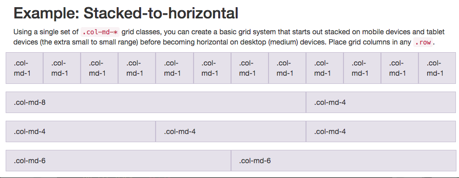
Bootstrap uses a responsive grid system, which makes it easy to put elements into rows and specify each element's relative width. Most of Bootstrap's classes can be applied to a div element. Here's a diagram of how Bootstrap's 12-column grid layout works:

Note that in this illustration, the col-md-* class is being used. Here, md means medium, and * is a number specifying how many columns wide the element should be. In this case, the column width of an element on a medium-sized screen, such as a laptop, is being specified. In the Cat Photo App that we're building, we'll use col-xs-*, where xs means extra small (like an extra-small mobile phone screen), and * is the number of columns specifying how many columns wide the element should be.
Put the Like, Info and Delete buttons side-by-side by nesting all three of them within one <div class="row"> element, then each of them within a <div class="col-xs-4"> element.
<div class="row">
    <div class="col-xs-4">
      <button class="btn btn-block btn-primary">Like</button>
    </div>
    <div class="col-xs-4">
      <button class="btn btn-block btn-info">Info</button>
    </div>
    <div class="col-xs-4">
      <button class="btn btn-block btn-danger">Delete</button>
    </div>
  </div>
<div class="row">
    <div class="col-xs-8">
          <h2 class="text-primary text-center">CatPhotoApp</h2>
    </div>
    <div class="col-xs-4">
          <a href="#">
        <img class="img-responsive thick-green-border" src="https://bit.ly/fcc-relaxing-cat" alt="A cute orange cat lying on its back. ">
        </a>
    </div>
</div>
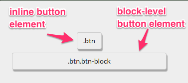
You can use spans to create inline elements. Remember when we used the btn-block class to make the button fill the entire row?
This image illustrates the difference between inline elements and block-level elements:

By using the span element, you can put several elements together, and even style different parts of the same element differently.
<p>Things cats <span class="text-danger">love:</span></p>


 本文介绍如何利用Bootstrap框架的响应式网格系统进行网页布局。通过不同类别的应用,可以轻松地将元素放入行中,并指定每个元素的相对宽度。文章还详细解释了如何使用col-xs-*类来适应超小屏幕。


 918
918

 被折叠的 条评论
为什么被折叠?


