


 本文介绍了如何使用Matplotlib库中的fill_between函数在时间轴上填充特定区间,以增强VIX指数的可视化效果,并展示了如何仅根据时间间隔操作,而不局限于日期范围。通过实例演示了代码实现和参数调整技巧。
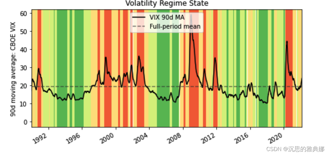
参考效果如下图:
上图实现代码如下:
import pandas as pd
import matplotlib.transforms as mtransforms
import matplotlib.pyplot as plt

url  = 'https://fred.stlouisfed.org/graph/fredgraph.csv?id=VIXCLS'

vix = pd.read_csv(url, index_col=0, parse_dates=True, na_values='.',
                  infer_datetime_format=True,
                 squeeze=True).dropna()


cmap = plt.get_cmap('RdYlGn_r')
ma.plot(color='black', linewidth=1.5, marker='', figsize=(8, 4),
       label='VIX 90d MA')
ax = plt.gca()
ax.set_xlabel('')
ax.set_ylabel('90d moving average: CBOE VIX')
ax.set_title('Volatility Regime State')
ax.grid(False)
ax.set_xlim(xmin=ma.index[0], xmax=ma.index[-1])
trans = mtransforms.blended_transform_factory(ax.transData, ax.transAxes)
for i, color in enumerate(cmap([0.2, 0.4, 0.6, 0.8])):
    ax.fill_between(ma.index, 0, 1, where=state==i,
 最低0.47元/天 解锁文章


 3万+
3万+

 被折叠的 条评论
为什么被折叠?
被折叠的 条评论
为什么被折叠?
 到【灌水乐园】发言


