


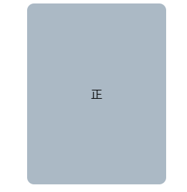
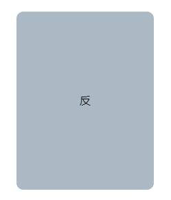
 本文介绍如何使用CSS3和HTML实现一个鼠标悬停时翻转的3D立体盒子效果,通过`transform-style: preserve-3d`和`rotateY`属性,演示了前端视觉效果的动态交互。
效果
鼠标经过,翻转
<!DOCTYPE html>
<html lang="en">
<head>
    <meta charset="UTF-8">
    <title>css3d翻转</title>
    <style>
        *{
            padding: 0;
            margin: 0;
        }

        .container{
            margin: 100px auto;
            width:200px;
            height:260px;
            /* 1.设置3d距离 */
            perspective:500px;
        }

        .box{
            position: relative;
            width:100%;
            height:100%;
            border-radius: 10px;
            background: #abb9c5;
            /* 过渡 */
            transition:all 1s;
            /* 3d翻转 */
            transform-style: preserve-3d;
        }

        .container:hover .box{
            /* 沿y轴翻转180度 */
            transform: rotateY(180deg);
        }

        .font, .back{
            position: absolute;
            top:0;
            left:0;
            width:100%;
            height:100%;
            text-align: center;
            line-height: 260px;
            /* 让盒子在背面不可见 */
            backface-visibility: hidden;
        }

        .back{
            transform: rotateY(180deg);
        }

    </style>
</head>
<body>
<div class="container">
    <div class="box">
        <div class="font">正</div>
        <div class="back">反</div>
    </div>
</div>
</body>
</html>


 扫一扫
扫一扫


 708
708

 被折叠的 条评论
为什么被折叠?
被折叠的 条评论
为什么被折叠?
 到【灌水乐园】发言


