


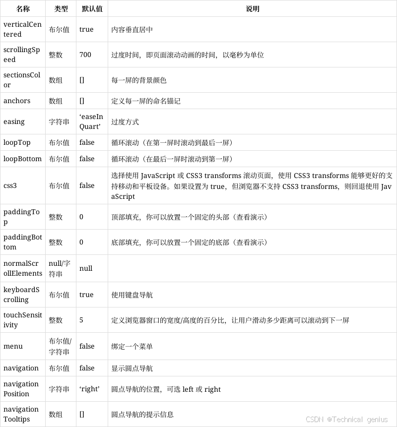
一、视差滚动核心原理
视差滚动(Parallax Scrolling)是一种网页设计技术,通过让背景和前景以不同速度滚动,创造出深度感和沉浸式体验。其核心原理基于人类视觉系统对距离的感知机制。
1.1 物理基础与实现机制
当观察者移动时,近处物体比远处物体移动得更快。在网页中,我们通过控制不同图层的滚动速度来模拟这种效果:
- 前景层:滚动速度较快(速度系数 0.5-1.0)
- 中间层:中等滚动速度(速度系数 0.2-0.5)
- 背景层:滚动速度最慢(速度系数 0-0.2)
1.2 关键技术实现
window.addEventListener('scroll', function() {
    const scrolled = window.pageYOffset;
    const parallaxElements = document.querySelectorAll('[data-speed]');

    parallaxElements.forEach(element => {
        const speed = element.dataset.speed;
        element.style.transform = `translateY(${scrolled * speed}px)`;
    });
});
二、三种主流实现方案
2.1 纯CSS实现(简单场景)
使用CSS background-attachment: fixed 实现基础视差效果,性能最佳但灵活性有限。
2.2 JavaScript + CSS Transform(推荐方案)
通过监听scroll事件,使用transform: translateY()动态调整元素位置,结合will-change属性优化性能。
2.3 第三方库(复杂项目)
使用如Rellax.js、Parallax.js等专门库,快速实现高级效果。
三、完整Demo实现

下面是一个功能完整的视差滚动演示页面,包含多种视差效果和交互控制:
<!DOCTYPE html>
<html lang="zh-CN">
<head>
    <meta charset="UTF-8">
    <meta name="viewport" content="width=device-width, initial-scale=1.0">
    <title>JavaScript视差滚动效果演示</title>
    <link rel="stylesheet" href="https://cdnjs.cloudflare.com/ajax/libs/font-awesome/6.4.0/css/all.min.css">
    <script src="https://cdn.tailwindcss.com"></script>
    <style>
        .parallax-section {
            min-height: 100vh;
            display: flex;
            align-items: center;
            justify-content: center;
            position: relative;
            overflow: hidden;
        }

        .parallax-bg {
            position: absolute;
            top: 0;
            left: 0;
            width: 100%;
            height: 120%;
            z-index: -1;
            background-size: cover;
            background-position: center;
        }

        .parallax-element {
            transition: transform 0.1s ease-out;
        }

        .section-content {
            background: rgba(255, 255, 255, 0.9);
            padding: 3rem;
            border-radius: 1rem;
            box-shadow: 0 20px 40px rgba(0, 0, 0, 0.1);
            backdrop-filter: blur(10px);
            max-width: 800px;
            margin: 0 auto;
        }

        .controls-panel {
            position: fixed;
            top: 50%;
            right: 2rem;
            transform: translateY(-50%);
            z-index: 1000;
            background: white;
            padding: 1rem;
            border-radius: 0.5rem;
            box-shadow: 0 10px 30px rgba(0, 0, 0, 0.2);
        }

        .progress-bar {
            position: fixed;
            top: 0;
            left: 0;
            width: 100%;
            height: 4px;
            background: linear-gradient(90deg, #667eea, #764ba2);
            transform-origin: left;
            z-index: 1001;
        }

        @keyframes float {
            0%, 100% { transform: translateY(0px); }
            50% { transform: translateY(-20px); }
        }

        .floating {
            animation: float 6s ease-in-out infinite;
        }
    </style>
</head>
<body class="bg-gray-50">
    <!-- 进度指示器 -->
    <div class="progress-bar" id="progressBar"></div>

    <!-- 控制面板 -->
    <div class="controls-panel">
        <div class="space-y-3">
            <button onclick="toggleParallax()" id="toggleBtn" class="w-full bg-blue-500 hover:bg-blue-600 text-white py-2 px-4 rounded-lg transition-all duration-300 flex items-center justify-center gap-2">
                <i class="fas fa-pause"></i>
                <span>暂停效果</span>
            </button>
            <button onclick="resetPage()" class="w-full bg-green-500 hover:bg-green-600 text-white py-2 px-4 rounded-lg transition-all duration-300 flex items-center justify-center gap-2">
                <i class="fas fa-redo"></i>
                <span>重置页面</span>
            </button>
            <div class="space-y-2">
                <label class="text-sm font-medium text-gray-700">速度强度</label>
                <input type="range" id="speedControl" min="0.1" max="2" step="0.1" value="1" class="w-full" onchange="updateSpeed(this.value)">
            </div>
        </div>
    </div>

    <!-- 导航栏 -->
    <nav class="fixed top-0 w-full bg-white/80 backdrop-blur-md z-50 shadow-sm">
        <div class="container mx-auto px-6 py-4">
            <div class="flex justify-between items-center">
                <h1 class="text-2xl font-bold text-gray-800">视差滚动演示</h1>
                <div class="flex gap-4">
                    <a href="#section1" class="text-gray-600 hover:text-blue-500 transition-colors">基础视差</a>
                    <a href="#section2" class="text-gray-600 hover:text-blue-500 transition-colors">多层效果</a>
                    <a href="#section3" class="text-gray-600 hover:text-blue-500 transition-colors">3D透视</a>
                </div>
            </div>
        </div>
    </nav>

    <!-- 英雄区域 -->
    <section class="parallax-section bg-gradient-to-br from-blue-400 to-purple-600">
        <div class="parallax-bg" id="heroBg" style="background-image: url('https://picsum.photos/1920/1080?random=1')"></div>
        <div class="container mx-auto px-6 text-center text-white">
            <h1 class="text-5xl md:text-7xl font-bold mb-6 floating">深度探索</h1>
            <p class="text-xl md:text-2xl mb-8 opacity-90">JavaScript视差滚动效果全方位演示</p>
            <div class="flex gap-4 justify-center">
                <button onclick="scrollToSection('section1')" class="bg-white text-blue-600 px-8 py-3 rounded-full font-semibold hover:bg-gray-100 transition-all duration-300 transform hover:scale-105">
            开始体验
                </button>
            </div>
        </div>
    </section>

    <!-- 基础视差效果区域 -->
    <section id="section1" class="parallax-section bg-white relative">
        <div class="parallax-bg" data-speed="0.3" style="background-image: url('https://picsum.photos/1920/1080?random=2')"></div>
        <div class="section-content">
            <h2 class="text-3xl font-bold text-gray-800 mb-6">基础视差效果</h2>
            <div class="grid md:grid-cols-2 gap-8">
                <div class="space-y-4">
                    <div class="parallax-element" data-speed="0.5">
                        <div class="bg-blue-100 p-6 rounded-lg">
                            <i class="fas fa-layer-group text-blue-500 text-2xl mb-3"></i>
                            <h3 class="text-xl font-semibold text-gray-800">前景元素</h3>
                            <p class="text-gray-600 mt-2">以正常速度滚动,增强视觉层次感</p>
                        </div>
                    </div>
                </div>
                <div class="space-y-4">
                    <div class="parallax-element" data-speed="0.2">
                        <div class="bg-purple-100 p-6 rounded-lg">
                            <i class="fas fa-mountain text-purple-500 text-2xl mb-3"></i>
                            <h3 class="text-xl font-semibold text-gray-800">背景元素</h3>
                            <p class="text-gray-600 mt-2">缓慢移动,营造深度空间感</p>
                        </div>
                    </div>
                </div>
            </div>
        </div>
    </section>

    <!-- 多层视差效果区域 -->
    <section id="section2" class="parallax-section bg-gray-100 relative">
        <div class="parallax-bg" data-speed="0.1" style="background-image: url('https://picsum.photos/1920/1080?random=3')"></div>
        <div class="container mx-auto px-6">
            <div class="section-content">
                <h2 class="text-3xl font-bold text-gray-800 mb-6">多层视差效果</h2>
                <div class="grid grid-cols-1 md:grid-cols-3 gap-6">
                    <div class="parallax-element" data-speed="0.8">
                    <div class="bg-white p-6 rounded-lg shadow-lg text-center transform hover:scale-105 transition-all duration-300">
                        <i class="fas fa-bolt text-yellow-500 text-3xl mb-4"></i>
                        <h3 class="text-lg font-semibold text-gray-800">快速层</h3>
                        <p class="text-gray-600 text-sm mt-2">滚动速度最快</p>
                    </div>
                </div>
                <div class="parallax-element" data-speed="0.5">
                    <div class="bg-white p-6 rounded-lg shadow-lg text-center transform hover:scale-105 transition-all duration-300">
                        <i class="fas fa-tachometer-alt text-green-500 text-3xl mb-4"></i>
                        <h3 class="text-lg font-semibold text-gray-800">中速层</h3>
                        <p class="text-gray-600 text-sm mt-2">中等滚动速度</p>
                    </div>
                </div>
                <div class="parallax-element" data-speed="0.2">
                    <div class="bg-white p-6 rounded-lg shadow-lg text-center transform hover:scale-105 transition-all duration-300">
                        <i class="fas fa-snowflake text-blue-500 text-3xl mb-4"></i>
                    <h3 class="text-lg font-semibold text-gray-800">慢速层</h3>
                        <p class="text-gray-600 text-sm mt-2">几乎静止不动</p>
                    </div>
                </div>
            </div>
        </div>
    </section>

    <!-- 3D透视效果区域 -->
    <section id="section3" class="parallax-section bg-gradient-to-tr from-indigo-500 to-pink-500 relative">
        <div class="parallax-bg" data-speed="0.05" style="background-image: url('https://picsum.photos/1920/1080?random=4')"></div>
        <div class="section-content">
            <h2 class="text-3xl font-bold text-white mb-6">3D透视效果</h2>
            <div class="grid md:grid-cols-2 gap-8 items-center">
                <div>
                    <p class="text-white text-lg mb-4">通过CSS透视和变换实现真正的3D空间感</p>
                    <ul class="text-white space-y-2">
                        <li class="flex items-center gap-2"><i class="fas fa-check"></i> 深度Z轴控制</li>
                        <li class="flex items-center gap-2"><i class="fas fa-check"></i> 视角旋转效果</li>
                        <li class="flex items-center gap-2"><i class="fas fa-check"></i> 空间层次分明</li>
                    </ul>
                </div>
                <div class="parallax-element" data-speed="0.6">
                    <div class="bg-white/20 p-6 rounded-lg backdrop-blur-md border border-white/30">
                        <i class="fas fa-cube text-white text-4xl mb-4"></i>
                        <h3 class="text-xl font-semibold text-white">3D立方体</h3>
                        <p class="text-white/80 mt-2">体验真正的三维空间滚动</p>
                    </div>
                </div>
            </div>
        </div>
    </section>

    <!-- 技术实现说明区域 -->
    <section class="py-20 bg-white">
        <div class="container mx-auto px-6">
            <h2 class="text-4xl font-bold text-center text-gray-800 mb-12">技术实现要点</h2>
            <div class="grid md:grid-cols-3 gap-8">
                <div class="text-center">
                    <div class="bg-blue-100 w-16 h-16 rounded-full flex items-center justify-center mx-auto mb-4">
                        <i class="fas fa-code text-blue-500 text-2xl"></i>
                    </div>
                    <h3 class="text-xl font-semibold text-gray-800 mb-3">性能优化</h3>
                    <p class="text-gray-600">使用transform代替top/left,启用GPU加速,确保60fps流畅体验</p>
                </div>
                <div class="text-center">
                    <div class="bg-green-100 w-16 h-16 rounded-full flex items-center justify-center mx-auto mb-4">
                        <i class="fas fa-mobile-alt text-green-500 text-2xl"></i>
                    </div>
                    <h3 class="text-xl font-semibold text-gray-800 mb-3">响应式设计</h3>
                    <p class="text-gray-600">自动适配桌面端和移动端,在不同设备上保持一致的视觉效果</p>
                </div>
                <div class="text-center">
                    <div class="bg-purple-100 w-16 h-16 rounded-full flex items-center justify-center mx-auto mb-4">
                        <i class="fas fa-palette text-purple-500 text-2xl"></i>
                    </div>
                    <h3 class="text-xl font-semibold text-gray-800 mb-3">用户体验</h3>
                    <p class="text-gray-600">提供控制选项,允许用户暂停效果或调整速度,确保舒适浏览体验</p>
                </div>
            </div>
        </div>
    </section>

    <script>
        // 全局配置
        let isParallaxEnabled = true;
        let globalSpeedMultiplier = 1.0;

        // 视差滚动核心函数
        function updateParallax() {
            if (!isParallaxEnabled) return;

            const scrolled = window.pageYOffset;
            const parallaxElements = document.querySelectorAll('[data-speed]');

            parallaxElements.forEach(element => {
                const baseSpeed = parseFloat(element.getAttribute('data-speed'));
                const effectiveSpeed = baseSpeed * globalSpeedMultiplier;
                const yPos = -(scrolled * effectiveSpeed);

                element.style.transform = `translateY(${yPos}px)`;
            });

            // 更新进度条
            const progressBar = document.getElementById('progressBar');
            const windowHeight = window.innerHeight;
            const documentHeight = document.documentElement.scrollHeight - windowHeight;
            const progress = (scrolled / documentHeight) * 100;
            progressBar.style.transform = `scaleX(${progress / 100})`;

            requestAnimationFrame(updateParallax);
        }

        // 控制函数
        function toggleParallax() {
            isParallaxEnabled = !isParallaxEnabled;
            const button = document.getElementById('toggleBtn');
            const icon = button.querySelector('i');
            const text = button.querySelector('span');

            if (isParallaxEnabled) {
                icon.className = 'fas fa-pause';
                text.textContent = '暂停效果';
                button.classList.remove('bg-red-500', 'hover:bg-red-600');
                button.classList.add('bg-blue-500', 'hover:bg-blue-600');
            } else {
                icon.className = 'fas fa-play';
                text.textContent = '继续效果';
                button.classList.remove('bg-blue-500', 'hover:bg-blue-600');
                button.classList.add('bg-red-500', 'hover:bg-red-600');
            }
        }

        function updateSpeed(value) {
            globalSpeedMultiplier = parseFloat(value);
        }

        function resetPage() {
            window.scrollTo({
                top: 0,
                behavior: 'smooth'
            });
        }

        function scrollToSection(sectionId) {
            document.getElementById(sectionId).scrollIntoView({
                behavior: 'smooth'
            });
        }

        // 初始化
        document.addEventListener('DOMContentLoaded', function() {
            updateParallax();

            // 添加滚动监听
            window.addEventListener('scroll', function() {
                if (isParallaxEnabled) {
                    requestAnimationFrame(updateParallax);
                }
            });
        });
    </script>
</body>
</html>
/* 视差滚动演示 - 补充样式 */

/* 自定义滚动条 */
::-webkit-scrollbar {
    width: 8px;
}

::-webkit-scrollbar-track {
    background: #f1f1f1;
}

::-webkit-scrollbar-thumb {
    background: linear-gradient(180deg, #667eea, #764ba2);
    border-radius: 4px;
}

::-webkit-scrollbar-thumb:hover {
    background: linear-gradient(180deg, #764ba2, #667eea);
}

/* 视差容器动画 */
.parallax-container {
    perspective: 1px;
    height: 100vh;
    overflow-x: hidden;
    overflow-y: auto;
}

.parallax-layer {
    position: absolute;
    top: 0;
    right: 0;
    bottom: 0;
    left: 0;
}

/* 响应式设计优化 */
@media (max-width: 768px) {
    .parallax-section {
        min-height: 70vh;
    }

    .controls-panel {
        right: 1rem;
        padding: 0.5rem;
    }

    .section-content {
        padding: 1.5rem;
        margin: 1rem;
    }
}

/* 性能优化类 */
.will-change-transform {
    will-change: transform;
}

/* 加载动画 */
@keyframes fadeInUp {
    from {
        opacity: 0;
        transform: translateY(30px);
    }
    to {
        opacity: 1;
        transform: translateY(0);
    }
}

.fade-in-up {
    animation: fadeInUp 0.8s ease-out;
}

/* 3D变换效果 */
.perspective-1000 {
    perspective: 1000px;
}

.transform-3d {
    transform-style: preserve-3d;
}

/* 交互反馈 */
.hover-lift {
    transition: all 0.3s ease;
}

.hover-lift:hover {
    transform: translateY(-5px);
    box-shadow: 0 15px 30px rgba(0, 0, 0, 0.15);
}

/* 渐变文字效果 */
.gradient-text {
    background: linear-gradient(135deg, #667eea 0%, #764ba2 100%);
    -webkit-background-clip: text;
    -webkit-text-fill-color: transparent;
    background-clip: text;
}
四、代码功能详解
-
核心视差引擎:通过监听scroll事件,使用requestAnimationFrame优化性能,实现流畅的60fps动画效果
-
多层视差系统:支持前景、中景、背景三层独立速度控制,每层可自定义滚动系数
-
交互控制面板:提供暂停/继续、重置页面、速度调节等实用功能
-
响应式设计:自动适配桌面端和移动设备,确保在不同屏幕尺寸下的最佳显示效果
-
性能优化特性:使用transform代替position定位,启用GPU加速,减少重绘和回流
五、动态效果说明
5.1 基础视差效果
- 背景图像以0.3倍速度缓慢滚动
- 前景元素以0.5倍速度正常滚动
- 形成明显的深度对比
5.2 多层视差系统
- 快速层(0.8倍速):响应迅速,增强动态感
- 中速层(0.5倍速):平稳过渡,保持视觉平衡
- 慢速层(0.2倍速):几乎静止,营造空间稳定感
5.3 3D透视变换
- 使用CSS perspective属性创建真实的三维空间
- 结合transform实现立体滚动效果
- 提供沉浸式的浏览体验
六、最佳实践建议
- 性能优先:始终使用transform而非修改top/left值
- 适度使用:避免过度设计导致用户体验下降
- 移动端优化:在性能较差的设备上适当降低效果强度
- 渐进增强:确保在禁用JavaScript时页面仍可正常访问


 扫一扫
扫一扫


 946
946

 被折叠的 条评论
为什么被折叠?
被折叠的 条评论
为什么被折叠?
 到【灌水乐园】发言


