


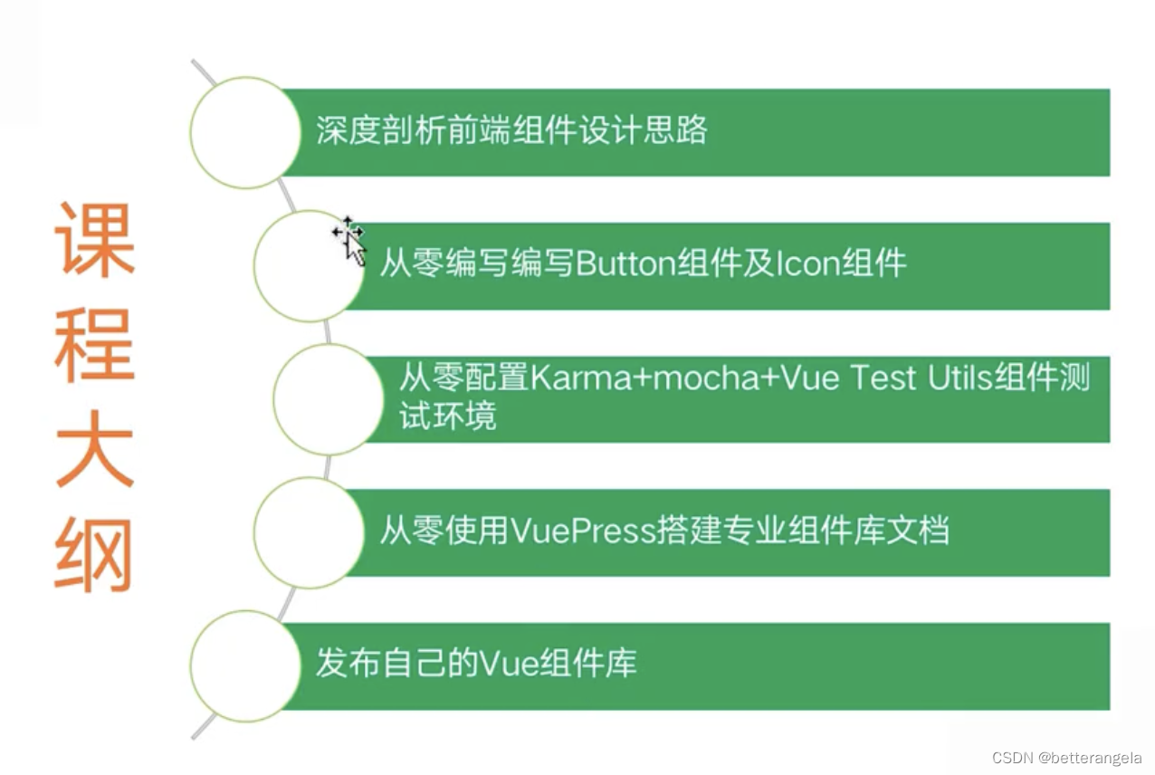
 博客围绕前端开发展开,介绍了UI组件库的全局组件注册、模块化编程与webpack打包,涉及button、icon等组件。还详细阐述了CSS相关技巧,如三角形绘制、垂直居中、固定宽高比、绘制<1px的线、圣杯布局及响应式方案等。
UI组件库
全局组件*
全局注册组件 & 并且使用了require.context
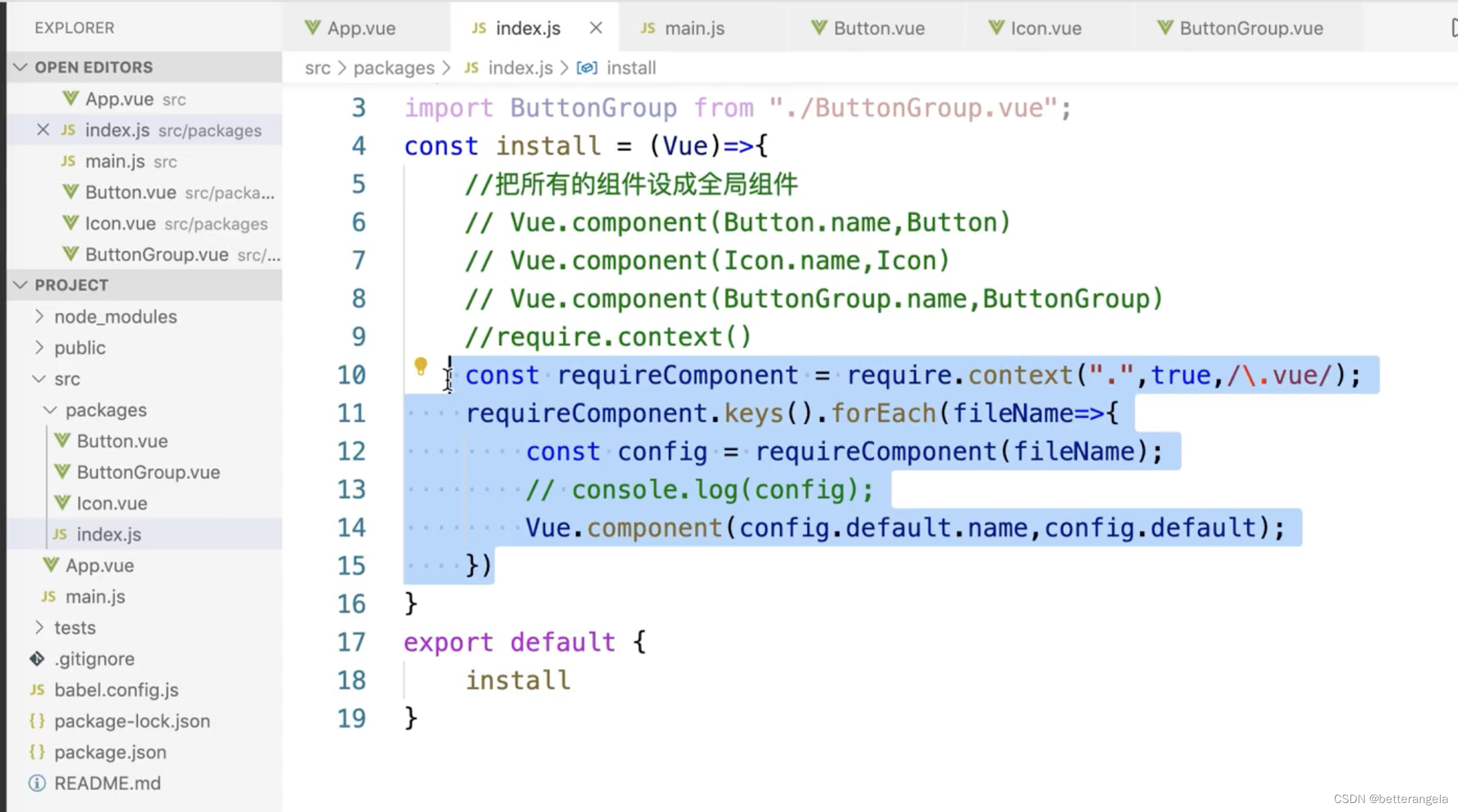
模块化编程 & webpack打包
const install=(Vue)=>{
    const context=require.context('.',true,/\.vue$/)
    context.keys().forEach(fileName=>{
        const module=context(fileName)
        Vue.component(module.default.name,module.default)
    })
}

export default {
    install
}
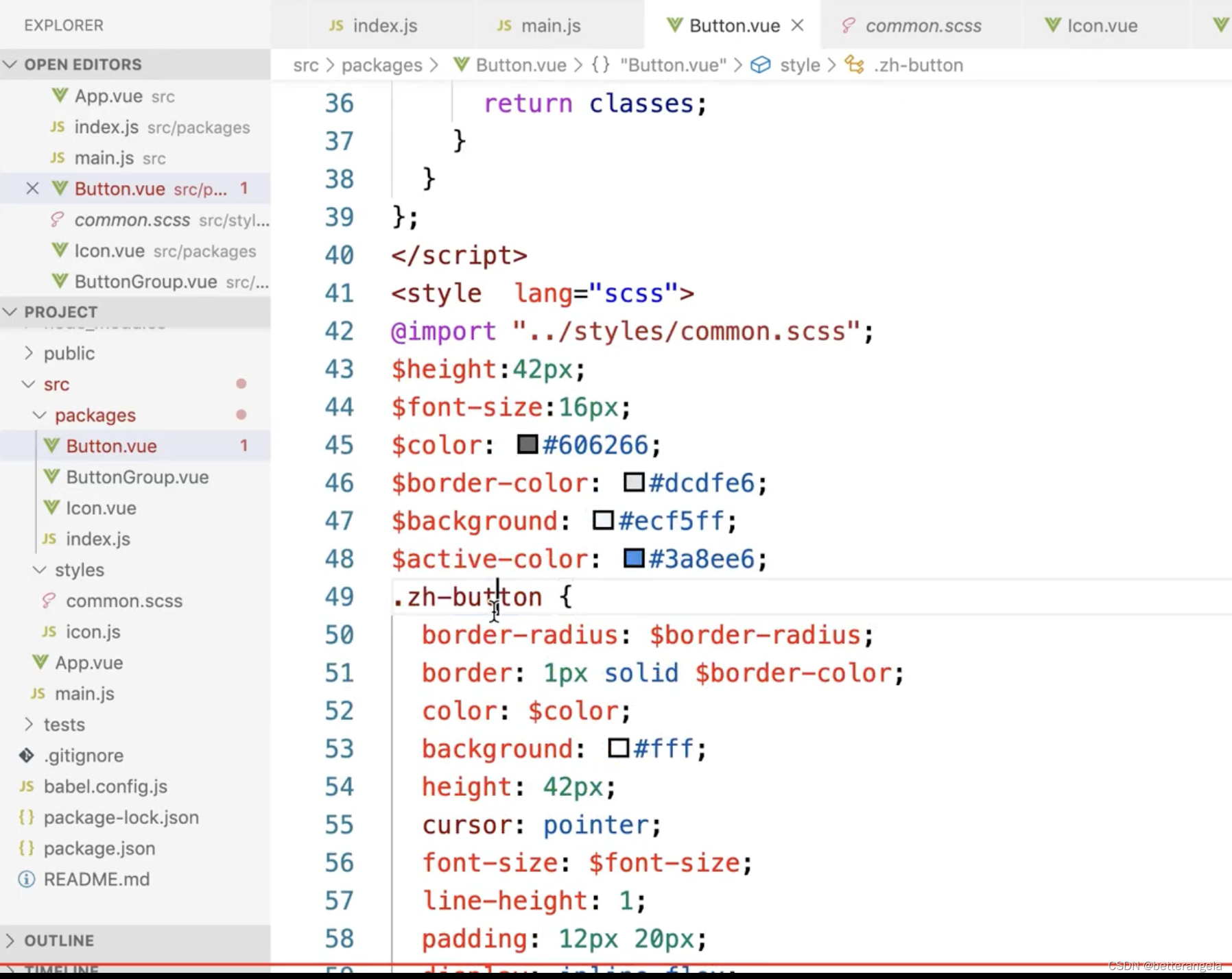
button*
SCSS:在@each中使用动态变量-腾讯云开发者社区-腾讯云
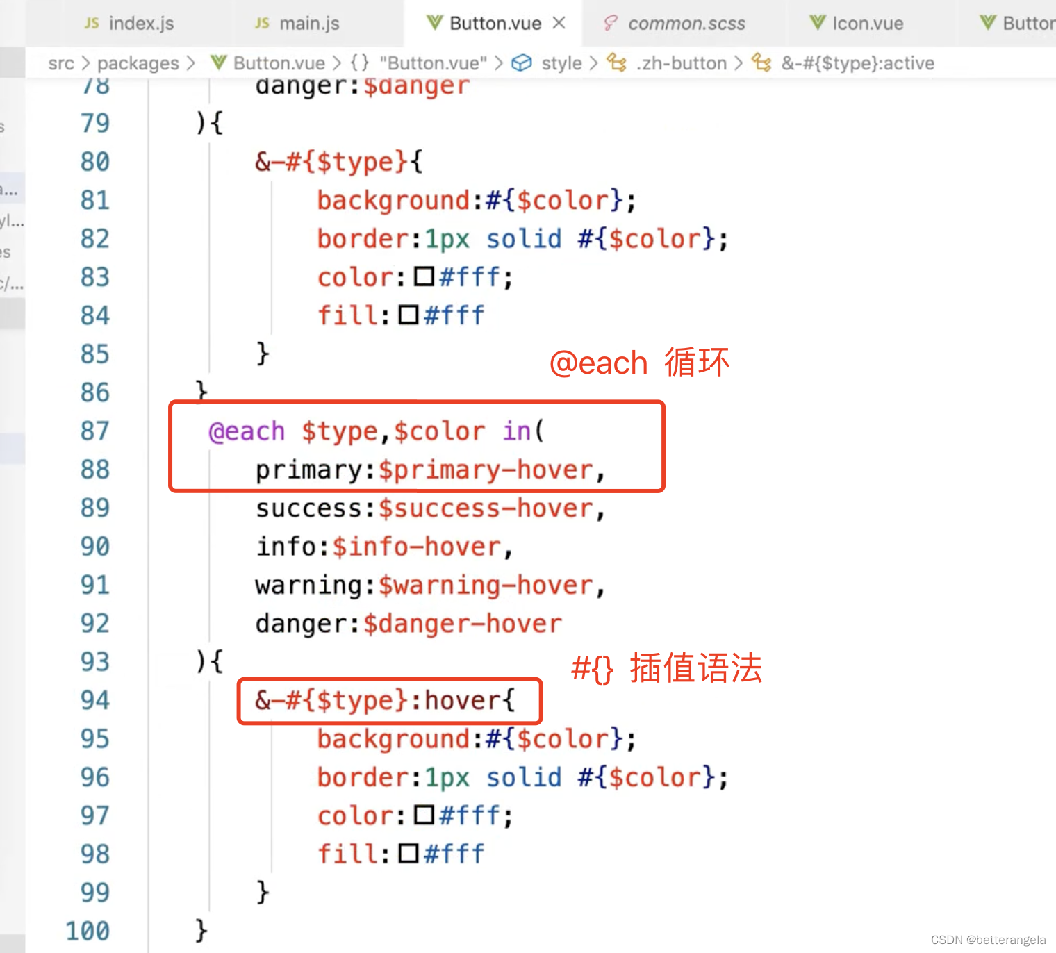
@each:循环语句
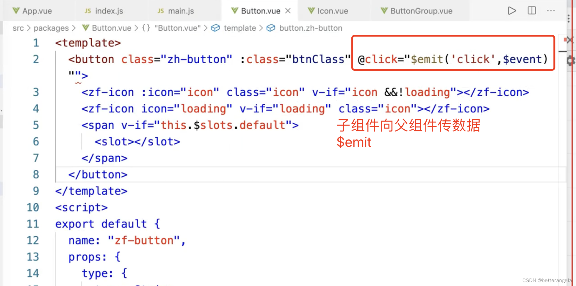
<template>
<button class="zh-button" :class="buttonClass">
<span v-if="$slots.default"><slot></slot></span>
</button>
</template>
<script>
const types=['primary','info','success','warning','danger']
export default {
name:'zh-button',
props:{
type:{
type:String,
default:'',
validator(val){
if(val && !types.includes(val)){
console.error('类型不合法')
}
return true;
}
}
},
computed:{
buttonClass(){
let classes=[]
if(this.type){
classes.push(`zh-button--${this.type}`)
}
return classes;
}
}
}
</script>
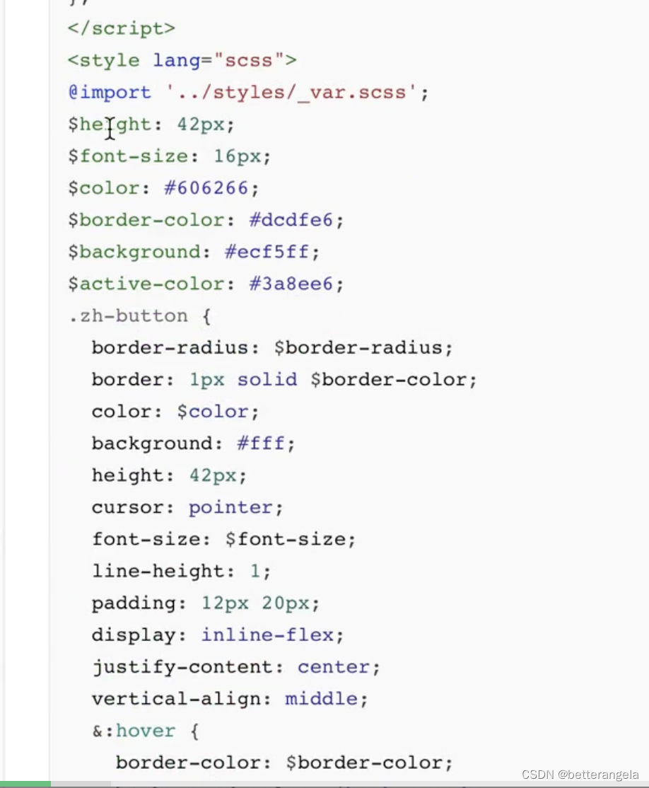
<style scoped lang="scss">
$primary-color:#409eff;
$success-color:#67c23a;
.zh-button{
padding: 12px 20px;
border: none;
color: #fff;
&:hover{
}
&:focus,&:active{
}
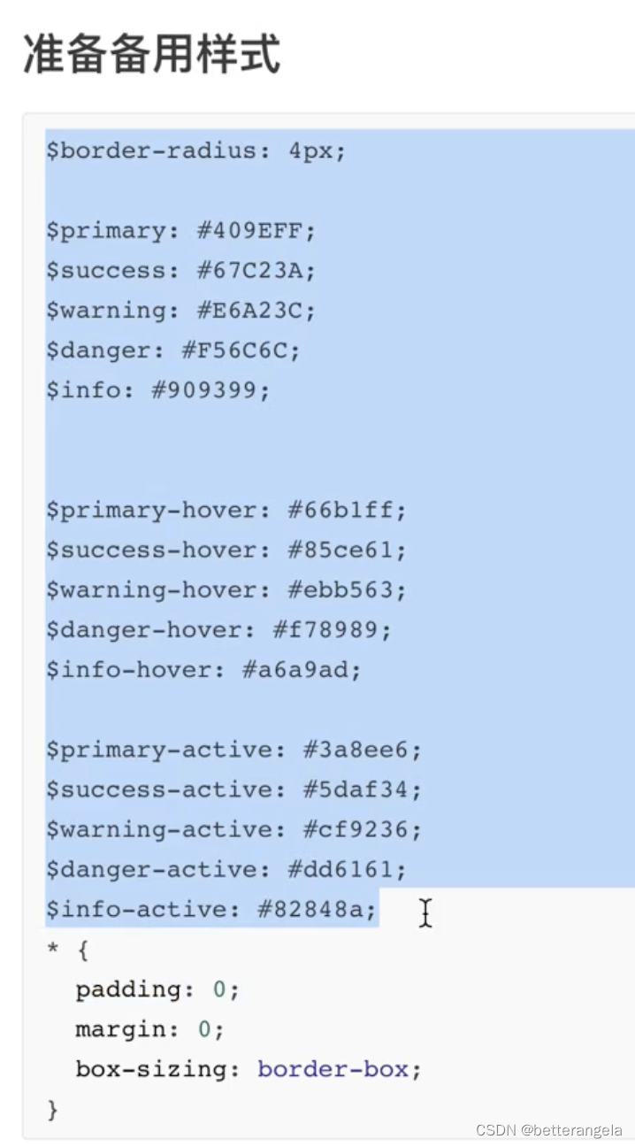
@each $type,$color in (
primary:$primary-color,
success:$success-color,
){
&--#{$type}{
background:$primary-color;
}
}
}
</style>
icon*
iconfont的symbol方式引入项目不显示_svg use symbol 不显示-优快云博客
order:1
<template>
<button class="zh-button" :class="buttonClass" v-on="$listeners">
  <zh-icon :icon="icon" v-if="icon"></zh-icon>
  <zh-icon icon="loading" v-if="loading" color="#fff"></zh-icon>
  <span v-if="$slots.default"><slot></slot></span>
</button>
</template>

<script>
const types=['primary','info','success','warning','danger']
export default {
  name:'zh-button',
  props:{
    type:{
      type:String,
      default:'',
      validator(val){
        if(val && !types.includes(val)){
          console.error('类型不合法')
        }
        return true;
      }
    },
    icon:{
      type:String,
    },
    iconPosition:{
      type:String,
      default:'left'
    },
    loading:{
      type:Boolean,
      default:false,
    }
  },
  computed:{
    buttonClass(){
      let classes=[]
      if(this.type){
        classes.push(`zh-button--${this.type}`)
      }
      if(this.iconPosition){
        classes.push(`zh-button--icon-${this.iconPosition}`)
      }
      return classes;
    }
  }
}
</script>

<style scoped lang="scss">
$primary-color:#409eff;
$success-color:#67c23a;
.zh-button{
  padding: 12px 20px;
  border: none;
  color: #fff;
  display: inline-flex;
  vertical-align: middle;
  align-items: center;
  cursor: pointer;
  &:hover{
  }
  &:focus,&:active{

  }

  @each $type,$color in (
    primary:$primary-color,
    success:$success-color,
  ){
    &--#{$type}{
      background:$primary-color;
    }
  }

  &--icon-left{
    > .icon{
      order: 1;
    }
    > span{
      order: 2;
    }
  }
  &--icon-right{
    > .icon{
      order: 2;
    }
    > span{
      order: 1;
    }
  }


}
</style>
绑定事件
单元测试(略)
CSS*
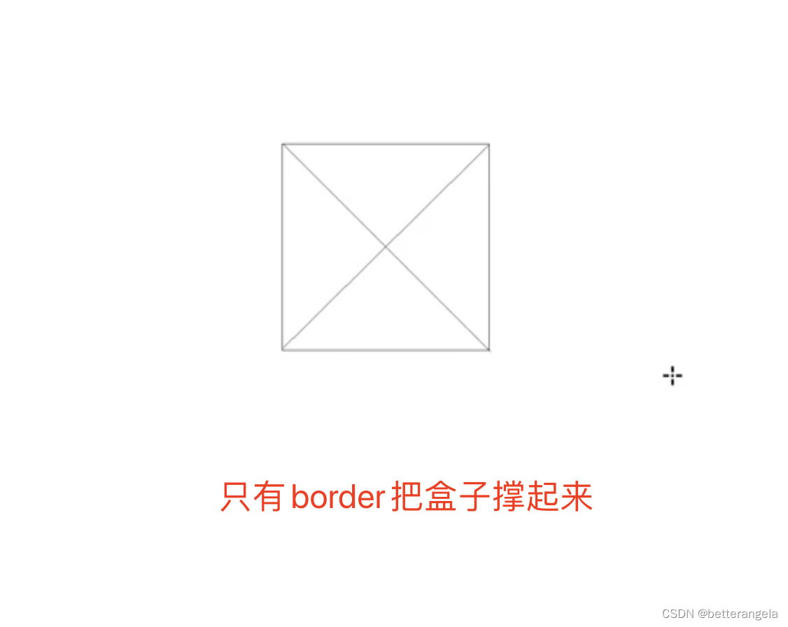
三角形*
宽高 padding都不写,只设置border的话,border会自动根据对角线/三角形来划分。
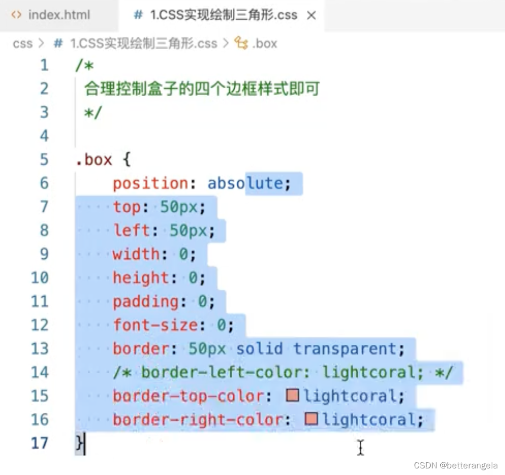
<div class="triangle"></div>
<div class="triangle-2"></div>
.triangle{
    width: 0;
    height: 0;
    border: 10px solid transparent;
    border-right: 10px solid red;
}
.triangle-2{
    width: 0;
    height: 0;
    border: 10px solid transparent;
    border-right-color: red;
    border-top-color: red;
}
垂直居中
盒子定位
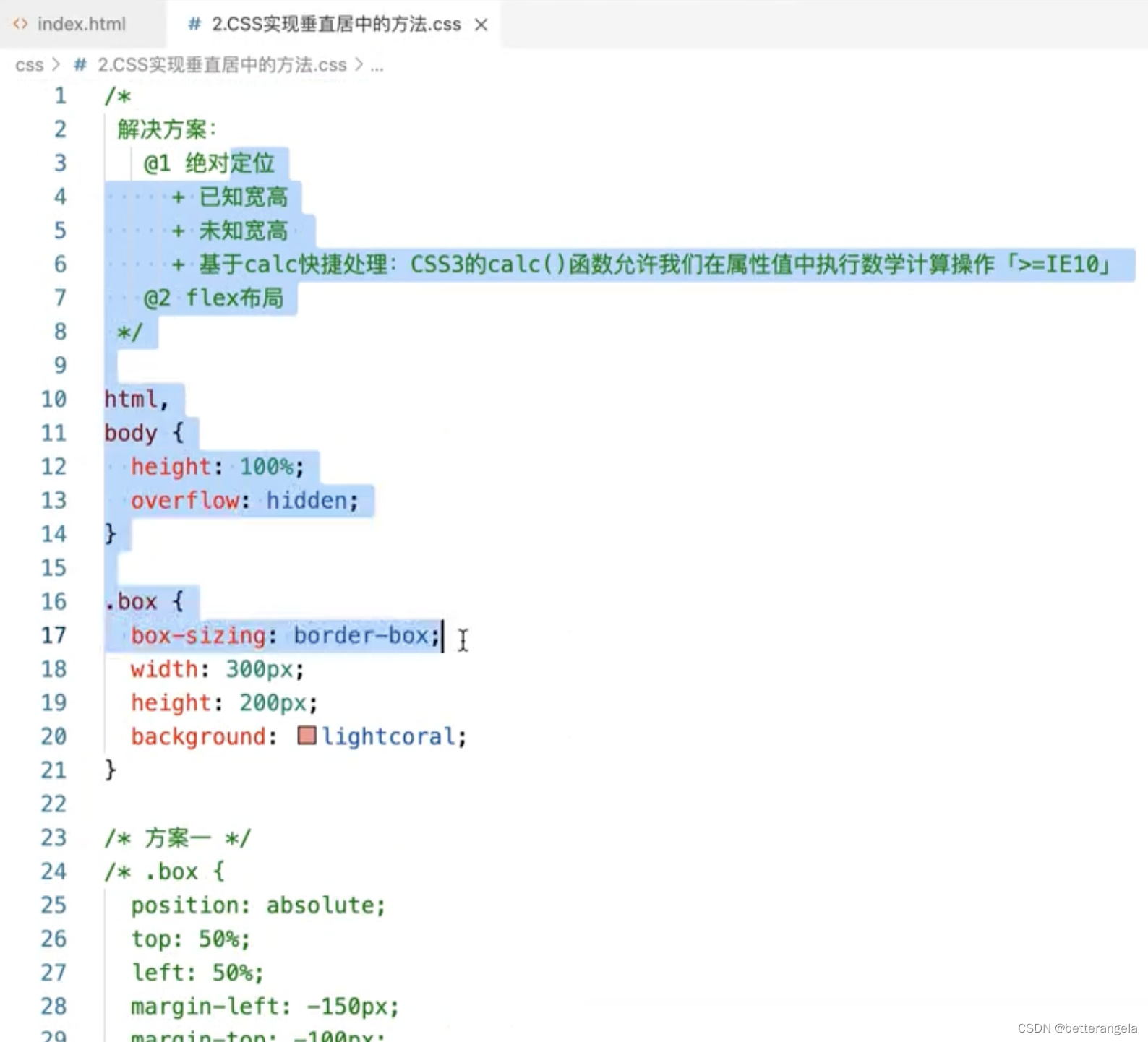
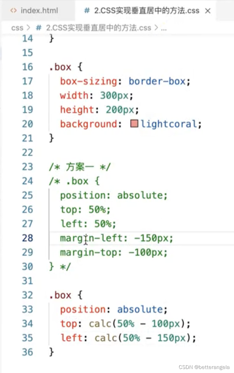
定位:相对/绝对
已知宽高:margin-left/calc
未知宽高:transform
flex布局
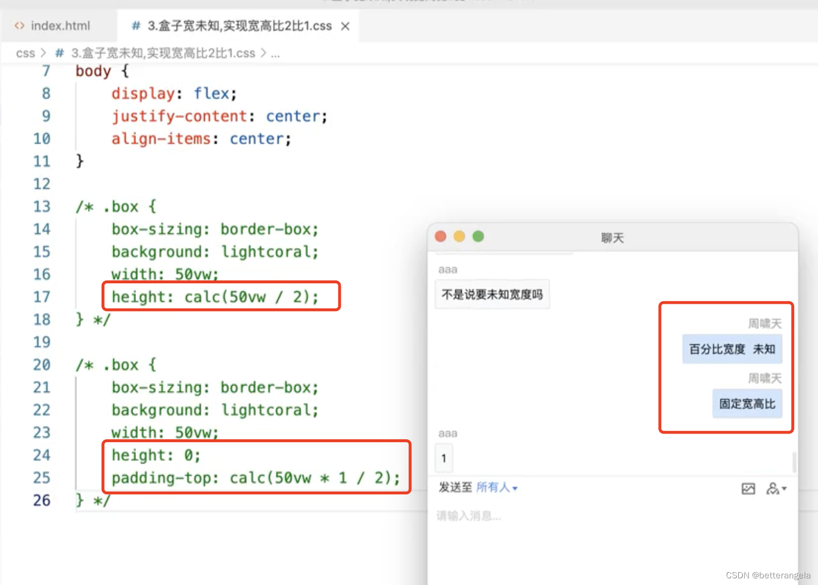
让盒子实现固定宽高比
绘制<1px的线*
- 用::after创建虚拟元素
- transform scale缩放
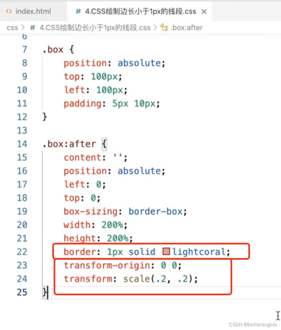
.thin{
  width: 200px;
  height: 100px;
  background: blue;
}
.thin::before{
  content: "";
  display: block;
  height: 1px;
  background: red;
  transform-origin: 0 0;
  transform: scale(1, 0.5);
}
圣杯布局*
左中右:左右固定,中间伸缩
flex布局
通过flex值来设置
flex: 伸 缩 basis
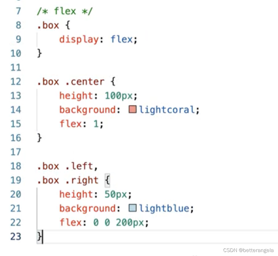
<div class="box">
    <div class="left"></div>
    <div class="middle"></div>
    <div class="right"></div>
</div>
.box{
    width: 100vw;
    height: 100px;
    display: flex;
}
.box .left,.box .right{
    flex: 0 0 100px;
    background: red;
}
.box .middle{
    flex: 1;
    background: blue;
}
定位
- 盒子左右padding
- 中间子盒子width:100%,左右盒子定位
<div class="box">
    <div class="left"></div>
    <div class="middle"></div>
    <div class="right"></div>
</div>

*{
    box-sizing: border-box;
    margin: 0;
    padding: 0;
}
.box{
    position: relative;
    width: 100%;
    padding: 0 100px;
    height: 100px;
    position: relative;
}
.box .left,.box .right{
    width: 100px;
    height: 100px;
    position: absolute;
    left: 0;
    top: 0;
    background: red;

}
.box .right{
    left: auto;
    right: 0;
}
.box .middle{
    width: 100%;
    height: 200px;
    background: blue;
}
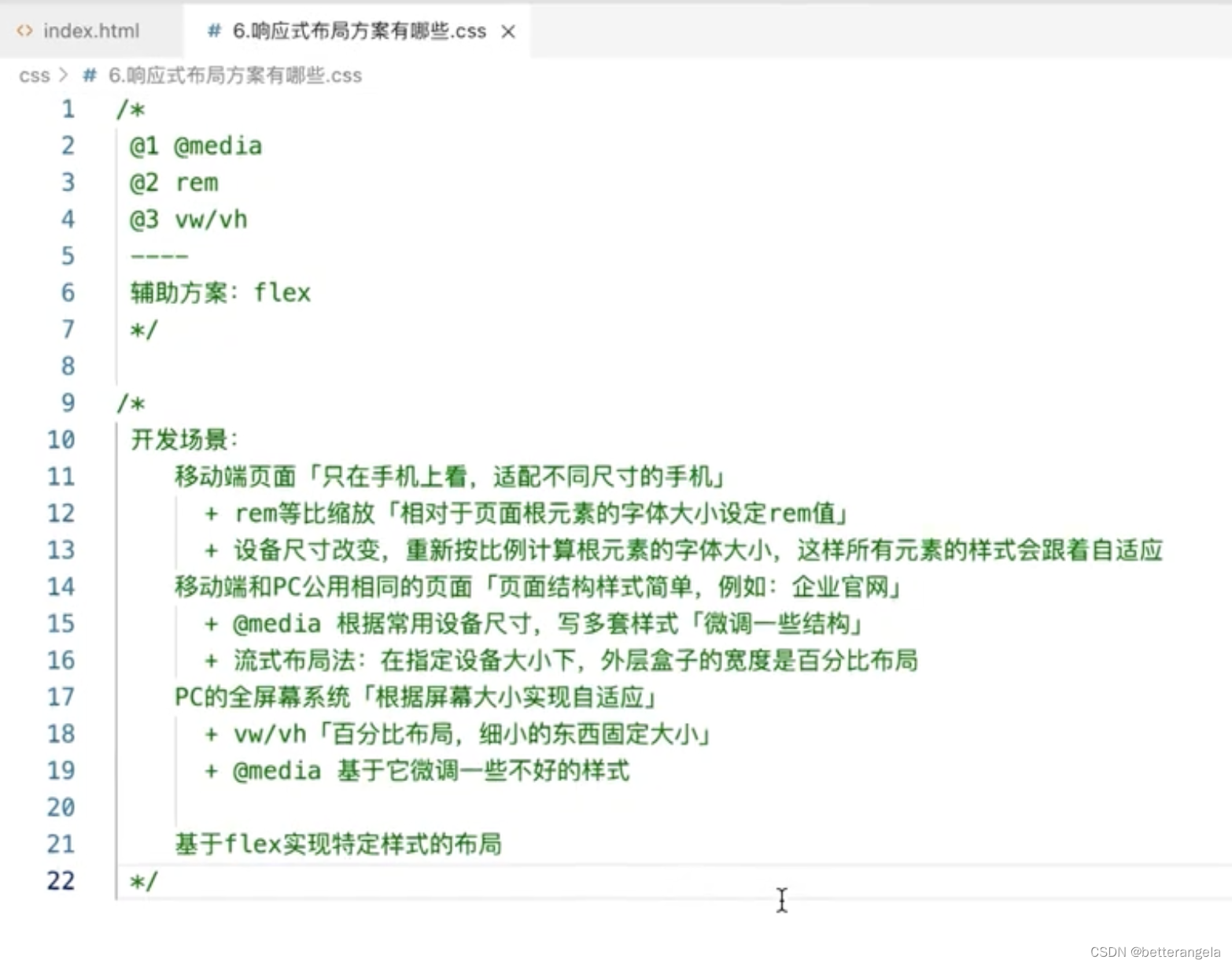
响应式的方案*
PC不同像素:
vw/vh:百分比布局。
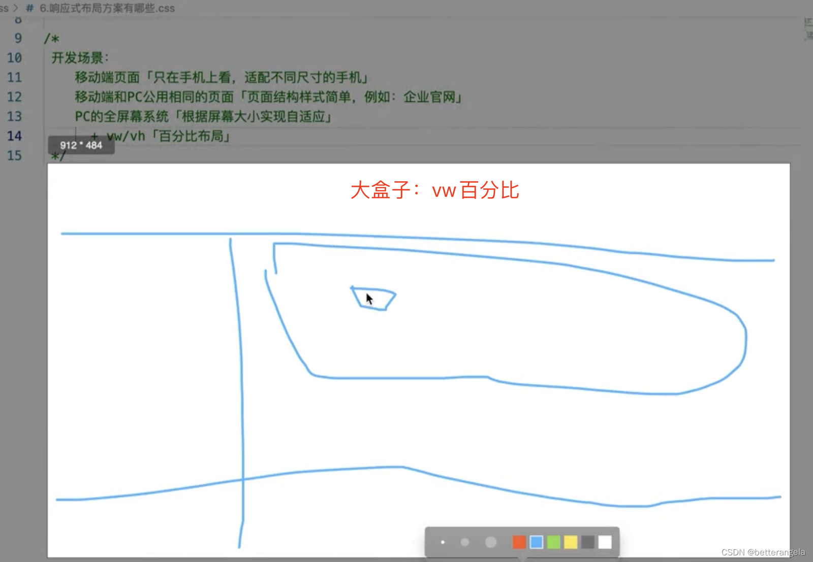
@media:媒体查询。微调,指定大小基于它微调。
移动&PC:共用一套页面。比如官网。
@media:基于设备尺寸写多套样式
移动端:
rem:等比缩放。相对于页面根元素大小设置rem值


 扫一扫
扫一扫


 被折叠的 条评论
为什么被折叠?
被折叠的 条评论
为什么被折叠?
 到【灌水乐园】发言


