


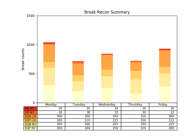
Matplotlib之Bar Chart:
import numpy as np
import matplotlib.pyplot as plt

data = [[300, 200, 250, 150, 280],
        [300, 166, 203, 250, 225],
        [100, 110, 115, 150, 112],
        [300, 200, 250, 150, 280],
        [20, 30, 15, 10, 12],
        [20, 10, 10, 10, 20]]

columns = ('Monday', 'Tuesday', 'Wednesday', 'Thursday', 'Friday')
rows = [x for x in ("EQP.NY", "EQB.NY", "EQP.LN", "EQB.LN", "FIP.NY", "FIB.NY")]

values = np.arange(0, 2000, 500)

# Get some pastel shades for the colors
colors = plt.cm.YlOrRd(np.linspace(0, 0.7, len(rows)))

n_rows = len(data)

index = np.arange(len(columns)) + 0.3
bar_width = 0.4

# Initialize the vertical-offset for the stacked bar chart.
y_offset = np.zeros(len(columns))

# Plot bars and create text labels for the table
cell_text = []
for row in range(n_rows):
    plt.bar(index, data[row], bar_width, bottom=y_offset, color=colors[row])
    y_offset = y_offset + data[row]
    cell_text.append(['%u' % x for x in data[row]])
# Reverse colors and text labels to display the last value at the top.
colors = colors[::-1]
cell_text.reverse()
# print(cell_text)

# Add a table at the bottom of the axes
the_table = plt.table(cellText=cell_text,
                      rowLabels=rows[::-1],
                      rowColours=colors,
                      colLabels=columns,
                      loc='bottom')

# Adjust layout to make room for the table:
plt.subplots_adjust(left=0.2, bottom=0.25)

# plt.ylabel("Loss in ${0}'s".format(value_increment))
plt.ylabel('Break counts')
# print(values)
plt.yticks(values, ['%d' % val for val in values])
plt.xticks([])
plt.title('Break Recon Summary')

plt.show()
效果:


 被折叠的 条评论
为什么被折叠?
被折叠的 条评论
为什么被折叠?
 到【灌水乐园】发言


