


 这篇博客介绍如何仅用CSS来创建具有3D效果和动画的漂亮按钮。通过结合使用边框、盒阴影、转换和过渡属性,创建出具有箭头和斜面效果的按钮,在鼠标悬停时还能呈现平滑的动画效果。
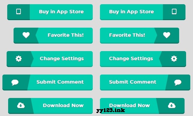
我从网站上看到一些漂亮的按钮但这些都是通过图像实现的。我想重新创建,仅用CSS样式。使用css边境技巧使三角箭头和框阴影创建3 d效果,我只创建了一个简单的css按钮看起来一样好。添加转换添加一个小动画,你有一个漂亮的动画按钮。.btn { box-sizing:border-box; -moz-box-sizing:border-box; -webkit-box-sizing:border-box; position: relative; display: inline-block; overflow: hidden; height: 53px; border-radius: 6px; -moz-border-radius: 6px; -webkit-border-radius: 6px; line-height: 30px; font-size: 16px; font-weight: bold; text-shadow: 0px 1px 1px #888;} .btn span.icon, .btn span.title { display: block; position: relative; line-height: 50px; padding: 0 30px; border-radius: 6px; -moz-border-radius: 6px; -webkit-border-radius: 6px; } .btn span.left { float: left; border-radius: 6px 0 0 6px; -moz-border-radius: 6px 0 0 6px; -webkit-border-radius: 6px 0 0 6px; } .btn span.right { float: right; border-radius: 0 6px 6px 0; -moz-border-radius: 0 6px 6px 0; -webkit-border-radius: 0 6px 6px 0; } .btn span.icon { font-size: 23px; background-color: #00967f; -webkit-box-shadow: 0 3px 0 0 #007261; box-shadow: 0 3px 0 0 #007261; text-shadow: 0px 1px 1px #888; } .btn span.title { -webkit-box-shadow: 0 3px 0 0 #00ae94; box-shadow: 0 3px 0 0 #00ae94; background-color: #00cdae; } /* arrows */ .btn span.arrow-left, .btn span.arrow-right { position: absolute; width: 0; height: 0; border-top: 25px solid transparent; border-bottom: 25px solid transparent; -webkit-transition: all .15s; -transition: all .15s; -webkit-transition-property: left, right; transition-property: left, right; } .btn.left span.arrow-left { right: 0; -webkit-box-shadow: 10px 0 0 0 #00cdae, 10px 3px 0 0 #00ae94; box-shadow: 10px 0 0 0 #00cdae, 10px 3px 0 0 #00ae94; border-right:10px solid #00cdae; } .btn.right span.arrow-left { right: 0; -webkit-box-shadow: 10px 0 0 0 #00967f, 10px 3px 0 0 #007261; box-shadow: 10px 0 0 0 #00967f, 10px 3px 0 0 #007261; border-right:10px solid #00967f; } .btn.left span.arrow-right { left: 0; -webkit-box-shadow: -10px 0 0 0 #00967f, -10px 3px 0 0 #007261; box-shadow: -10px 0 0 0 #00967f, -10px 3px 0 0 #007261; border-left:10px solid #00967f; } .btn.right span.arrow-right { left: 0; -webkit-box-shadow: -10px 0 0 0 #00cdae, -10px 3px 0 0 #00ae94; box-shadow: -10px 0 0 0 #00cdae, -10px 3px 0 0 #00ae94; border-left:10px solid #00cdae; } /* Slants */ .btn span.slant-left, .btn span.slant-right { position: absolute; width: 0; height: 0; border-top: 0 solid transparent; border-bottom: 50px solid transparent; -webkit-transition: all .15s; -transition: all .15s; -webkit-transition-property: left, right; transition-property: left, right; } .btn.left span.slant-right { left: 0; -webkit-box-shadow: -10px 0 0 0 #00967f, -10px 3px 0 0 #007261; box-shadow: -10px 0 0 0 #00967f, -10px 3px 0 0 #007261; border-left:10px solid #00967f; } .btn.right span.slant-right { left: 0; -webkit-box-shadow: -10px 0 0 0 #00cdae, -10px 3px 0 0 #00ae94; box-shadow: -10px 0 0 0 #00cdae, -10px 3px 0 0 #00ae94; border-left: 10px solid #00cdae; } .btn.left span.slant-left { right: 0; -webkit-box-shadow: 10px 0 0 0 #00cdae, 10px 3px 0 0 #00ae94; box-shadow: 10px 0 0 0 #00cdae, 10px 3px 0 0 #00ae94; border-right: 10px solid #00cdae; } .btn.right span.slant-left { right: 0; -webkit-box-shadow: 10px 0 0 0 #00967f, 10px 3px 0 0 #007261; box-shadow: 10px 0 0 0 #00967f, 10px 3px 0 0 #007261; border-right: 10px solid #00967f; } .btn:active, .btn.active { height: 51px; } .btn:hover { } .btn:hover span.arrow-left { right: 10px; } .btn:hover span.arrow-right { left: 10px; } .btn:hover span.slant-left { right: 10px; } .btn:hover span.slant-right { left: 10px; }
dd:


 扫一扫
扫一扫


 515
515

 被折叠的 条评论
为什么被折叠?
被折叠的 条评论
为什么被折叠?
 到【灌水乐园】发言


