


 本文深入讲解Flex布局的核心概念,包括主轴与交叉轴控制、排列方向、空间占比调整及元素缩放,同时介绍如何实现元素的对齐、折行与嵌套容器的兼容处理。
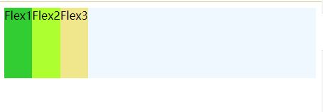
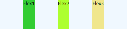
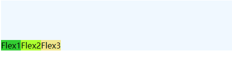
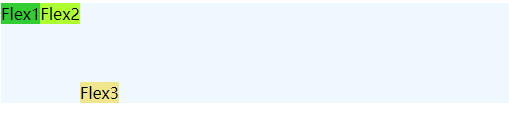
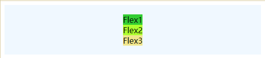
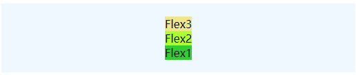
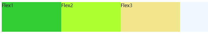
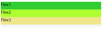
div竖排 display:flex
<!DOCTYPE html>
<html>
	<head>
		<meta charset="utf-8">
		<title></title>
		<div class="flex">
			<div class="flex1">Flex1</div>
			<div class="flex2">Flex2</div>
			<div class="flex3">Flex3</div>
		</div>

		<style type="text/css">
			.flex {
				display: flex;
				height: 100px;
				background-color: aliceblue;
			}

			.flex1 {
				background-color: limegreen;
			}

			.flex2 {
				background-color: greenyellow;
			}

			.flex3 {
				background-color: khaki;
			}
		</style>
	</head>
	<body>
	</body>
</html>
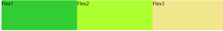
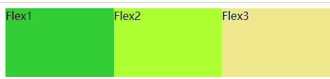
对齐方式: x轴对齐
- 所有内容居中对齐: justify-content:center
.flex {
				justify-content: center;
				display: flex;
				height: 100px;
				background-color: aliceblue;
			}
- 所有内容居右: justify-content: flex-end
.flex {
				justify-content: flex-end;
				display: flex;
				height: 100px;
				background-color: aliceblue;
			}
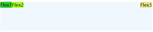
- 两端分散对齐: space-between
.flex {
				justify-content: space-between;
				display: flex;
				height: 100px;
				background-color: aliceblue;
			}
- 平分空间:space-evenly
.flex {
				justify-content: space-evenly;
				display: flex;
				height: 100px;
				background-color: aliceblue;
			}
- 平分空间: space-around (优先两边)
.flex {
				justify-content: space-around;
				display: flex;
				height: 100px;
				background-color: aliceblue;
			}
对齐方式:y轴对齐
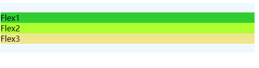
- 默认stretch 与justify-content:flex-start 或者不添加一致
<!DOCTYPE html>
<html>
	<head>
		<meta charset="utf-8">
		<title></title>
		<div class="flex">
			<div class="flex1">Flex1</div>
			<div class="flex2">Flex2</div>
			<div class="flex3">Flex3</div>
		</div>

		<style type="text/css">
			.flex {
				align-items: stretch;
				display: flex;
				height: 100px;
				background-color: aliceblue;
			}

			.flex1 {
				background-color: limegreen;
			}

			.flex2 {
				background-color: greenyellow;
			}

			.flex3 {
				background-color: khaki;
			}
		</style>
	</head>
	<body>
	</body>
</html>
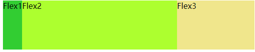
- 左上角对齐,不占满: align-items: flex-start;
.flex {
				align-items: flex-start;
				display: flex;
				height: 100px;
				background-color: aliceblue;
			}
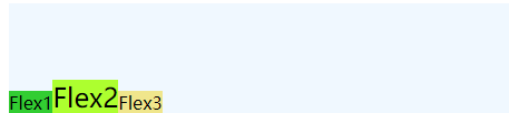
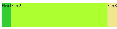
- 靠左居中: align-items: center;
- 靠左居下:align-items: flex-end;
- 基线对齐:解决鼠标经过后变大但是左右位置不变大:align-items: baseline;
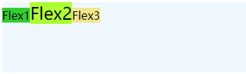
.flex2 {
				font-size: 24px;
				background-color: greenyellow;
			}
- 比如使用 align-items: flex-start;
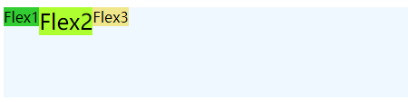
- 使用 align-items: flex-end;
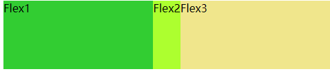
子元素交叉对齐: align-self
- 前面元素考上对齐,最后一个靠下对齐:
<!DOCTYPE html>
<html>
	<head>
		<meta charset="utf-8">
		<title></title>
		<div class="flex">
			<div class="flex1">Flex1</div>
			<div class="flex2">Flex2</div>
			<div class="flex3">Flex3</div>
		</div>

		<style type="text/css">
			.flex {
				align-items: flex-start;
				display: flex;
				height: 100px;
				background-color: aliceblue;
			}

			.flex1 {
				background-color: limegreen;
			}

			.flex2 {
				/* font-size: 24px; */
				background-color: greenyellow;
			}

			.flex3 {
				background-color: khaki;
				align-self: flex-end;
			}
		</style>
	</head>
	<body>
	</body>
</html>
- 前面元素按照左对齐,最后一个右对齐:
去掉align-self, 使用margin
.flex3 {
				background-color: khaki;
				/* align-self: flex-end; */
				margin-left: auto;
			}
排列方式:
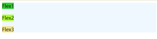
- 主轴和交叉轴一起使用,然后添加:flex-direction: column;
<!DOCTYPE html>
<html>
	<head>
		<meta charset="utf-8">
		<title></title>
		<div class="flex">
			<div class="flex1">Flex1</div>
			<div class="flex2">Flex2</div>
			<div class="flex3">Flex3</div>
		</div>

		<style type="text/css">
			.flex {
				justify-content: space-between;
				align-items: flex-start;
				flex-direction: column;
				display: flex;
				height: 100px;
				background-color: aliceblue;
			}

			.flex1 {
				background-color: limegreen;
			}

			.flex2 {
				background-color: greenyellow;
			}

			.flex3 {
				background-color: khaki;
			}
		</style>
	</head>
	<body>
	</body>
</html>
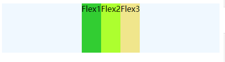
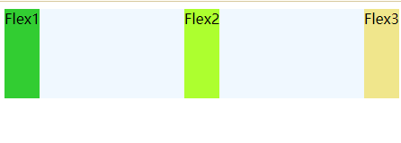
- 水平居中对齐
.flex {
			    justify-content: space-between;   // 去掉后则居中吸顶居中
				align-items: center;
				flex-direction: column;
				display: flex;
				height: 100px;
				background-color: aliceblue;
			}
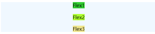
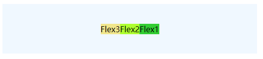
- 垂直居中对齐:
	.flex {
				justify-content: center;
				align-items: center; // 注释后将变为以下图片
				flex-direction: column;
				display: flex;
				height: 100px;
				background-color: aliceblue;
			}
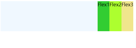
- 方向靠右:
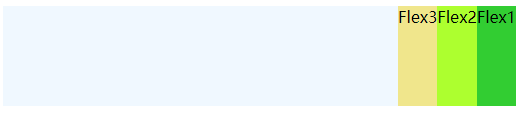
.flex {
				/* justify-content: center; */
				/* align-items: center; */
				flex-direction: row-reverse;
				display: flex;
				height: 100px;
				background-color: aliceblue;
			}
开启两个注释后结果:
- 倒叙排列:
.flex {
				justify-content: center;
				align-items: center;
				flex-direction: column-reverse;
				display: flex;
				height: 100px;
				background-color: aliceblue;
			}
空间占比: 左右1,中间2
	.flex .flex3{
				flex:1
			}
			.flex2{
				flex:2
			}
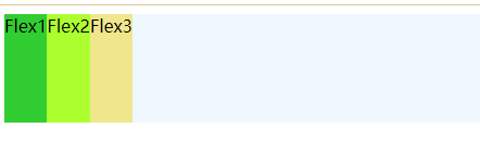
flex basis: 主轴尺寸
- 每个div宽度一致:
<!DOCTYPE html>
<html>
	<head>
		<meta charset="utf-8">
		<title></title>
		<div class="flex">
			<div class="flex1">Flex1</div>
			<div class="flex2">Flex2</div>
			<div class="flex3">Flex3</div>
		</div>

		<style type="text/css">

			.flex >* {
				flex-basis: 200px;
			}

			.flex {
				display: flex;
				height: 100px;
				background-color: aliceblue;
			}

			.flex1 {
				background-color: limegreen;
			}

			.flex2 {
				background-color: greenyellow;
			}

			.flex3 {
				background-color: khaki;
			}
		</style>
	</head>
	<body>
	</body>
</html>
这个时候添加width不在管用,优先级高于width,默认是auto,这个时候我们可以使用min-width来设置
.flex > * {
  flex-basis: 200px;
  min-width: 250px;
}
高度依旧如此:
            .flex >* {
				flex-basis: 30px;

			}

			.flex {
				flex-direction: column;
				display: flex;
				height: 100px;
				background-color: aliceblue;
			}
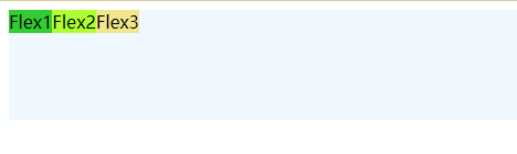
缩放:flex-grow
设置两边自动大小,中间auto:
<style type="text/css">

			.flex {
				flex-basis: auto;
				display: flex;
				height: 100px;
				background-color: aliceblue;
			}

			.flex1 {
				background-color: limegreen;
				/* flex-grow: 1; */
			}

			.flex2 {
				flex-grow: 1;
				background-color: greenyellow;
			}

			.flex3 {
				/* flex-grow: 1; */
				background-color: khaki;
			}
		</style>
将1和3的注释起开后:三者各占据1/3
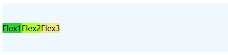
收缩限制:flex-shrink
flex2随着flex-basis的变大,他的收缩也会变大,因为是flex-shrink = 2
	.flex1 ,.flex3 {
				flex-basis: 600px;
				flex-shrink: 1;
			}
			.flex2 {
				flex-basis: 600px;
				flex-shrink: 2;
			}
// 添加上面一个演示代码即可
flex属性:
-
默认值:0 1 auto, 不增长但收缩,收缩比例:1,flex-basis为auto: 取用户自定义宽度或内容宽度。
-
flex值如下:
-
flex: 1 等同:flex:1 1 0,即自动缩放比例1,flex-basis为0.
-
auto 等同 flex: 1 1 auto
-
指定两个数字: 第一个为flex-grow, 第二个若是数字则为: flex-shrink, 如果是宽度则为flex-basis.
-
指定三个值分别为:flex-grow, flex-shrink ,flex-basis
折行
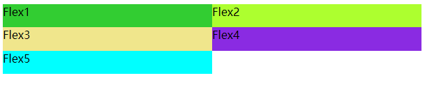
如果元素有固定宽度,且超过容器宽度,若不可以收缩可以使用flex-wrap让其折行,使得每个元素都不超过容器的高度,但无法使用grid的单独控制行、列占比,亦不能自由定位元素到特定的位置
<!DOCTYPE html>
<html>
	<head>
		<meta charset="utf-8">
		<title></title>
		<div class="flex">
			<div class="flex1">Flex1</div>
			<div class="flex2">Flex2</div>
			<div class="flex3">Flex3</div>
			<div class="flex4">Flex4</div>
			<div class="flex5">Flex5</div>

		</div>

		<style type="text/css">
			.flex {
				height: 100px;
				display: flex;
				flex-wrap: wrap;
			}
			.flex>* {
				flex-shrink: 0;
				flex-basis: 300px;

			}
			.flex1 {
				background-color: limegreen;
			}

			.flex2 {
				background-color: greenyellow;
			}

			.flex3 {
				background-color: khaki;
			}

			.flex4 {
				background-color: blueviolet;
			}

			.flex5 {
				background-color: cyan;
			}
		</style>
	</head>
	<body>
	</body>
</html>
这里我们依旧可以添加align-content 与justify-content 来控制主轴与交叉轴位置(两者属性基本一致)
比如我们设置中间空格:
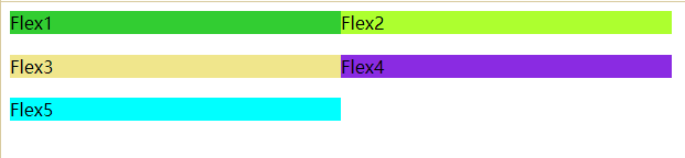
其他属性align-content依旧 可以使用
.flex {
				align-content: space-between;
				justify-content: ;
				height: 100px;
				display: flex;
				flex-wrap: wrap;
			}
嵌套flex容器兼容问题
在以上代码基础上flex4中增加p标签出现以下问题
<div class="flex4">Flex4
				<p>这是个很长很长很长很长很长很长很长很长很长很长很长很长很长很长很长很长很长很长文本</p>
</div>
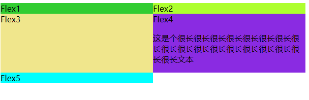
解决办法:
原因是min-widht:auto, 在flex4中添加min-widht:0
<!DOCTYPE html>
<html>
	<head>
		<meta charset="utf-8">
		<title></title>
		<div class="flex">
			<div class="flex1">Flex1</div>
			<div class="flex2">Flex2</div>
			<div class="flex3">Flex3</div>
			<div class="flex4">Flex4
				<p>这是个很长很长很长很长很长很长很长很长很长很长很长很长很长很长很长很长很长很长文本</p>
			</div>
			<div class="flex5">Flex5</div>

		</div>

		<style type="text/css">
			.flex {
				align-content: space-between;
				justify-content: ;
				height: 100px;
				display: flex;
				flex-wrap: wrap;
			}
			.flex>* {
				flex: 1;
			}
			.flex1 {
				background-color: limegreen;
			}

			.flex2 {
				background-color: greenyellow;
			}

			.flex3 {
				background-color: khaki;
			}

			.flex4 {
				display: flex;
				flex: 1;
				min-width: 0;
				background-color: blueviolet;
			}
			.flex4 > p{
				white-space: nowrap;
				overflow: hidden;
				text-overflow: ellipsis;
			}

			.flex5 {
				background-color: cyan;
			}
		</style>
	</head>
	<body>
	</body>
</html>
总结
- 开启flex布局使用display: flex属性
- flex有主轴和交叉轴,分别使用justify-content和align-items控制
- 支持按行和列进行排列,使用flex-direction,另支持row-reverse和column-reverse反向排列
- flex属性:flex-grow、flex-shrink、flex-basis调整空间占比和缩放
- flex-wrap设置折行


 扫一扫
扫一扫


 561
561

 被折叠的 条评论
为什么被折叠?
被折叠的 条评论
为什么被折叠?
 到【灌水乐园】发言


