 SVG实现带背景色的环形进度条,


 文章介绍了如何使用SVG绘制圆并创建带背景色的环形进度条,通过调整stroke-dasharray和stroke-dashoffset属性实现进度动画,同时通过CSS的transform旋转来修正起点位置。
先用svg画圆
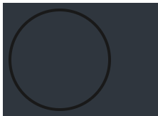
注意:cx cy 圆心和半径r的坐标点关系;一开始我cx cy 70,r70 然切边了
 <div class="circle">
      <svg width="160" height="160">
        <circle
          cx="80"
          cy="80"
          r="70"
          fill="transparent"
          stroke="#191919"
          stroke-width="4"
        ></circle>
      </svg>
    </div>
带背景色的环形进度条
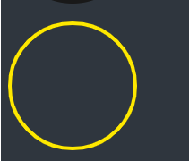
<!-- 半径为70CM 的话 周长=2*3.14*70=439.6厘米 stroke-dasharray给个整数440 -->
<div class="circle">
<svg width="160" height="160" id="lu">
<circle
cx="80"
cy="80"
r="70"
fill="transparent"
stroke="#191919"
stroke-width="4"
></circle>
<circle
id="hh"
cx="80"
cy="80"
r="70"
fill="transparent"
stroke="#fee800"
stroke-width="4"
stroke-dasharray="440" //描边的点划线的图案
></circle>
</svg>
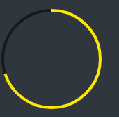
</div>界面显示效果
stroke-dashoffset: offset;相对于起始点的偏移,正数偏移x值的时候,相当于往左移动了x个长度单位,负数偏移x的时候,相当于往右移动了x个长度单位。
加个css,显示如下
#hh {
      stroke-dashoffset: 20;
    }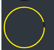
这会你发现,咦?怎么是歪的,不是从最上面开始的,没关系,我们调整一下
 #lu{
        transform: rotate(270deg);
    }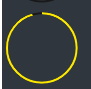
就可以正常显示啦,对于想要逆向还是正向来说,只需要调整stroke-dashoffset为正数还是负数即可!
4,在开发当中,我们就可以依据圆的周长,数据总和,当前数据来计算出,需要显示的大小
例如:num=70,total=100;cicle=440
偏移量 = 440 - (440*70/100)


 扫一扫
扫一扫


 8161
8161

 被折叠的 条评论
为什么被折叠?
被折叠的 条评论
为什么被折叠?
 到【灌水乐园】发言


