


1.实现效果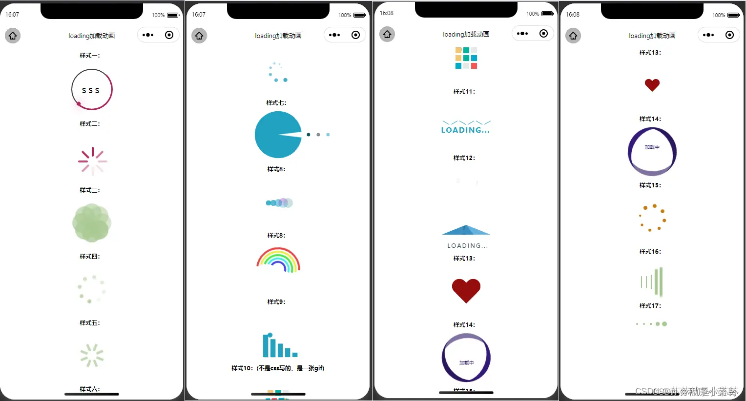
2.实现原理
- .伪元素
- .css3动画
- .transform
3.实现代码
从上到下,从左到右依次的代码如下
page {
  background: #fff;
  padding-bottom: 100px;
  /* background: #000;
  background: radial-gradient(#222, #000); */
}
.title{
  margin: 20rpx ;
  font-size: 25rpx;
  text-align: center;
  font-weight: bold;
}
.box{
  /* width: 100px; */
  height: 100px;
  display: flex;
  align-items: center;
  justify-content: center;
  margin: 0 auto;
  overflow: unset;
}
/* 第一个 */
.ring {
  position: relative;
  margin: 40rpx auto;
  width: 80px;
  height: 80px;
  text-align: center; /* 字体水平居中 */
  line-height: 80px;
  font-size: 20px;
  letter-spacing: 4px;
  background: transparent;
  border: 2px solid #3c3c3c;
  border-radius: 50%;
  box-shadow: 0 0 20 rgba(0, 0, 0, .5);
  user-select: none; /* 无法选中 */
}
.ring::before {
  content: ''; /* 内容 */
  position: absolute;
  z-index: 99;
  top: -3px;
  left: -3px;
  width: 100%;
  height: 100%;
  border: 3px solid transparent;
  border-top: 3px solid #b3205d;
  border-right: 3px solid #771940;
  border-radius: 50%;
  animation: animateCircle 2s linear infinite; /* 动画:名称 时间 速率 重复 */
}
.line{
  display: block;
  position: absolute;
  top: calc(50% - 2px);
  left: 50%;
  width: 50%;
  height: 4px;
  background: transparent;
  transform-origin: left; /* 动画开始位置 */
  animation: animate 2s linear infinite;
  transform: rotate(45deg);
}
.line::before {
  content: '';
  position: absolute;
  width: 8px;
  height: 8px;
  border-radius: 50%;
  background: #b3205d;
  top: -4px;
  right: -4px;
  box-shadow: 0 0 20px #b3205d;
}
@keyframes animate {
  100% {
    /* 360+45 */
    transform: rotate(405deg);
  }
}
@keyframes animateCircle {
  0% {
    transform: rotate(0deg);
  }
  100% {
    transform: rotate(360deg);
  }
}

/* 第二个 */

.loading{
  position: relative;
}
.loading>view{
  position: absolute;
  width: 4px;
  height: 20px;
  border-radius: 10px;
  background-color: #b3205d;
}
.loading>view:nth-child(1){
  top: 20px;
  left: 0px;
  animation: loading infinite 1s;
}
.loading>view:nth-child(2){
  top: 14.1442px;
  left: 14.1442px;
  transform: rotate(-45deg);
  animation: loading infinite 1s 0.125s;
}
.loading>view:nth-child(3){
  top: 0px;
  left: 20px;
  transform: rotate(90deg);
  animation: loading infinite 1s 0.25s;
}
.loading>view:nth-child(4){
  top: -14.1442px;
  left: 14.1442px;
  transform: rotate(45deg);
  animation: loading infinite 1s 0.375s;
}
.loading>view:nth-child(5){
  top: -20px;
  left: 0px;
  transform: rotate(0deg);
  animation: loading infinite 1s 0.5s;
}
.loading>view:nth-child(6){
  top: -14.1442px;
  left: -14.1442px;
  transform: rotate(-45deg);
  animation: loading infinite 1s 0.625s;
}
.loading>view:nth-child(7){
  top: 0px;
  left: -20px;
  transform: rotate(90deg);
  animation: loading infinite 1s 0.75s;
}
.loading>view:nth-child(8){
  top: 14.1442px;
  left: -14.1442px;
  transform: rotate(45deg);
  animation: loading infinite 1s 0.875s;
}

@keyframes loading {
  50% {
    opacity: 0.1;
  }
  100% {
    opacity: 1;
  }
}
/* 第三个 */
.circle-line,.circle-line1,.circle-add{
  width: 100px;
  height: 100px;
  display: inline-block;
  position: relative;
}
.circle-line text{
  display: block;
  width: 40px;
  height: 40px;
  border-radius: 50%;
  opacity: .7;
  position: absolute;
  top: calc(50% - 20px);
  left: calc(50% - 40px);
  background-color: #a8c992;
  tran
最低0.47元/天 解锁文章


 扫一扫
扫一扫


 1523
1523


 到【灌水乐园】发言


