<!DOCTYPE html>
<html lang="en">

<head>
    <meta charset="UTF-8">
    <meta name="viewport" content="width=device-width, user-scalable=no, initial-scale=1.0,maximum-scale=1.0,minimum-scale=1.0">
    <link rel="stylesheet" href="css/normalize.css">
    <link rel="stylesheet" href="CSS/index.css">
    <title>主页</title>
    <style>

    </style>
</head>

<body>
    <header class="app">
        <ul>
            <li>
                <img src="images/close.png" alt="">
            </li>
            <li>
                <img src="images/logo.png" alt="">
            </li>
            <li>
                打开京东APP,购物更轻松
            </li>
            <li>立即打开</li>
        </ul>
    </header>
    <!-- 搜索 -->
    <div class="search-wrap">
        <div class="search-btn">
        </div>
        <div class="search">
            <div class="jd-icon"></div>
            <div class="sou"></div>
        </div>
        <div class="search-login">
            登陆
        </div>

    </div>
    <!-- 主题内容部分 -->
    <div class="mainContent">
        <!-- 滑动图 -->
        <div class="slider">
            <img src="upload/banner.dpg" alt="">
        </div>
        <!-- 蔡康永 品牌日 -->
        <div class="brand">
            <div>
                <a href="#">
                    <img src="upload/pic1.dpg" alt="">
                </a>

            </div>
            <div>
                <a href="#">
                    <img src="upload/pic2.dpg" alt="">
                </a>

            </div>
            <div>
                <a href="#">
                    <img src="upload/pic3.dpg" alt="">
                </a>

            </div>
        </div>
        <nav>
            <a href="">
                <img src="upload/nav1.webp" alt="">
                <span>京东超市</span>
            </a>
            <a href="">
                <img src="upload/nav2.webp" alt="">
                <span>京东超市</span>
            </a>
            <a href="">
                <img src="upload/nav1.webp" alt="">
                <span>京东超市</span>
            </a>
            <a href="">
                <img src="upload/nav1.webp" alt="">
                <span>京东超市</span>
            </a>
            <a href="">
                <img src="upload/nav1.webp" alt="">
                <span>京东超市</span>
            </a>
            <a href="">
                <img src="upload/nav1.webp" alt="">
                <span>京东超市</span>
            </a>
            <a href="">
                <img src="upload/nav1.webp" alt="">
                <span>京东超市</span>
            </a>
            <a href="">
                <img src="upload/nav1.webp" alt="">
                <span>京东超市</span>
            </a>
            <a href="">
                <img src="upload/nav1.webp" alt="">
                <span>京东超市</span>
            </a>
            <a href="">
                <img src="upload/nav1.webp" alt="">
                <span>京东超市</span>
            </a>
        </nav>
        <!-- 新闻模块 -->
        <div class="news">
            <a href="#">
                <img src="upload/new1.dpg" alt="">
            </a>
            <a href="#">
                <img src="upload/new2.dpg" alt="">
            </a>
            <a href="#">
                <img src="upload/new3.dpg" alt="">
            </a>
        </div>
    </div>
</body>

</html>
body {
margin: 0 auto;
width: 100%;
min-width: 320px;
max-width: 640px;
font-size: 14px;
color: #666;
font-family: -apple-system, Helvetica, sans-serif;
line-height: 1.5;
background-color: #ccc;
height: 2000px;
}
.app {
width: 100%;
height: 45px;
}
.app ul {
margin: 0;
padding: 0;
list-style: none;
}
a {
color: #666;
text-decoration: none;
}
img {
vertical-align: middle;
}
.app ul li {
float: left;
height: 45px;
background-color: #333333;
text-align: center;
line-height: 45px;
color: #fff;
}
.app ul li:nth-child(1) {
width: 8%;
}
.app ul li:nth-child(1) img {
width: 10px;
}
.app ul li:nth-child(2) {
width: 10%;
}
.app ul li:nth-child(2) img {
width: 30px;
vertical-align: middle;
}
.app ul li:nth-child(3) {
width: 57%;
}
.app ul li:nth-child(4) {
width: 25%;
background-color: #E1251B;
}
.search-wrap {
overflow: hidden;
position: fixed;
width: 100%;
height: 44px;
min-width: 320px;
max-width: 640px;
}
.search-btn::before {
content: "";
display: block;
width: 20px;
height: 18px;
background: url(../images/s-btn.png);
background-size: 20px 18px;
margin: 14px 0 0 15px;
}
.search-btn {
width: 40px;
height: 44px;
position: absolute;
top: 0;
left: 0;
}
.search-login {
width: 40px;
height: 44px;
position: absolute;
top: 0;
right: 0;
line-height: 44px;
color: #fff;
}
.search {
position: relative;
height: 30px;
background-color: white;
margin: 0 50px;
border-radius: 15px;
margin-top: 7px;
}
.jd-icon {
width: 20px;
height: 15px;
position: absolute;
top: 8px;
left: 13px;
background: url(../images/jd.png) no-repeat;
background-size: 20px 15px;
}
.jd-icon::after {
content: "";
position: absolute;
right: -20px;
display: block;
width: 1px;
height: 15px;
background-color: #ccc;
}
.sou {
position: absolute;
top: 8px;
left: 55px;
width: 18px;
height: 15px;
background: url(../images/jd-sprites.png) no-repeat -81px 0;
background-size: 200px auto;
}
.slider img {
width: 100%;
}
.brand {
overflow: hidden;
border-radius: 10px 10px 0 0;
}
.brand div {
float: left;
width: 33.33%;
}
.brand div img {
width: 100%;
}
nav {
padding-top: 5px;
}
nav a {
float: left;
width: 20%;
text-align: center;
}
nav a img {
width: 40px;
margin: 10px 0;
}
nav a span {
display: block;
}
.news a {
margin-top: 20px;
float: left;
box-sizing: border-box;
}
.news a:nth-child(1) {
width: 50%;
border-left: 1px solid #ccc;
}
.news img {
width: 100%;
}
.news a:nth-child(n+2) {
width: 25%;
}


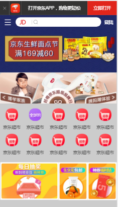
 本文详细解析了京东APP主页的HTML结构,包括头部导航、搜索框、轮播图、品牌日活动区、导航菜单和新闻模块等关键部分的设计与实现。


 扫一扫
扫一扫


 138
138

 被折叠的 条评论
为什么被折叠?
被折叠的 条评论
为什么被折叠?
 到【灌水乐园】发言


