


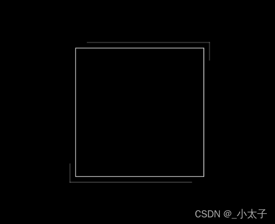
边框外面的线是会环绕动起来的,代码很简单,效果很酷哦
<div></div>
html,body {
	height:100%;
	background-color:#000;
}
div {
	width:200px;
	height:200px;
	position:absolute;
	left:50%;
	top:50%;
	transform:translate(-50%,-50%);
	border:1px solid #eee;
}
div::after,div::before {
	/* 固定在div下 */
  z-index:-1;
	position:absolute;
	top:0;
	right:0;
	bottom:0;
	left:0;
	/* 撑开一点大小 */
  margin:-5%;
	box-shadow:inset 0px 0px 2px #fff;
	animation:clipMe 8s linear infinite;
}
div::before {
	content:"";
}
div::after {
	content:"";
	/* 提前运动4s */
  animation-delay:-4s;
}
@keyframes clipMe {
	0%,100% {
	clip:rect(0px,220.0px,2px,0px);
}
25% {
	clip:rect(0px,2px,220.0px,0px);
}
50% {
	clip:rect(218.0px,220.0px,220.0px,0px);
}
75% {
	clip:rect(0px,220.0px,220.0px,218.0px);
}
}


 扫一扫
扫一扫


 1703
1703

 被折叠的 条评论
为什么被折叠?
被折叠的 条评论
为什么被折叠?
 到【灌水乐园】发言


