


目录
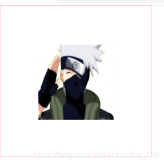
1.图片在盒子中水平垂直居中
<!DOCTYPE html>
<html lang="en">
<head>
    <meta charset="UTF-8">
    <meta name="viewport" content="width=device-width, initial-scale=1.0">
    <title>Document</title>
    <style>
        *{
            margin: 0;
            padding: 0;
        }
        div{
            width: 300px;
            height: 300px;
            border: 1px solid pink;
            text-align: center;
            line-height: 300px;
        }

        img{
            width: 150px;
            height: 150px;
            vertical-align:middle;
        }
    </style>
</head>
<body>
    <div>
        <img src="./images/卡卡西.jpg" alt="">
    </div>
</body>
</html>
效果:
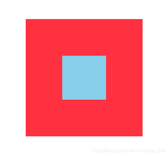
2.绝对定位子元素居中
width:400px;
height: 307px;
// 绝对定位子元素居中
position: absolute;
left:50%;
top:50%;
margin-left:-200px;//子元素宽度的一半
margin-top:-307px/2;//子元素高度的一半
background-color: #fff;
3.清除浮动
给父盒子添加以下样式
3.1伪元素清除浮动
/* 为元素清除浮动方法: */
        .clearfix::after{
            content:"";
            display: block;
            height: 0;
            /* 隐藏元素 */
            visibility: hidden;
            /* 清除浮动 */
            clear: both;
        }
        /* 兼容IE6,7  清除浮动 */
        .clearfix{
            *zoom:1;
        }
3.2双伪元素清除浮动
/* 清除浮动方法: */
        .clearfix:before,
        .clearfix::after{
            content:"";
            display: table;
        }
        .clearfix::after{
            clear: both;
        }
        /* 清除浮动 兼容IE */
        .clearfix{
            *zoom:1;
        }
4.定位实现垂直水平居中
<!DOCTYPE html>
<html lang="en">
<head>
    <meta charset="UTF-8">
    <meta name="viewport" content="width=device-width, initial-scale=1.0">
    <title>Document</title>
    <style>
        *{
            margin: 0;
            padding: 0;
        }
        .dad {
            position: relative;
            width: 400px;
            height: 400px;
            background-color: #ff3040;
            margin: 100px auto;
        }
        .son{
            position: absolute;
            top:50%;
            margin-top: -75px;
             /* 先top走父盒子的百分之50%, 在margin-top 走自身盒子高度的一半 记得是负值 */
             left: 50%;
             margin-left: -75px;
             /* 先left走父盒子的百分之50%, 在margin-left 走自身盒子宽度的一半 记得是负值 */
             width: 150px;
             height: 150px;
             background-color: #87ceeb;
        }
    </style>
</head>
<body>
    <div class="dad">
        <div class="son"></div>
    </div>
</body>
</html>
效果:
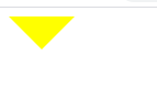
5.画三角形
<!DOCTYPE html>
<html lang="en">
<head>
    <meta charset="UTF-8">
    <meta name="viewport" content="width=device-width, initial-scale=1.0">
    <title>Document</title>
    <style>
        div{
            width: 0px;
            height: 0px;
            /* border-top: 30px solid transparent;
            border-left: 30px solid transparent;
            border-right: 30px solid #0000ff;
            border-bottom: 30px solid transparent; */
            /* 宽高为0,利用边框来画三角形
               三角形的大小取决于边框的粗细
             */

             /* border-width: 30px;
             border-style: solid; */
             /* border-color: transparent transparent pink transparent; */
             /* border-color: transparent;
             border-top-color: tomato; */

             border: 30px solid transparent;
             border-top-color: yellow;
        }
    </style>
</head>
<body>
    <div></div>
</body>
</html>
效果:
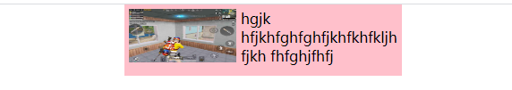
6.文字围绕浮动元素
<!DOCTYPE html>
<html lang="en">
<head>
    <meta charset="UTF-8">
    <meta name="viewport" content="width=device-width, initial-scale=1.0">
    <title>Document</title>
    <style>
        *{
            margin: 0;
            padding: 0;
        }
        .box{
            width: 300px;
            height: 70px;
            background-color: pink;
            margin: 0 auto;
            padding:5px;
        }
        .pic{
            float: left;
            width: 120px;
            height: 60px;
            margin-right: 5px;
        }
        .pic img{
            width:100%;
            height: 60px;
        }
    </style>
</head>
<body>
    <div class="box">
        <div class="pic">
            <img src="./images/2f68db3d5f65401df280b270a1dd3ae.jpg" alt="">
        </div>
        <p>
            hgjk hfjkhfghfghfjkhfkhfkljh fjkh fhfghjfhfj
        </p>
    </div>
</body>
</html>
效果:
7.单行文本溢出显示省略号
<!DOCTYPE html>
<html lang="en">
<head>
<meta charset="UTF-8">
<meta name="viewport" content="width=device-width, initial-scale=1.0">
<meta http-equiv="X-UA-Compatible" content="ie=edge">
<title>单行文本溢出显示省略号</title>
<style>
div {
width: 150px;
height: 80px;
background-color: pink;
margin: 100px auto;
/* 这个单词的意思是如果文字显示不开自动换行 */
/* white-space: normal; */
/* 1.这个单词的意思是如果文字显示不开也必须强制一行内显示 */
white-space: nowrap;
/* 2.溢出的部分隐藏起来 */
overflow: hidden;
/* 3. 文字溢出的时候用省略号来显示 */
text-overflow: ellipsis;
}
</style>
</head>
<body>
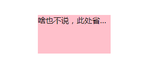
<div>
啥也不说,此处省略一万字
</div>
</body>
</html>效果:
8.表单轮廓和防止拖拽文本域
<!DOCTYPE html>
<html lang="en">
<head>
    <meta charset="UTF-8">
    <meta name="viewport" content="width=device-width, initial-scale=1.0">
    <title>Document</title>
    <style>
        input, textarea {
            /* 取消表单轮廓 */
            outline: none;
        }
        textarea {
            /* 防止拖拽文本域 */
            resize: none;
        }
    </style>
</head>
<body>
    <!-- 1. 取消表单轮廓 -->
    <input type="text">
    <!-- 2. 防止拖拽文本域 -->
    <textarea name="" id="" cols="30" rows="10"></textarea>
</body>
</html>
9.图片文字垂直居中对齐
<!DOCTYPE html>
<html lang="en">
<head>
<meta charset="UTF-8">
<meta name="viewport" content="width=device-width, initial-scale=1.0">
<title>Document</title>
<style>
img {
/* vertical-align: bottom; */
/* 让图片和文字垂直居中 */
vertical-align: middle;
/* vertical-align: top; */
}
textarea {
vertical-align: middle;
}
</style>
</head>
<body>
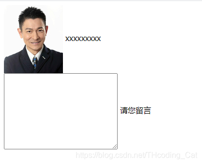
<img src="images/ldh.jpg" alt=""> xxxxxxxxxxxx
<br>
<textarea name="" id="" cols="30" rows="10"></textarea> 请您留言
</body>
</html>效果:
10.图片底侧有空白缝隙解决方案
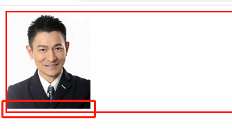
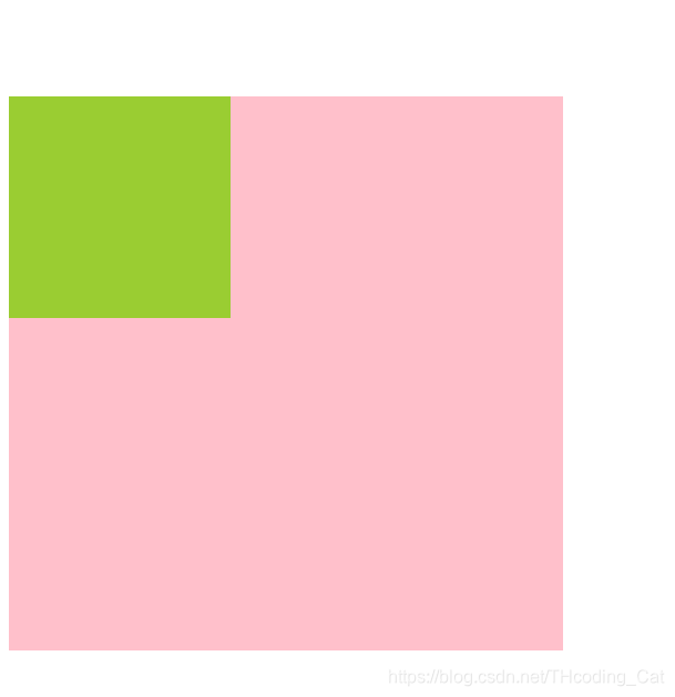
未解决效果:
代码:
<!DOCTYPE html>
<html lang="en">
<head>
<meta charset="UTF-8">
<meta name="viewport" content="width=device-width, initial-scale=1.0">
<meta http-equiv="X-UA-Compatible" content="ie=edge">
<title>图片底侧空白缝隙解决方案</title>
<style>
div {
border: 2px solid red;
}
img {
/* vertical-align: middle; */
/* 转为块级元素则去除图片底侧空白缝隙解决方案 */
display: block;
}
</style>
</head>
<body>
<div>
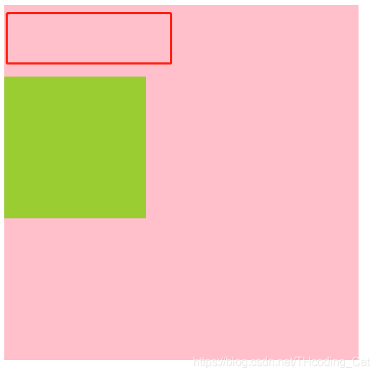
<img src="images/ldh.jpg" alt="">
</div>
</body>
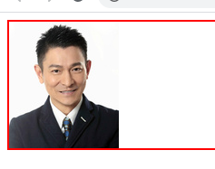
</html>解决后效果:
11.多行溢出文字显示省略号
<!DOCTYPE html>
<html lang="en">
<head>
<meta charset="UTF-8">
<meta name="viewport" content="width=device-width, initial-scale=1.0">
<title>Document</title>
<style>
div{
width: 150px;
height: 65px;
background-color: pink;
margin: 100px auto;
overflow: hidden;
text-overflow: ellipsis;
/* 弹性伸缩盒子模型显示 */
display: -webkit-box;
/* 限制在一个块元素显示的文本的行数 */
-webkit-line-clamp: 3;
/* 设置或检索伸缩盒对象的子元素的排列方式 */
-webkit-box-orient: vertical;
}
</style>
</head>
<body>
<div>
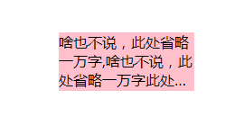
啥也不说,此处省略一万字,啥也不说,此处省略一万字此处省略一万字
</div>
</body>
</html>效果:
12.通过伪元素添加字体图标
<!DOCTYPE html>
<html lang="en">
<head>
    <meta charset="UTF-8">
    <meta name="viewport" content="width=device-width, initial-scale=1.0">
    <title>Document</title>
    <style>
         /* 声明字体 */
         @font-face {
            font-family: 'iconfont';
            src: url('font/iconfont.eot');
            src: url('font/iconfont.eot?#iefix') format('embedded-opentype'),
                url('font/iconfont.woff2') format('woff2'),
                url('font/iconfont.woff') format('woff'),
                url('font/iconfont.ttf') format('truetype'),
                url('font/iconfont.svg#iconfont') format('svg');
        }

        *{
            margin: 0;
            padding: 0;
        }
        div{
            position: relative;
            width: 300px;
            height: 60px;
            border: 1px solid #aaa;
            margin: 120px auto;
        }
        /* 使用伪元素构造字体图标 */
        div::before{
            position: absolute;
            top:18px;
            right:10px;

            content:'\e644';
            font-family: "iconfont";
            font-size: 12px;
        }
    </style>
</head>
<body>
    <div></div>
</body>
</html>
13.外边距塌陷问题
未解决效果:
代码:
<!DOCTYPE html>
<html lang="en">
<head>
    <meta charset="UTF-8">
    <meta name="viewport" content="width=device-width, initial-scale=1.0">
    <title>外边距塌陷问题</title>
    <style>
        .dad{
            width: 500px;
            height: 500px;
            background-color: pink;
            /* 解决方法一:给父元素加一个border/border-top */
            /* border: 1px solid #000; */
            /* 解决方法二:给父元素加padding */
            padding-top: 1px;
            /* 解决方法三:给父元素加overflow:hidden; */
            /* overflow: hidden; */

        }
        .son{
            width: 200px;
            height: 200px;
            background-color: yellowgreen;
            margin-top: 100px;
        }
    </style>
</head>
<body>
    <!-- 当两个盒子嵌套时,给小盒子设置margin-top,会把大盒子一起带下来,有三种方法可解决 -->
    <div class="dad">
        <div class="son"></div>
    </div>
</body>
</html>
解决后效果:
14.巧用边框做四方格
这种四方格最开始我用margin来做,效果始终不如意,尚且不知道是什么原因
改用border后反而更简单:
&:nth-child(even){
border-left: 10px solid #fff;
}
&:nth-child(-n+2) {
border-bottom: 8px solid #fff;
}
给第二,四位方格添加左边框,给前两个方格添加下边框即可
.banner-items{
            float: right;
            width: 343px;
            height: 280px;
            .banner-item{
                float: left;
                width: 171px;
                height: 140px;
                &:nth-child(even){
                    border-left: 10px solid #fff;
                }
                &:nth-child(-n+2) {
                    border-bottom: 8px solid #fff;
                }
                img{
                    width: 100%;
                    height: 100%;
                }
            }
        }
15.实现绝对定位元素水平垂直居中
left,top均设置为50%,同时margin-left设置为绝对定位元素宽度的一半取负,margin-top设置为绝对定位元素高度的一半取负
//例如:绝对定位元素宽度为100px;高度为100px
position:absolute;
left:50%;
top:50%;
margin-left:-50px;
margin-top:-50px;
利用绝对定位元素自动伸缩的特性,设置margin:auto;设置left和right的值相等,top和bottom的值相等
position:absolute;
left: 0;
right: 0;
top: 0;
bottom: 0;
margin:auto;注意:left和right的值不能超过其相对元素width减去它自身width的一半,否则绝对定位元素会优先取left值进行定位(前提是文档流是从左向右),但是top和bottom的值却没有这个限制
16.阻止a链接跳转的5种方式
    <--这种不推荐使用-->
    <a href="#abc">不跳转</a>


    <a href="JavaScript:">不跳转</a>
    <a href="JavaScript:void(0)">不跳转</a>
    <a href="JavaScript:null">不跳转</a>
    <a href="JavaScript:undefined">不跳转</a>
    <a href="#" onclick = 'return false'>不跳转</a>
17.隐藏滚动条
::v-deep .el-collapse-item__content{
  //需要高度
  max-height: 230px;
  //隐藏滚动条
  overflow-y: auto;
  scrollbar-width: none;
  -ms-overflow-style: none;
}
//针对webkit内核
::v-deep .el-collapse-item__content::-webkit-scrollbar{
  display: none;
}
效果:


 扫一扫
扫一扫


 628
628

 被折叠的 条评论
为什么被折叠?
被折叠的 条评论
为什么被折叠?
 到【灌水乐园】发言


