


 本文介绍了如何使用Python库plotnine实现类似R语言ggplot2的视觉效果,展示了如何制作直方图、面积图、条形图、箱线图和饼图,以及时间序列和散点图,适合熟悉ggplot2的用户快速上手。

“今天又是一篇Python可视化的好文。用过R语言的都知道ggplot2画出来的图表是极其舒适的,从配色到线条,都十分养颜。之前我用过Python来画图,原始状态下的图表真的是难以入目,难登大雅之堂。今天,文章介绍了一个库,叫 plotnine,是可以实现ggplot2的功效,具体怎么玩?可以收藏了本篇文章慢慢研究哈哈。
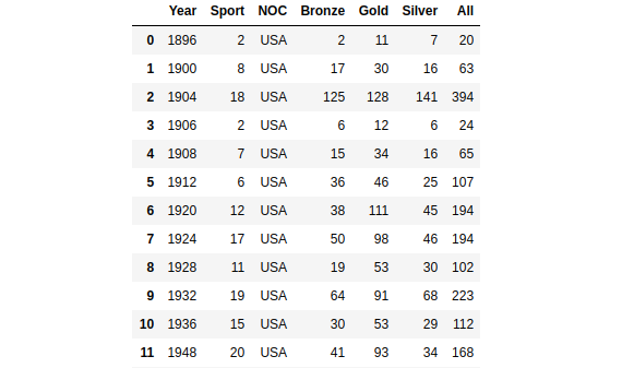
Plotnine is the implementation of the R package ggplot2 in Python. It replicates the syntax of R package ggplot2 and visualizes the data with the concept of the grammar of graphics. It creates a visualization based on the abstraction of layers. When we are making a bar plot, we will build the background layer, then the main layer of the bar plot, the layer that contains title and subtitle, and etc. It is like when we are working with Adobe Photoshop. The plotnine package is built on top of Matplotlib and interacts well with Pandas. If you are familiar with the ggplot2, it can be your choice to hand-on with plotnine.
# Dataframe manipulation
import pandas as pd

# Linear algebra
import numpy as np

# Data visualization with matplotlib
import matplotlib.pyplot as plt

# Use the theme of ggplot
plt.style.use('ggplot')

# Data visualization with plotnine
from plotnine import *
import plotnine

# Set the figure size of matplotlib
plt.figure(figsize = (6.4,4.8))
1 Histogram using plotnine
A histogram is the most commonly used graph to show frequency distributions. It lets us discover and show the underlying frequency distribution of a set of numerical data. To construct a histogram from numerical data, we first need to split the data into intervals, called bins.
# Create a histogram
(
    ggplot(data = full_data[full_data['Age'].isna() == False])+
    geom_histogram(aes(x = 'Age'),
                   fill = '#c22d6d',
                   bins = 20)+  # Set number of bin
    labs(title = 'Histogram of Athlete Age',
         subtitle = '1896 - 2016')+
    xlab('Age')+
    ylab('Frequency')+
    theme_bw()
)
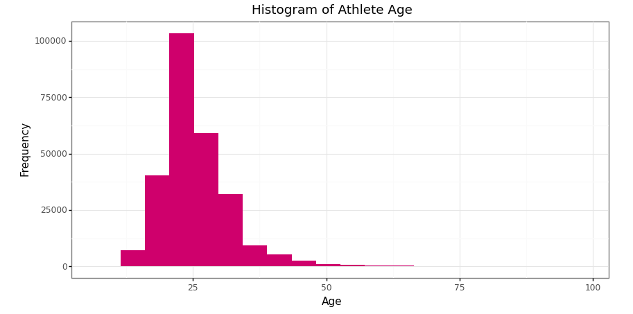
Histogram of athlete’s age in Olympics data 1896–2016 (Image by Author)
2 Area chart using plotnine
An area chart is an extension of a line graph, where the area under the line is filled in. While a line graph measures change between points, an area chart emphasizes the data volume.
# Data manipulation before making time series plot
# 1 Each country medals every year
medal_noc = pd.crosstab([full_data['Year'], full_data['NOC']], full_data['Medal'], margins = True).reset_index()
# Remove index name
medal_noc.columns.name = None
# Remove last row for total column attribute
medal_noc = medal_noc.drop([medal_noc.shape[0] - 1], axis = 0)
medal_noc# 2 General champion
medal_noc_year = medal_noc.loc[medal_noc.groupby('Year')['All'].idxmax()].sort_values('Year')
medal_noc_year
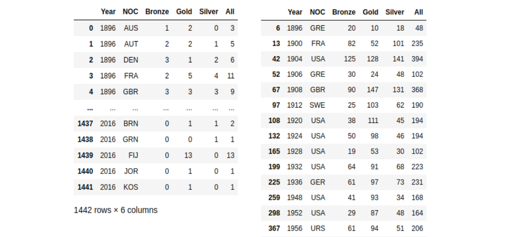
Medals acquisition by countries in 1896–2016 (left) and medals acquisition by the general winner in 1896–2016 (right) (Image by Author)
# Create a time series plot
(
    ggplot(data = medal_noc_year)+
    geom_area(aes(x = 'Year',
                  y = 'Gold',
                  group = 1),
              size = 1,
              fill = '#FFD700',
              alpha = 0.7)+
    geom_area(aes(x = 'Year',
                  y = 'Silver',
                  group = 1),
              size = 1,
              fill = '#C0C0C0',
              alpha = 0.8)+
    geom_area(aes(x = 'Year',
                  y = 'Bronze',
                  group = 1),
              size = 1,
              fill = '#cd7f32',
              alpha = 0.8)+
    scale_x_discrete(breaks = range(1890,2020,10))+
    labs(title = 'Area Chart of Medals Acquisition',
         subtitle = '1896 - 2016')+
    xlab('Year')+
    ylab('Frequency')+
    theme_bw()
)
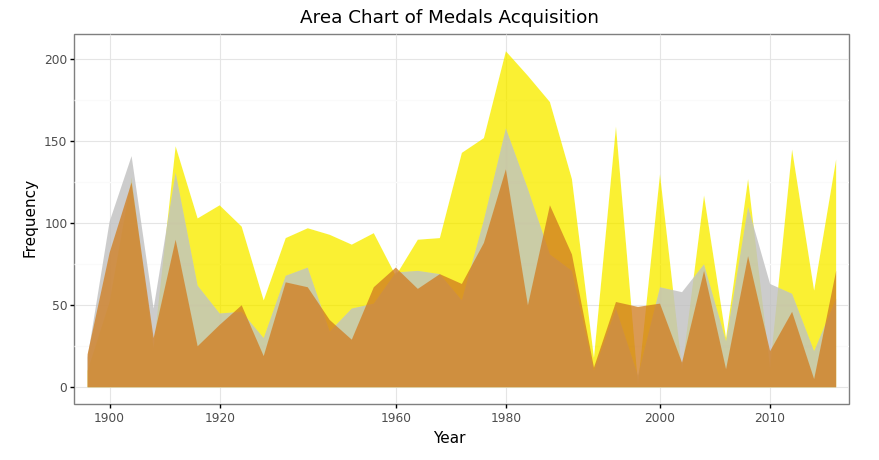
Area chart of total medals acquisition in 1896–2016 in Olympics data (Image by Author)
3 Bar plot using plotnine
Bar plot has a similar aim to the histogram. It lets us discover and show the underlying frequency distribution of a set of categorical data. As we know that categorical data can not be measured by the mathematics equation, such as multiplication, subtraction, etc but can be counted.
# Data manipulation before making bar plot
# The country that won the most olympics - table
medal_noc_count = pd.DataFrame(medal_noc_year['NOC'].value_counts()).reset_index()
medal_noc_count.columns = ['NOC','Count']
medal_noc_count
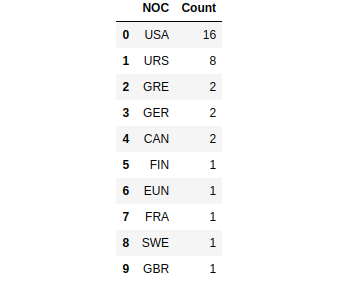
Top ten countries top that won the most Olympics competition 1896–2016 (Image by Author)
# Create a bar plot
(
    ggplot(data = medal_noc_count)+
    geom_bar(aes(x = 'NOC',
                 y = 'Count'),
             fill = np.where(medal_noc_count['NOC'] == 'USA', '#c22d6d', '#80797c'),
             stat = 'identity')+
    geom_text(aes(x = 'NOC',
                  y = 'Count',
                  label = 'Count'),
              nudge_y = 0.7)+
    labs(title = 'Bar plot of Countries that Won Olympics',
         subtitle = '1896 - 2016')+
    xlab('Country')+
    ylab('Frequency')+
    scale_x_discrete(limits = medal_noc_count['NOC'].tolist())+
    theme_bw()
)
“Note: we are able to using
geom_labelas the alternative ofgeom_text. It has a similar argument too. Please, try by yourself!
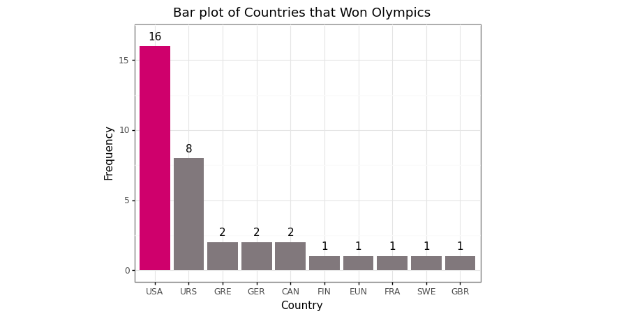
Bar plot of the top ten countries top that won the most Olympics competition 1896–2016 (Image by Author)
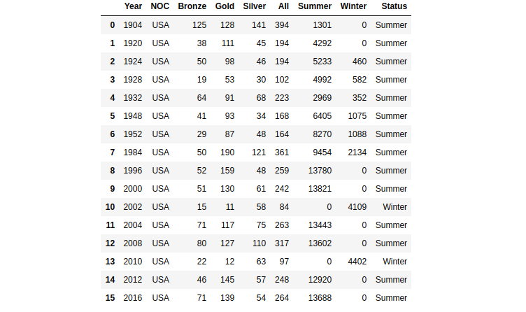
# Data manipulation before making bar plot
# Top five sport of USA
# 1 Cross tabulation of medals
medal_sport = pd.crosstab([full_data['Year'], full_data['NOC'], full_data['Sport']], full_data['Medal'], margins=True).drop(index='All', axis=0).reset_index()
medal_sport# 2 Cross tabulation of medals in sports
medal_sport_usa = medal_sport[medal_sport['NOC'] == 'USA']
medal_sport_usa_count = medal_sport_usa.groupby('Sport')['All'].count().reset_index()
medal_sport_usa_count_10 = medal_sport_usa_count.sort_values('All', ascending=False).head(10)
medal_sport_usa_count_10
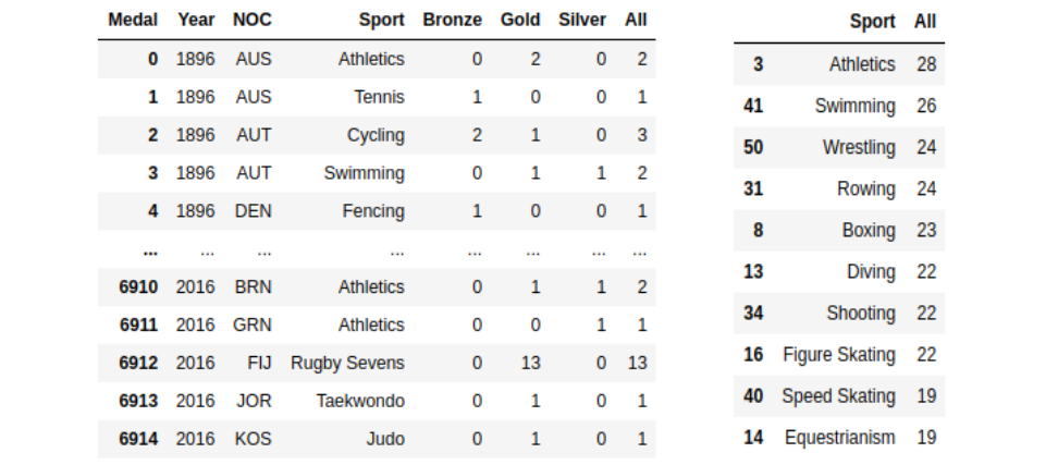
Number of medals each sport won by country 1896–2016 (left) and number of medals each sport won by USA 1896–2016 (right) (Image by Author)
# Create a bar plot
(
    ggplot(data = medal_sport_usa_count_10)+
    geom_bar(aes(x = 'Sport',
                 y = 'All',
                 width = 0.6),
             fill = np.where(medal_sport_usa_count_10['Sport'] == 'Figure Skating', '#c22d6d', '#80797c'),
             stat = 'identity')+
    geom_text(aes(x = 'Sport',
                  y = 'All',
                  label = 'All'),
              nudge_y = 0.9)+
    labs(title = 'Bar plot of Top Ten Sport Won by USA',
         subtitle = '1896 - 2016')+
    xlab('Sport')+
    ylab('Frequency')+
  scale_x_discrete(limits = medal_sport_usa_count_10['Sport'].tolist()[::-1])+
    theme_bw()+
    coord_flip()
)
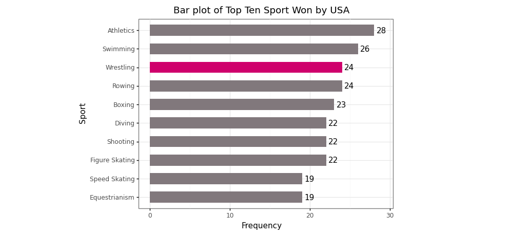
Bar plot of top ten sports won by USA 1896–2016 (Image by Author)
4 Box and Whisker plot using plotnine
Box and Whisker plot is a standardized way of displaying the distribution of data based on a five-number summary:
Minimum value
The first quartile (Q1)
Median
The third quartile (Q3)
Maximum value
We need to have information on the dispersion of the data. *A box and Whisker plot is a graph that gives us a good indication of how the values in the data are spread out*. Although box plots may seem primitive in comparison to a histogram or density plot, they have the advantage of taking up less space, which is useful when comparing distributions between many groups or data.
# Data manipulation
data_usa_urs = full_data[full_data['NOC'].isin(['USA','URS'])]
data_usa_urs = data_usa_urs[data_usa_urs['Age'].isna() == False].reset_index(drop = True)
# Create a box plot
(
    ggplot(data = data_usa_urs)+
    geom_boxplot(aes(x = 'NOC',
                     y = 'Age'),
                     fill = '#c22d6d',
                 show_legend = False)+
    labs(title = 'Box and Whisker plot of Age',
         subtitle = '1896 - 2016')+
    xlab('Country')+
    ylab('Age')+
    coord_flip()+
    theme_bw()
)
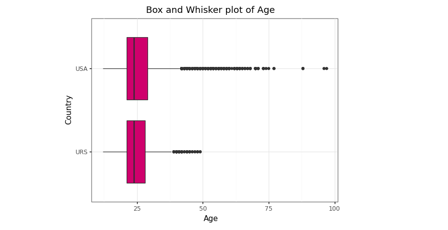
Box and Whisker plot of age distribution between USA and URS in 1896–2016 (Image by Author)
5 Pie chart using plotnine
Pie charts are very popular for showing a compact overview of a *composition* or *comparison*. It enables the audience to see a data comparison at a glance to make an immediate analysis or to understand information quickly. While they can be harder to read than column charts, they remain a popular choice for small datasets.
“Note: we can’t a pie chart via
plotninepackage because unfortunately, the functioncoord_polarwhich is needed to created pie chart is not in theplotnineAPI
# Data manipulation before making pie chart
# Dominant season
# 1 Select the majority season each year
data_season_year = pd.crosstab(full_data['Year'], full_data['Season']).reset_index()
data_season_year.columns.name = None
data_season_year['Status'] = ['Summer' if data_season_year.loc[i,'Summer'] > data_season_year.loc[i,'Winter'] else 'Winter' for i in range(len(data_season_year))]
data_season_year# 2 Dominant season each year
dominant_season = data_season_year.groupby('Status')['Year'].count().reset_index()
dominant_season
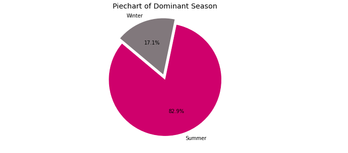
The majority season since Olympics event 1896–2016 (Image by Author)
# Customize colors and other settings
colors = ['#c22d6d','#80797c']
explode = (0.1,0) # Explode 1st slice
# Create a pie chart
plt.pie(dominant_season['Year'], explode = explode, labels = dominant_season['Status'], colors = colors, autopct = '%1.1f%%', shadow = False, startangle = 140)
plt.title('Piechart of Dominant Season') # Title
plt.axis('equal')
plt.show()
Pie chart of the majority season since Olympics event 1896–2016 (Image by Author)
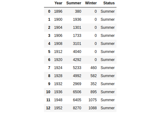
6 Time series plot using plotnine
A time series plot is a plot that shows observations against time. According to the Chegg Study, the uses of the time-series plot are listed.
Time series plot easily identifies the trends.
Data for long periods of time can be easily displayed graphically
Easy future prediction based on the pattern
Very useful in the field of business, statistics, science etc
# Data manipulation before making time series plot
left = medal_noc_year[medal_noc_year['NOC'] == 'USA']
right = data_season_year
data_season_usa = left.merge(right, on='Year', how='left')
data_season_usa
The medal acquisition of USA and majority season in Olympics event 1904–2016 (Image by Author)
# Create a time series plot
(
    ggplot(data = data_season_usa)+
    geom_line(aes(x = 'Year',
                  y = 'All',
                  group = 1),
              size = 1.5,
              color = '#c22d6d')+
    geom_point(aes(x = 'Year',
                   y = 'All',
                   group = 1),
               size = 3,
               color = '#000000')+
    geom_text(aes(x = 'Year',
                  y = 'All',
                  label = 'All'),
              nudge_x = 0.35,
              nudge_y = 10)+
    scale_x_discrete(breaks = range(1900,2020,10))+
    labs(title = 'Line Chart of Medals Acquisition (USA)',
         subtitle = '1896 - 2016')+
    xlab('Year')+
    ylab('Frequency')+
    theme_bw()
)
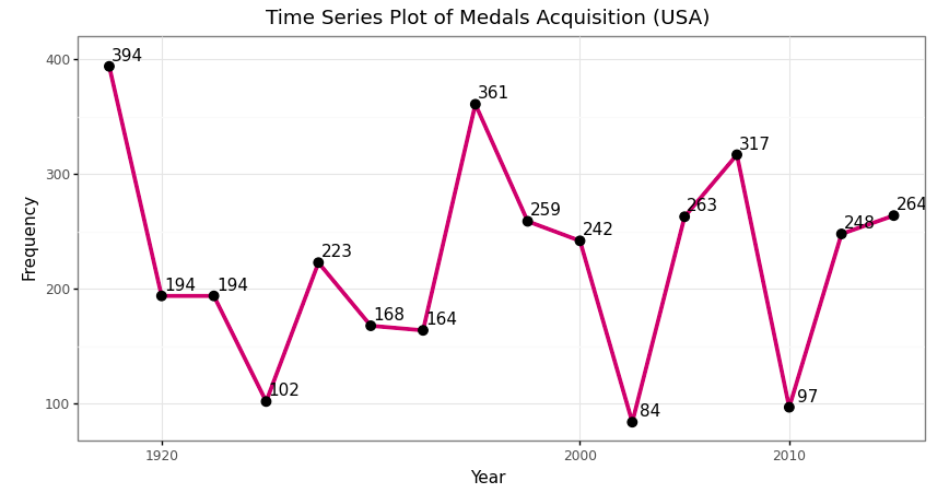
Time series plot of medals acquisition of USA in Olympics event 1904–2016 (Image by Author)
7 Scatter plot using plotnine
A scatterplot is a type of data visualization that shows the relationship between two numerical data. Each point of the data gets plotted as a point whose (x, y) coordinates relates to its values for the two variables. The strength of the correlation can be determined by how closely packed the points are to each other on the graph. Points that end up far outside the general cluster of points are known as outliers.
# Data manipulation before making scatter plot
# 1 Select the majority season each year
data_medals = full_data[full_data['Medal'].notna()]
left = data_medals[(data_medals['NOC'] == 'USA') & (data_medals['Medal'].notna())].groupby('Year')['Sport'].nunique().reset_index()
right = medal_noc[medal_noc['NOC'] == 'USA']
sport_medal_usa = left.merge(right, on = 'Year', how = 'left')
sport_medal_usacorr_sport_all = np.corrcoef(sport_medal_usa['Sport'], sport_medal_usa['All'])[0,1]# Print status
print('Pearson correlation between number of sport and total of medals is {}'.format(round(corr_sport_all,3)))
The medal acquisition of USA and number of sports in Olympics event 1896–2016 (Image by Author)
# Create a scatter plot
(
    ggplot(data = sport_medal_usa)+
    geom_point(aes(x = sport_medal_usa['Sport'],
                   y = sport_medal_usa['All'],
                   size = sport_medal_usa['All']),
               fill = '#c22d6d',
               color = '#c22d6d',
               show_legend = True)+
    labs(title = 'Scatterplot Number of Sport and Total of Medals',
         subtitle = '1896 - 2016')+
    xlab('Number of Sport')+
    ylab('Total of Medals')+
    theme_bw()
)
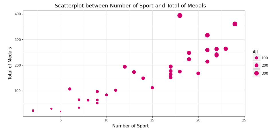
Scatter plot between the number of sports and total medals acquisition (Image by Author)
8 Facet wrapping using plotnine
According to the plotnine official site, facet_wrap() creates a collection of plots (facets), where each plot is differentiated by the faceting variable. These plots are wrapped into a certain number of columns or rows as specified by the user.
# Data manipulation before making box and whisker plot
data_usa_urs['Medal'] = data_usa_urs['Medal'].astype('category')
data_usa_urs['Medal'] = data_usa_urs['Medal'].cat.reorder_categories(['Gold', 'Silver', 'Bronze'])
data_usa_urs
The pre-processing is done, now let’s create a visualization!
# Create a box and whisker plot
(
    ggplot(data = data_usa_urs[data_usa_urs['Medal'].isna() == False])+
    geom_boxplot(aes(x = 'NOC',
                     y = 'Age'),
                 fill = '#c22d6d')+
    labs(title = 'Box and Whisker plot of Age',
         subtitle = '1896 - 2016')+
    xlab('Country')+
    ylab('Age')+
    theme_bw()+
    facet_grid('. ~ Medal')
)
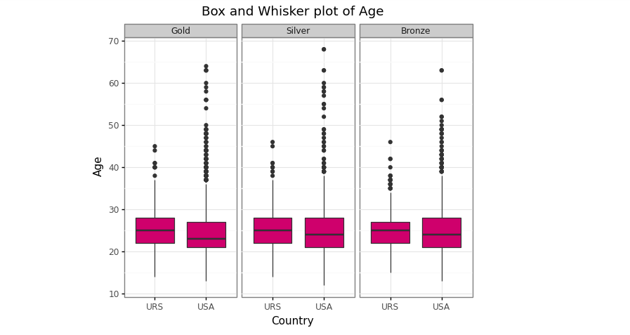
Box and Whisker plot of age between USA and URS by medals type (Image by Author)
Conclusion
The plotnine package is a wonderful data viz package in Python. It replicates the ggplot2 package in R and the user can easily create a visualization more beautiful. It accommodates all the ggplot2 package, but for several viz like a pie chart, it doesn't support yet! This is not the problem because we can use the matplotlib as another alternative.
References
[1] Anonim. Making Plots With plotnine (aka ggplot), 2018. https://monashdatafluency.github.io/.
[2] J. Burchell. Making beautiful boxplots using plotnine in Python, 2020. https://t-redactyl.io/.
[3] S. Prabhakaran. Top 50 ggplot2 Visualizations — The Master List (With Full R Code), 2017. http://r-statistics.co/.


 2万+
2万+


 到【灌水乐园】发言


