


 eplot为pandas DataFrame和Series提供了一个接口,允许用户直接使用pyecharts库进行交互式图表的绘制,简化了数据分析过程中的绘图步骤。通过eplot,用户无需创建pyecharts对象,只需调用DataFrame的eplot方法即可生成各种图表,包括折线图、柱状图、散点图等。
文章目录
1 eplot
1.1 eplot简介
eplot 是pyecharts库对pandas的一个接口,通过给DataFrame及Series类添加方法,直接使用DataFrame对象添加的方法来画echats交互图。避免了导入pyecharts模块、实例化对应的图像、添加数据等复杂的步骤。
pyecharts提供的方法可以使用python直接画echarts图,但是需要数行代码,而我们平时做数据分析时,数据多存在pandas的DataFrame里,DataFrame的plot方法可以使用matplotlib做后端,直接通过调用实例化的类的方法来绘制图像,如: df.plot.bar()。
基于同样的想法,为了在pandas中更流畅的使用pyecharts,eplot通过给DataFrame, Series类注册eplot方法来实现类似的功能。
因此,我们无需在DataFrame外创建pyecharts对象,而是直接用eplot方法通过pyecharts后端来画交互图。
安装方法: pip install eplot
1.2 调用方法对比
1.2.1 使用pyecharts的绘图方法
pyecharts 是echarts的一个Python接口,它提供了丰富的交互图像,在jupyter notebook中可以方便的数据展示和生成报告, 在python中可以通过导入pyecharts后实例化各类图像,然后通过add添加数据,来绘图。
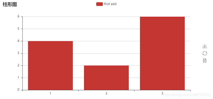
from pyecharts import Bar
bar = Bar('柱形图')
df = pd.DataFrame({'x':[1,2,3], 'y':[4,2,6]})
bar.add('first add', df.x, df.y)
bar
1.2.2 使用eplot
from eplot import eplot
df = pd.Series([4,2,6],index=[1,2,3])
df.eplot.bar(title='柱形图')
参考pyecharts文档:http://pyecharts.org/#/zh-cn/prepare
2 图标示例
from eplot import eplot
import pandas as pd
import numpy as np
df = pd.DataFrame([np.random.uniform(10,1,size=1000),
                   np.random.uniform(10,5,size=1000),
                   np.random.randint(1,high=10,size=1000),
                   np.random.choice(list('ABCD'),size=1000)],
                  index=['col1','col2','col3','col4']).T
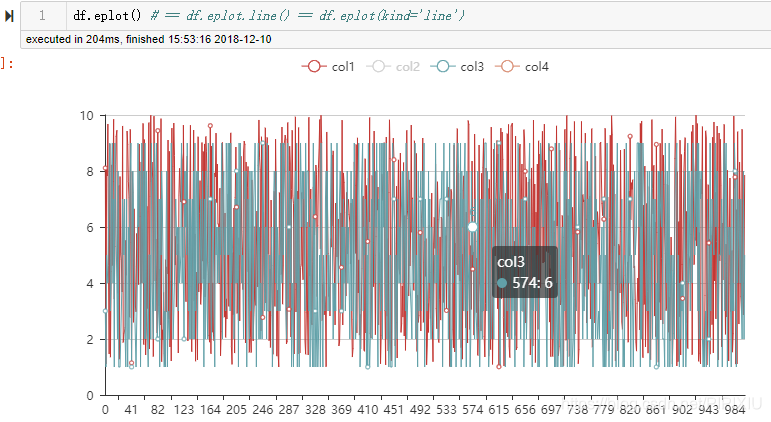
2.1 折线图
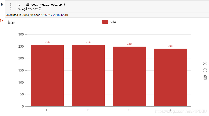
2.2 柱状图

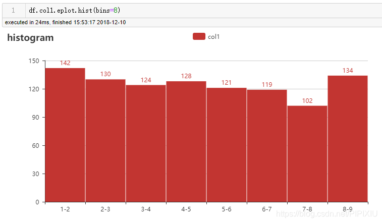
2.3 直方图

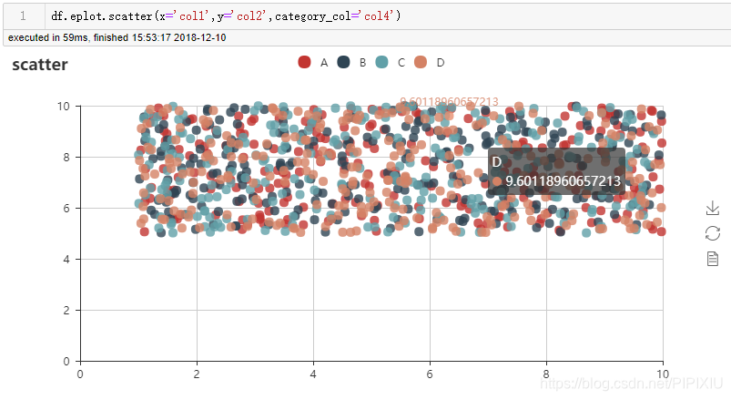
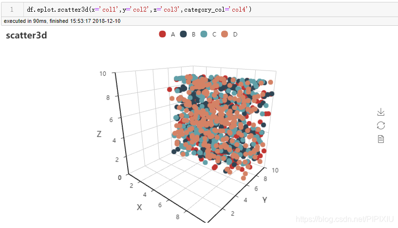
2.4 散点图(二维,三维,分类散点图)
在这里插入图片描述
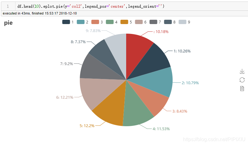
2.5 饼图
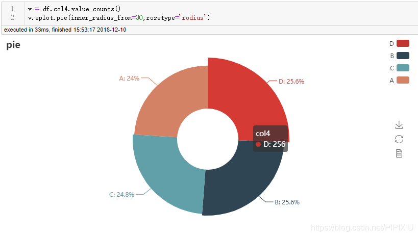
2.6 玫瑰图
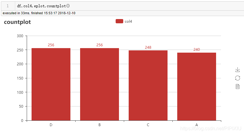
2.7 计数图
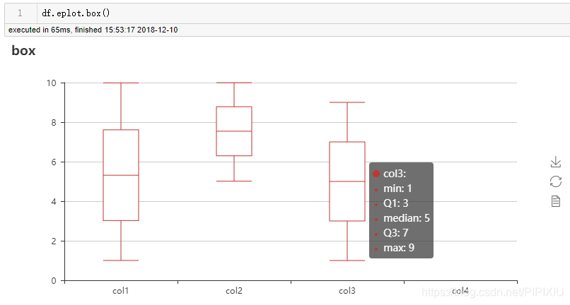
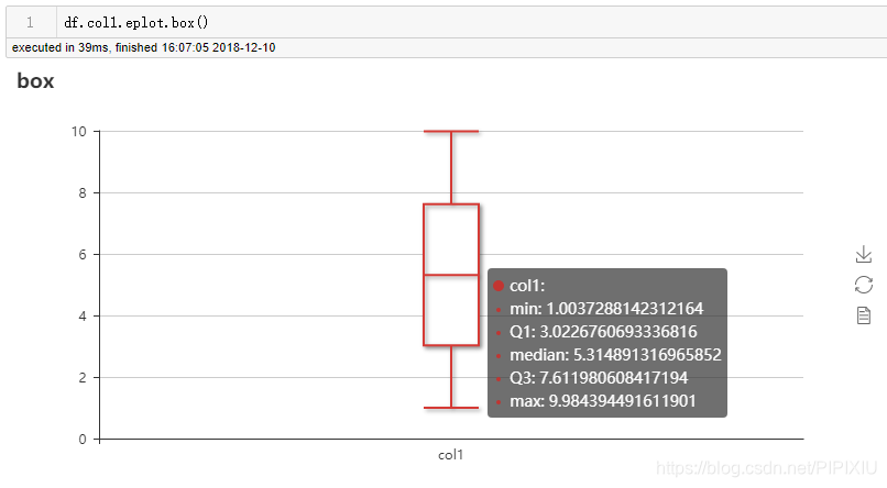
2.8 箱线图
更多内容请看github:https://github.com/pjgao/eplot


 3925
3925


 到【灌水乐园】发言


