<!DOCTYPE html>
<html lang="en">

<head>
    <meta charset="UTF-8">
    <meta http-equiv="X-UA-Compatible" content="IE=edge">
    <meta name="viewport" content="width=device-width, initial-scale=1.0">
    <title>Document</title>
    <style>
        * {
            margin: 0;
            padding: 0;
            box-sizing: border-box;
        }

        body {
            display: flex;
            justify-content: center;
            align-items: center;
            min-height: 100vh;
            background-color: #000000;
        }

        .bubble {
            position: absolute;
            width: 200px;
            height: 200px;
            border-radius: 50%;
            box-shadow: inset 0 0 25px rgba(255, 255, 255, 0.25);
            animation: animate 8s ease-in-out infinite;
        }

        @keyframes animate {

            0%,
            100% {
                transform: translateY(-20px);
            }

            50% {
                transform: translateY(20px);
            }
        }

        .bubble:nth-child(2) {
            position: relative;
            zoom: 0.45;
            top: -100px;
            left: -10px;
            animation-delay: -4s;
            z-index: -10;
        }

        .bubble:nth-child(3) {
            position: relative;
            zoom: 0.25;
            top: -300px;
            left: -80px;
            animation-delay: -6s;
            z-index: -10;
        }

        .bubble:nth-child(4) {
            position: relative;
            zoom: 0.35;
            top: -200px;
            left: -120px;
            animation-delay: -3s;
            z-index: -10;
        }

        .bubble:nth-child(5) {
            position: relative;
            zoom: 0.5;
            top: -250px;
            left: 0px;
            animation-delay: -5s;
            z-index: -10;
        }

        .bubble::before {
            content: '';
            position: absolute;
            top: 50px;
            left: 45px;
            width: 30px;
            height: 30px;
            border-radius: 50%;
            background-color: #ffffff;
            filter: blur(2px);
            z-index: 100;
        }

        .bubble::after {
            content: '';
            position: absolute;
            top: 80px;
            left: 85px;
            width: 20px;
            height: 20px;
            border-radius: 50%;
            background-color: #ffffff;
            filter: blur(2px);
            z-index: 100;
        }

        .bubble span {
            position: absolute;
            border-radius: 50%;
            filter: blur(8px);
        }

        .bubble span:nth-child(1) {
            inset: 10px;
            border-left: 15px solid #0fb4ff;
        }

        .bubble span:nth-child(2) {
            inset: 10px;
            border-left: 15px solid #ff3384;
        }

        .bubble span:nth-child(3) {
            inset: 20px;
            border-left: 15px solid #ffeb3b;
        }

        .bubble span:nth-child(4) {
            inset: 30px;
            border-left: 15px solid #ff3384;
            filter: blur(12px);
        }

        .bubble span:nth-child(5) {
            inset: 10px;
            border-left: 10px solid #ffffff;

        }
    </style>
</head>

<body>
    <div class="bubble">
        <span></span>
        <span></span>
        <span></span>
        <span></span>
        <span></span>
    </div>
    <div class="bubble">
        <span></span>
        <span></span>
        <span></span>
        <span></span>
        <span></span>
    </div>
    <div class="bubble">
        <span></span>
        <span></span>
        <span></span>
        <span></span>
        <span></span>
    </div>
    <div class="bubble">
        <span></span>
        <span></span>
        <span></span>
        <span></span>
        <span></span>
    </div>
    <div class="bubble">
        <span></span>
        <span></span>
        <span></span>
        <span></span>
        <span></span>
    </div>
</body>

</html>


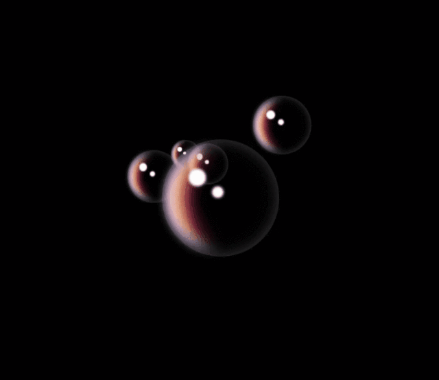
 这是一个HTML和CSS的示例,展示了如何使用纯CSS创建动态气泡效果。通过CSS动画,每个气泡都有上升和下降的运动轨迹,同时内部包含模糊的白色小点,营造出逼真的气泡飘浮感。


 扫一扫
扫一扫


 2005
2005

 被折叠的 条评论
为什么被折叠?
被折叠的 条评论
为什么被折叠?
 到【灌水乐园】发言


