 使用rem.js和reset.css实现响应式布局


 这篇博客探讨了如何通过JavaScript的rem.js库和CSS的reset.css来实现网页的响应式设计。rem.js动态调整html字体大小,从而根据窗口宽度改变页面元素的尺寸,确保在不同设备上的一致显示。reset.css则重置了常见的样式,提供了一个干净的起点。文章强调了在移动优先的设计策略中,这两种技术的重要性。
rem.js:
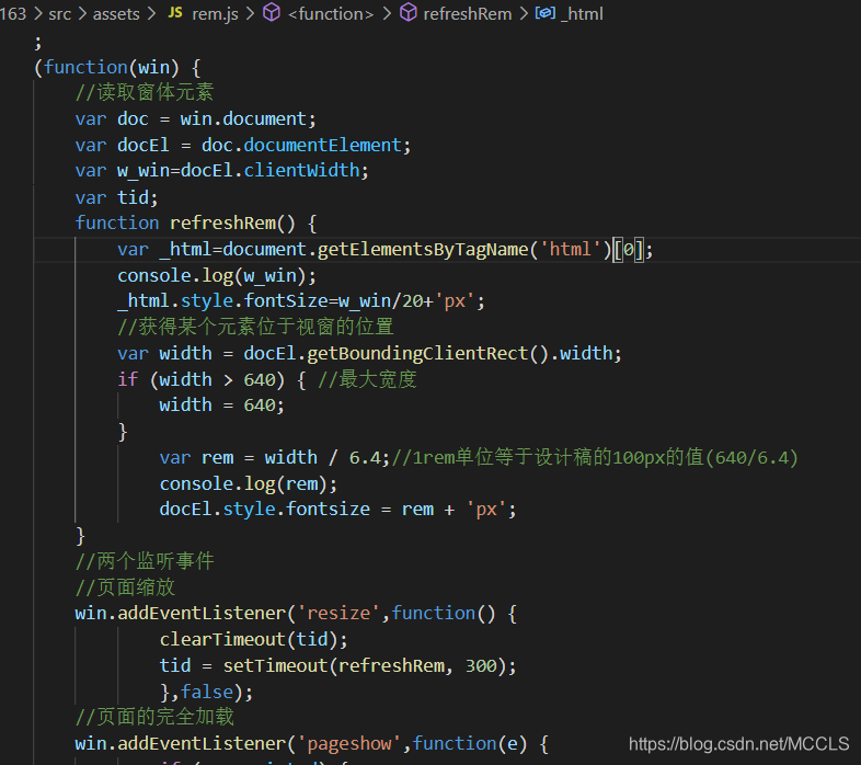
代码:
;
(function(win) {
//读取窗体元素
var doc = win.document;
var docEl = doc.documentElement;
var w_win=docEl.clientWidth;
var tid;
function refreshRem() {
var _html=document.getElementsByTagName('html')[0];
console.log(w_win);
_html.style.fontSize=w_win/20+'px';
//获得某个元素位于视窗的位置
var width = docEl.getBoundingClientRect().width;
if (width > 640) { //最大宽度
width = 640;
}
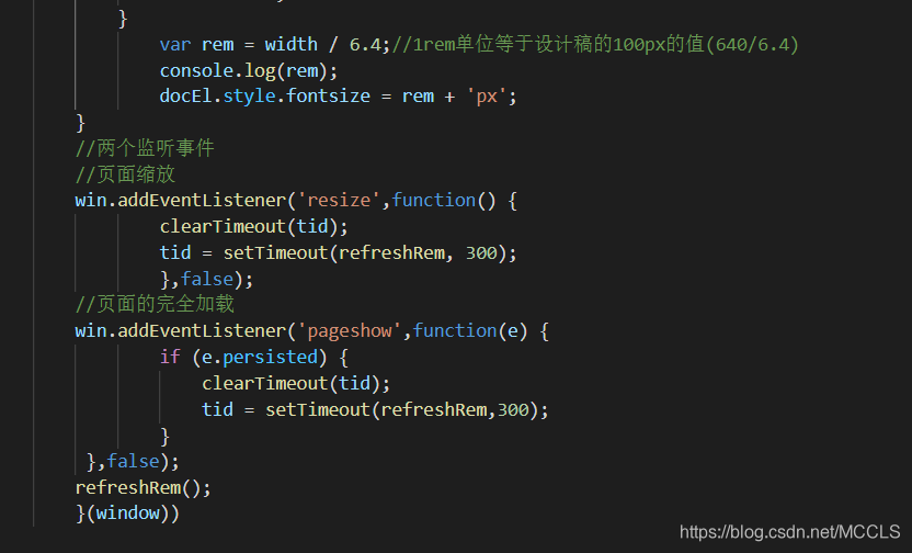
var rem = width / 6.4;//1rem单位等于设计稿的100px的值(640/6.4)
console.log(rem);
docEl.style.fontsize = rem + 'px';
}
//两个监听事件
//页面缩放
win.addEventListener('resize',function() {
clearTimeout(tid);
tid = setTimeout(refreshRem, 300);
},false);
//页面的完全加载
win.addEventListener('pageshow',function(e) {
if (e.persisted) {
clearTimeout(tid);
tid = setTimeout(refreshRem,300);
}
},false);
refreshRem();
}(window))
reset.css:
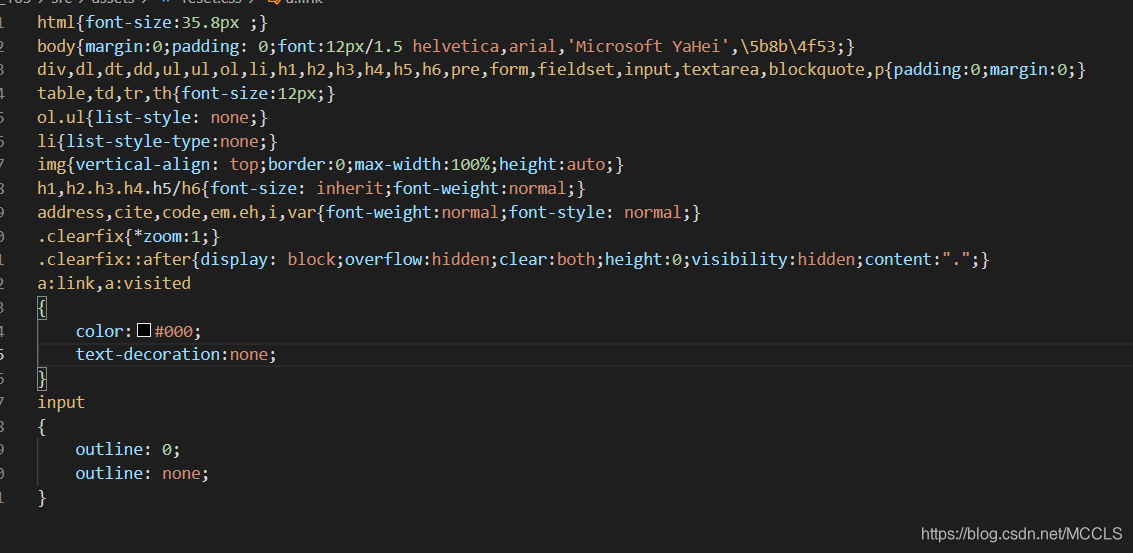
代码:
html{font-size:35.8px ;}
body{margin:0;padding: 0;font:12px/1.5 helvetica,arial,'Microsoft YaHei',\5b8b\4f53;}
div,dl,dt,dd,ul,ul,ol,li,h1,h2,h3,h4,h5,h6,pre,form,fieldset,input,textarea,blockquote,p{padding:0;margin:0;}
table,td,tr,th{font-size:12px;}
ol.ul{list-style: none;}
li{list-style-type:none;}
img{vertical-align: top;border:0;max-width:100%;height:auto;}
h1,h2.h3.h4.h5/h6{font-size: inherit;font-weight:normal;}
address,cite,code,em.eh,i,var{font-weight:normal;font-style: normal;}
.clearfix{*zoom:1;}
.clearfix::after{display: block;overflow:hidden;clear:both;height:0;visibility:hidden;content:".";}
a:link,a:visited
{
    color:#000;
    text-decoration:none;
}
input
{
    outline: 0;
    outline: none;
}


 扫一扫
扫一扫


 2564
2564

 被折叠的 条评论
为什么被折叠?
被折叠的 条评论
为什么被折叠?
 到【灌水乐园】发言


